
Dotted Journal – Hardcover Bullet Journal System
$9.00
Organize your thoughts and plans with this premium dotted journal. Features 240 pages of thick,

Precision Gel Pen Set – Smooth Writing Collection
$9.00
Experience effortless writing with this set of precision gel pens. Quick-drying ink prevents smudging while

Ceramic Planter Set – Nordic Minimalist Design
$9.00
Bring life to any space with these clean-lined ceramic planters. The Nordic-inspired design features drainage

True Wireless Earbuds – Active Noise Canceling Pro
$15.00
Immerse yourself in pure sound with adaptive noise canceling that adjusts to your environment. 8-hour

Ceramic Coffee Mug – Double-Wall Insulated 12oz
$30.00
Start your mornings right with this thoughtfully designed ceramic mug. Double-wall construction keeps drinks at
Dotted Journal – Hardcover Bullet Journal System
$9.00
Organize your thoughts and plans with this premium dotted journal. Features 240 pages of thick,

Automatic Watch – Stainless Steel Classic
$35.00
Precision meets elegance in this automatic timepiece. Features a transparent case back, sapphire

Premium Organic Cotton Tee – Essential Collection
$35.00
The perfect everyday essential crafted from 100% organic cotton. Pre-shrunk and garment-washed for
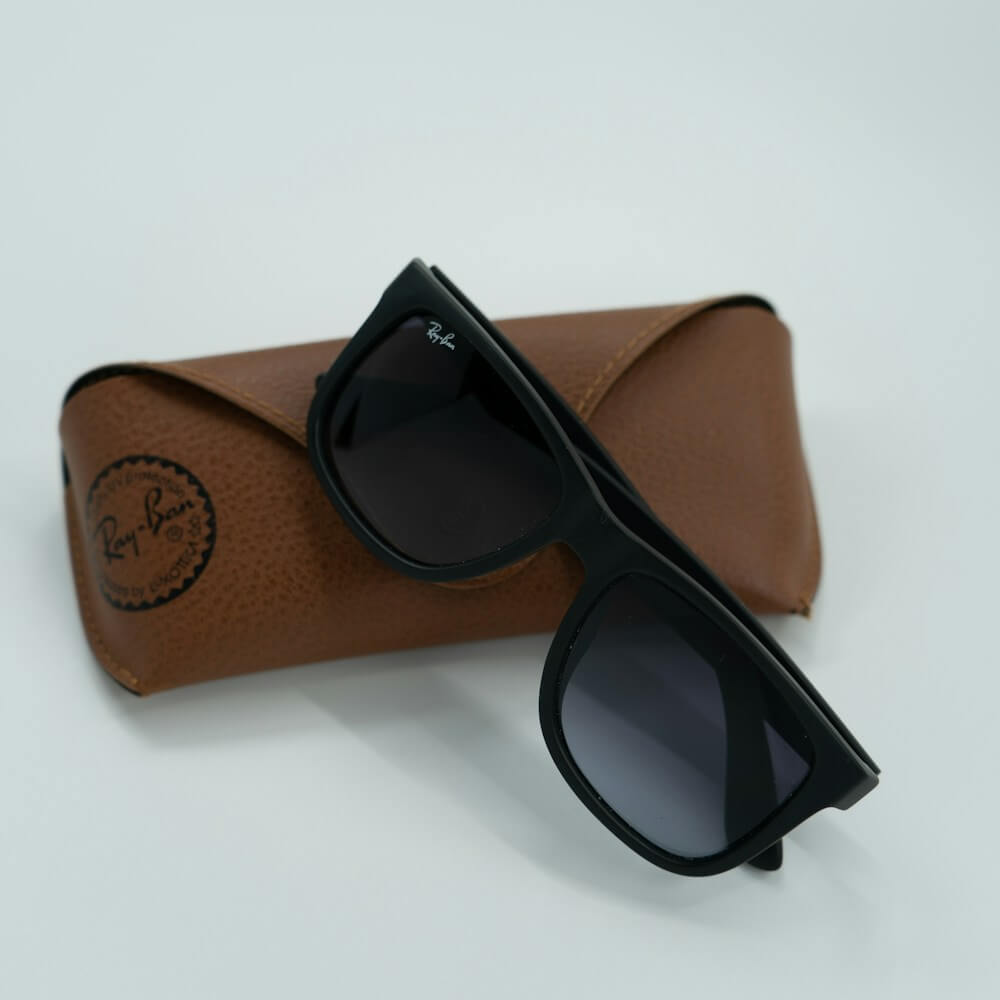
Polarized Aviator Sunglasses – Titanium Frame
$35.00
Classic aviator style with modern technology. These titanium-framed sunglasses feature polarized lenses for

Adjustable Tablet Stand – Multi-Angle Aluminum Base
$18.00
Perfect for video calls, reading, or drawing. This aluminum tablet stand adjusts to multiple angles and

Heavyweight Cotton Hoodie – Oversized Comfort Fit
$20.00
Cozy up in premium heavyweight cotton that gets softer with every wash. The oversized fit and

Bamboo Cutting Board – Antibacterial with Juice Groove
$20.00
Sustainable and functional kitchen essential. This bamboo cutting board features natural antibacterial properties, a convenient juice