One-Page vs Multi-Step checkout remains one of the most debated decisions for WooCommerce store owners in 2026. Your checkout design directly determines whether browsers become buyers—or join the 70.22% of shoppers who abandon their carts globally.
The one-page vs multi-step checkout debate isn’t about following trends—it’s a data-driven decision that impacts your revenue. One-page checkout typically delivers 3-5% higher conversion rates for low-value, impulse purchases and mobile shoppers. Multi-step checkout performs 28-35% better for complex or high-value products by reducing cognitive load.
The right choice depends on your average order value, product complexity, audience behavior, and device traffic—not universal best practices. This guide compares one-page vs multi-step checkout with real conversion data, implementation strategies, and decision frameworks to help you choose the best approach for your WooCommerce store.
Table of Contents
What is One-Page Checkout?
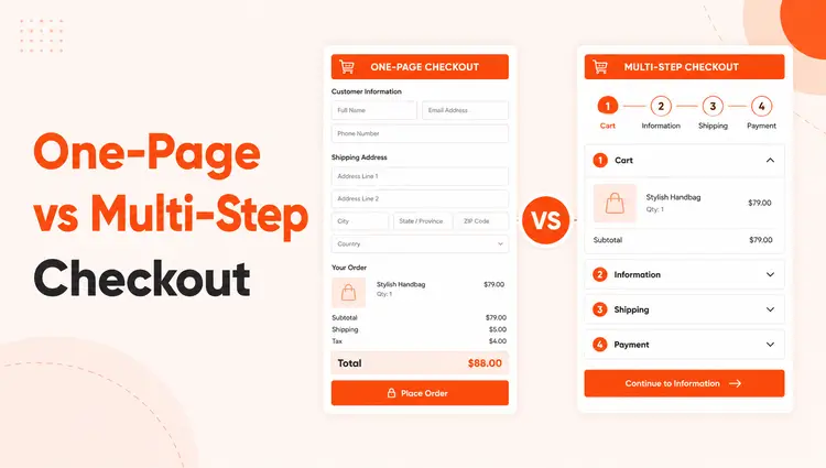
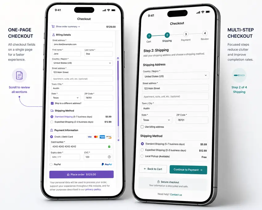
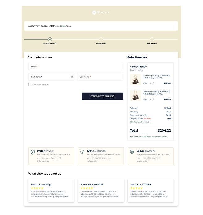
One-page checkout (also called single-page checkout) displays all checkout elements on a single screen: billing information, shipping details, payment method, and order review. Customers scroll through the form, fill in required fields, and complete their purchase without navigating to additional pages.
This approach prioritizes speed and simplicity. It works particularly well for:
- Digital products with no shipping requirements
- Low-friction purchases under $50-$100
- Mobile-first stores where reducing page loads matters
- Repeat customers who value speed over guidance
Pros:
- Faster completion for returning customers
- Fewer page loads and technical failure points
- Better mobile experience when designed with collapsible sections
- Reduces friction for impulse purchases
Cons:
- Can feel overwhelming with too many visible fields
- Limited ability to track where customers abandon
- Fewer natural opportunities for upsells or trust-building elements
- Requires careful design to avoid visual clutter
What is Multi-Step Checkout?
Multi-step checkout breaks the purchase process into separate stages, typically spread across 3-5 screens: customer information, shipping details, payment method, and order review. Each step displays only relevant fields for that stage, with a progress indicator showing completion status.
This structured approach reduces cognitive load by presenting information in digestible chunks. It performs best for:
- High-value products require careful consideration
- Complex purchases with customization options
- B2B transactions with multiple decision-makers
- First-time customers unfamiliar with your brand
Pros:
- Less overwhelming for new or hesitant customers
- Clear progress indicators build psychological commitment
- Easier to track abandonment points with analytics
- Natural spaces for trust signals, upsells, and reassurance
Cons:
- More clicks and page loads extend checkout time
- Each new page creates potential abandonment points
- Can frustrate experienced buyers seeking speed
- More complex to implement and maintain
One-Page vs Multi-Step Checkout: Conversion Data Comparison
Understanding the one-page vs multi-step checkout performance differences requires examining specific use cases rather than relying on general benchmarks. Choosing between checkout types isn’t about following trends—it’s about understanding how each performs under specific conditions.
Overall Conversion Benchmarks
According to multiple 2026 industry studies:
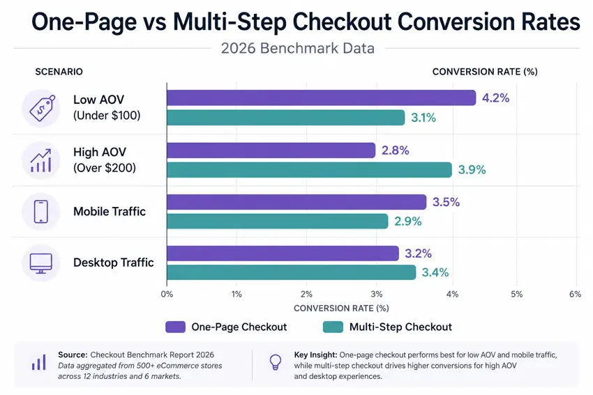
- One-page checkout conversion rates typically range from 2.8% to 4.2%
- Multi-step checkout averages 2.5% to 3.8% for general ecommerce
- The global ecommerce conversion rate baseline sits at 1.9% to 2.5%
However, these numbers tell an incomplete story. Performance varies dramatically based on implementation quality, product type, and audience expectations.
When One-Page Checkout Wins
Research from checkout optimization studies shows that one-page checkout outperforms multi-step in these scenarios:
Mobile-first traffic: Mobile shoppers abandon 73-75% of carts compared to 65-68% on desktop, according to 2026 data from Growth Suite. One-page checkout eliminates multiple page loads that increase mobile abandonment risk.
Low average order value: For purchases under $75, customers make quick decisions. Single-page checkout reduces friction at the moment of impulse. Stores report 15-22% conversion lifts for digital products and low-value physical goods.
Returning customers: Shoppers familiar with your brand and products don’t need hand-holding. They want speed. One-page checkout serves this audience better.
When Multi-Step Checkout Wins
Multi-step checkout demonstrates superior performance in different contexts:
- High-value purchases: For orders over $200, multi-step checkout can increase completion rates by 28-35%, according to WooCommerce checkout data. Breaking complex decisions into stages reduces the psychological weight of committing to expensive purchases.
- Complex product configurations: Products requiring customization, add-ons, or detailed specifications benefit from structured, step-by-step guidance.
- First-time buyers: New customers need more trust-building and clarity. Multi-step checkout provides natural opportunities to display security badges, guarantees, and reassurance at each stage.
- Better analytics: Multi-step processes let you identify exactly where customers drop off—shipping costs, payment options, or unexpected fees—enabling targeted optimization.
Side-by-Side Comparison
| Factor | One-Page Checkout | Multi-Step Checkout |
| Speed | Fastest for experienced users | Slower due to multiple steps |
| Cognitive Load | Higher—all fields visible | Lower—information chunked by stage |
| Mobile Performance | Better if designed well | Can feel tedious without optimization |
| Analytics Tracking | Limited abandonment insight | Precise drop-off point tracking |
| Upsell Opportunities | Minimal without cluttering | Natural placement between steps |
| Editing & Review | Easy—scroll to any field | Requires “back” navigation |
| Best For | Impulse buys, repeat customers, digital products | High-value items, complex products, new customers |
| Ideal AOV | Under $100 | Over $200 |
| Implementation | Simpler technical setup | More complex structure required |
Cart Abandonment: Which Reduces Drop-Offs?
Cart abandonment remains one of ecommerce’s biggest challenges. Understanding how checkout design influences abandonment helps you make data-driven decisions.
The Abandonment Reality
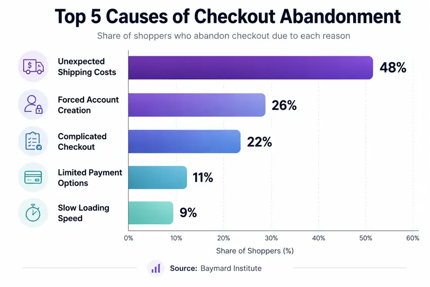
The average WooCommerce cart abandonment rate sits between 70-75% in 2026. According to WooCommerce abandoned cart research, 22% of US shoppers abandon carts specifically because the checkout process feels “too long or complicated.”
One-Page Checkout and Abandonment
One-page checkout reduces abandonment by:
- Eliminating page load failures between steps
- Removing opportunities to second-guess during transitions
- Providing immediate visibility into total requirements
However, it can increase abandonment when:
- Forms appear overwhelming with 20+ visible fields
- Users can’t estimate how long completion will take
- Mobile users face excessive scrolling
Multi-Step Checkout and Abandonment
Multi-step checkout helps reduce abandonment through:
- Progressive disclosure—showing only relevant information per stage
- Progress indicators that build completion commitment
- Reduced form fatigue by chunking information
But abandonment risk increases when:
- Each new page introduces loading delays
- Customers face unexpected requirements late in the process
- The number of steps exceeds 4-5 screens
The form fatigue factor matters significantly. Baymard Institute found that the average US checkout contains 23.48 form elements, but optimal flows use just 12-14 elements. Reducing field count can increase conversion rates by 35.26%, regardless of whether you use one-page or multi-step design.
Mobile Experience: A Critical Decision Factor
Mobile commerce represents 72.9% of all ecommerce sales in 2026. Your checkout’s mobile performance directly impacts revenue.
One-Page Checkout on Mobile
Advantages:
- Single page load reduces connection failure risk
- No navigation between multiple screens
- Faster for users on stable connections
Challenges:
- Excessive scrolling frustrates mobile users
- Small screens make long forms feel overwhelming
- Difficult to provide field-specific help text without cluttering
Best practices for mobile one-page checkout:
- Use collapsible sections to hide completed information
- Implement autofill for address and payment fields
- Position most important fields above the fold
- Enable guest checkout to reduce required fields
Multi-Step Checkout on Mobile
Advantages:
- Smaller chunks feel less daunting on small screens
- Progress indicators help users understand the time commitment
- Each step fits comfortably on mobile viewports
Challenges:
- Multiple page loads increase abandonment risk on slow connections
- Back navigation can be clunky on mobile browsers
- More screens extend overall completion time
Best practices for mobile multi-step checkout:
- Limit steps to 3-4 maximum
- Make progress indicators prominent
- Allow users to edit previous steps without losing data
- Optimize page load speed ruthlessly
User Experience and Psychology
Checkout design taps into specific psychological principles that influence completion rates.
The Progressive Commitment Effect
Multi-step checkout leverages the principle of progressive commitment. Once customers invest time completing step one, they’re more likely to complete steps two and three. Each completed stage builds psychological momentum toward purchase.
This effect works particularly well for high-value purchases where customers need time to build confidence in their decision.
The Simplicity Preference
One-page checkout appeals to the simplicity bias—humans prefer solutions that appear straightforward. When customers see all requirements upfront, they can make quick go/no-go decisions without feeling manipulated by a multi-step funnel.
This approach works best for customers who’ve already decided to buy and just want to complete the transaction.
Decision Fatigue
Both approaches must account for decision fatigue, but in different ways:
One-page checkout can trigger decision fatigue when too many fields, options, and choices appear simultaneously.
Multi-step checkout can create fatigue by making the process feel longer than necessary, especially for simple purchases.
How to Implement One-Page vs Multi-Step Checkout in WooCommerce
WooCommerce doesn’t include advanced checkout customization by default, but plugins like ShopLentor make implementation straightforward.
Setting Up One-Page Checkout with ShopLentor
ShopLentor offers a Shopify-style checkout option that creates a clean, single-page flow:
- Install and activate ShopLentor (free or Pro version)
- Navigate to Dashboard → ShopLentor → Settings → Modules
- Enable the Shopify Style Checkout module
- Customize the layout using Elementor or Gutenberg template builder
- Optimize field order to prioritize essential information
- Test thoroughly on mobile devices
- Monitor conversion data to identify improvement opportunities
For product-page one-page checkout, ShopLentor’s Quick Checkout module lets customers purchase directly from product pages via popup or redirect to a streamlined checkout page.
Setting Up Multi-Step Checkout with ShopLentor
ShopLentor Pro includes a dedicated Multi-Step Checkout module:
- Ensure you have ShopLentor Pro installed
- Go to Dashboard → ShopLentor → Modules and enable Multi-Step Checkout
- Access the Template Builder (Elementor or Gutenberg)
- Use the WL: Multi-Step Checkout widget on your checkout page
- Configure steps (typically: Customer Details, Shipping, Payment, Review)
- Customize step labels and progress indicator styling
- Add trust badges and reassurance elements to each step
- Test the full flow on multiple devices
- Set up analytics tracking for each step to monitor abandonment
Both options integrate with any WooCommerce theme and work with all payment gateways.
Which Checkout Type is Right for Your Store?
Rather than choosing based on trends, use this decision framework:
Choose One-Page Checkout If:
- Your average order value is under $100
- You sell digital products or subscriptions
- Mobile traffic represents over 60% of your visitors
- You have strong repeat customer base
- Your products require minimal customization
- You want simpler technical maintenance
- Speed is your primary competitive advantage
Choose Multi-Step Checkout If:
- Your average order value exceeds $200
- You sell complex or customizable products
- You’re targeting first-time buyers unfamiliar with your brand
- You need detailed analytics on checkout abandonment
- You want natural placement for upsells and add-ons
- Your products require extensive shipping or configuration details
- Building trust during checkout is critical for your industry
Consider a Hybrid Approach
Some stores benefit from using both:
- One-page checkout for logged-in, returning customers
- Multi-step checkout for first-time buyers or high-value orders
- Adaptive checkout that adjusts based on cart value or product type
ShopLentor allows you to create multiple checkout templates and assign them to different customer segments or product categories.
Testing and Optimization: The Only Way to Know for Sure
Theoretical frameworks help, but your specific audience and product mix determine what actually works. A/B testing removes guesswork.
How to Run a Checkout A/B Test
- Establish your baseline: Track current conversion rate, abandonment rate, and average session duration for at least two weeks
- Create variation: Set up the alternative checkout type using ShopLentor
- Split traffic evenly: Use a plugin like Google Optimize or Nelio A/B Testing to send 50% of traffic to each version
- Run for statistical significance: Test for at least 2-4 weeks or until you reach 100+ conversions per variation
- Track multiple metrics: Monitor conversion rate, revenue per visitor, cart abandonment, and checkout completion time
- Account for seasonality: Avoid testing during major sales events or holidays that skew behavior
Key Metrics to Track
- Conversion rate: Percentage of checkout page visitors who complete purchase
- Cart abandonment rate: Percentage who start but don’t finish checkout
- Revenue per visitor: Total revenue divided by checkout page visitors
- Time to completion: Average duration from checkout start to confirmation
- Mobile vs desktop performance: Segment results by device type
- Step abandonment (multi-step only): Where customers drop off in the process
What to Do With Results
If one approach clearly outperforms (15%+ improvement), implement it store-wide. If results are close (under 10% difference), consider:
- Segmenting by product category or cart value
- Optimizing the underperforming version before choosing
- Running secondary tests on specific elements (field order, progress indicators, trust badges)
Common Mistakes to Avoid
With One-Page Checkout:
- Displaying 20+ form fields without visual grouping
- Failing to implement address autocomplete
- Not offering guest checkout option
- Neglecting mobile optimization
- Omitting progress indicators (even on single pages, showing completion percentage helps)
With Multi-Step Checkout:
- Creating more than 5 steps
- Hiding shipping costs until the final step
- Failing to save progress between steps
- Using unclear step labels
- Not allowing users to edit previous steps easily
- Neglecting page load speed between steps
Universal Mistakes:
- Forcing account creation before purchase
- Requesting unnecessary information
- Hiding security badges and trust signals
- Providing unclear error messages
- Not offering multiple payment methods
- Failing to display total cost early
According to WooCommerce cart abandonment data, mandatory account creation alone accounts for 26% of checkout abandonment—the second most common reason after unexpected costs.
Advanced Considerations
Form Field Optimization
Regardless of checkout type, field optimization matters enormously. Research shows that removing even one unnecessary field can increase conversions by 5-10%.
Essential fields only:
- Email address
- Billing address
- Payment information
Conditional fields:
- Shipping address (only if different from billing)
- Phone number (only if required for delivery)
- Company details (only for B2B checkout)
Fields to eliminate:
- “Confirm email” or “confirm password”.
- Fax numbers
- Unnecessary address line 2 requirements
ShopLentor’s Checkout Field Manager lets you add, remove, or customize fields without coding.
Address Autocomplete
Google Address Autocomplete can reduce checkout completion time by 30-40% according to conversion optimization research. ShopLentor offers this feature, enabling customers to select validated addresses with a few keystrokes rather than typing full details.
This matters for both checkout types but provides particular value for one-page checkout by reducing the perceived length of address fields.
Trust and Security Signals
Strategic placement of trust elements influences completion rates:
For one-page checkout: Place security badges near payment fields and money-back guarantees near the final purchase button.
For multi-step checkout: Distribute trust signals across steps—SSL badges on payment step, return policy on review step, delivery guarantees on shipping step.
Frequently Asked Questions
What is the difference between one-page checkout and one-click checkout?
One-page checkout displays all checkout fields on a single page that customers fill out manually. One-click checkout uses saved customer data to complete purchases instantly without any form filling. Amazon’s “Buy Now” is one-click; most WooCommerce stores use one-page or multi-step checkout requiring manual entry.
Which has better conversion rates: one-page or multi-step checkout?
Neither is universally better, it depends on your store context. One-page checkout converts 3-5% better for impulse purchases under $100, mobile traffic, and repeat customers. Multi-step checkout performs 28-35% better for complex products over $200 and first-time buyers. Test both with your specific audience.
How many steps should a WooCommerce multi-step checkout have?
The optimal range is 3-4 steps: Customer Info, Shipping, Payment, and Review. Five or more steps increase abandonment. Two steps feel too restrictive. Three to four steps balance cognitive load reduction with completion speed.
Can I use different checkout types for different products on the same store?
Yes. ShopLentor and similar plugins let you assign different checkout templates by product category, cart value, or customer type. Example: use one-page checkout for digital products and multi-step for high-value physical goods. This hybrid approach optimizes for different purchase contexts.
What causes checkout abandonment more: checkout design or other factors?
Other factors matter more than checkout type. According to Baymard Institute 2026 data: unexpected shipping costs (48%), forced account creation (26%), complicated process (22%), and limited payment options (11%) are the main causes. Fix these issues before changing checkout structure.
Is multi-step checkout better for mobile shoppers?
Not automatically. Multi-step works well by showing smaller chunks per screen, but each page load risks abandonment on slow connections. Well-optimized one-page checkout with collapsible sections and autofill often performs better on mobile. Test both with your actual mobile traffic.
How do I track where customers abandon in multi-step checkout?
Use Google Analytics 4 with enhanced ecommerce tracking or WooCommerce analytics plugins like MonsterInsights. Enable event tracking on each step to monitor completion rates and identify drop-off points. ShopLentor’s Multi-Step Checkout creates trackable steps automatically.
Does checkout speed affect conversion rates?
Yes. 74% of shoppers abandon if checkout loading exceeds 3 seconds. Optimize for under 2-second load times, enable address autocomplete, and minimize scripts. A one-page site typically loads faster since it’s a single page; a multi-step site requires optimizing each individual step.
What’s the best checkout method for high-value products ($500+)?
Multi-step checkout performs 28-35% better for expensive items. It reduces decision overwhelm, builds progressive commitment, provides space for trust signals, and creates natural pauses for consideration. The slight time increase is offset by significantly higher completion rates.
How does AI affect checkout optimization in 2026?
AI enables address autocomplete, dynamic field display, predictive shipping, smart payment suggestions, and real-time fraud detection. Emerging agentic commerce (AI agents completing purchases autonomously) requires machine-readable checkout data. Stores should optimize for both human and AI shoppers.
Conclusion
The one-page vs multi-step checkout decision ultimately depends on your store’s unique context: product type, average order value, and customer behavior patterns.
One-page checkout and multi-step checkout both convert well when matched to the right store context. One-page excels for speed-focused, mobile-heavy, low-value purchases. Multi-step performs better for complex, high-value transactions requiring trust-building and detailed analytics.
Rather than following competitors or trends, analyze your average order value, product complexity, customer familiarity, and mobile traffic patterns. Test both approaches if you’re uncertain—real data from your specific audience beats general best practices.
WooCommerce stores can implement either approach quickly using ShopLentor’s Shopify Style Checkout or Multi-Step Checkout modules, both offering full customization without coding.
Your checkout page determines whether browsers become buyers. Choose the approach that removes friction for your specific customers, not the one that worked for someone else’s store.