You already know trust matters in eCommerce. You’ve probably added a review section, displayed some star ratings, and dropped a badge or two somewhere on your site.
But here’s the problem most store owners miss: it’s not just what you display — it’s where.
A trust badge sitting in your footer won’t stop a hesitant buyer at checkout. A 5-star rating buried below the fold won’t reassure someone who just landed on your product page. And reviews locked inside a tab that nobody clicks? Completely invisible to the people who needed to see them most.
WooCommerce gives you the tools. But it doesn’t tell you where to use them. That’s what this guide is for.
Getting WooCommerce trust badges placement right — along with where you put your ratings and reviews — is what separates a store that converts from one that just looks trustworthy. We’ll cover exactly where to place each trust element, page by page, so your trust signals actually reach buyers when doubt is highest and a sale is still winnable.
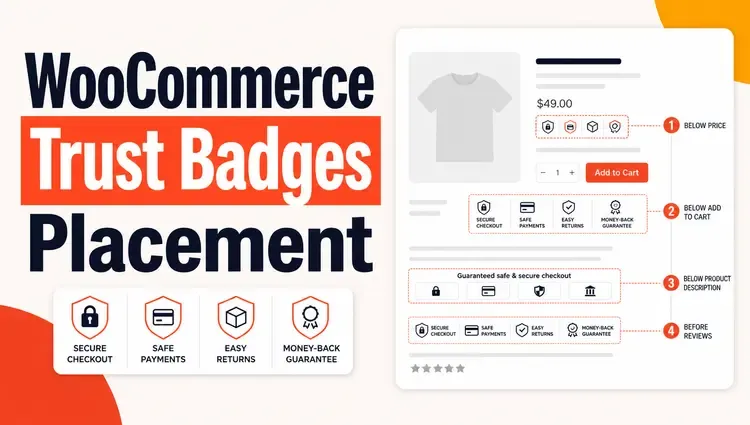
Place trust badges below the Add to Cart button on product pages and near the Place Order button on your checkout page. Put star ratings directly under the product title. Display review summaries above the fold so shoppers see social proof before they scroll. These three placements have the highest impact on conversions.
TL;DR
- Star ratings go under the product title — always.
- Full reviews go below the product description, not buried in a tab.
- Trust badges belong near every decision point: Add to Cart, cart page, and checkout.
- Ratings in search snippets need proper schema markup.
- Don’t place badges randomly — every badge must appear at a moment of buyer hesitation.
Table of Contents
Why WooCommerce Trust Badges Placement Is the Real Problem?
Most WooCommerce store owners know they need reviews and trust badges. The part that trips people up is where to put them.
A trust badge hidden in your footer does almost nothing. A 5-star rating buried three scrolls below the fold won’t stop someone from bouncing. Placement is not a design preference — it’s a conversion decision.
Displaying customer reviews can boost sales by 19.8%, and conversion rates increase by 270% when online retailers show five or more product reviews. But that lift only happens when shoppers actually see them at the right moment.
This guide walks you through exactly where to place each trust element in WooCommerce — and why each placement works.
ShopLentor- WooCommerce Builder for Elementor & Gutenberg
A versatile page builder to build modern and excellent online stores with more than 100k+ Active Installations.
The Three Types of Trust Elements (and Why They’re Different)
Before getting into placement, it helps to understand what each element does.
- Star ratings: Give a quick, scannable signal. Shoppers process them in under a second. They work best near the product title and in search results.
- Written reviews: They provide detail and context. They answer the questions a shopper is silently asking. They work best below the product description, where shoppers go when they want reassurance.
- Trust badges: These are visual guarantees. They reduce fear at high-anxiety moments — like entering a card number. They’re small icons or symbols placed on key areas like product pages, the cart, the footer, and especially the checkout page to show that your store is secure and trustworthy.
Each one solves a different kind of doubt. The goal is to match the right trust element to the right moment in the buying journey.
Where to Place Star Ratings in WooCommerce?
Directly Below the Product Title
This is the single most important placement for ratings. Shoppers scan product pages in an F-shaped pattern — top to bottom, left to right. The rating needs to be at the very top of that scan path.
In a default WooCommerce product page, the rating already appears below the title. If you’ve customized your layout with a page builder, make sure the rating block stays there. Dragging it lower is one of the most common mistakes store owners make.
You can control this in WooCommerce using the Product Rating module — it lets you position the rating block precisely, adjust star size, and style it to match your brand.
In the Product Gallery Area (for High-Ticket Items)
For expensive products, consider showing an aggregate rating summary (total reviews + average score) near the main product image. Shoppers buying a $200+ item want social proof before they even read the description.
In Search Results (Google & WooCommerce)
Star ratings in Google search results come from schema markup, not from where you place them on the page. Make sure your WooCommerce store outputs proper Product schema with aggregateRating data. Most SEO plugins handle this automatically, but verify it with Google’s Rich Results Test.
Ratings in your WooCommerce shop archive (category pages) show under each product card. Leave these enabled — they’re a strong conversion signal for shoppers comparing products.
Where to Place Reviews in WooCommerce
Below the Product Description — Not in a Tab
WooCommerce puts reviews inside a tab by default (“Reviews” tab, alongside “Description” and “Additional Information”). This is a problem. Tabs hide content. Most shoppers don’t click them.
Move reviews below the product description so they’re visible on scroll. You don’t need to show all reviews — show a summary (average rating + review count) at the top, then the first 3–5 reviews below. Let shoppers load more on demand.
You can implement this layout using the Product Reviews Block for Gutenberg, which gives you full control over how and where reviews render on the product page without touching code.
Highlight the Most Helpful Review Near the Top
Don’t sort reviews chronologically by default. Show the most helpful or most detailed review first. This is the review that answers the most common buyer questions. It builds trust faster than a long list of short reviews.
On the Homepage and Category Pages (Selectively)
Showing 2–3 featured reviews on your homepage builds store-level trust, not just product-level trust. Keep these short — one sentence testimonials with a name and product bought. Don’t use generic “Great product!” quotes. Shoppers see through those immediately.
Studies show that products rated above four out of five stars are significantly more attractive to buyers — and the first five reviews have the highest impact on conversion rates. Use that insight: surface your strongest reviews prominently, and don’t just display reviews in the order they were submitted.
Where to Place Trust Badges in WooCommerce
This is where most stores get it wrong. They either put badges only in the footer or pile them everywhere with no strategy.
The rule is simple: Place a badge wherever a buyer hesitates.
Here are the five key placements, in order of impact.
1. Below the Add to Cart Button (Product Page)
Positioning badges near Add to Cart buttons gives customers a confidence boost right when they’re reaching for their wallets.
This is the highest-impact spot on a product page. After reading the description and checking the price, the shopper hovers over Add to Cart — and that’s when doubt creeps in. A badge here (money-back guarantee, secure payment, free returns) dissolves that doubt in real time.
Keep it simple: 2–3 badges maximum. Don’t create visual noise that distracts from the button itself.
You can add custom badge blocks to this area using ShopLentor’s Product Badges module, which lets you design and position badges without editing theme files.
2. On the Cart Page (Below the Proceed to Checkout Button)
Adding a trust seal below the “Proceed to Checkout” button increases buyer confidence at the point where they’re deciding whether to continue.
The cart page is where second thoughts happen. Shoppers review their order, second-guess the price, and wonder if the site is legitimate. A payment security badge or a “100% Secure Checkout” seal here directly addresses those doubts.
3. On the Checkout Page (Near the Place Order Button)
This is the highest-anxiety moment in the entire buying journey. The shopper is about to enter card details. Any hesitation here results in an abandoned order.
Some WooCommerce practitioners report checkout conversion lifts of up to 42% after adding security and payment icons — though this figure varies widely by store, audience, and product type. The direction of the effect is consistent: visible trust signals at checkout reduce drop-off.
Place badges directly above or below the Place Order button. Good options include:
- SSL secure/encrypted checkout badge.
- Payment method logos (Visa, Mastercard, PayPal, Stripe).
- Money-back guarantee seal.
- “No-risk” or “Safe to buy” reassurance text with an icon.
Don’t use too many. Three to four badges grouped cleanly is the sweet spot.
4. In the Footer (Store-Wide Trust)
Footer badges work differently from page-level badges. They’re not conversion triggers — they’re background credibility signals. Shoppers who scroll to your footer to check legitimacy will see these.
Good footer badges include:
- SSL certificate seal.
- Payment icons.
- Industry trust marks or certifications (if applicable).
Customer trust is one of the key elements that determines the success of an eCommerce store — and many customers have a hard time trusting new or small stores with their personal information, especially on a first visit. Footer badges help with this quietly, without interrupting the browsing experience.
5. On the Order Confirmation Page
Most stores stop thinking about trust the moment a purchase is complete. That’s a mistake. The order confirmation page is where buyer’s remorse starts. A badge here — “Your payment was secure,” “Your order is protected,” or “Easy 30-day returns” — reinforces the decision and reduces refund requests.
What Types of Trust Badges Work Best Where
| Badge Type | Best Placement |
| SSL / Secure Checkout | Checkout page, footer |
| Payment logos (Visa, PayPal) | Checkout page, product page |
| Money-back guarantee | Product page (below Add to Cart), cart |
| Free returns / Free shipping | Product page, cart |
| Security seals (Norton, McAfee) | Checkout page, footer |
| Customer rating summary | Product page (top), homepage |
| “Verified purchase” labels | Review section on product page |
Common Placement Mistakes to Avoid
- Putting badges only in the footer. The footer is fine for background trust — but it won’t lift your conversion rate. Badges need to appear at decision moments.
- Overloading the checkout page. More badges do not mean more trust. Too many creates visual clutter and actually looks less credible. Stick to 3–4 relevant ones.
- Using low-resolution or mismatched badge images. A blurry badge looks fake. Use SVG format where possible — it’s lightweight and scales perfectly on all screen sizes. SVGs are more lightweight and scalable than PNG or other image types, which is important given that over 60% of mobile traffic is directed to e-commerce sites.
- Hiding reviews in tabs. Default WooCommerce tab layout buries reviews. Restructure your product page to show reviews inline and visible on scroll.
- Showing ratings without review counts. A 5-star rating with 1 review is less convincing than a 4.7-star rating with 84 reviews. Always show the number of reviews alongside the average.
- Displaying badges you haven’t earned. Don’t show a PayPal badge if you don’t accept PayPal. Don’t display a Norton Secured seal without the actual certificate. You must purchase trust badges from relevant vendors and go through the verification process before displaying them — all demo data should be replaced with genuine credentials.
A Practical Example: How to Structure a WooCommerce Product Page
Here’s a clean, high-converting product page layout that puts trust elements in the right places:
[Product Images]
[Product Title]
[Star Rating + Review Count] ← placement 1
[Price]
[Short Description]
[Add to Cart Button]
[Trust Badges: Secure Payment | Free Returns | Money-Back Guarantee] ← placement 2
[Full Description]
[Review Summary + Top Reviews] ← placement 3
[Load More Reviews button]
This structure puts trust signals at every key scan point. The shopper sees the rating immediately, sees reassurance near the purchase button, and has detailed reviews available when they want them.
How ShopLentor Helps With Trust Element Placement
If you’re building your WooCommerce store with Elementor or the block editor, ShopLentor (formerly WooLentor) gives you granular control over where each trust element appears — without writing code.
- Use the Product Rating block to position and style star ratings anywhere on the product page
- Use the Product Reviews block to move reviews out of the default tab and into the page content flow
- Use the Product Badges module to add custom trust badges near the Add to Cart button or anywhere else on the page
All three work visually — drag, drop, and configure without touching PHP.
Join Our Success Story
Begin crafting the store of your dreams today and watch your vision come to life with every detail you choose!
Frequently Asked Questions
Q: Where is the best place to put trust badges on a WooCommerce product page?
A: Below the Add to Cart button. That’s the moment buyers hesitate before committing. A money-back guarantee or secure payment badge at that exact spot directly reduces drop-off.
Q: Should I put star ratings on my WooCommerce category (shop) pages?
A: Yes. Ratings on category pages help shoppers compare products before they even click through. WooCommerce shows them by default — don’t remove them.
Q: Why are my WooCommerce reviews not showing in Google search results?
A: Google pulls star ratings for search snippets from schema markup, not from your page design. Make sure your store outputs a valid Product schema with aggregateRating. Use Google’s Rich Results Test to verify.
Q: How many trust badges should I show on the checkout page?
A: Three to four is the sweet spot. More than that creates clutter and can look untrustworthy. Include a security seal, payment method logos, and one guarantee badge.
Q: Does moving reviews out of the default WooCommerce tab hurt SEO?
A: No — it actually helps. Content visible in the page body is indexed more reliably than content inside tabs. Moving reviews into the main content flow gives them better crawlability and keeps them visible to shoppers who don’t click tabs.
Q: What’s the difference between a trust badge and a product badge in WooCommerce?
A: A product badge (like “Sale,” “New,” or “Best Seller”) labels the product itself. A trust badge (like “Secure Checkout” or “Money-Back Guarantee”) reassures the buyer about the transaction. They serve different purposes and should be placed in different spots.
Q: Do trust badges actually improve conversions?
A: Yes, when placed correctly. The impact is highest at checkout — visible security and payment icons near the Place Order button consistently reduce cart abandonment, with some practitioners reporting significant conversion lifts. The keyword is “placed correctly” — a badge in your footer does almost nothing.
Conclusion
Trust elements only work when placed where buyers actually look and hesitate.
Star ratings go at the top of the product page — under the title, always. Reviews go below the description in an accessible, scrollable format. Trust badges go at every decision point: near Add to Cart, on the cart page, and most critically, at checkout.
Get those placements right, and you’re not just adding badges, you’re removing the friction that stops real buyers from completing a purchase.
Start with the checkout page. That’s where the money leaks. Add a security seal and payment logos near the Place Order button this week and measure the difference.