Your product page has one job: turn a visitor into a buyer.
Most WooCommerce stores fail at this — not because of bad products, but because of bad layout. The default WooCommerce product page is functional, but it’s generic. It doesn’t guide the buyer’s eye, it doesn’t create urgency, and it doesn’t build trust fast enough to hold attention.
The good news: you don’t need a developer to fix this.
Quick Answer: A high-converting WooCommerce product page layout puts your images, price, and Add to Cart button front and center — with trust signals, clear descriptions, and smart upsells below. ShopLentor gives you full drag-and-drop control over this layout in Elementor or Gutenberg, without touching code.
Table of Contents
Why Your Default WooCommerce Product Page Layout Is Costing You Sales?
WooCommerce gives you a working product page out of the box. But “working” and “converting” are not the same thing.
The default layout gives every store the same structure: image on the left, title and price on the right, description below, reviews further down. There’s no urgency. No visual hierarchy. No flexibility to highlight what makes your product different.
Here’s what that costs you:
- Visitors don’t know where to look first
- Trust signals (reviews, guarantees, badges) are buried or missing
- The Add to Cart button competes with surrounding noise
- Mobile layouts often collapse poorly
- You can’t customize layouts per product category or type
A well-designed product page layout solves all of this. And it measurably moves the needle — layout changes alone can lift conversion rates significantly when they reduce friction and increase confidence.
ShopLentor- WooCommerce Builder for Elementor & Gutenberg
A versatile page builder to build modern and excellent online stores with more than 100k+ Active Installations.
What Makes a WooCommerce Product Page Layout Actually Convert?
Before you redesign anything, understand what buyers need to feel confident enough to click Add to Cart.
They need to answer four questions fast:
- Is this the right product for me? → Clear title, images, short description
- Is the price reasonable? → Visible price, any savings or urgency
- Can I trust this store? → Reviews, ratings, badges, return policy
- What do I do next? → Obvious Add to Cart button
Your layout exists to answer these questions in order, quickly, and without making the buyer work for it.
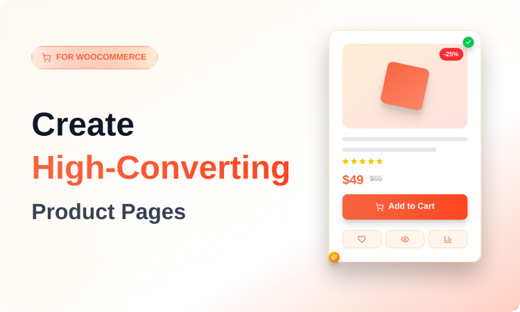
The Key Elements of a High-Converting Product Page Layout
Product Images: Your First and Most Important Element
Images do more selling than your copy does. Buyers can’t touch your product — images close that gap.
Your image section should:
- Show multiple angles (at least 3–5 images per product).
- Include zoom capability so buyers can examine details.
- Use consistent dimensions and high resolution across all products.
- Support video where the product has motion or demonstrates functionality.
- Show real-life context, not just a product on white background.
On mobile, images take up most of the screen — make them count.
Above-the-Fold Layout: What Buyers See Without Scrolling
Everything a buyer needs to make a preliminary decision should be visible without scrolling. This means:
- Product name (clear, readable)
- Price (and any sale price or discount)
- A short value statement or key benefit
- Star rating (even if it’s just a number)
- The Add to Cart button
If any of these are missing or pushed below the fold, you’re asking buyers to do extra work. Most won’t.
The Add to Cart Button
This is the most important interactive element on your page. It should:
- Be a contrasting color — not gray, not subtle
- Use clear action text (“Add to Cart”, “Buy Now”, “Get Yours”)
- Stay visible as buyers scroll (sticky Add to Cart is proven to improve conversions)
- Never be surrounded by competing buttons or links at the same visual weight
ShopLentor Pro includes a sticky Add to Cart bar that follows the buyer as they scroll — a small change that removes the friction of scrolling back up to buy.
Trust Signals: Placed Where Buyers Need Them
Most stores put trust signals in the footer or on a dedicated page. That’s too late.
Put them on the product page, near the Add to Cart button:
- Star ratings and review count
- Money-back guarantee badge
- Secure payment icons
- Return and shipping policy (short version)
- Real customer photos or testimonials
Buyers look for reasons to trust before they click buy, not after.
Product Description: Short Above, Full Below
Your product description has two jobs at two different moments in the buyer journey.
Above the fold: A 2–3 sentence summary of what the product does and who it’s for. No fluff. Benefit-led.
Below the fold: Full details, specifications, size guides, FAQs, compatibility notes — whatever a buyer needs. This is where tabs work well.
Don’t dump everything into one long block of text. Buyers scan — they don’t read.
Variation Swatches: Replace Dropdowns
If your product has color, size, or material variations, the default WooCommerce dropdown selector is a missed opportunity. Replace it with visual swatches — color blocks, image thumbnails, or labeled buttons.
Swatches reduce hesitation and make the selection feel like part of the experience, not a form field to fill out.
ShopLentor includes variation swatches as a built-in module — no separate plugin needed.
Common WooCommerce Product Page Layout Mistakes
These are the most frequent layout errors that kill conversions:
1. Burying the price: Price should be near the top, next to the product name. If buyers have to search for it, they’ll assume it’s hidden for a reason.
2. Weak or low-contrast Add to Cart button: If your button color is similar to your background, it blends in. The button should stand out immediately.
3. No social proof above the fold: Reviews and ratings should be visible near the top — even just a star rating with a count. Buyers use this as a quick trust signal.
4. Walls of text in the description: Use short paragraphs, bullet points, and headers inside your description. Make it scannable.
5. Ignoring mobile layout: Most eCommerce traffic is mobile. A layout that looks good on a desktop can break on mobile. Always test both.
6. Generic related products: The “Related Products” section at the bottom of every WooCommerce page is auto-populated and often irrelevant. Curate it or replace it with a targeted upsell or cross-sell section.
How to Build Custom WooCommerce Product Page Layouts Without Code
The default WooCommerce product page is a PHP template. Changing it without code used to mean hiring a developer or living with the default.
That’s changed. Tools like ShopLentor let you build fully custom product page layouts through a visual drag-and-drop interface — either in Elementor or Gutenberg — and apply them across your entire store, specific categories, or individual products.
What ShopLentor Gives You
ShopLentor (formerly WooLentor) is a WooCommerce page builder plugin with over 100,000 active installations across 120+ countries. It’s built specifically for WooCommerce — not a general-purpose page builder that happens to support it.
For product page layouts, ShopLentor gives you:
- 120+ widgets for Elementor covering every product page element: images, titles, prices, ratings, descriptions, tabs, related products, and more
- 85+ Gutenberg blocks if you prefer the block editor
- 110+ pre-built templates you can import and customize
- Template Builder to create custom product templates and apply them by product, category, or tag
- Variation Swatches built in, replacing the default dropdown
- Sticky Add to Cart bar that stays visible as buyers scroll
- Sales Countdown Timer to add urgency to promotions
- Stock Progress Bar to signal scarcity
- Wishlist and Compare features built in — no extra plugins
- Mobile-optimized output with selective script loading
The key advantage: ShopLentor is modular. You enable only what you need, which keeps your store fast.
Step-by-Step: Creating a Custom Product Page Template in ShopLentor
Here’s the basic workflow:

Step 1: Install ShopLentor: Install and activate ShopLentor from the WordPress plugin directory (search “ShopLentor”). Elementor should already be installed.
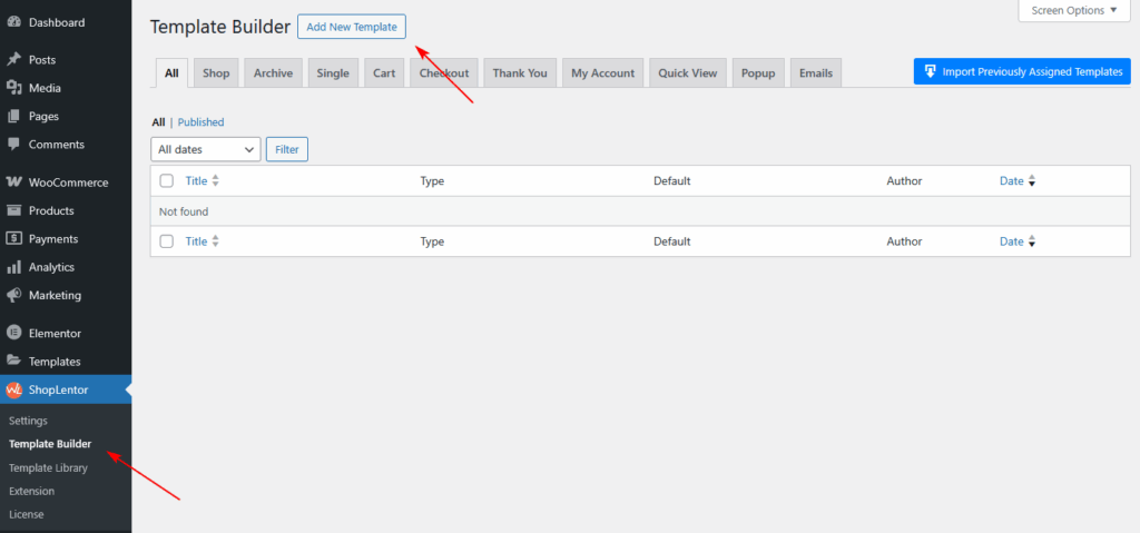
Step 2: Go to Dashboard → ShopLentor → Template Builder → Add New.
Step 3: Click the “Add New” button in the top right corner. A popup will appear with template settings.
Step 4: Fill in the template settings in the pop-up:
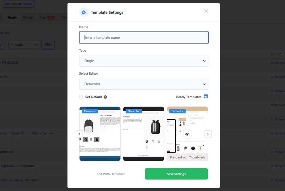
- Enter a name for your template
- Set the template Type as “Single” ← this is the single product page type (not “Product”)
- Choose your editor: Elementor or Gutenberg
- Optionally check “Set Default” if you want this to apply across all products
- Pick a Sample Design from the available presets, or start from scratch
- Click “Save Settings”
Step 5: Click “Edit with Elementor” (or Gutenberg). This opens the visual editor with your new template.
Step 6: In Elementor, search for ShopLentor widgets — they carry the “WL” badge so you can identify them. Drag in the elements you need:
- WL: Product Images (with zoom)
- WL: Product Title
- WL: Product Price
- WL: Rating
- WL: Add to Cart
- WL: Description
- WL: Product Tabs
- WL: Related Products
Arrange them into columns that put the most important buying information above the fold. You have full control over column structure, spacing, typography, and color.
Step 7: Once the layout is ready, publish the template.
Layout Structures That Work for Different Product Types
Not every product needs the same layout. Here are three common scenarios:
Simple Products (one SKU, clear use case)
Use a standard two-column layout above the fold: images left, title/price/Add to Cart right. Keep the description short. Focus on one or two key benefits. Trust signals directly below the Add to Cart button.
Variable Products (multiple sizes, colors, options)
Lead with a strong image gallery. Make variation selection the central interaction — use swatches, not dropdowns. Show the price update dynamically when a variation is selected. Keep the path to Add to Cart as short as possible.
High-Consideration Products (expensive, complex, or technical)
These buyers do more research before buying. Give them more: detailed specifications in tabs, FAQs on the page, multiple images including lifestyle shots, a prominent review section with full review text, and a clear returns or guarantee policy. A sticky Add to Cart bar is especially valuable here since buyers scroll more before deciding.
A Practical Example: Fashion Store Product Page
Imagine a WooCommerce fashion store selling women’s dresses. The default layout shows a single image, a dropdown for size selection, and a description below.
With ShopLentor, the redesigned product page might look like this:
- Above the fold: Full-width image gallery with multiple model shots and a zoom function. To the right: product name, price (with sale price struck through), a star rating, and a size swatch selector. Directly below that: an Add to Cart button with a “Free returns, 30 days” trust badge next to it.
- Below the fold: A short benefit-led description. Tabs for full details, a size guide, and customer reviews. A curated “Complete the Look” section showing matching products (not auto-generated related products).
- Mobile: Single-column layout with images stacked. Sticky Add to Cart bar at the bottom of the screen.
This layout answers the buyer’s four questions — right product, right price, trusted store, clear next step — faster than the default, and on every device.
SEO Considerations for Product Page Layouts
Your layout affects your SEO, not just your conversions. Here’s how:
- Page speed matters. A bloated layout with unnecessary plugins slows your page. ShopLentor’s modular design lets you load only what you use. Faster pages rank better and convert better.
- Structured content helps crawlers. Clean heading hierarchy (H1 for product name, H2 for sections) makes it easier for search engines to understand your page.
- Images need alt text. Every product image should have a descriptive alt attribute. ShopLentor doesn’t override your image settings — you still control this in WooCommerce.
- Schema markup. WooCommerce outputs product schema by default. Make sure your layout doesn’t break it by adding too many custom fields in odd places.
- Mobile-first indexing. Google indexes the mobile version of your page. Test your mobile layout — not just your desktop layout.
Video Presentation: How to Use Product Grid – Modern layout for Elementor | ShopLentor
Frequently Asked Questions
Q: What is a WooCommerce product page layout?
A WooCommerce product page layout is the arrangement of elements on your single product page — images, price, Add to Cart button, description, reviews, and related products. The layout controls where each element sits, how prominently it appears, and how buyers move through the page toward a purchase decision.
Q: Why should I customize my WooCommerce product page layout?
The default WooCommerce layout is identical across every store that uses it. It doesn’t let you control visual hierarchy, highlight your product’s key selling points, add urgency, or place trust signals where buyers look. Customizing your layout means you can design a page that guides buyers toward a purchase rather than leaving them to figure it out on their own.
Q: Can I customize WooCommerce product page layouts without coding?
Yes. Plugins like ShopLentor let you build custom product page layouts using a visual drag-and-drop editor in both Elementor and Gutenberg. You can move, add, remove, and style every element on the page without touching PHP, CSS, or template files.
Q: What elements should be above the fold on a WooCommerce product page?
Above the fold (visible without scrolling) should include: the product image, product name, price, a short benefit statement or key feature, star rating, and the Add to Cart button. These are the elements buyers need to make an initial purchase decision. Everything else — full descriptions, specifications, reviews — can sit below the fold.
Q: Does changing my product page layout affect SEO?
Yes, in both directions. A well-structured layout with clean heading hierarchy, fast load time, and mobile-responsive design can help your product pages rank better. A bloated or poorly coded layout can slow page speed and hurt rankings. Use a modular tool like ShopLentor that loads only what you need, and make sure your image alt text, heading structure, and product schema remain intact after customization.
Q: What is ShopLentor, and how does it help with WooCommerce product pages?
ShopLentor (formerly WooLentor) is a WooCommerce page builder plugin that works with Elementor and Gutenberg. It gives you 120+ product-specific widgets, a full template builder, and 110+ pre-built templates. For product pages specifically, it lets you control every element — images, price, swatches, ratings, Add to Cart, tabs, related products — through a visual editor, and apply custom templates per category or product type.
Q: How do I apply a different product page layout to different product categories?
In ShopLentor’s Template Builder, after you create a template, you can set display conditions that control where the template appears. You can apply it to all products, specific categories, specific tags, or individual products. This means a fashion store can use one layout for clothing (with a size chart) and a different layout for accessories — without any coding.
Conclusion
Your WooCommerce product page layout is a conversion tool, not just a design choice. Every element — where images sit, how visible your price is, whether your Add to Cart button stands out, how trust signals are placed — affects whether a visitor buys.
The default WooCommerce layout is a starting point, not a destination.
ShopLentor gives you the control to build product page layouts that are structured around how buyers actually make decisions: fast, visual, mobile-first, and trust-driven. With over 120 Elementor widgets, 85+ Gutenberg blocks, and a full template builder, you can create exactly the layout your products need — without writing a line of code.
If you’re still using the default WooCommerce product page, the gap between your layout and a high-converting one is a fixable problem. Start with the elements that matter most — images, Add to Cart visibility, and trust signals — and build from there.