Getting traffic to your WooCommerce store is hard work. Losing those visitors because your product page isn’t built to convert is an even more painful problem — and a more common one than most store owners realize.
According to Baymard Institute, which has conducted over 200,000 hours of ecommerce usability research, 62% of mobile ecommerce product pages have “mediocre or worse” UX performance.
Even on desktop, only 48% of leading ecommerce sites achieve a “decent” or “good” product page score. That means most WooCommerce stores are leaving conversions on the table right now.
This guide walks through the 10 most damaging WooCommerce product page mistakes — and exactly what to do about each one.
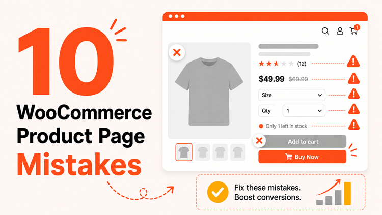
Quick Answer: The most common WooCommerce product page mistakes are poor product images, weak descriptions, missing reviews, a disappearing add-to-cart button, plain variation dropdowns, an uncustomized default layout, no upsells, disorganized product information, absent trust signals, and a slow or broken mobile experience. Every one of these is fixable — and fixing them directly improves conversions.
ShopLentor- WooCommerce Builder for Elementor & Gutenberg
A versatile page builder to build modern and excellent online stores with more than 100k+ Active Installations.
What Makes a High-Converting WooCommerce Product Page?
Before getting into the mistakes, it helps to understand what a strong product page actually does. A high-converting product page does four things well:
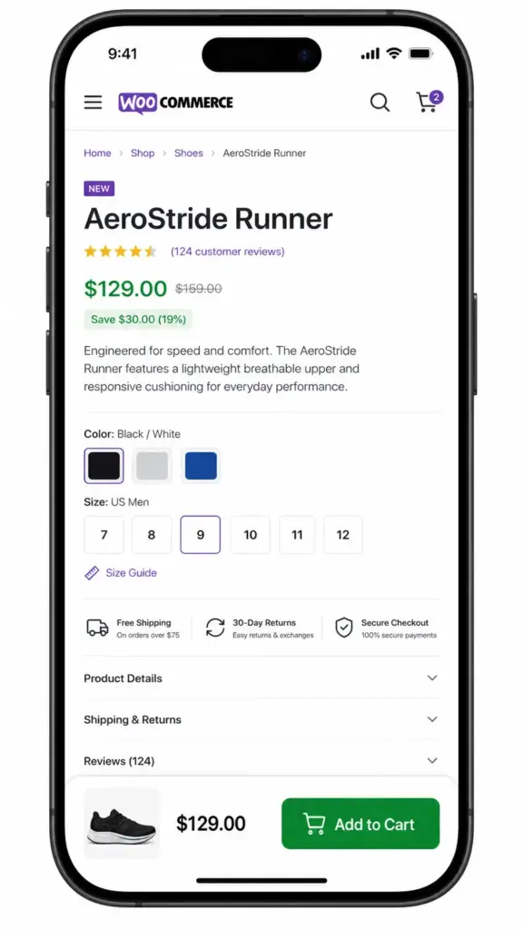
- Builds trust — professional images, customer reviews, visible return policy
- Removes friction — clean layout, clear CTA, fast mobile experience
- Answers objections — specific descriptions, FAQs, size guides, stock info
- Guides toward action — persistent buy button, urgency signals, smart upsells
When your page fails at any of these, you lose sales. Here’s where most WooCommerce stores go wrong.
10 WooCommerce Product Page Mistakes
Mistake #1: Low-Quality or Insufficient Product Images
Shoppers can’t touch your product. Your images are the closest thing to a physical experience you can give them, which makes image quality one of the highest-leverage improvements you can make to any product page.
A single blurry photo, one-angle shot, or inconsistently sized image signals low quality, even when the product itself is excellent. Baymard Institute research identifies image quality and zoom capability as primary drivers of whether a product page visitor adds to cart or leaves.
How to fix it:
- Use high-resolution images (at least 800×800px) with a zoom function enabled
- Show multiple angles — front, back, side, detail shots, and in-use context photos
- Add a short product video where possible — even 15–30 seconds builds credibility
- Keep backgrounds consistent across your catalog for a polished, professional look
- Compress images using WebP format to maintain quality without slowing page load
Mistake #2: Vague or Generic Product Descriptions
“High-quality material. Great for everyday use.” That copy describes nothing and convinces no one.
Generic descriptions leave buyers without the information they need to decide. They also add no SEO value, which means fewer people find your product in the first place. The two problems compound each other.
How to fix it:
- Lead with the customer benefit, not just the feature or specification
- Answer clearly: Who is this for? What problem does it solve? Why is it better than alternatives?
- Write a short description near the price — 3 to 5 lines maximum — that captures attention fast
- Use a longer, structured description below for full product details, specs, and compatibility notes
- Use short paragraphs and bullets — scannable descriptions perform better than dense text blocks
Mistake #3: No Customer Reviews or Hidden Star Ratings
A product page with no reviews looks untested. Buyers rely heavily on peer validation before committing to a purchase — especially first-time visitors who don’t yet know your brand.
Displaying reviews and star ratings prominently is one of the most consistently effective trust-building changes you can make. Baymard Institute research found that 60% of users look for return policy and review information directly on the product page before deciding to buy.
How to fix it:
- Enable WooCommerce’s built-in review system if it isn’t already active
- Add an automated review request to your post-purchase email sequence
- Display star ratings visibly near the product title and price — not buried below the fold
- Respond to negative reviews publicly — Baymard testing found this is positively perceived as a sign of customer care, yet 89% of ecommerce sites don’t do it
Mistake #4: An Add-to-Cart Button That Disappears When Scrolling
Your buy button is the most critical element on the page. When someone scrolls through a long product gallery or description, and the “Add to Cart” button disappears off-screen, they face real friction. Most won’t scroll back up — they’ll leave.
How to fix it:
- Place the add-to-cart button above the fold on both desktop and mobile
- Use a sticky add-to-cart bar that stays visible as users scroll down the page
- Make the button large, high-contrast, and action-oriented (“Add to Cart”, “Buy Now”)
- Don’t bury it below long text sections or below the fold on mobile
If you're using ShopLentor, the Sticky Add to Cart module keeps your buy button fixed in a persistent bar throughout the entire product page scroll — no code required. You can also customize the button's label, color, and styling through the Add to Cart Button widget.Mistake #5: Using Dropdown Menus for Product Variations
WooCommerce’s default variation selector is a plain dropdown. For products with colors, sizes, or styles, this is a missed opportunity. Dropdowns hide options by default, which makes it harder for customers to visualize what they’re selecting — and harder to spot when a variation is out of stock.
Baymard Institute’s usability research found that 57% of ecommerce sites still use dropdown menus for size selection, and that this consistently leads to wasted effort and abandonment when a preferred size or color isn’t available.
How to fix it:
- Replace dropdowns with visual swatches — color circles, image thumbnails, or button labels
- Ensure variation images update automatically when a customer selects a color or style
- Show per-variation stock status so customers know availability before they commit
ShopLentor's Variation Swatches module replaces WooCommerce's plain dropdowns with clean, visual selectors without any code changes.Mistake #6: Never Customizing the Default WooCommerce Product Layout
Out of the box, most WooCommerce stores look nearly identical. The default product page puts elements in the same order, the same proportions, and the same layout — regardless of what you’re selling or who your buyers are.
A fashion brand needs different layout priorities than a digital product store or a supplement business. The default layout isn’t optimized for any specific product type, which means it’s never fully optimized for yours.
How to fix it:
- Build a custom product page template that reflects your brand and matches how your customers think
- Position elements strategically: trust badges near the price, size charts near variations, FAQs below the fold
- Consider different templates for different product categories if your catalog is diverse
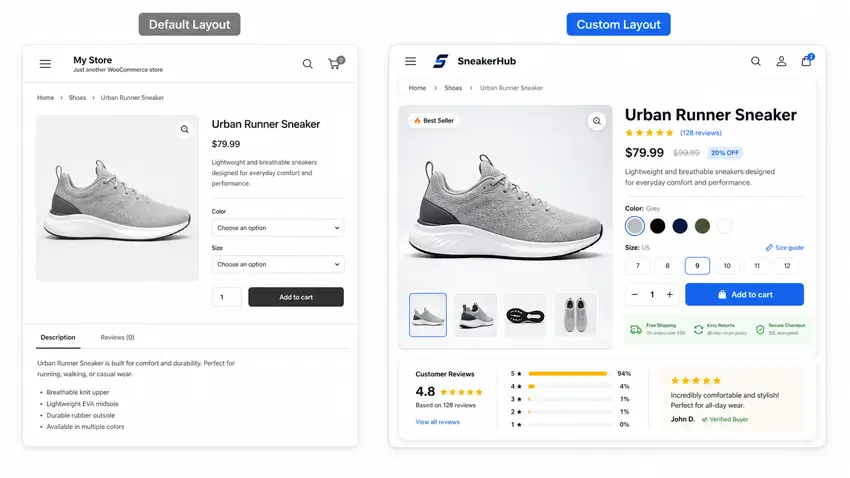
ShopLentor's Single Product Page Builder lets you drag and drop every product element — images, tabs, reviews, ratings, upsells, sticky cart — into any layout you want using Elementor or Gutenberg. It comes with pre-built templates designed specifically for product pages.For a full walkthrough, see: How to Build a Custom Single Product Template
Mistake #7: No Upsells, Cross-Sells, or Related Products
When a visitor is on your product page, they’re already in a buying mindset. That’s the best moment to show them a complementary item, an upgraded version, or something other buyers frequently purchased alongside that product.
If your page ends with nothing but an add-to-cart button, you’re missing a significant revenue opportunity on every single visit.
How to fix it:
- Add an upsell section for premium or upgraded versions of the product
- Add a cross-sell section for accessories or complementary items
- Show recently viewed products for returning visitors who are comparing options
- Keep recommendation sections lean — 3 to 4 items maximum to avoid overwhelming buyers
ShopLentor's Product Upsell, Product Cross-Sell, Related Product, and Recently Viewed Products widgets each handle a specific part of this — and you can place them at exactly the right position in your custom product template.Mistake #8: Dumping All Information Into One Unstructured Block
This mistake shows up in two opposite ways. The first: a wall of text that buries important information and overwhelms buyers. The second: hiding critical details — like return policies or specifications — entirely, which creates purchase anxiety instead.
Both hurt conversions. The fix is structure, not just more content.
How to fix it:
- Organize product information into clearly labeled tabs: Description, Specifications, Shipping & Returns, Reviews, FAQs
- Keep each tab focused and scannable — short paragraphs and bullets, not long prose
- Put the most purchase-relevant information in the first visible tab
- Add a product-specific FAQ to pre-answer common objections before they become barriers
For stores that want full control over tab order, labels, and styling, ShopLentor’s Product Tab widget and Product Data Tabs widget allow you to customize the entire tab structure on a custom product template.
Mistake #9: No Trust Signals Near the Buy Decision
Anxiety is one of the biggest conversion killers. Even when a shopper wants your product, they hesitate if they can’t quickly answer: Is this site secure? What if it doesn’t fit? Can I return it easily?
Baymard’s quantitative research found that 15% of shoppers abandoned orders in the last quarter specifically because they found the return policy unsatisfactory, and 44% of ecommerce sites don’t display or link to their return policy from the product page at all.
How to fix it:
- Display secure payment badges and accepted payment icons near the add-to-cart button
- Add a short, clear return and refund summary directly on the product page — don’t just link to a separate page
- Show live stock availability to signal demand and reduce hesitation
- Include a size chart for clothing, footwear, or any product where fit matters before purchase
ShopLentor's Product Stock widget and Available Stock Progress Bar display real-time inventory status to create gentle urgency. For size-dependent products, the WooCommerce Size Chart module embeds a size guide directly within the product page.Mistake #10: Ignoring Mobile Experience and Page Speed
Mobile is no longer a secondary shopping channel. In 2025, mobile devices account for approximately 59% of global ecommerce traffic (Statista, 2025). Yet Baymard Institute’s product page benchmark found that only 38% of mobile ecommerce product pages achieve a “decent” or better UX score — meaning 62% fall below the bar.
A slow product page makes this worse. Page load speed directly affects both bounce rate and conversion rate — improvements in load time consistently correlate with measurable improvements in sales.
How to fix it:
- Compress all product images before uploading — use WebP format and aim for under 100KB per image where possible
- Use a caching plugin and a CDN to reduce server response times
- Enable lazy loading for images and galleries so the page renders quickly on first view
- Test your product pages on real mobile devices — not just desktop browser previews — checking button tap targets, text size, and image scaling
- Audit your active plugins and remove any that add unnecessary scripts to product pages
Quick Reference: 10 Mistakes and Their Fixes
| Mistake | Core Problem | Key Fix |
| Poor product images | Low trust, high bounce rate | Multiple angles, zoom enabled, video |
| Vague descriptions | Buyers can’t decide | Benefit-led, scannable copy |
| No reviews | Missing social proof | Enable reviews + request them post-purchase |
| Hidden add-to-cart | Lost impulse purchases | Sticky add-to-cart bar |
| Dropdown variations | Poor visual UX | Replace with visual swatches |
| Default page layout | No brand differentiation | Build a custom product template |
| No upsells / cross-sells | Lost revenue per visitor | Upsell, cross-sell, related product widgets |
| Unstructured information | Overwhelm or anxiety | Organize into clean, labeled product tabs |
| No trust signals | Purchase hesitation | Payment badges, stock status, return summary |
| Slow / broken mobile | High abandonment | Image compression, caching, mobile testing |
Also worth reading: 14 Proven Ways to Optimize WooCommerce Product Pages
Frequently Asked Questions
What are the most common WooCommerce product page mistakes?
The most common WooCommerce product page mistakes are poor product images, vague descriptions, missing customer reviews, a non-sticky add-to-cart button, plain variation dropdowns, an uncustomized default layout, no upsells or cross-sells, disorganized information, absent trust signals, and a slow mobile experience.
How do I know if my product page is hurting conversions?
Check your product page analytics. A high bounce rate, low add-to-cart rate, or significant scroll drop-off before the buy button are all signs of a product page problem. Use a heatmap tool alongside WooCommerce analytics to identify exactly where visitors are stopping.
Do product images really affect WooCommerce sales?
Yes. Baymard Institute, which has conducted 200,000+ hours of ecommerce UX research, identifies image quality and zoom capability as primary factors in product page performance. Poor images are one of the fastest ways to lose an otherwise ready buyer.
What is a sticky add-to-cart button and why does it matter?
A sticky add-to-cart button stays visible as a user scrolls down the product page. Without one, visitors on long product pages have to scroll back to the top to buy — friction that causes many to leave instead. For products with detailed descriptions or large image galleries, a sticky buy button is especially important.
Can I customize my WooCommerce product page without coding?
Yes. ShopLentor’s Single Product Page Builder works with both Elementor and Gutenberg, letting you drag and drop every product element into any layout with no code required. You can build different templates for different product categories and include widgets for sticky cart, swatches, tabs, reviews, and more.
What trust signals should every WooCommerce product page include?
Every WooCommerce product page should show: a return and refund policy summary (not just a link), secure payment icons near the buy button, live stock status, and a size chart for any product where fit is a factor. These elements reduce purchase anxiety, particularly for first-time visitors.
Why does mobile experience matter so much for WooCommerce product pages?
Mobile devices account for approximately 59% of global ecommerce traffic (Statista, 2025). Yet Baymard Institute found that only 38% of mobile product pages have “decent” or better UX. A poor mobile product page — slow loading, small tap targets, broken image scaling — directly drives abandonment from your largest traffic source.
Conclusion
Your product page is where the buying decision actually happens. Traffic doesn’t matter if visitors land and leave without converting.
Every mistake on this list is fixable — and most don’t require a developer. Start with the issues that feel most relevant to your store. For most WooCommerce merchants, that means image quality, buy button visibility, and getting rid of the default page layout.
If you’re still using WooCommerce’s out-of-the-box product template, building a custom one is the single highest-leverage change most stores can make. It puts every element — image gallery, trust signals, tabs, upsells, sticky cart — exactly where they work best for your products and your customers.