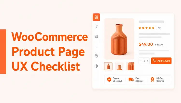
If you run a WooCommerce store, your product page is where buying decisions happen. A solid WooCommerce Product Page UX Checklist helps you make pages clearer, easier to use, and more trustworthy, so shoppers can understand the product quickly and act with confidence.
This guide gives beginners a practical checklist to improve product page visuals, content, calls to action, mobile usability, trust signals, and overall store experience. It also shows where ShopLentor (formerly WooLentor) can help you implement these improvements with visual templates and widgets instead of custom code.
Quick Answer / TL;DR
A WooCommerce Product Page UX Checklist should help you answer three questions fast: what the product is, why it matters, and how to buy it. In practice, that means clear images, visible pricing, easy variation selection, a strong add-to-cart area, trust signals, mobile-friendly layout, and fast performance.
Why a product page checklist matters
A product page checklist turns vague advice like “improve UX” into specific checks you can repeat across every product. That matters because product pages often fail for simple reasons: unclear options, weak hierarchy, hidden shipping details, poor mobile layouts, or missing social proof.
For beginners, a checklist also makes store improvements less overwhelming. Instead of redesigning everything at once, you can fix the highest-impact elements first and apply the same standards to future products.
What should be included in a WooCommerce Product Page UX Checklist?
A useful WooCommerce Product Page UX Checklist should cover these areas:
- Product images and media quality.
- Clear title, price, and short description above the fold.
- Easy-to-understand product variations and options.
- A prominent add-to-cart area with minimal friction.
- Reviews, shipping details, and return information that build trust.
- Mobile usability, speed, and accessibility checks.
When these pieces work together, your product page becomes easier to scan and easier to buy from. That improves both user experience and the likelihood of conversion.
1. Visuals and media
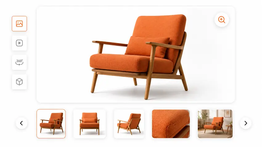
Your visuals do a large part of the selling work. If images are blurry, cropped inconsistently, or fail to show details, shoppers have to guess, and guessing hurts confidence.
Use this checklist:
- Upload high-resolution product images with consistent aspect ratios across the catalog.
- Show multiple angles and close-ups, plus at least one real-life or contextual use image where relevant.
- Enable zoom or lightbox so shoppers can inspect details.
- Add a short product video when movement, texture, scale, or use needs explanation.
- Avoid cluttered galleries that compete with the main image.
For stores that want a more polished visual presentation, ShopLentor’s Product Grid – Luxury widget includes customizable aspect ratios, image styling, hover effects, and spacing controls for editorial-style product displays.
2. Above-the-fold clarity
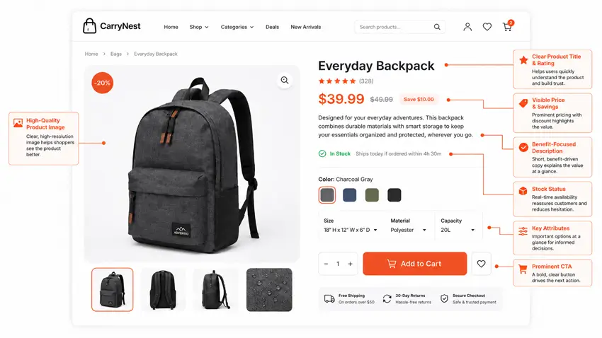
A shopper should understand the basics of your product in a few seconds. If your page hides the price, delays the value proposition, or pushes important details too far down, you create unnecessary friction.
Check these elements first:
- The product title clearly describes the item instead of using vague names only.
- Price is easy to see, with discounts shown clearly if applicable.
- A short description explains the main benefit or what makes the product different.
- Availability or stock status appears near the buy area.
- Key attributes such as size, color, material, dimensions, or compatibility are easy to scan.
ShopLentor’s single product template builder supports drag-and-drop placement of product image, title, rating, description, price, add-to-cart button, product meta, and tabs, which makes it easier to organize this area without code.
3. Variation and option usability
Variations are one of the easiest places to lose a sale. If a shopper has to dig through unclear dropdowns or gets vague validation errors, the page feels harder than it should.
Use these checks:
- Make size, color, or style choices obvious and easy to compare.
- Keep sold-out options visible but disabled where possible, so users understand availability.
- Update price or images dynamically when a selected variation changes those details.
- Show clear, local validation messages like “Please select a size.”
- Keep the variation selector close to the add-to-cart area.
If you create product-specific templates in ShopLentor, you can standardize how variation-related widgets appear across different product types, which helps reduce inconsistency from one page to the next.
4. Add-to-cart and action area
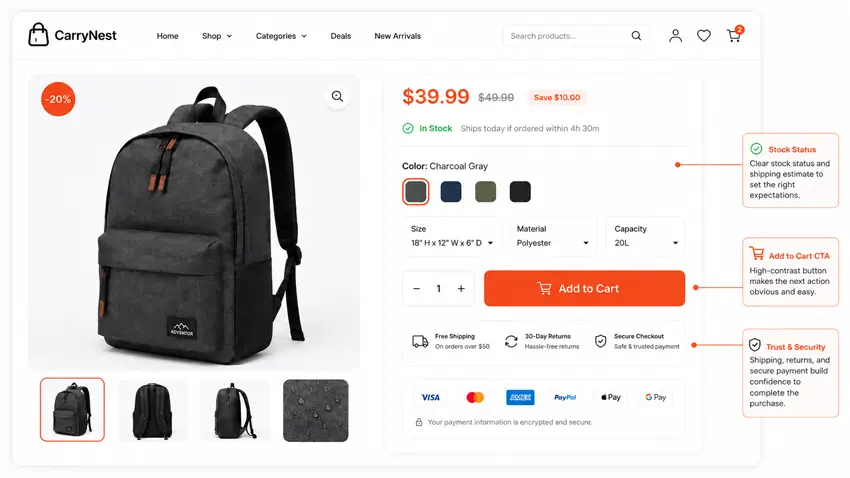
The add-to-cart block should feel obvious, focused, and low-friction. When too many competing elements surround it, users hesitate or miss the next step.
Review this area carefully:
- Use one primary add-to-cart button that stands out from surrounding elements.
- Place quantity, variation selectors, and stock information close to the button.
- Add shipping, returns, or delivery notes near the purchase area when they affect decision-making.
- Keep secondary actions like wishlist or compare visually less dominant.
- Consider a sticky add-to-cart pattern on mobile if it improves usability without crowding the screen.
This is also where clean design matters more than decoration. Premium styling can help, but clarity matters more than visual flair.
5. Descriptions and product details
Good product copy reduces uncertainty. Instead of writing long generic paragraphs, structure your content so users can scan features, understand fit or compatibility, and answer pre-purchase questions quickly.
Use this format:
- A short intro or summary near the top.
- Bulleted features and benefits for easy scanning.
- Technical specifications, materials, dimensions, or compatibility details in a dedicated section.
- Care, usage, or installation guidance where relevant.
- Simple language that defines technical terms the first time they appear.
A realistic example: if you sell a blender, do not only say “high-performance motor.” Also include capacity, noise expectations, dishwasher-safe parts, and whether it handles ice, since those details help beginners judge fit before buying. This follows the broader ecommerce product-page clarity guidance discussed by Baymard Institute.
6. Trust signals
Shoppers rarely judge products on product information alone. They also judge whether your store looks credible and whether buying feels safe.
Check for these trust signals:
- Star ratings and review counts near the top of the page.
- Customer reviews visible before the user reaches the very bottom.
- Clear links to shipping, returns, warranty, and refund policies.
- Payment and checkout reassurance near the purchase area.
- Limited, purposeful badges such as “New” or “Sale,” rather than a clutter of promotional labels.
ShopLentor’s product display features include badge controls, review display elements, and styling settings that can help you present trust-building information more consistently.
7. Mobile UX, speed, and accessibility
A product page that looks fine on desktop can still fail badly on mobile. Many WooCommerce stores overload the top of the mobile page, making the price or call to action harder to find.
Run these checks:
- Test pages on a real phone, not only in a desktop preview.
- Make sure the image, title, price, and primary action appear early in the scroll path.
- Keep tap targets large enough for buttons, swatches, and selectors.
- Compress images and avoid heavy elements that slow the page down.
- Maintain readable contrast, useful alt text, and a logical heading structure.
WooCommerce’s developer UX guidance also emphasizes consistency, clear messaging, and accessible interaction patterns, which are important when adding third-party extensions or custom templates.
How ShopLentor can help beginners
For beginners, the hardest part is often not understanding what good UX looks like. It is implementing it cleanly inside WordPress and WooCommerce without breaking the layout.
ShopLentor can help by giving you visual control over product templates and grid layouts. Its documentation shows support for custom single product templates, drag-and-drop product widgets, and premium grid layouts such as Product Grid – Luxury, which includes controls for badges, aspect ratios, columns, quick actions, and pagination.
That makes it useful when you want to apply this checklist consistently across a store instead of editing each product page manually. It is not the only way to improve UX, but it is a practical one for non-developers.
Common mistakes beginners should avoid
A few mistakes show up repeatedly on WooCommerce product pages:
- Pushing key product information below sliders, banners, or decorative elements.
- Using weak or generic product descriptions that do not answer buyer questions.
- Hiding important variation states inside dropdowns without visual clarity.
- Making the add-to-cart area visually blend into the rest of the page.
- Treating mobile as an afterthought.
In most cases, fixing these basics has more impact than adding more apps, more badges, or more animations.
Frequently Asked Questions
What is the most important part of a WooCommerce product page UX checklist?
The most important part is clarity around the product, price, and purchase action. If users cannot quickly understand what the item is and how to buy it, the rest of the page matters less.
How can beginners improve product page UX without coding?
Beginners can improve UX by upgrading images, clarifying descriptions, surfacing reviews and policies, simplifying variation choices, and using a builder like ShopLentor to control layout visually.
Should reviews appear high on the page?
Yes. Reviews and star ratings work best when users can notice them early, especially near the title or buy area, because they reduce uncertainty during decision-making.
Why does mobile UX matter so much for product pages?
Mobile shoppers often have less patience and less screen space. If the page buries the CTA, overloads the layout, or uses small tap targets, the buying process becomes harder immediately.
How often should a WooCommerce product page be reviewed?
Review key product pages quarterly and after theme, plugin, or template changes. High-traffic and high-revenue products should be checked first because improvements there usually matter most.
Conclusion
A WooCommerce Product Page UX Checklist helps you make better decisions page by page instead of redesigning on instinct. When you improve product visuals, information hierarchy, variation clarity, add-to-cart visibility, trust signals, and mobile usability together, you create pages that are easier to use and easier to buy from.
For a beginner-friendly implementation path, ShopLentor is relevant because it supports custom single product templates and flexible product grid layouts, which can make these UX improvements faster to apply across a store