Are you looking to boost your WooCommerce store’s email subscription rates? One of the most effective ways to capture your visitors’ attention and encourage them to sign up for your newsletter is through email subscription pop-ups.
However, with so many different design options, it can be overwhelming to figure out which one will work best for your store. That’s why we’ve rounded up 10 of the best email subscription popup examples to inspire your strategy and help you increase your subscriber list.
From bold and colorful designs to clean and minimalist layouts, these examples will show you how to create eye-catching pop-ups that entice your visitors to subscribe and stay engaged with your brand.
So, if you’re ready to take your email marketing to the next level, keep reading to discover the best pop-up designs for your WooCommerce store.
ShopLentor- WooCommerce Builder for Elementor & Gutenberg
A versatile page builder to build modern and excellent online stores with more than 100k+ Active Installations.
Table of Contents
Understanding Email Subscription Pop-ups
Before we look at examples, it’s crucial to understand why email subscription pop-ups exist. An email subscription pop-up is a small window on a website, typically when a user is about to leave the site or has been browsing for some time.
These pop-ups often offer something in exchange for the visitor’s email address, such as a discount code, exclusive content, or updates and promotions from the business. The primary objective is to captivate visitors’ attention, prompting them to subscribe to the business’s email list. This facilitates direct communication and paves the way for potential conversions in the future.
Why Email Subscription Pop-ups are Necessary for an Online Store
Email subscription pop-ups are among the most effective ways to grow your email list and turn website visitors into subscribers. They are small windows on a website that typically appear when a user is about to leave the site or has been browsing for some time.
These pop-ups often offer something in exchange for the visitor’s email address, such as a discount code, exclusive content, or updates and promotions from the business.
Email subscription pop-ups are integral to a successful online store’s marketing strategy. Here are some key reasons why:
- Direct Communication: Email allows direct communication with potential and existing customers, which makes it a valuable tool for building relationships and increasing conversions.
- Targeted Marketing: With email subscribers’ consent, you can segment your audience based on demographics or behavior. It allows for highly targeted and personalized marketing campaigns.
- Cost-effective: Compared to other forms of advertising, email has a low cost per lead and can generate a high return on investment (ROI).
- Long-term impact: An email list is a long-term asset that you own, unlike social media followers or website traffic, which can fluctuate
Recommended Blogs for You:
👉 7 Best Google Analytics WooCommerce Plugins for Your Online Store
👉 14 Proven Ways to Optimize WooCommerce Product Pages
👉 7 Best WooCommerce Pre-Order Plugins in 2024
👉 How to Create an Email Subscription Popup on WordPress
👉 10+ Exit Intent Popup Examples to Increase Conversions
10 Best Email Subscription Popup Examples for Your Online Business
Integrating a captivating pop-up on your website lets you easily collect email addresses from engaged visitors and smoothly add them to your mailing list. But what qualities define an outstanding email pop-up?
Explore 10 exceptional email subscription popup examples from diverse eCommerce sites. These examples are dissected for their amazing design and persuasive copy tactics that boosted conversions.
MVMT Watches
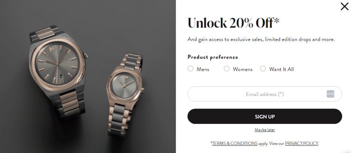
MVMT Watches’ clean and straightforward popup design is visually appealing and easy to navigate. The brand offers a 20% discount in exchange for an email address, enticing visitors to subscribe. The minimalistic approach also aligns with the brand’s overall aesthetic, creating a cohesive user experience.
Tommy Hilfiger USA
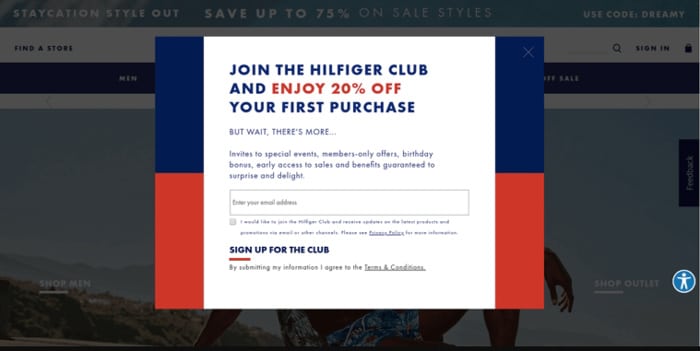
Tommy Hilfiger’s popup merges brand loyalty with a tangible reward. The popup features a crisp white backdrop and an enticing offer: ‘20% off your first order when you sign up.’ The blue CTA button highlights Tommy’s branding, prompting customers to ‘Sign Up.’
An instant discount converts visitors into subscribers and potential customers, driving conversion and sales.
Heatonist
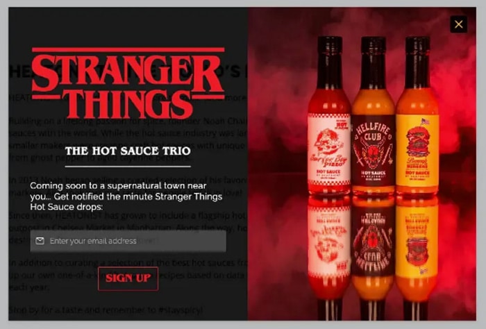
This email popup showcases a great way to gather emails for exciting product updates. By signing up, you’ll be among the first to receive exclusive announcements and stay ahead of the curve. The bright colors and enticing messaging make it hard to resist submitting an email address.
Sunbasket
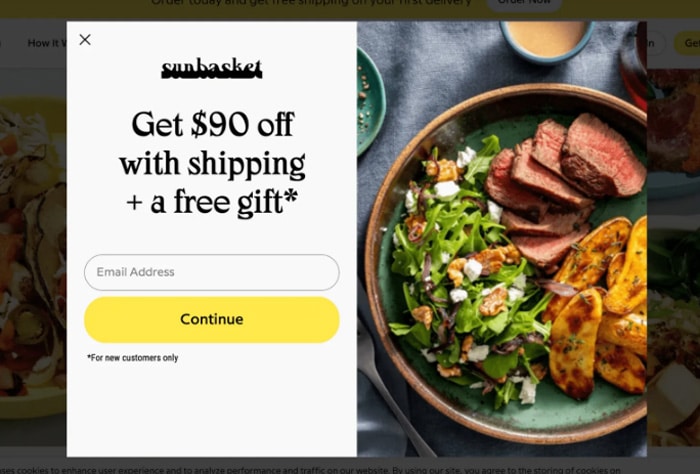
This email popup illustration is from a meal delivery service. For businesses in this category, showcasing products is highly effective. That’s why a mouthwatering meal image is featured – a clever way to capture the interest of potential customers. The concise headline details the benefits of signing up, with the incentive prominently displayed: $90 off with shipping plus a free gift.
Woven Store
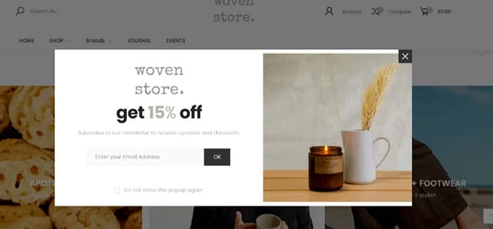
This newsletter popup effectively conveys the message, crucial for engaging potential subscribers. The inclusion of playful fonts enhances the visual appeal of the popup.
Chanty

Chanty’s email capture campaign is truly impressive. Incorporating animation in a popup is a smart move, but utilizing a Matrix-inspired animation takes it to a whole new level. This stands out as one of the most innovative email popup examples we’ve come across.
Really Good Emails
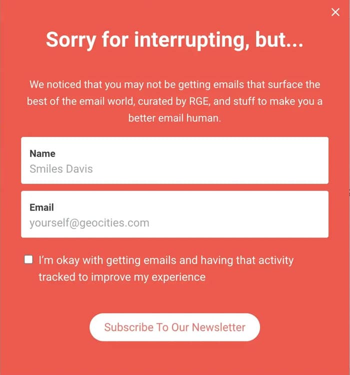
This popup is a playful way to encourage visitors to subscribe to Really Good Email’s newsletter. The headline is humorous, while the subheading clearly outlines the benefits of signing up. The call-to-action maintains the same lighthearted tone, inviting visitors to subscribe. Overall, the popup is effective in engaging the audience and promoting the newsletter.
Dolce & Gabbana
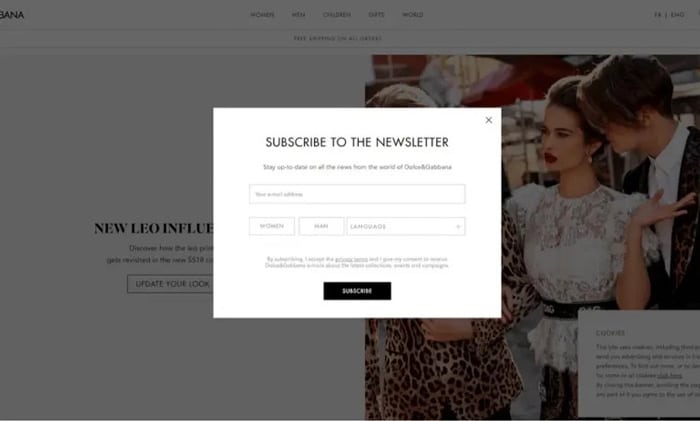
This popup is a newsletter popup by D&G features. It has four input fields and a subscription button. It’s visually simple but its minimalist design gives the impression that it’s just asking for your email address.
Gaiam
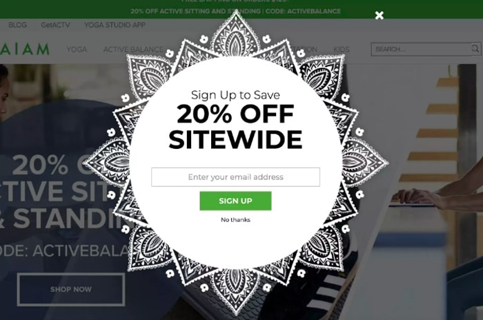
This distinctive shape immediately grabs visitors’ attention and complements the brand’s visual style. Enjoy a sitewide 20% discount upon signing up. For those uninterested, a convenient “no thanks” option is available.
Some Recommended Tools for Creating Email Subscription Popups
The success of an email popup doesn’t just depend on design but also on the tools used to implement it. There are manus tools available for subscription popups. Here are a few top-tier tools to help you create convert popups.
ShopLentor
ShopLentor is a vast plugin for wooCommerce. It is a drag and drop page builder. With its vast features and functionality, ShopLentor provides a Popup Builder module with popup templates. It empowers you to elevate website engagement effortlessly. Utilize its prebuilt popup templates to create visually captivating designs seamlessly aligned with your brand aesthetics.
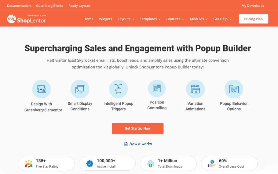
Whether for promotions or lead capture, this module offers features that grant full control over conditions, triggers, general settings, and advanced options. Tailor when and where your popups appear to ensure optimal engagement with your audience.
With ShopLentor, designing and implementing effective popups has never been more straightforward for enhancing user interaction on your website.
OptinMonster
OptinMonster‘s popup builder streamlines the process of crafting eye-catching campaigns, email forms, announcement bars, and opt-in forms. You can effortlessly create compelling campaigns within minutes with a user-friendly interface and interactive features.
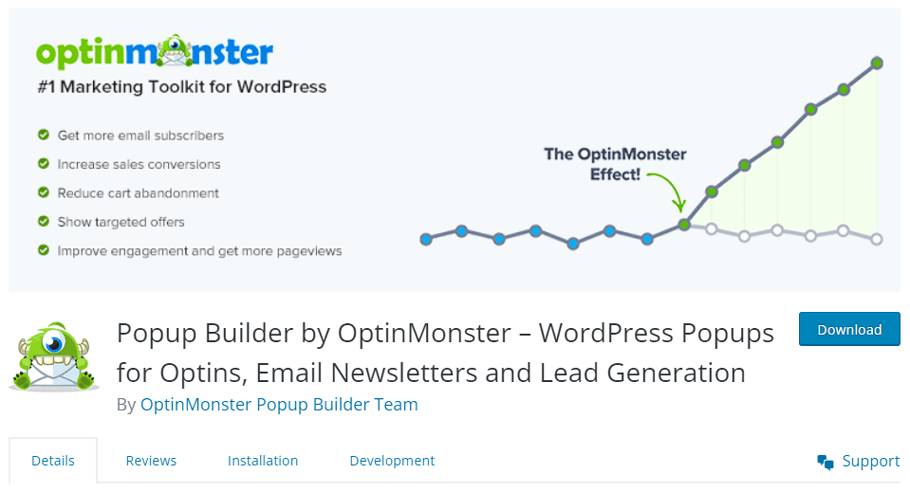
This tool focuses on providing a seamless user experience by delivering precise messaging without disrupting the browsing flow. Its mobile-responsive designs guarantee consistent impact across all devices.
Privy
Grow your email lists effortlessly using Privy’s eCommerce platform. Convert browsers into subscribers with customizable popups, flyouts, and high-converting displays. Encourage first purchases on Shopify with exclusive welcome incentives like first-time discounts.
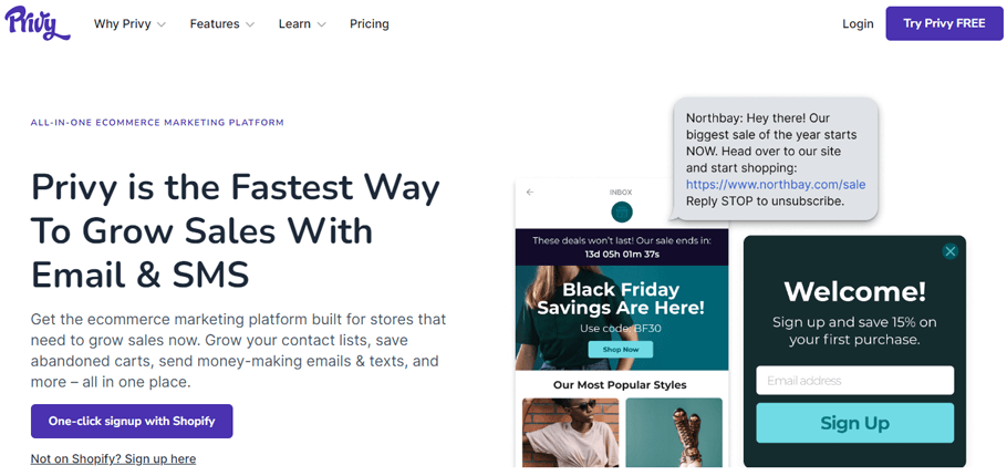
Simplify sign-ups with interactive spin-to-win wheels. Privy offers a seamless user experience on all devices, ensuring effective marketing. Enhance engagement and drive conversions with Privy’s versatile tools for eCommerce businesses.
MailChimp
Elevate your emails with Mailchimp, the top email marketing brand. Get expert advice to boost your campaigns, drive traffic, and increase sales. Use Customer Journey Builder for targeted automation.
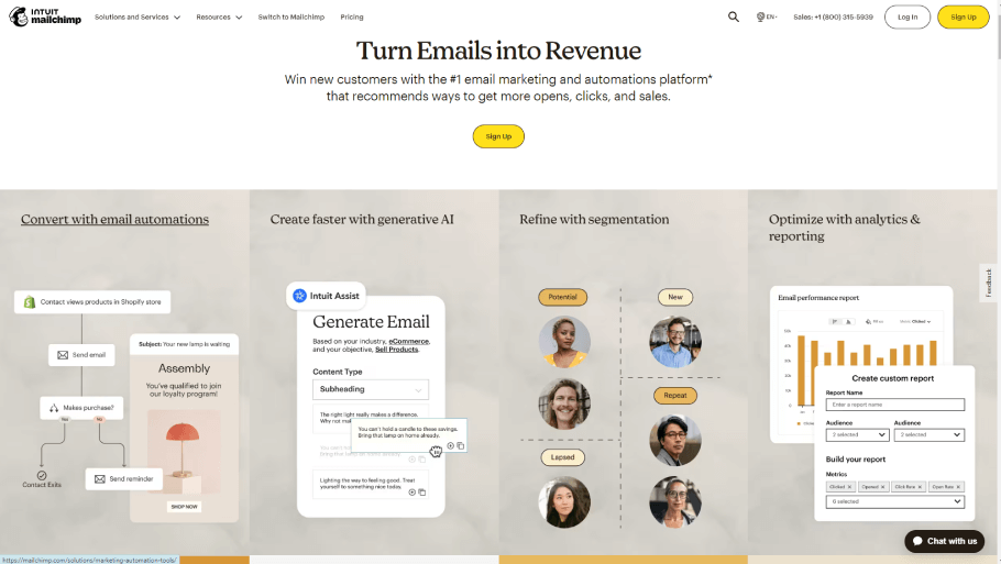
Benefit from pre-built journeys for cross-selling, cart recovery, customer re-engagement, and acquisition. Personalize content based on customer behavior for loyalty and growth. Unleash Mailchimp’s power to enhance your email strategy and elevate customer engagement.
Frequently Asked Questions
What makes an effective email subscription popup?
An effective email subscription popup should have a clear value proposition, concise copy, and an eye-catching design. It should offer an incentive for users to subscribe, such as discounts, exclusive content, or updates.
How can I create a visually appealing subscription popup?
Focus on a clean design that aligns with your brand to create an attractive popup. Use high-quality images, readable fonts, and a color scheme that complements your website. Ensure the popup is visually appealing without being intrusive.
What are some best practices for timing and triggers of subscription popups?
Timing and triggers are crucial. Consider using exit-intent triggers, scroll triggers, or timed delays to display the popup when it’s most likely to capture the user’s attention without interrupting their browsing experience.
Should I include an incentive in my subscription popup?
Yes, including an incentive, such as a discount or exclusive access, can significantly increase subscription rates. Users are more likely to subscribe when they perceive value in doing so.
How can I optimize my subscription popup for mobile users?
Ensure your subscription popup is fully optimized for mobile devices. Use a responsive design that adapts to different screen sizes, and test the popup’s functionality on various mobile devices to guarantee a seamless experience.
How frequently should I display subscription popups to users?
Avoid overwhelming users with frequent popups. Use them judiciously and consider setting rules to display popups at appropriate intervals. Too many popups can lead to a negative user experience and potential site abandonment.
Are there any strategies to reduce popup irritability?
Yes, there are. Employ strategies such as not showing the popups to returning visitors or segmenting your audience so that specific groups are shown the most relevant popups. Additionally, consider using a countdown timer to let visitors know when the popup will disappear.
ShopLentor- WooCommerce Builder for Elementor & Gutenberg
A versatile page builder to build modern and excellent online stores with more than 100k+ Active Installations.
Final Word
Email subscription popups are more than a trend; they’re a proven marketing method that can deliver substantial returns. With creativity, relevance, and the right tools, you can turn your email popup into an asset that continually adds value to your online business.
Follow these Email Subscription popup examples, choose the tools that fit your needs, and start turning your website visitors into loyal subscribers. Remember that the inbox is your playground in online marketing, and email popups are the gatekeepers. Make sure they’re as inviting as they are powerful.
