What is Popup Builder Module? #
Popup Builder is a feature-rich module of ShopLentor (formerly WooLentor), designed to help you create engaging and interactive popups for your WooCommerce website. With Popup Builder module, you can capture your visitors’ attention and improve user engagement, ultimately boosting conversions.
Key Benefits of Popup #
- Grab your visitors’ attention with eye-catching popups.
- Tailor popups to match your brand’s look and feel.
- Use popups for promotions, lead capture, and much more.
- Define precisely when and where your popups appear.
- Craft stunning popups without coding expertise.
Access & Enable Popup Builder Settings #
- Navigate to the ShopLentor menu on your WordPress dashboard.
- Click Settings, then select the Modules tab.
- Locate and click on Popup Builder, then access its settings.
- In the popup builder settings window, enable the feature.
- Save your changes. You can also configure popup width, height, and z-index here.
Create or import from pre-design popups #
- Head to the Template Builder menu under ShopLentor.
- Click Add New Template Builder to create a popup template.
- Provide a name for the template.
- Select the popup type and choose an editor (Elementor or WordPress Default Editor).
- You can use pre-designed templates or design your popup from scratch.
- Save your template.
Editing with Elementor #
- Click Edit with Elementor to customize your popup further.
- Add, remove, or modify elements to suit your needs.
Configure the popup settings #
ShopLentor’s Popup Builder Module offers a range of options to fine-tune your popups. Let’s delve into the key configuration options for your popup, which are grouped into five categories:
Conditions #
You have the flexibility to choose precisely where and when your popup appears. You can establish multiple conditions to fine-tune its behavior and timing.
Triggers #
You have the ability to exert precise control over both the conditions and timing that dictate when and how your popup will be presented to your audience.
- On Page Load: Specify the delay in seconds before the popup appears.
- On Scroll: Trigger the popup based on user scroll behaviour.
- On Click: Activate the popup after a set number of clicks on the page (Pro version).
- On Click Specific Element: Trigger the popup by clicking on a specific element using its ID or class name (Pro version).
- After Inactivity: Display the popup if the page remains inactive for a specified duration (Pro version).
- On Page Exit Intent: Show a popup when the user attempts to leave the page (Pro version).
General Settings #
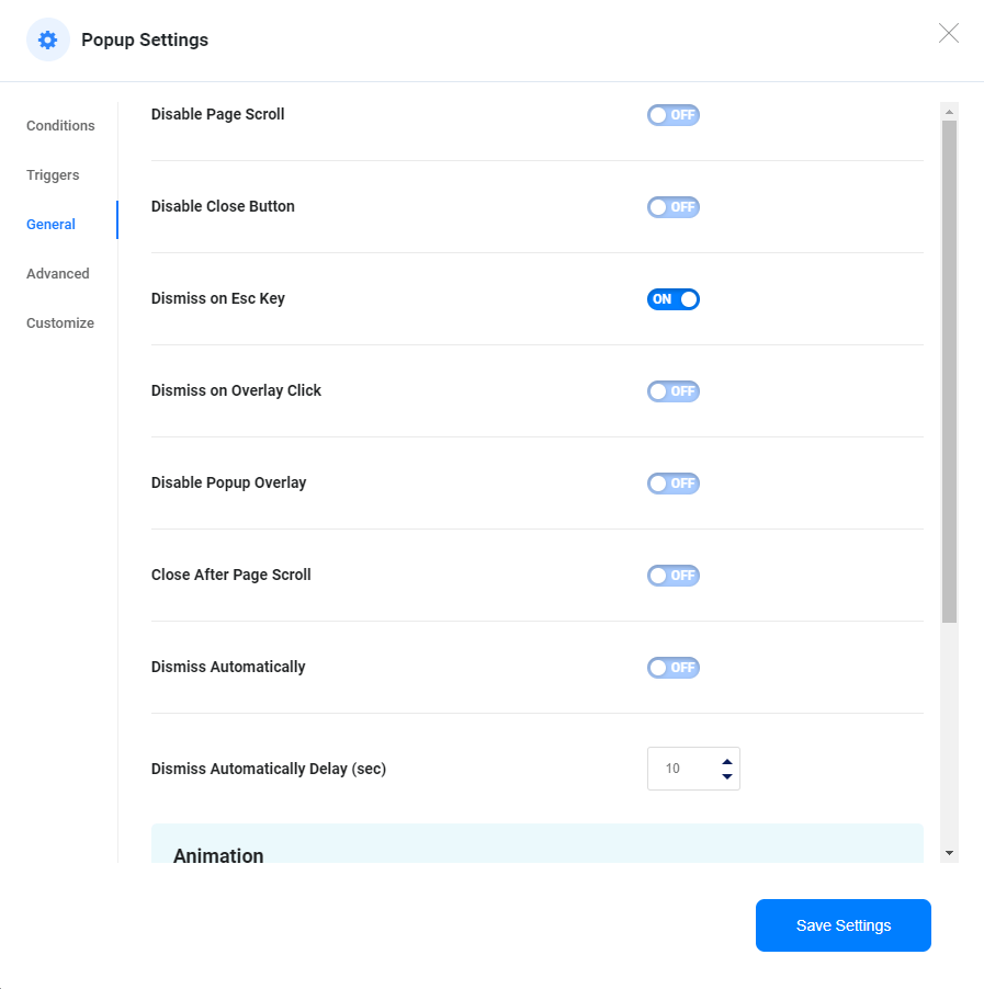
Here, you’ll find essential controls. Like common settings
- Disable Page Scroll: Decide whether page scrolling is allowed when the popup is active.
- Disable Close Button: Users can disable the popup close button.
- Dismiss on ESC Key: Enable users to close the popup using the ESC key.
- Dismiss on Overlay Click: Allow users to close the popup by clicking on the overlay (Pro version).
- Disable Popup Overlay: Turn off the overlay for the popup (Pro version).
- Close After Page Scroll: Enable scrolling down the page to close the popup (Pro version).
- Dismiss Automatically: Auto-close the popup after a predefined time (Pro version).
- Animation: Set animations for popup opening and closing.
- Animation Duration (sec): Specify the duration of these animations (Pro version).
Advanced Options #
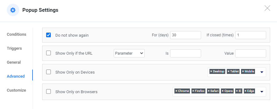
Do Not Show Again #
The popup will automatically close for a set duration if a visitor closes it a certain number of times.
Do not show again For (days) {set_date} if closed (times) {certain_number_of_time}
Show only if URL #
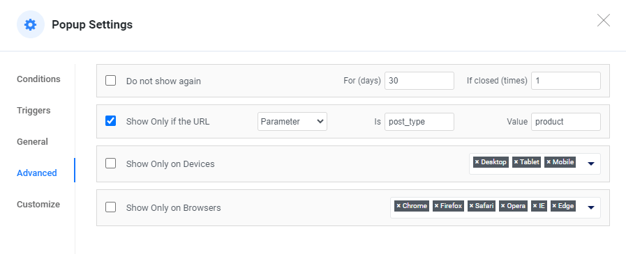
The popup will be displayed depending on the URL environment. Let’s delve into how this functionality operates.
Parameter: If you establish a condition based on URL parameters and their values, consider this example: when using a URL such as https://example.com/?post_type=product, the parameter is “post_type,” and its corresponding value is “product.”
Query String Is: A URL query string is a part of a URL that follows a question mark (?) and contains key-value pairs separated by ampersands (&). It is used to send data from the client (usually a web browser) to the server. Each key-value pair in the query string is used to transmit specific information or parameters to the server, which can then process the request accordingly.
Here’s an example of a URL with a query string:
https://example.com/?post_type=product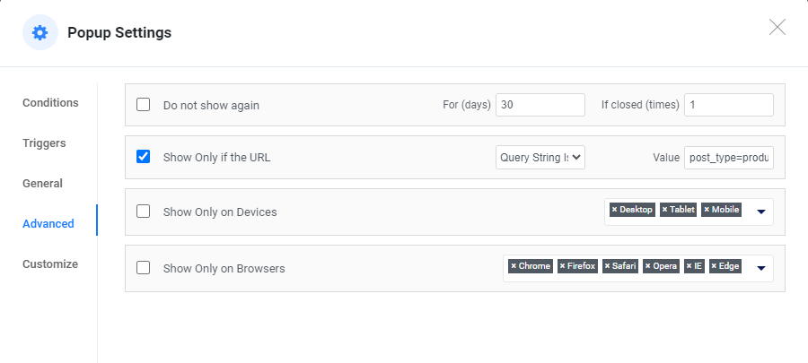
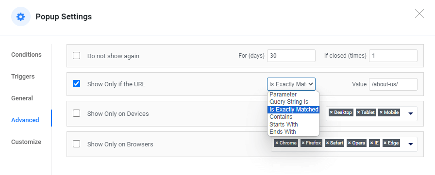
Is Exactly Matched: This criterion will exclusively display the content if the URL value precisely matches {/url-slug/}. For instance, if you wish to trigger a popup when a visitor navigates to the “About Us” page, such as https://example.com/about-us/, you should specify the root domain (example.com) and include the full path (/about-us/).
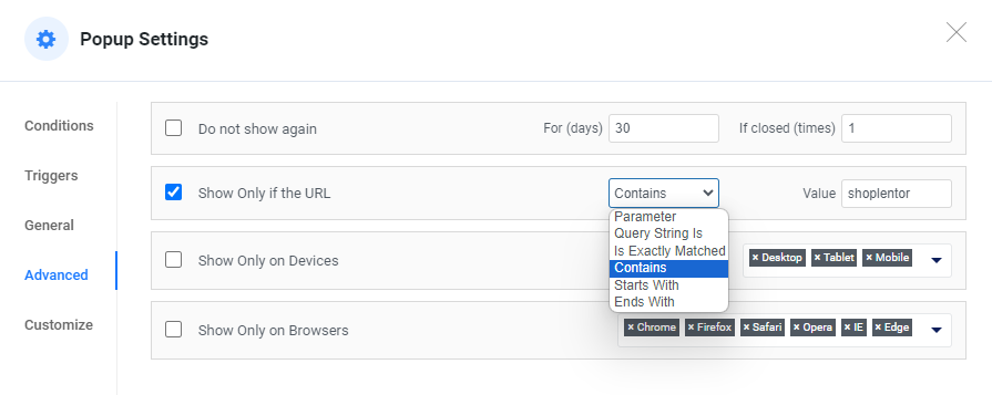
Contains: “This option is useful when you want to target specific text within a URL. For example, if any URL on your website contains the term ‘shoplentor,’ the PopUp will be displayed on all those pages.”
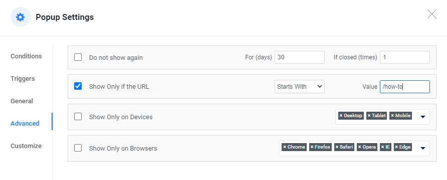
Starts With: If desired, you can configure the popup to appear based on the starting term of your URL. For instance, if you have pages where the initial segment of the URL begins with ‘How To‘ you can easily achieve this by setting the value to ‘/how-to‘.
Starts With: If desired, you can configure the popup to appear based on the starting term of your URL. For instance, if you have pages where the initial segment of the URL begins with ‘How To‘ you can easily achieve this by setting the value to ‘/how-to‘.

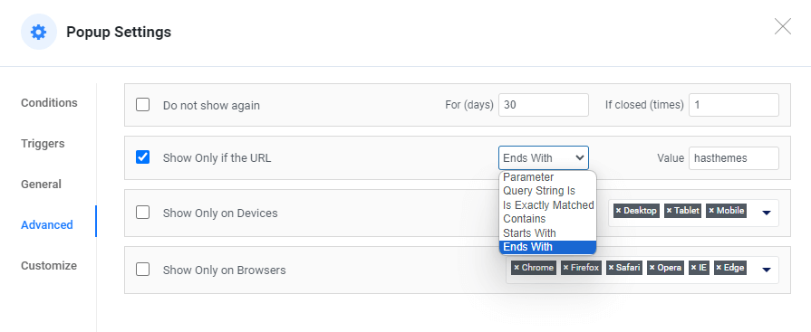
Ends With: It operates in a similar functionality to ‘Starts With,’ but instead, it displays the popup by targeting the last term in the URL.
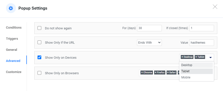
Show Only on Devices #
If you wish to enable or disable the popup on specific devices, you can achieve this by simply enabling or disabling the respective device options.
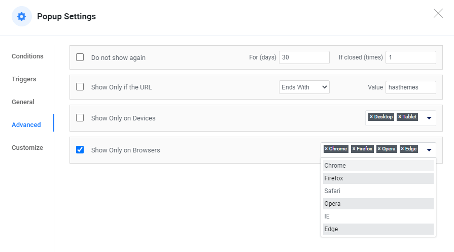
Show Only on Browsers #
Furthermore, you have the option to disable or enable the popup on specific browsers. You can accomplish this by enabling or disabling the respective browser.
Customize #
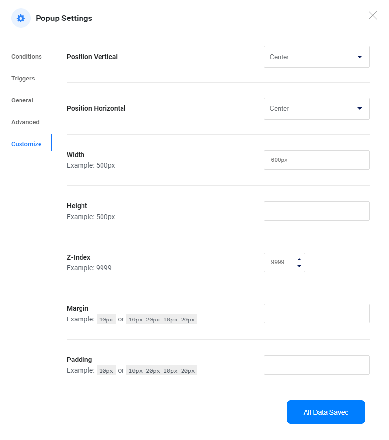
Tailor the visual appearance of your popup:
- Position Vertical: Adjust the vertical placement (Top, Center, Bottom).
- Position Horizontal: Modify the horizontal positioning (Top, Center, Bottom).
- Further customize dimensions, z-index, margin, and padding as needed.
Adding Multiple Popups #
To create additional popups, return to the template builder and repeat the process. You can add as many popups as required, each with its unique settings and designs.
With ShopLentor’s Popup Builder, you have the flexibility and tools to create engaging, user-friendly popups that enhance your WooCommerce website’s functionality and user experience. Explore the possibilities and engage your audience effectively.