The ShopLentor plugin includes a Quick View Module that allows users to display product details in a popup, improving the shopping experience by letting visitors view product information without leaving the current page.
Why Use the Quick View Module?
The Quick View Module enhances shopping convenience by enabling visitors to quickly view product details and add items to their cart without leaving the current page. This helps reduce friction in the shopping process and boosts conversion rates.
Enable Quick View Module
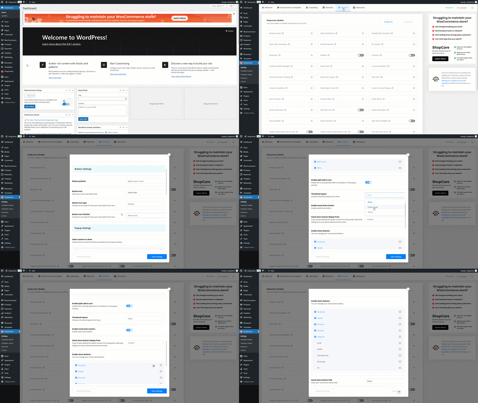
This option allows you to enable or disable the Quick View Module for your WooCommerce site. To activate it:
Go to WordPress Dashboard > WooLentor > Settings > Modules. From the list of modules, toggle the Quick View switch to ON.
Enable/Disable: Use this switch to activate or deactivate the Quick View Module.
Enable Quick View in Shop/Archive Pages
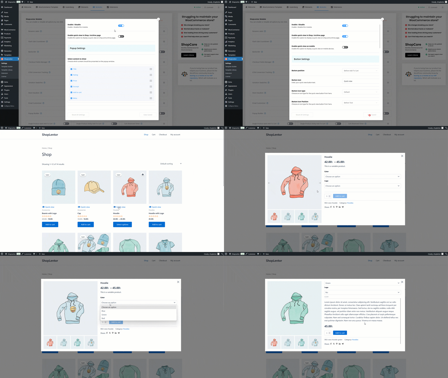
If enabled, a quick view button will appear on your Shop and Archive pages, allowing users to preview product details.
- Enable quick view in shop/archive page: Toggle this switch to enable or disable the quick view functionality on shop and archive pages.
Enable Quick View on Mobile
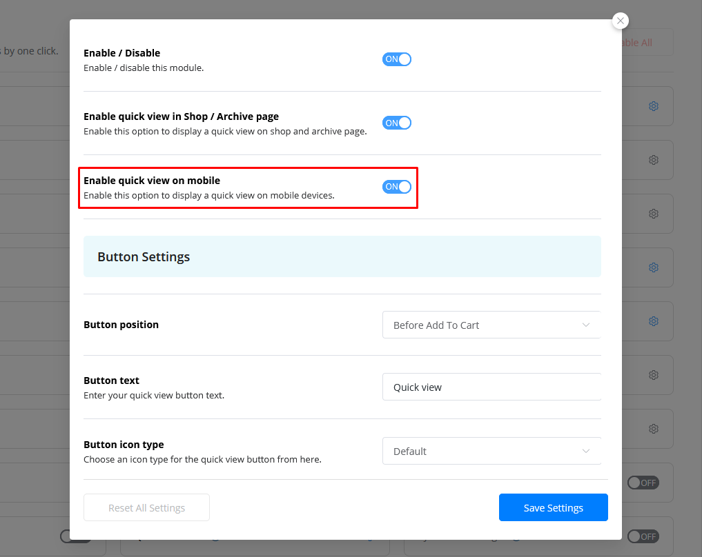
Enabling this option ensures that mobile users can also access the quick view feature.
- Enable quick view on mobile: Toggle this switch to enable or disable the quick view feature on mobile devices.
Button Settings
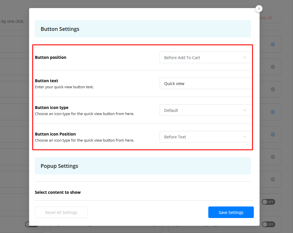
Customize the quick view button with various configuration options. These settings allow you to determine the button’s position, text, and icon.
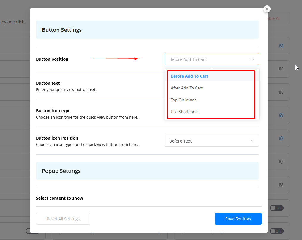
Button Position
Set where the Quick View button will appear on the product page.
Button position: Select one of the following options:
- Before Add to Cart: The Quick View button will appear before the “Add to Cart” button.
- After Add to Cart: The Quick View button will appear after the “Add to Cart” button.
- Top on Image: The Quick View button will appear on top of the product image.
- Use Shortcode: Use the shortcode [woolentor_quickview_button] to place the Quick View button anywhere on the page.
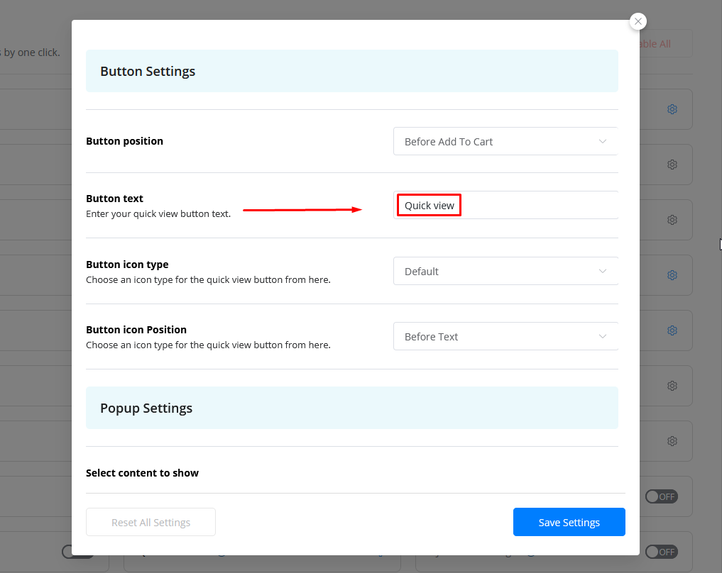
Button Text
You can modify the text displayed on the quick view button.
- Button text: Enter your preferred button text (e.g., “Quick View”).
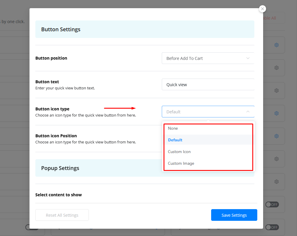
Button Icon Type
Customize the icon displayed on the Quick View button by choosing from predefined options or uploading your own.
Button icon type: Select from the following options:
- None: If you don’t want an icon on the Quick View button, select “None.”
- Default: The default Quick View icon is selected by default.
- Custom Icon: To add a custom icon, select this option. You’ll then see an option to manage and customize the icon.
- Custom Image: To use an image instead of an icon, select this option. You’ll then be able to upload a custom image for the button.
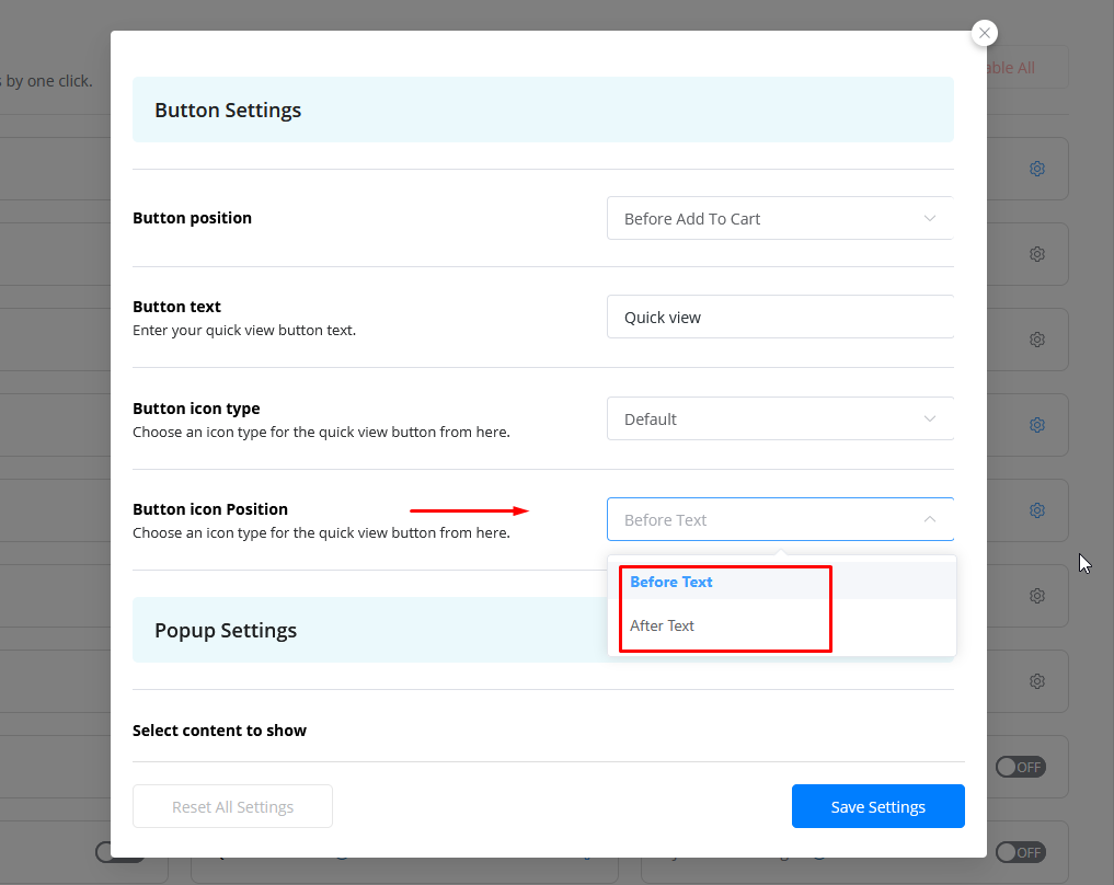
Button Icon Position
Set the icon’s position relative to the button text.
Button icon position: Choose where the icon will appear in relation to the text:
- Before Text: Select this option to place the icon before the button text.
- After Text: Select this option to place the icon after the button text.
Popup Settings
The Popup Settings allow you to configure the content that appears in the quick view popup, as well as enable features like AJAX add-to-cart and social sharing.
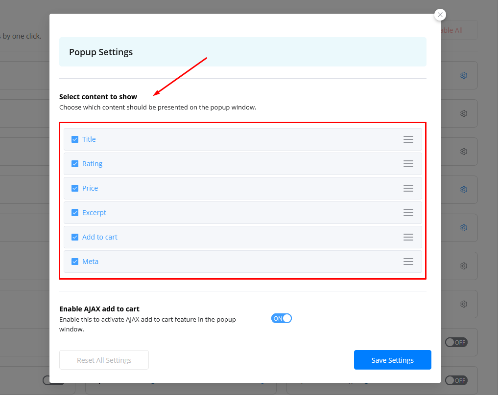
Select Content to Show
This option lets you choose which product details to display in the popup. You can manage the popup content and order/position it.
Select content to show: Choose from the following:
- Title
- Price
- Rating
- Add to Cart
- Excerpt
- Meta
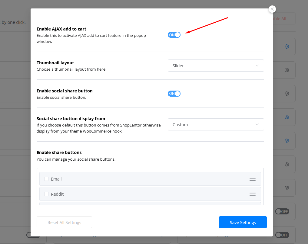
Enable AJAX Add to Cart
Enable AJAX functionality to allow users to add products to the cart directly from the quick view popup without reloading the page.
- Enable ajax add to cart: Toggle this switch to enable or disable AJAX add-to-cart functionality in the quick view popup.
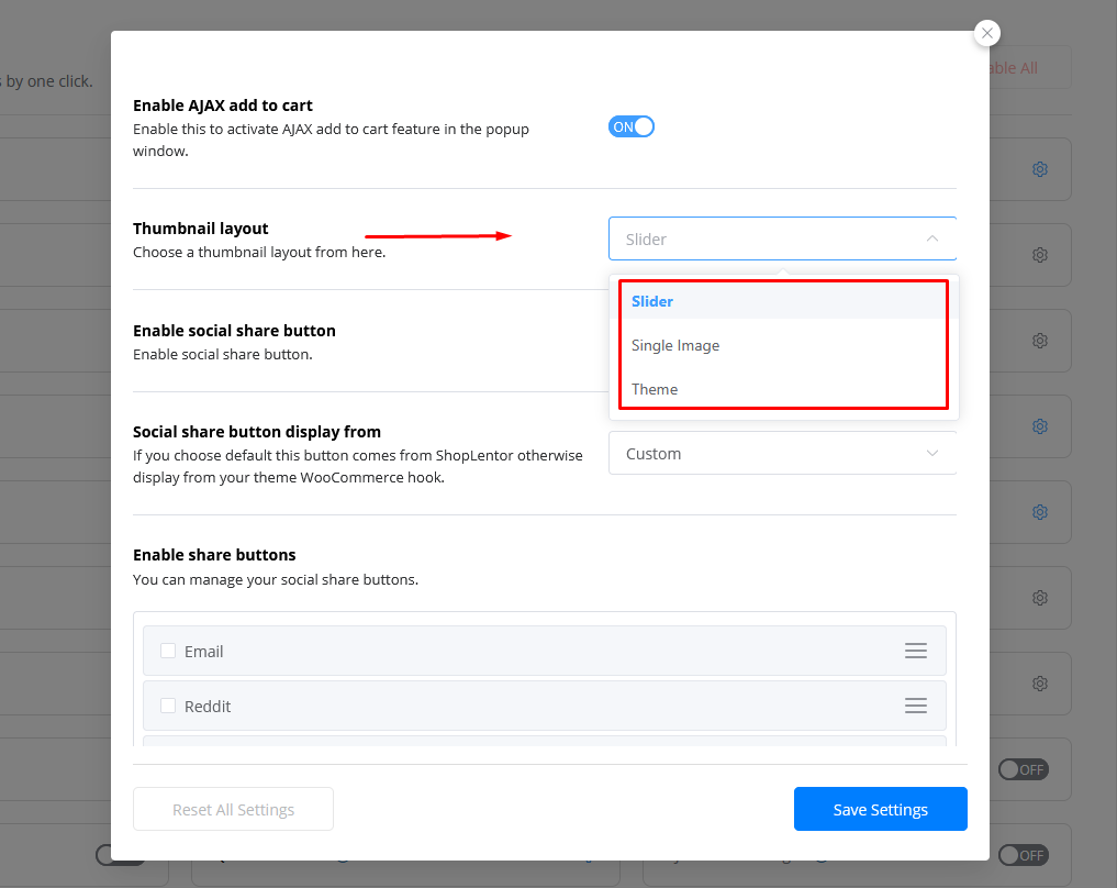
Thumbnail Layout
Choose how the product images are displayed in the popup.
Thumbnail layout: Select one of the following layouts:
- Slider
- Single Image
- Theme (Activate theme style)
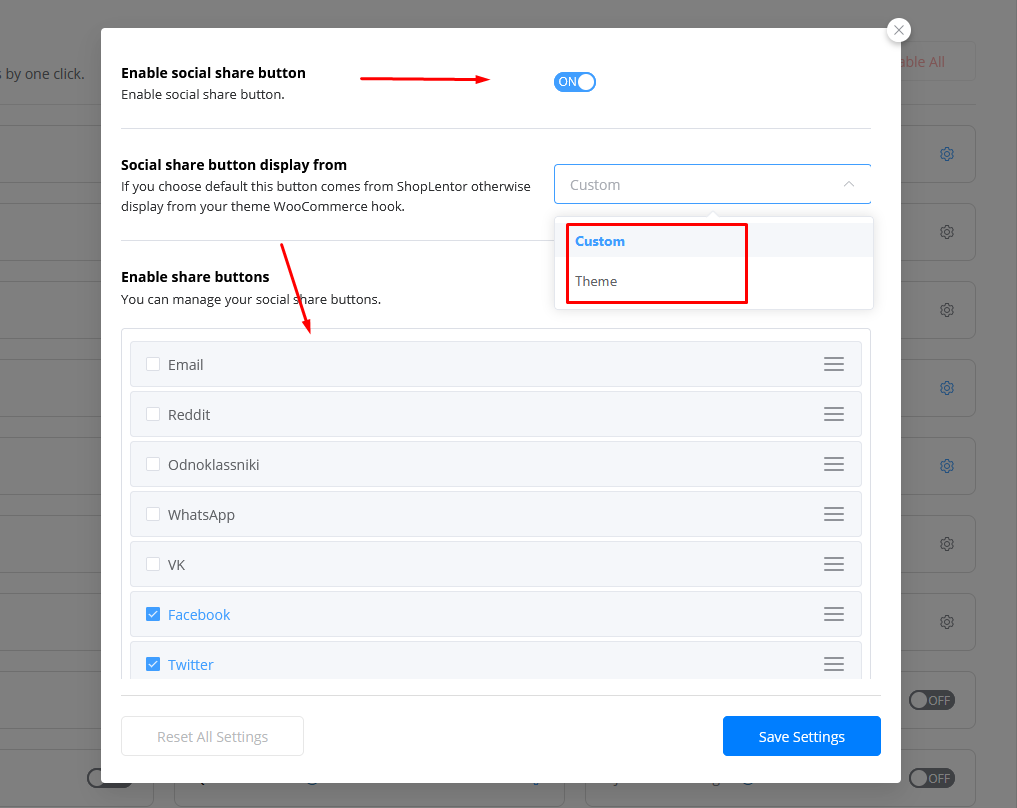
Enable Social Share Button
Enable this option to display social sharing buttons in the quick view popup.
- Enable social share button: Toggle this switch to enable or disable social sharing.
Social Share Button Display From
Choose whether the social share button layout comes from ShopLentor or your theme’s default WooCommerce hook.
Social share button display from: Select one of the following:
- Custom: This is the default option, allowing you to customize and manage your social share buttons through ShopLentor.
- Theme: Select this option if you prefer to use the social media layout provided by your active theme.
Enable Share Buttons
Manage and customize the social share buttons displayed in the quick view popup. You can also rearrange the order of the social icons.
Enable share buttons: Choose which social media platforms you want to enable:
- Telegram
- Odnoklassniki
- Vk
Enable Share Buttons
Customize the title of the social share section.
Social share button title: Enter your desired title (e.g., “Share this product”).
For detailed instructions on designing custom templates using the Quick View Template Builder, refer to the Quick View Template Builder Documentation.
ShopLentor- WooCommerce Builder for Elementor & Gutenberg
A versatile page builder to build modern and excellent online stores with more than 100k+ Active Installations.