The Product Grid – Modern widget is built with a modern design approach, offering a clean, stylish, and visually appealing way to display WooCommerce products. It supports Grid View, List View, and a Grid–List toggle, giving shoppers more control over how they browse.
With features like badges, stock status, product feature labels, quick action buttons, and multiple pagination options, this widget provides both flexibility and functionality. Its easy-to-use styling controls let you customize every part of the layout, making it an excellent choice for any WooCommerce store that wants a polished and user-friendly product display.
Why Use Product Grid – Modern Layout?
The Product Grid – Modern Layout widget gives you the flexibility and design freedom to create a clean, modern, and conversion-focused WooCommerce product grid. Built with a modern design approach, it includes practical features that help shoppers browse smoothly and make faster purchase decisions. Here’s why this layout stands out:
- Shop Page Templates
- Create a modern, flexible shop page using the versatile Product Grid – Modern Layout.
- Product Archive Templates
- Ideal for all category pages, offering a clean, consistent browsing experience.
- Any Page Built with Elementor
- Use it on any Elementor page for consistent, stylish product displays.
Steps of Adding Product Grid – Modern Layout
Step 1: How to Enable Product Grid – Modern Widget
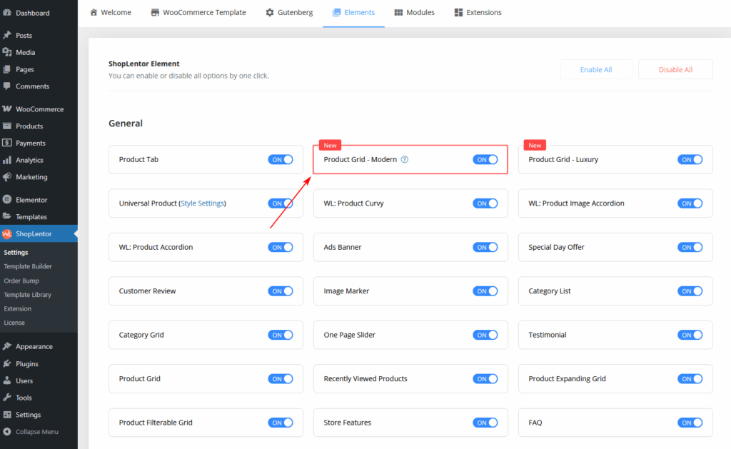
- Go to Dashboard → WooLentor → Settings → Elements
- Find Product Grid – Modern Layout
- Switch it ON to activate the widget
After enabling, the widget becomes available in Elementor.
Step 2: How to Use the Product Grid – Modern Layout Widget
You can use it in two ways:
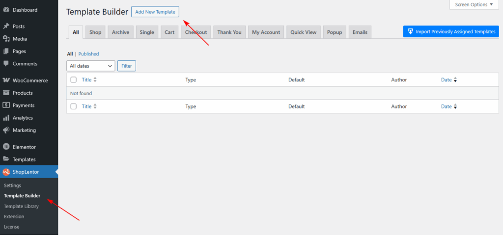
Method 1: Using the ShopLentor Template Builder.
- Go to Dashboard → WooLentor → Template Builder
- Click Add New
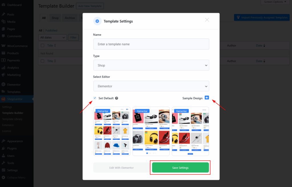
- In the popup:
- Enter a Template Name
- Select Type: Shop or Archive
- Enable Set Default
- Choose a sample design (optional)
- Click Save Settings
- Click Edit with Elementor
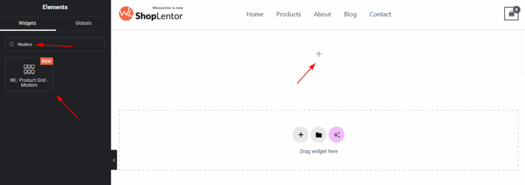
- Search for “Product – Modern”
- Drag & drop the widget into your Shop page template
Method 2: Add Directly Inside Elementor
- Edit any page with Elementor
- Search for Product Grid – Modern Layout
- Drag the widget into your desired section
You can now customize the layout and design of your product grid.
Step 3: How to Customize the Product Grid – Modern Widget
You can customize the widget from the Content tab inside Elementor.
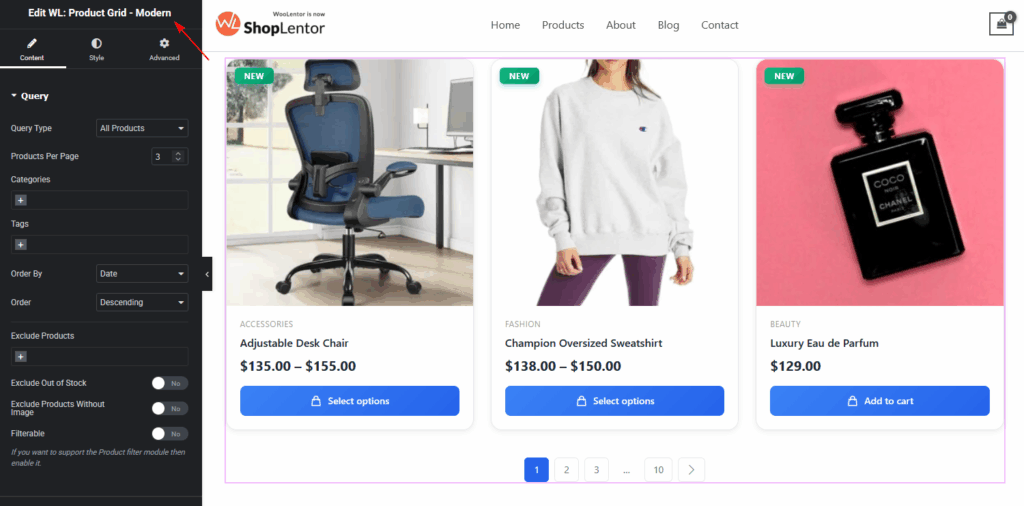
Query
Control which products appear:
- Query types: All, Recent, Featured, On Sale, Best Selling, Manual
- Products per page
- Categories & Tags
- Include / Exclude products
- Exclude Out-of-Stock products
- Exclude products without images
- Sorting options
- Filterable mode
View Mode
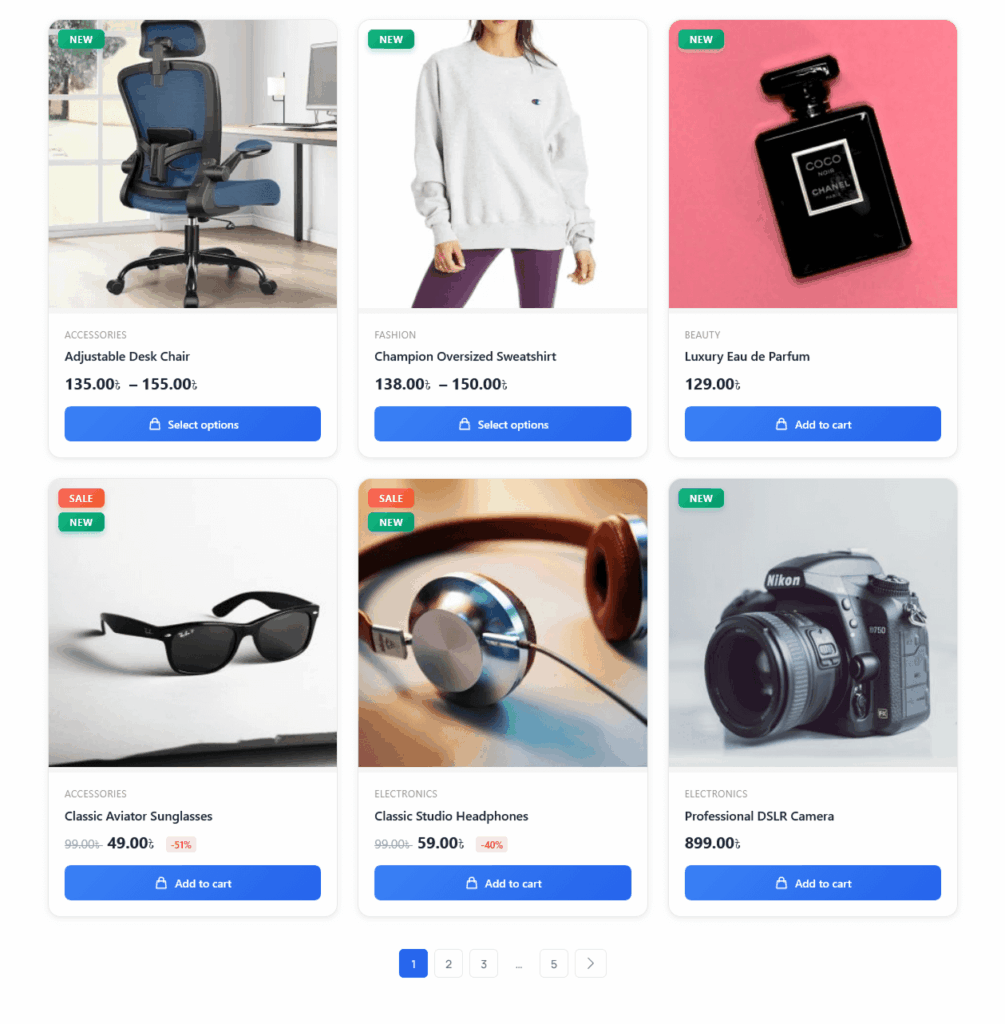
Choose how your store products will appear:
- Grid View — image-focused, modern layout
- List View — detailed layout with stock status, features, and quantity selector
- Grid–List Tab View — customers can switch between Grid and List
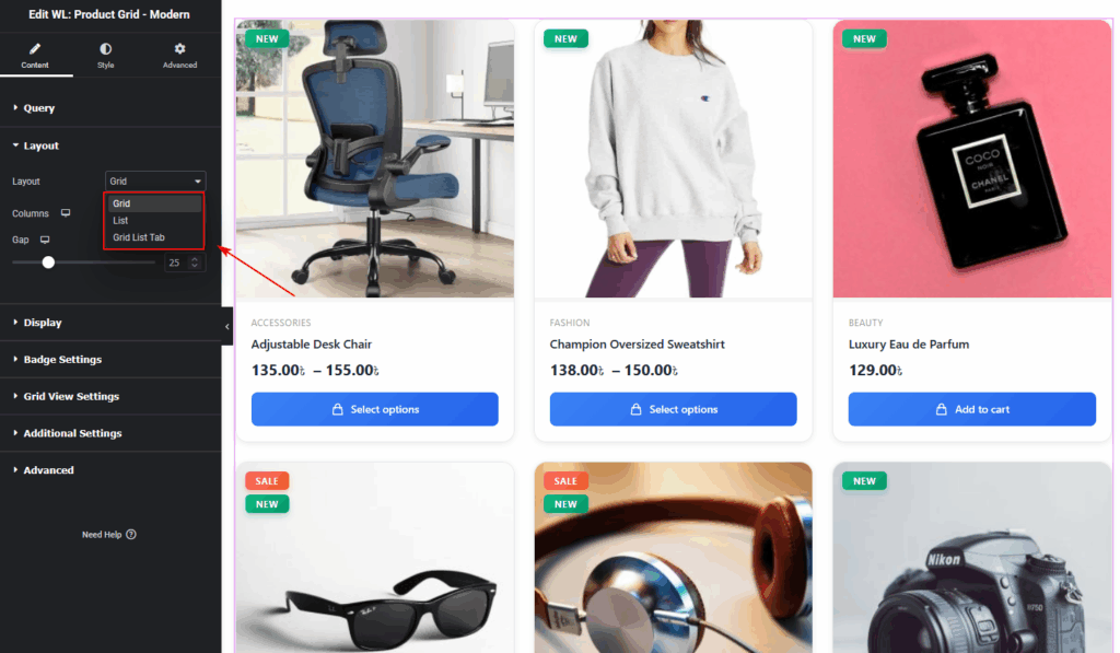
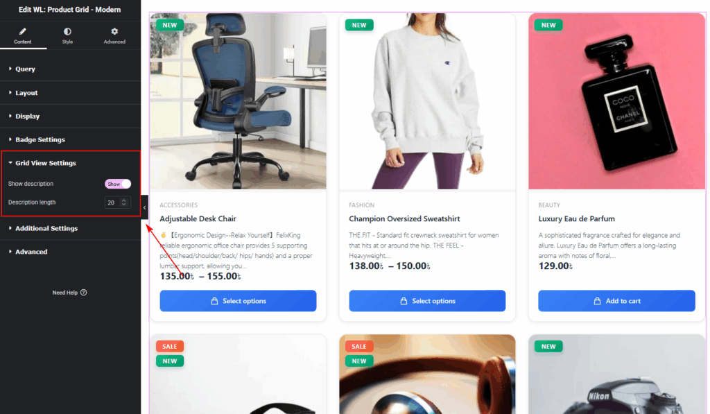
Grid
- Enable/Disable product description
- Control description length
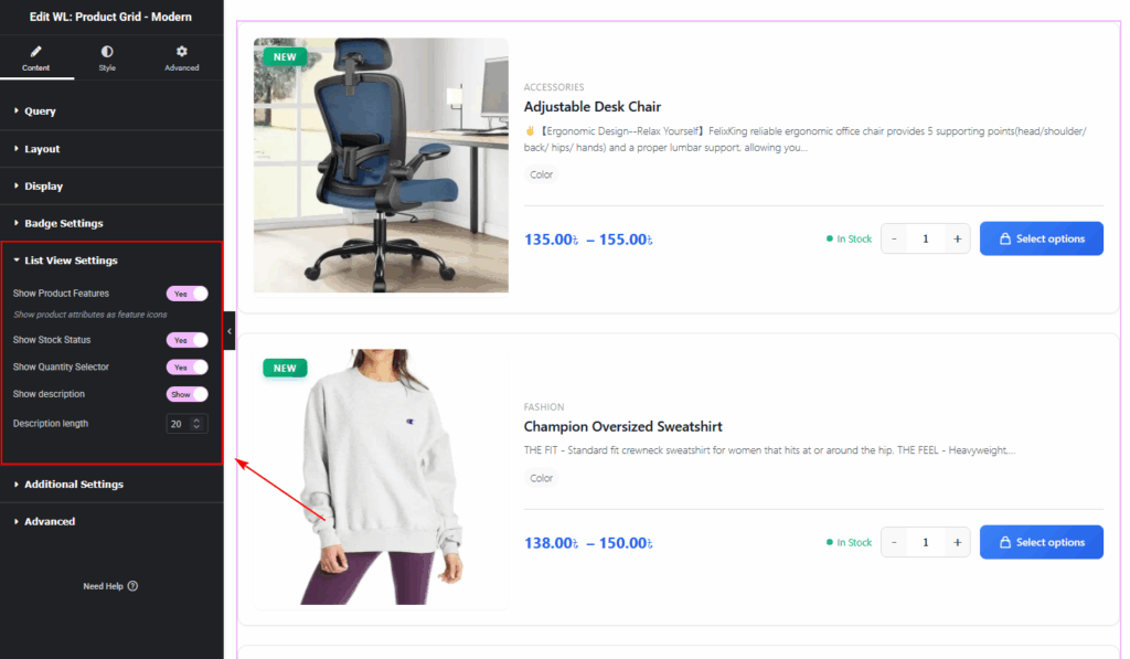
List
Available only in List View or Grid–List Tab View:
- Show Product Features (up to 3 attributes like size, material, etc.)
- Show Stock Status (In Stock / Low Stock / Out of Stock)
- Quantity Selector (+/– buttons for bulk shopping)
- Enable/Disable product description
- Extended product description
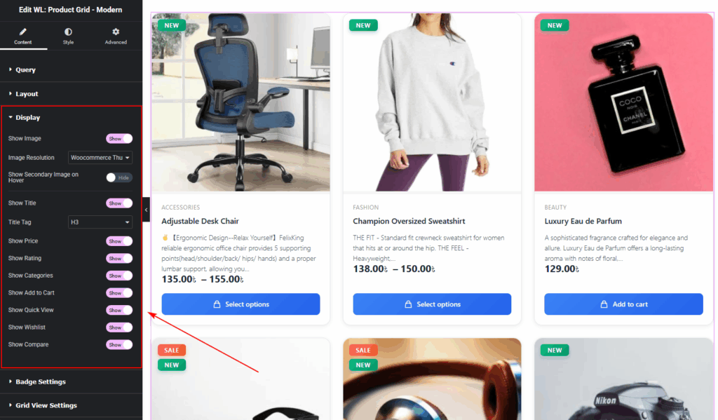
Display options
The Display Settings section allows you to choose which product details you want to show inside the grid or list layout. You can easily turn individual elements on or off based on your design needs.
Available Options:
Image, Image Resolution, Secondary Image on Hover, Title, Price, Rating, Categories, Add to Cart Button, Quick View Button, Wishlist Button, and Compare Button.
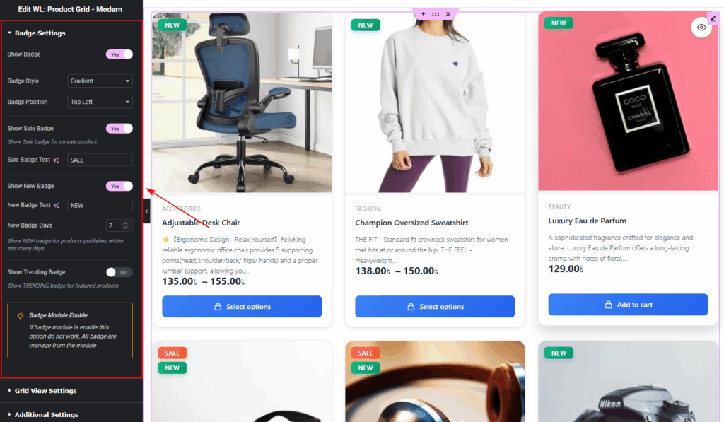
Badge Settings
Display product badges:
- Show Badge,Badge Style (Gradient, Solid, Outline),Badge Position (Top Left, Top Right)
- Show Sale Badge,Sale Badge Text,Show New Badge,New Badge Text
- New Badge Days,Show Trending Badge,Badge Module Enable Notice
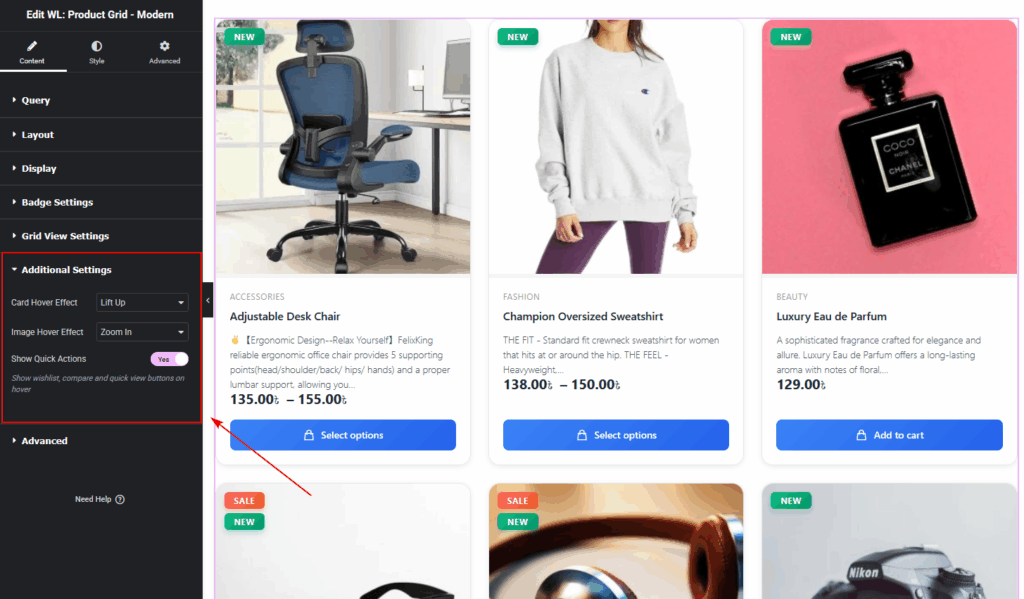
Additional Settings
The Additional Settings section provides extra visual and interactive enhancements beyond the basic display elements.
- 1. Card Hover Effect,Lift Up,Shadow,None
- 2. Image Hover Effect,Zoom In,Fade,None
- 3. Show Quick Actions
- Displays floating action icons (Wishlist, Quick View, Compare) on hover.
Advanced Settings
The Advanced Settings allow you to control how products load and how users navigate through your product list.
Enable Pagination:
- Turn pagination on or off for the product grid.
- Pagination Type
- Choose how users move through products:
- Numbers — Traditional page numbers (1, 2, 3, etc.)
- Load More — Loads additional products via a button
- Infinite Scroll — Automatically loads products as users scroll
- Choose how users move through products:
- Load More Button Text(if Load More is selected)
- Customize the button label displayed on the Load More button.
- No More Products Text
- Set the message shown when there are no additional products to load.

Step 4: How to Customize the Product Grid – Modern Style
All styling options are available under the Style tab in Elementor.
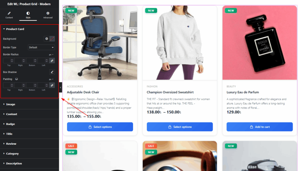
Product Card
- Card background, border, radius
- Container padding
- Hover effects
- Box Shadow
Image
- Image Border Radius:
Adjust the corner roundness of the product image. - Useful for creating soft, rounded, or sharp-edge layouts.

Content
Content Padding:
- Adjusts the inner spacing around the product content (title, price, buttons, etc.).
- Helps create compact or spacious layouts based on your design preference.
Content Alignment:
- Align content to the left, center, or right.
- Useful for matching theme design or achieving a clean grid balance.

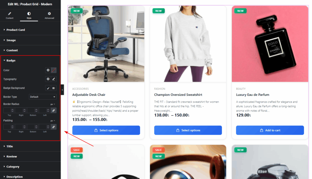
Badge
- Badge text color
- Badge background
- Border radius
- Typography
- Padding & margin
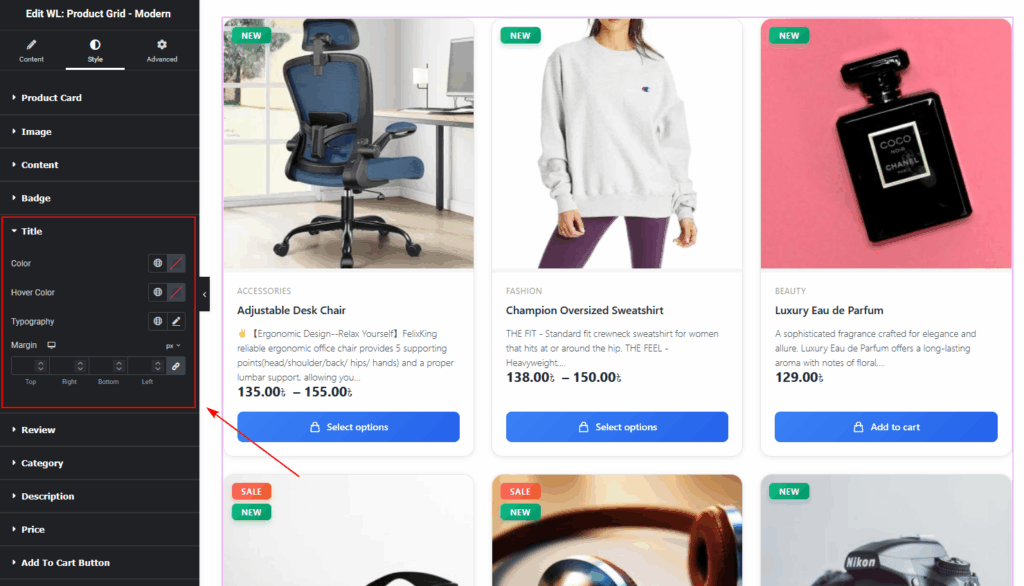
Title
- Normal & Hover colors
- Typography
- Margin
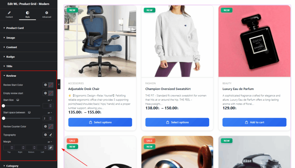
Rating
- Star colors (filled & empty)
- Spacing and size
- Review count typography
Category
- Text color
- Typography
- Margin spacing
- Background color
- Hover color
- padding/Margin
- Border radius

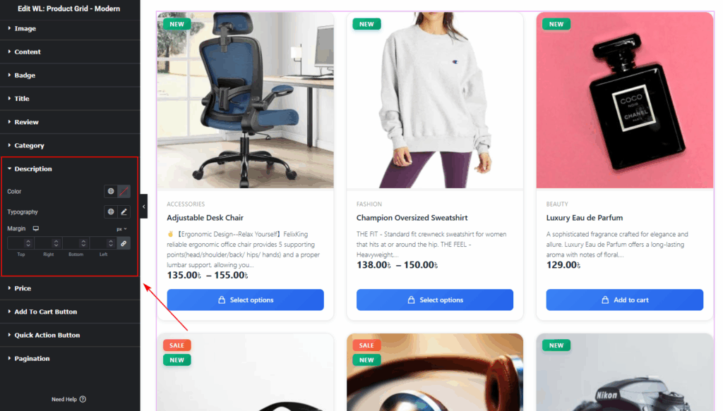
Description
- Text color
- Typography
- Margin spacing
Price
- Regular price color
- Sale price color
- Typography settings

Add To Cart Button
Includes Add to Cart & Quick Actions:
- Normal & Hover color
- Background color
- Typography
- Icon Size
- Border Type
- Border radius
- Padding

Quick Action Button
Includes Quick Action Button:
- Normal & Hover color
- Text color
- Background color
- Size
- Border radius
- Padding

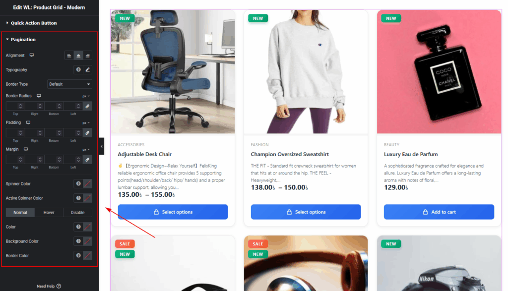
Pagination
Pagination Alignment, Typography, Normal State Colors, Hover State Colors, Active State Colors, Border Type, Border Color, Border Radius, Padding, and Margin.
Step 5: Visit & Preview the Page
Once you finish customizing:
- Click Publish or Update
- Visit your Shop page
- Test both Grid and List views
- Check responsiveness on Mobile, Tablet, and Desktop
- Make any additional style adjustments
Your Product Grid – Modern Layout is now live!
Tips for Best Visual Results
- Use Grid View for visual products like fashion or beauty.
- Use List View for detailed or B2B items.
- Enable secondary image hover for a more dynamic look.
- Use Sale, New, and Trending badges to highlight key products.
Conclusion
The Product Grid – Modern Layout widget is a powerful and flexible solution for displaying WooCommerce products in a clean, modern, and user-friendly way.
Whether you’re building a custom Shop Page, Category Page, or a promotional section on any Elementor-designed page, this widget gives you full control over layout, styling, and user experience.