The Elementor WooCommerce Luxury Product Grid widget delivers a premium, editorial-style layout that elevates the visual quality of any WooCommerce store. With refined typography, dynamic badges, customizable image ratios, elegant hover effects, and flexible styling controls, it creates a polished, high-end product showcase. Ideal for fashion, jewelry, beauty, and home decor sites, this widget makes it easy to build modern shop pages, archives, and landing pages with a consistent luxury feel.
Why Use Product Grid – Luxury Widget?
The Product Grid – Luxury Widget is built for premium brands that want their products to appear refined, editorial, and visually striking. It blends magazine-style design with advanced functionality to deliver a high-end shopping experience that boosts engagement and conversions. Compatible with both Elementor and Gutenberg, it lets you showcase products in a clean, modern, luxury-focused layout.
Where You Can Use the Luxury Widget
- Shop Page Templates:
- Enhance your shop page with a premium editorial design.
- Product Archive Templates:
- Enhances all category pages with a clean, editorial visual flow
- Any Page Built with Elementor:
- Add the luxury grid to any Elementor page effortlessly.
1. Adding the Luxury Product Grid Template
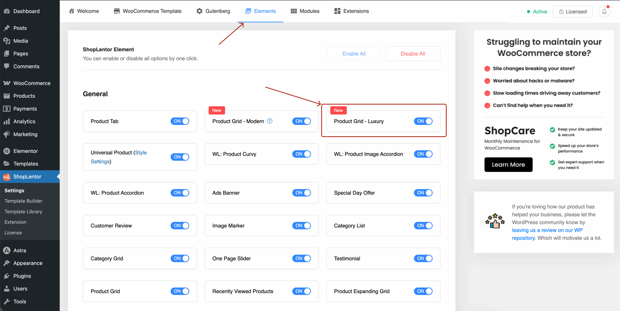
Step 1: Enable the Widget
- Navigate to ShopLentor → Settings → Elements in your WordPress dashboard.
- Find Product Grid – Luxury.
- Toggle the switch ON to activate it.
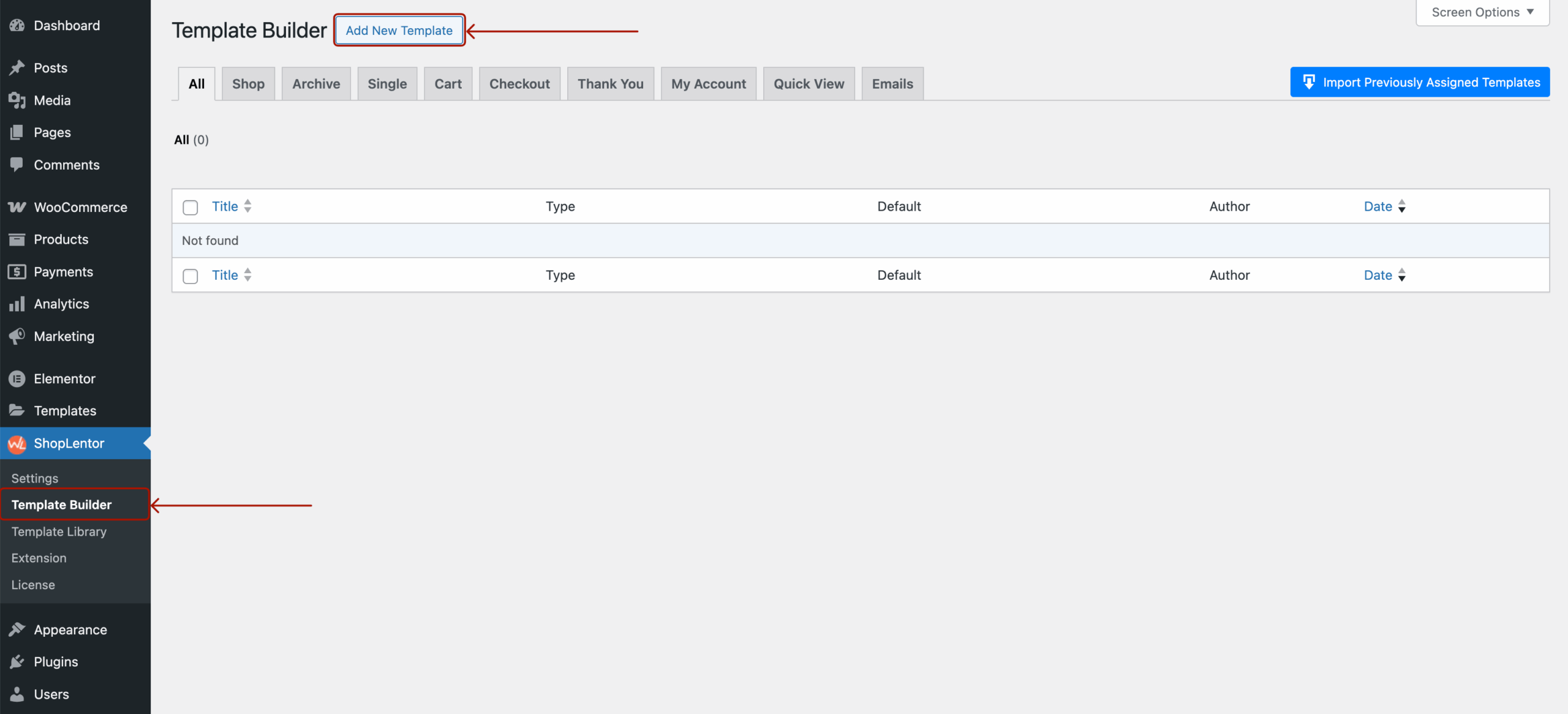
Step 2: Using ShopLentor Template Builder.
- Go to ShopLentor → Template Builder.
- Click Add New Template.
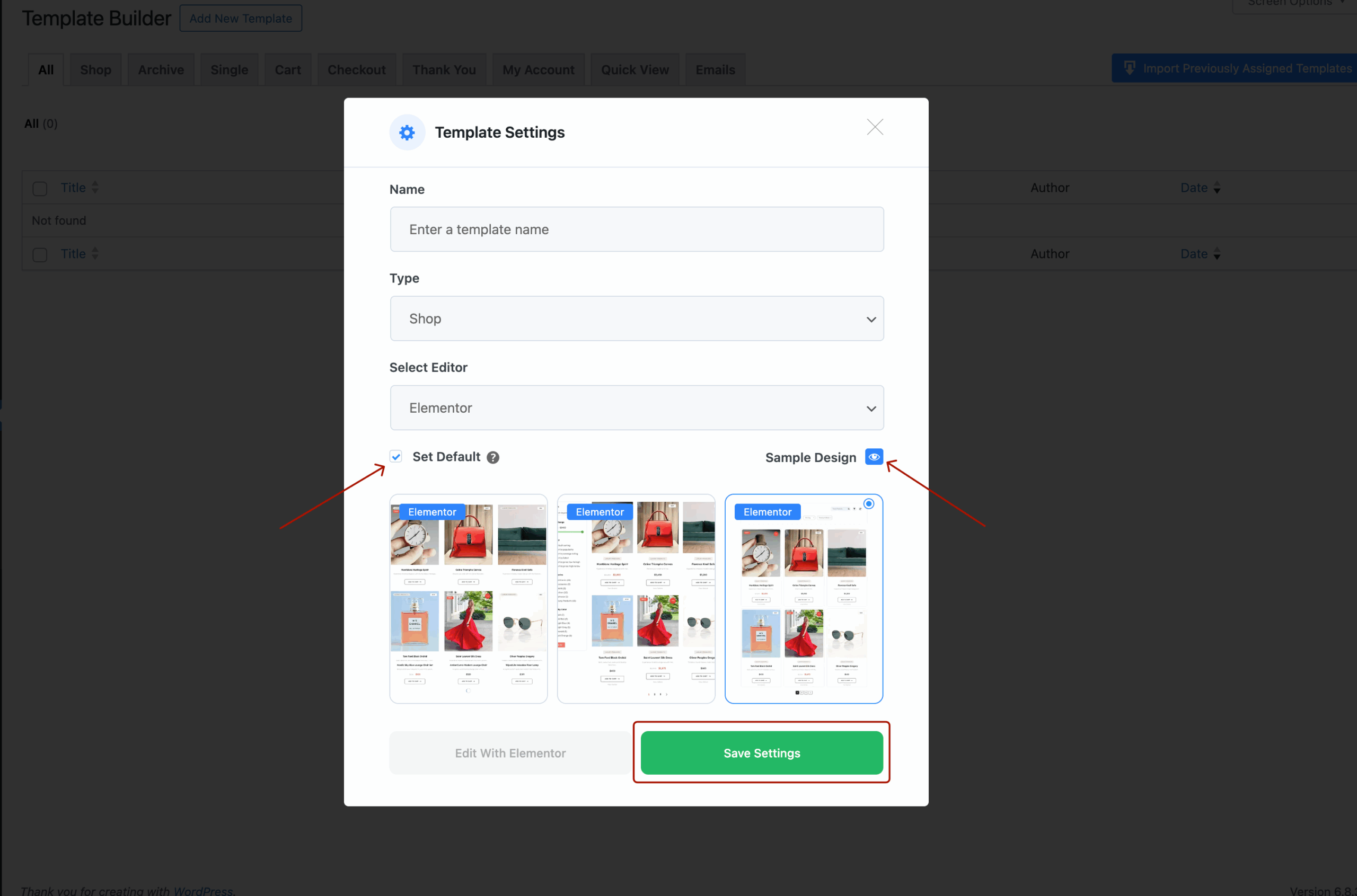
- Fill in the popup form:
- Template Name: e.g., Shop Page
- Type: Select Shop or Archive
- Editor: Choose Elementor
- (Optional) Enable Set Default to make it your active template.
- Select the sample layout: WL: Product Grid – Luxury
- Click Save Settings, then Edit with Elementor.
Alternatively, You Can Add the WL: Product Grid – Luxury Widget Directly in Elementor Without Choosing a Default Layout
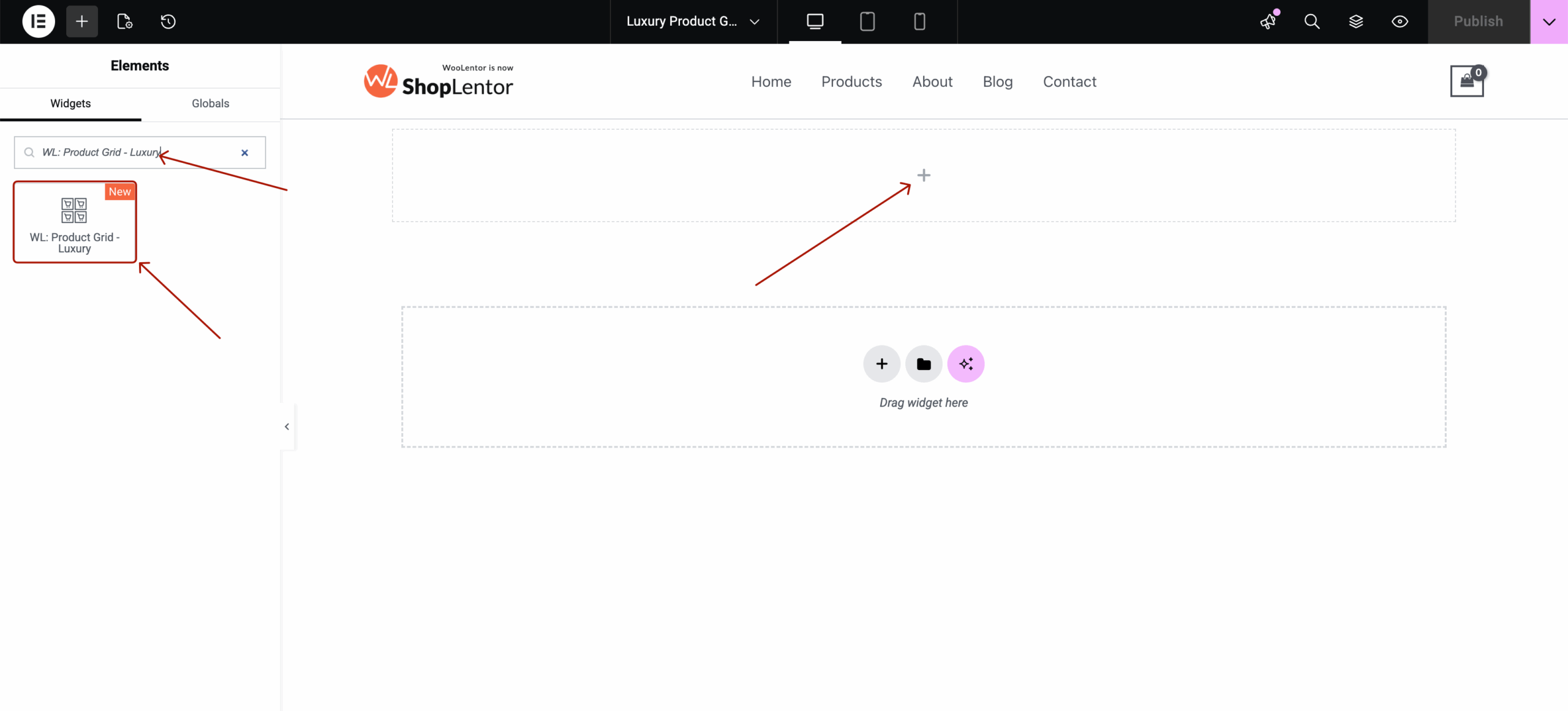
2. Adding the Elementor WooCommerce Luxury Product Grid Widget
- Open a page with Edit with Elementor
- Search for WL: Product Grid – Luxury
- Drag and drop the widget into your page

3. Content Tab Settings
The Content tab controls data, structure, and functional elements.
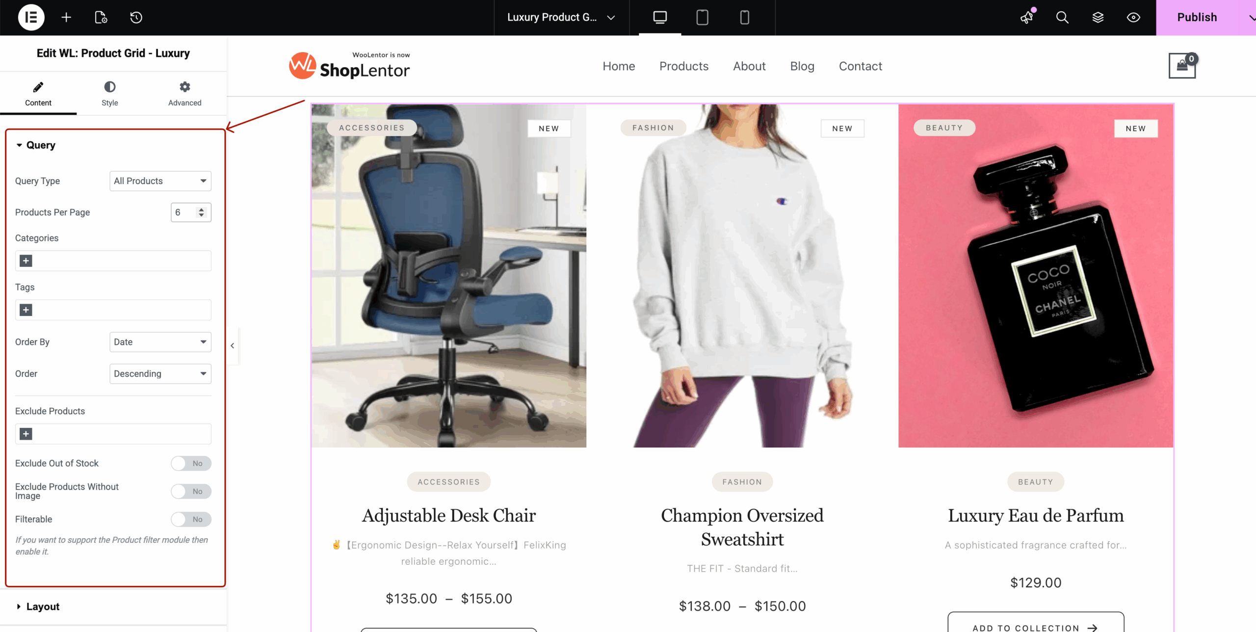
3.1 Query
Configure which WooCommerce products appear.
Options include:
- Query Type → All, Featured, On Sale, Best Selling, Manual Selection
- Products Per Page → Control total product count
- Categories / Tags → Include or exclude
- Order By → Date, Title, Price, Rating
- Order → Ascending / Descending
- Exclude Products
- Exclude Out of Stock
- Exclude Products Without Images
- Filterable → Enables WooCommerce filtering (Pro support)
3.2 Layout
Layout controls grid structure.
Includes:
- Columns for Desktop, Tablet, Mobile
- Column Gap
- Row Gap
- Product Alignment
- Aspect Ratio (from MD file)
- Square 1:1
- Portrait 3:4
- Editorial 4:5
- Vertical 9:16

3.3 Display Options
Toggle visibility of product items:
- Image
- Title
- Categories
- Description
- Price
- Rating
- Add to Cart Button
- Quick View Button
- Wishlist Button
These can be shown or hidden individually.

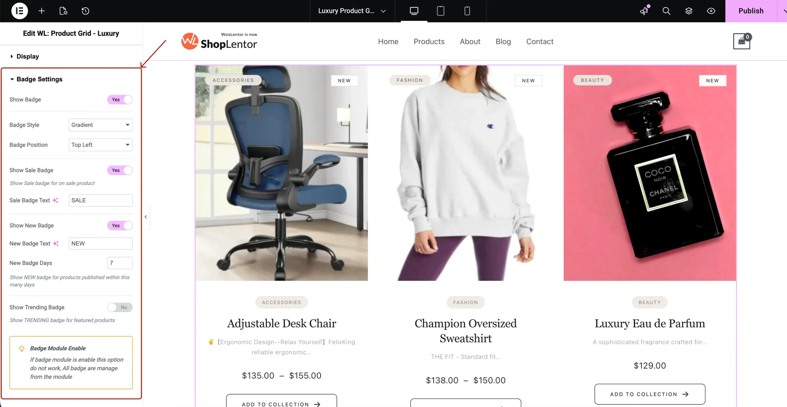
3.4 Badge Settings
Control how product badges appear.
Options include:
- Enable Badges
- Badge Style (Solid, Gradient, etc.)
- Badge Position (Top Left / Right)
- Sale Badge Text
- New Badge Text + Days
- Trending Badge
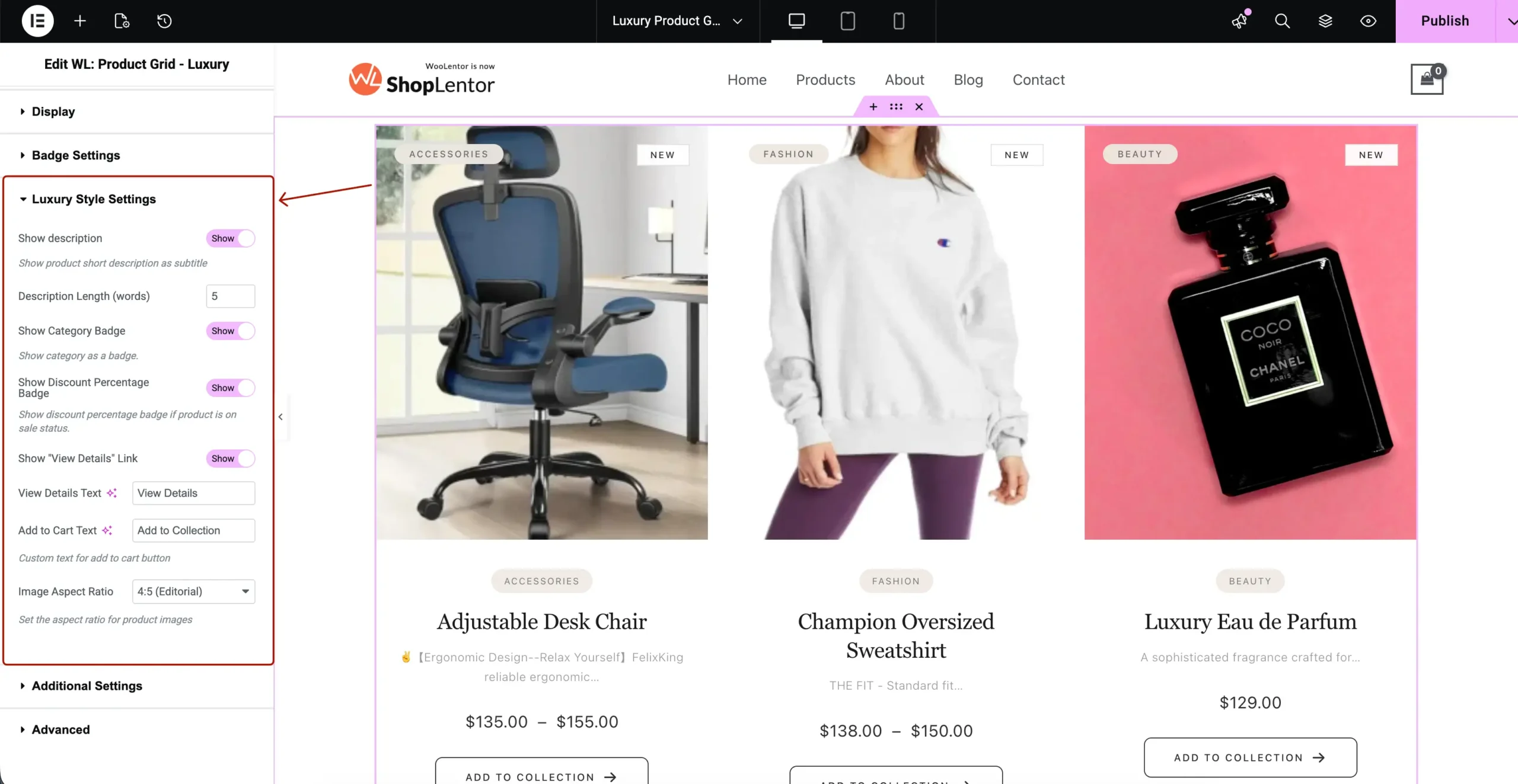
3.5 Luxury Style Settings
Widget-specific premium settings:
- Card Hover Effects
- Image Hover Effects
- Smooth transitions
- Quick Action visibility
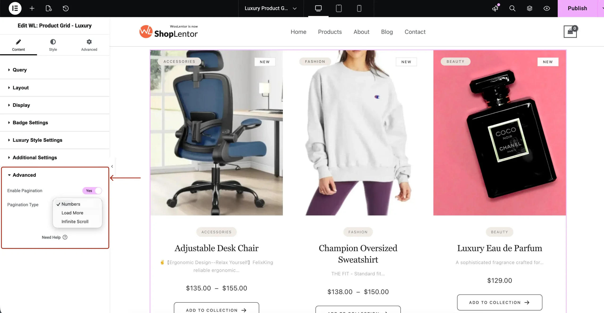
3.6 Advanced
Includes pagination.
Available pagination types:
- Numbers
- Load More (AJAX)
- Infinite Scroll
4. Styling the Elementor WooCommerce Luxury Product Grid
The Style tab contains all visual customization settings.
Your screenshot shows all available style groups — each one is documented below with full detail.
4.1 Product Card
Controls overall card appearance.
Options:
- Background Color
- Border Type
- Border Radius
- Box Shadow
- Padding
- Margin

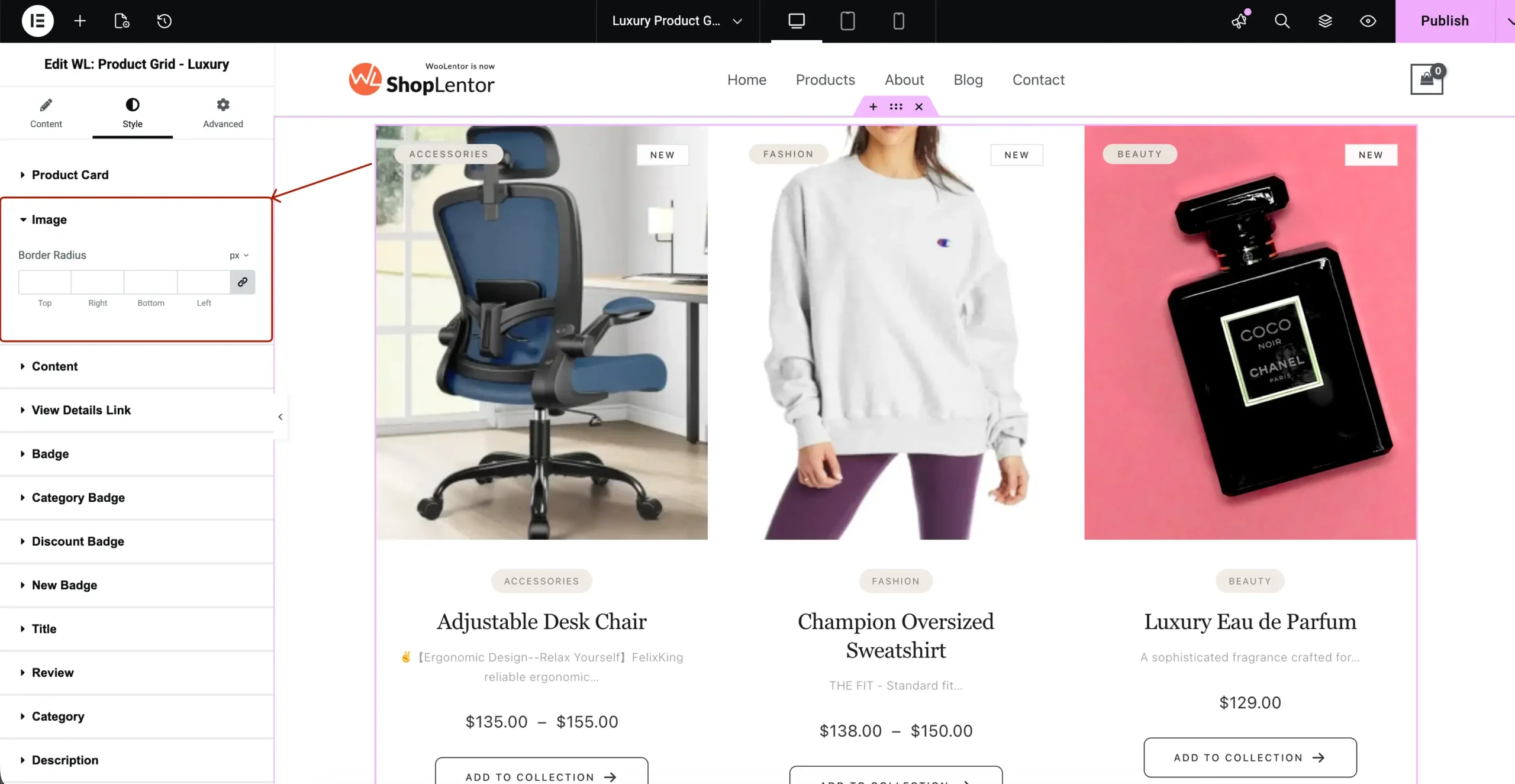
4.2 Image
Customize product images.
Options:
- Image Border Radius
- Spacing
- Hover Tint (if provided)
- Image Alignment
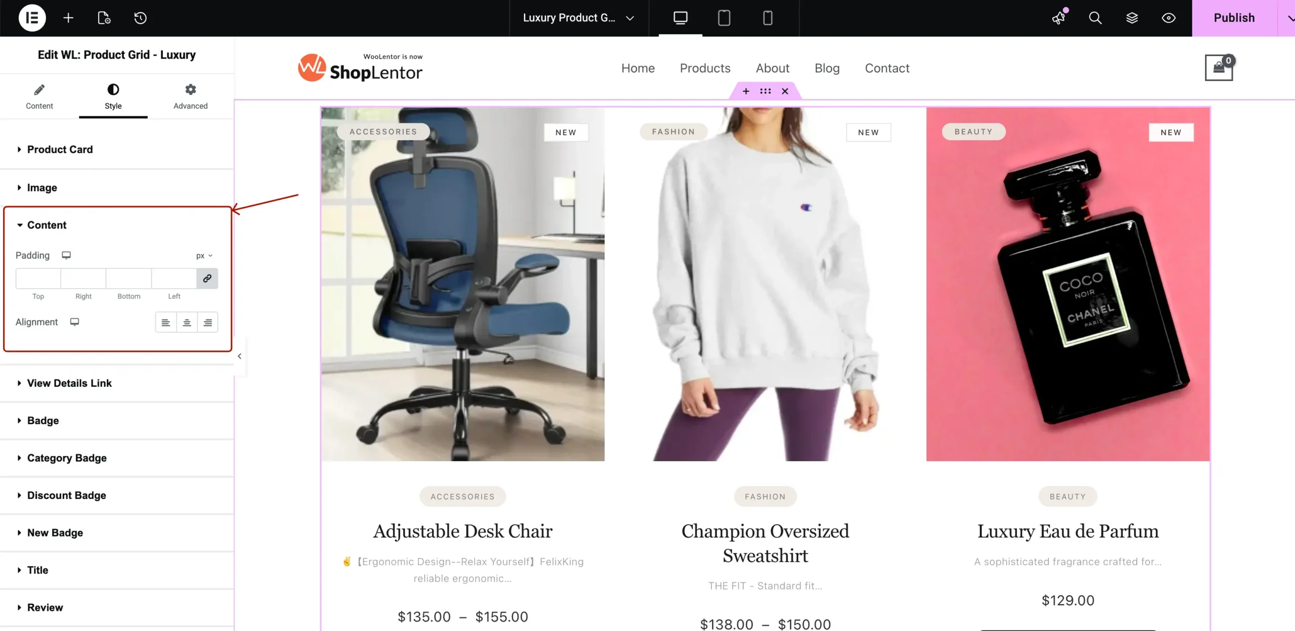
4.3 Content
Controls internal spacing + alignment.
Options:
- Padding (Top/Right/Bottom/Left)
- Alignment (Left / Center / Right)
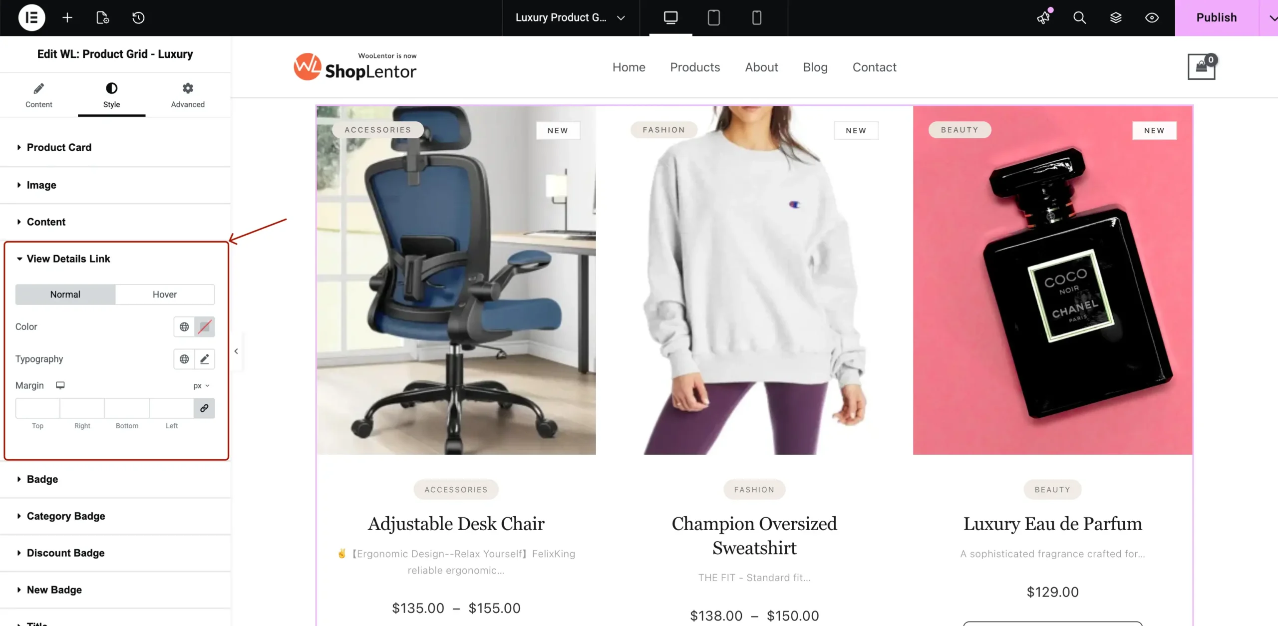
4.4 View Details Link
Style the small text link shown below Add to Cart.
Options:
- Normal/Hover Colors
- Typography
- Margin
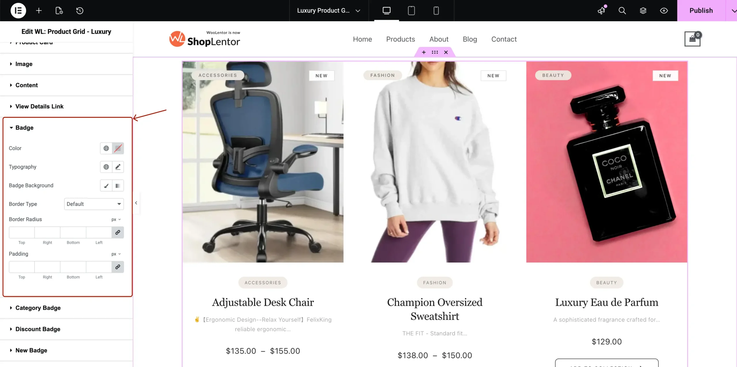
4.5 Badge
This is the general badge style.
Options:
- Text Color
- Background Color
- Border Type
- Border Radius
- Padding
- Typography
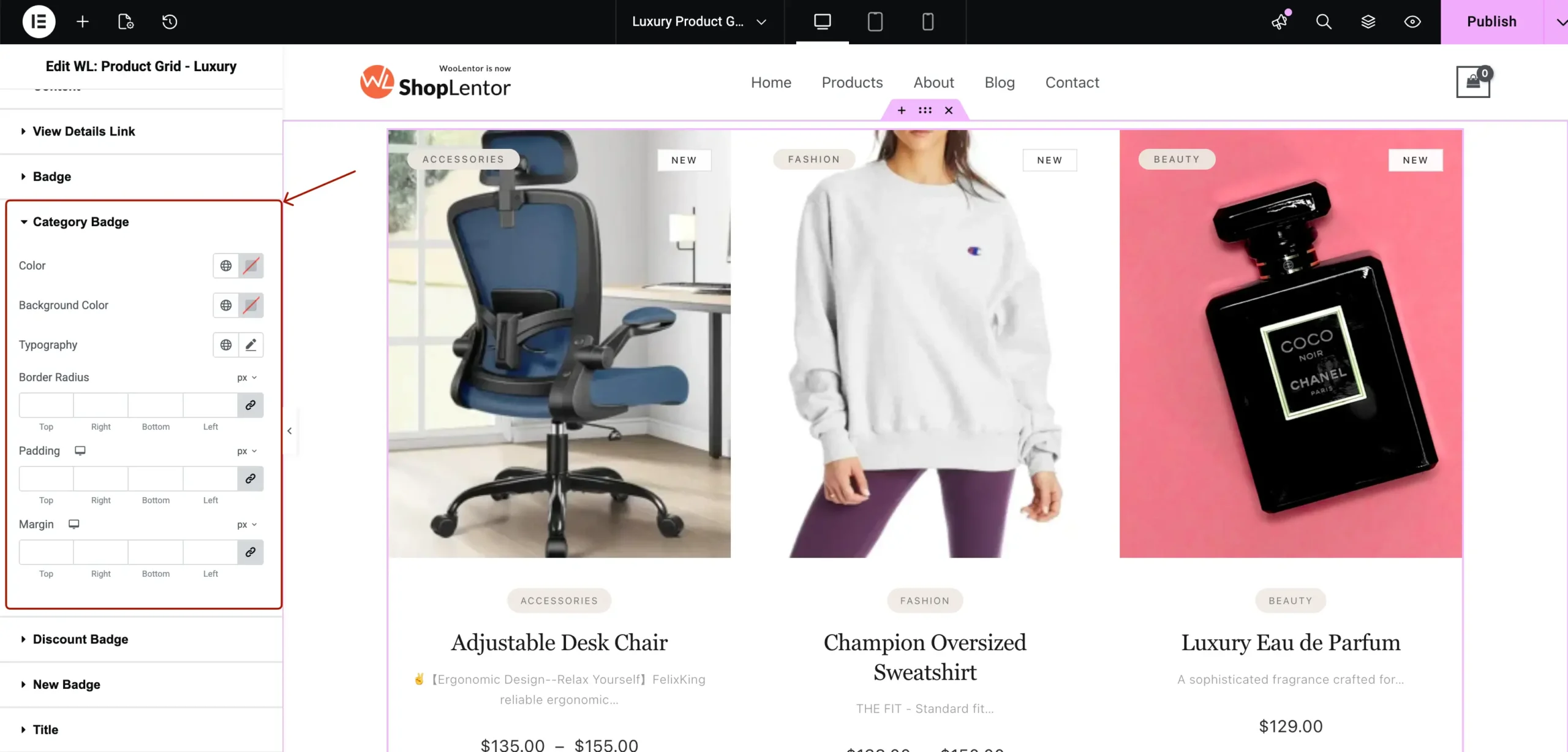
4.6 Category Badge
Styles the pill-shaped category badge.
Options:
- Text Color
- Background
- Border Radius
- Padding
- Typography
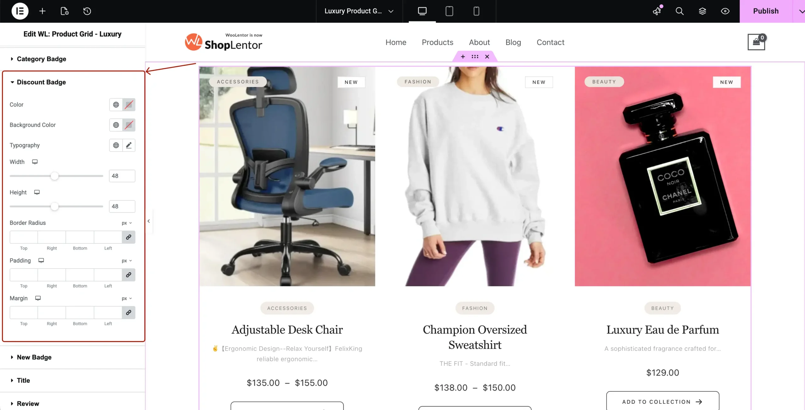
4.7 Discount Badge
Styles discount % or SALE badge.
Options:
- Background Color
- Text Color
- Padding
- Border Radius
- Typography
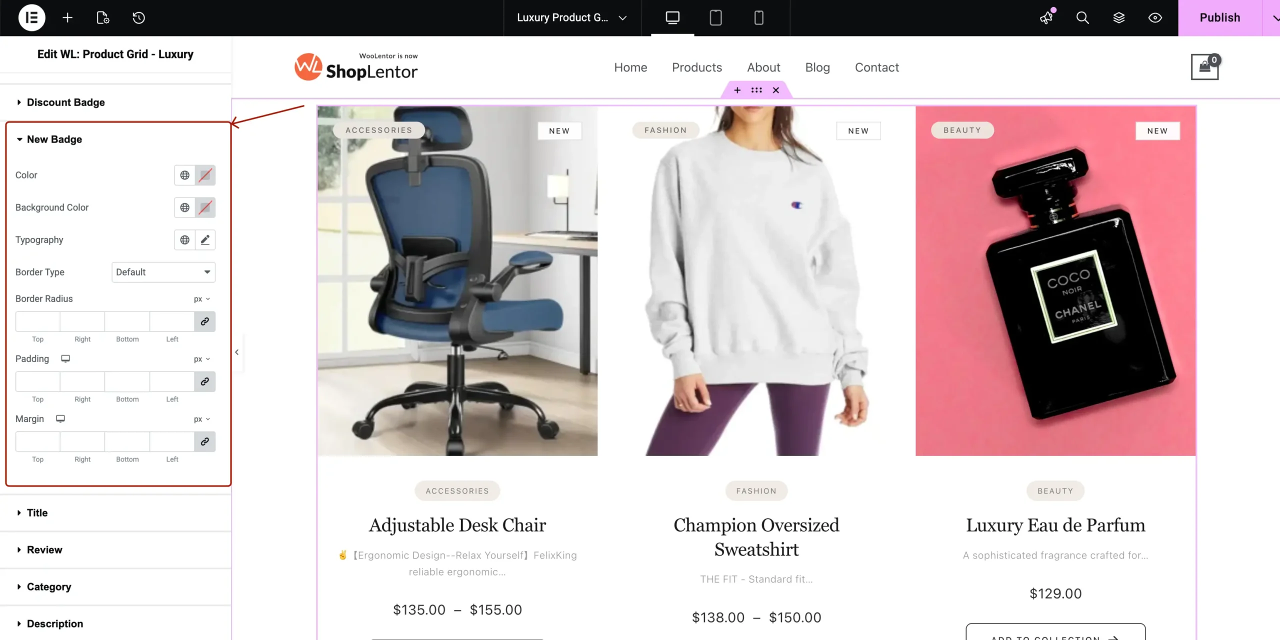
4.8 New Badge
Customize the NEW product badge.
Options:
- Text Color
- Background Color
- Typography
- Padding
- Border Radius
4.9 Title
Product title typography.
Options:
- Color
- Hover Color
- Typography
- Spacing

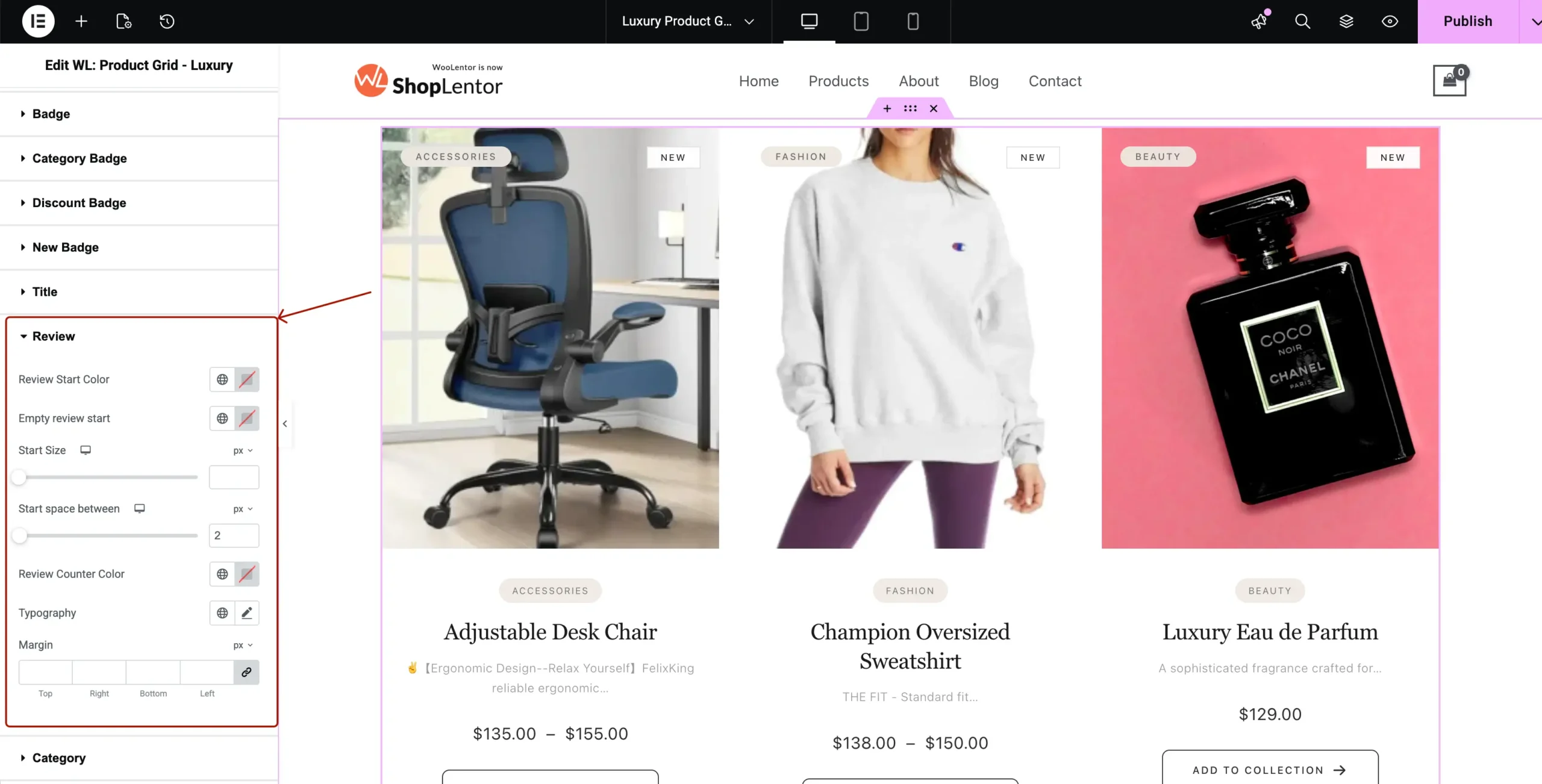
4.10 Review
Rating stars styling.
Options:
- Star Color
- Empty Star Color
- Typography
- Star Size
- Spacing
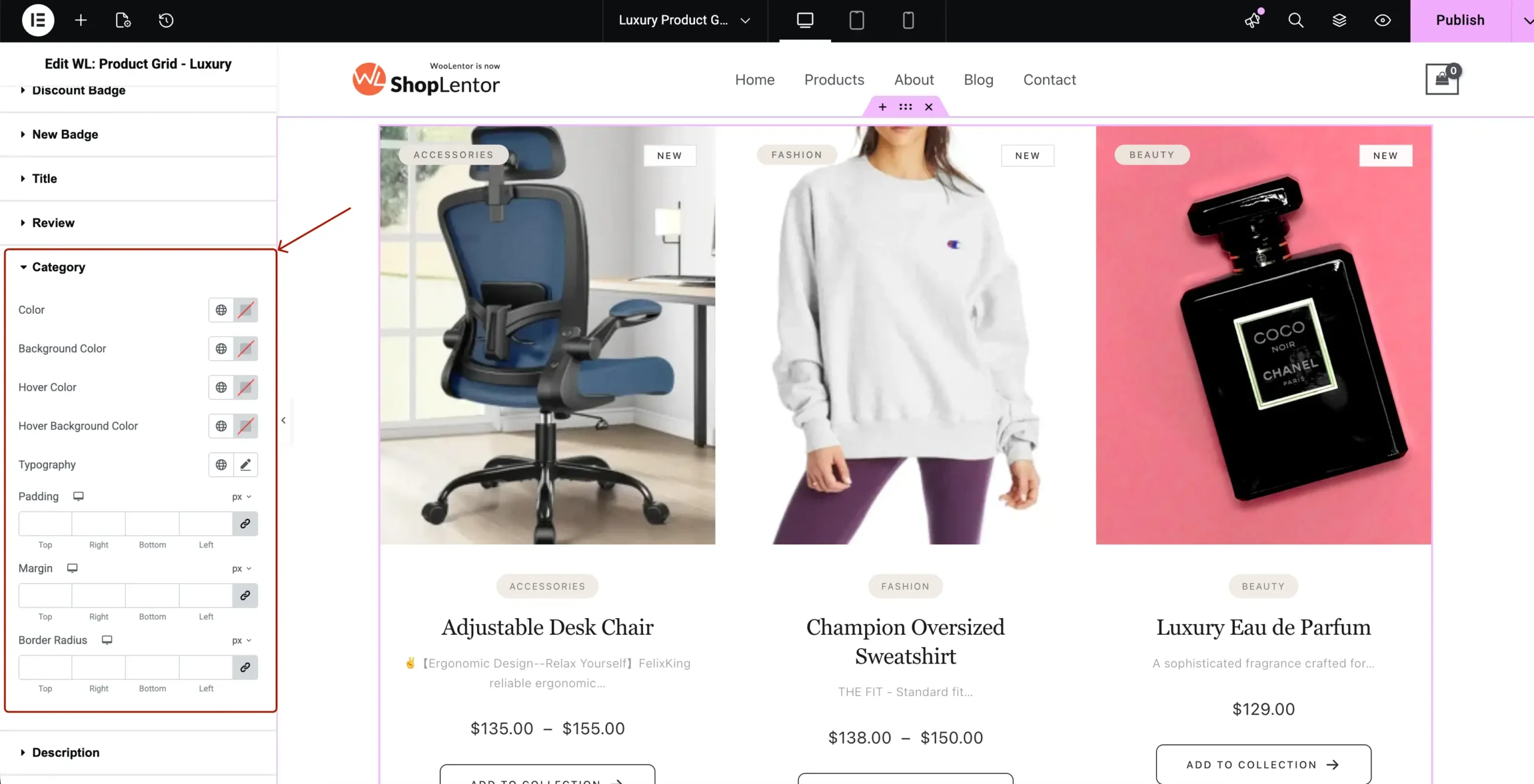
4.11 Category (Text)
This is different from Category Badge. This is the text category below the image.
Options:
- Text Color
- Background Color
- Hover Colors
- Typography
- Padding
- Margin
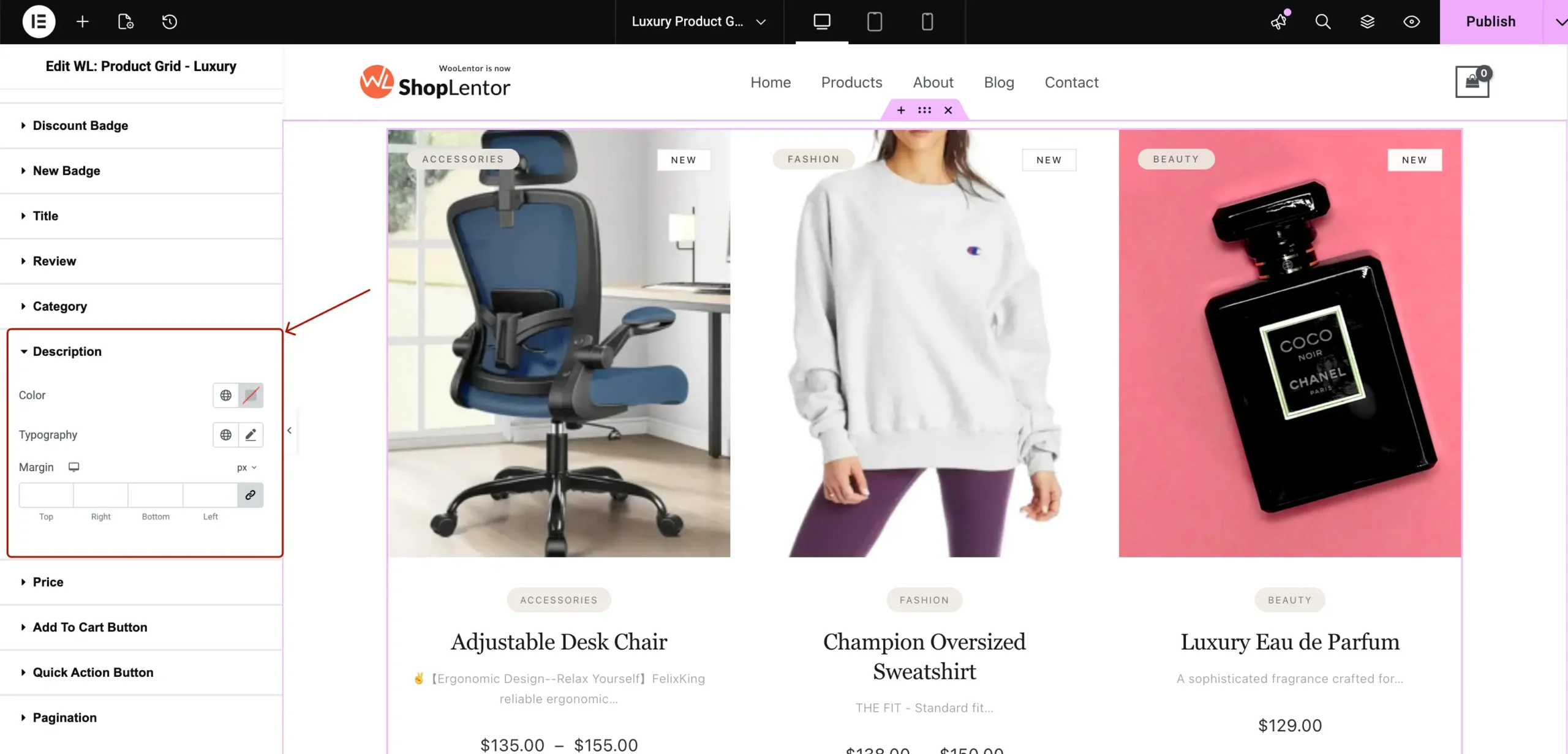
4.12 Description
Styles short description.
Options:
- Text Color
- Typography
- Spacing
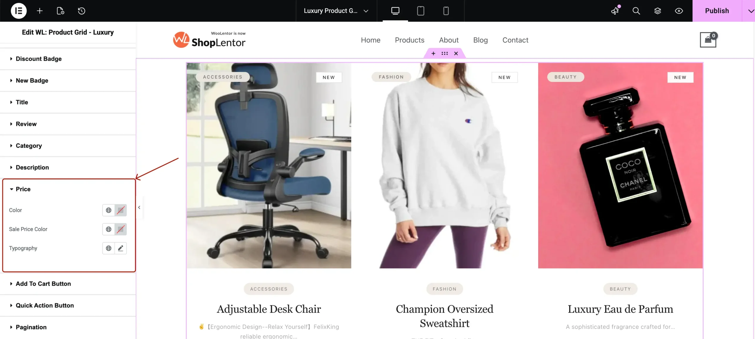
4.13 Price
Controls Regular + Sale pricing.
Options:
- Regular Price Color
- Sale Price Color
- Typography
- Spacing
4.14 Add To Cart Button
Options include:
- Normal + Hover Text Color
- Background Color
- Border Type
- Border Radius
- Typography
- Icon Size
- Padding

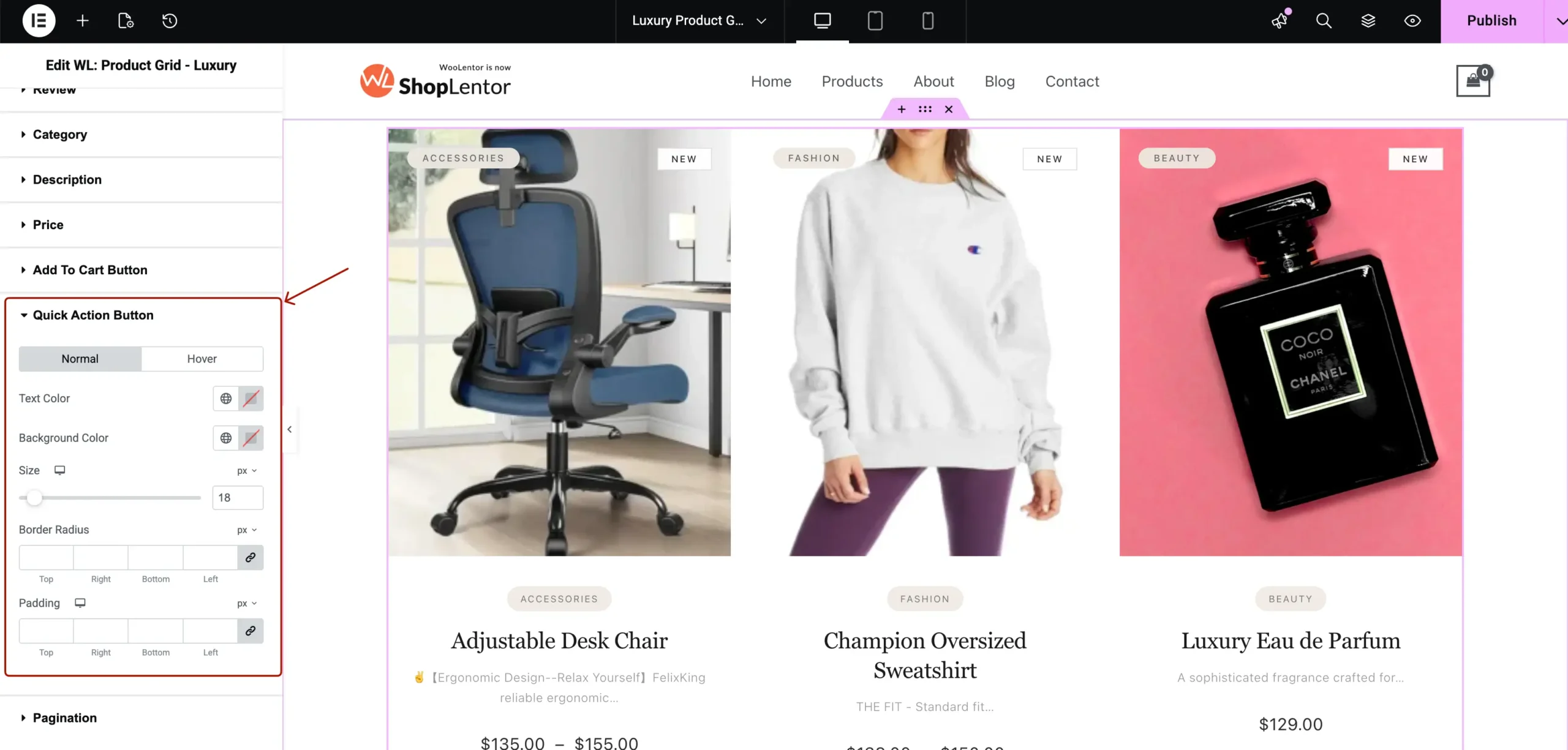
4.15 Quick Action Button
Styles WishList, Compare, QuickView hover buttons.
Options:
- Icon Color
- Button Background
- Hover Background
- Border Radius
- Padding
4.16 Pagination
The visual style of the pagination area.
Options:
- Text Color
- Background Color
- Padding
- Border Type
- Typography

5. Tips for Best Visual Results
- Use consistent badge colors
- Maintain 40–60px spacing for premium look
- Choose correct aspect ratio based on images
- Enable hover animations for luxury feel
- Avoid too many badges on each product
Conclusion
The Elementor WooCommerce Luxury Product Grid widget provides one of the most elegant, customizable, and conversion-friendly product layouts available for WooCommerce.
With full control over layout, badges, quick actions, advanced styling, and pagination — you can create a premium product showcase that matches modern high-end ecommerce design trends.