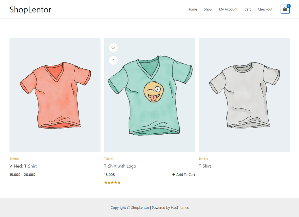
It’s easy to showcase Product Grid. The “Product Grid” creates your own customized layout to display your products from several different options available in this Block. This Block is designed to be used on the Pages Template.
The “Product Grid” Block is a new way to organize your product catalog. It is perfect for eCommerce sites, product landing pages, or any other type of site that displays products in a visually appealing and professional manner.
Steps of adding Product Grid Block
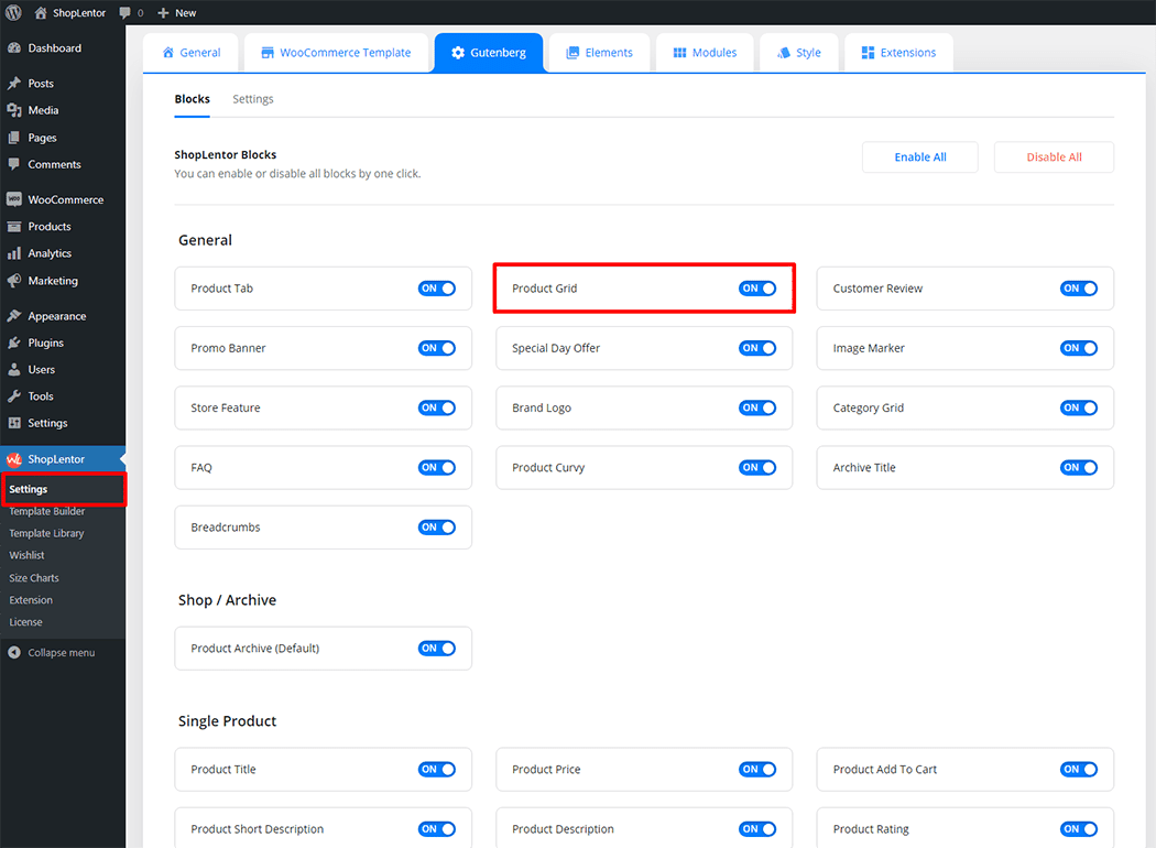
Go to WordPress Dashboard > WooLentor > Settings > Gutenberg. From the list of Gutenberg, turn ON the “Product Grid” Block.
- You need to use the “WL: Product Grid” Block to view your Product Grid on the Page.
- To add a WL: Product Grid, Drag and drop the “WL: Product Grid” Block onto the Page.
Step 1: How to Enable Product Grid Block?
Go to Dashboard > WooLentor > Settings > Gutenberg. From the list of Gutenberg, turn ON the Product Grid Block.
Step 2: How to use the Product Grid Block?
If you want to leverage the Product Grid feature on your WooCommerce store, you will need to use a Block named “WL: Product Grid“. To do so, simply search for the Block in the Gutenberg Block panel, and use it on the corresponding template that you have created for the Page.
To add the Product Grid Block, search by “Product Grid” and use the Block that has the “WL Badge”.
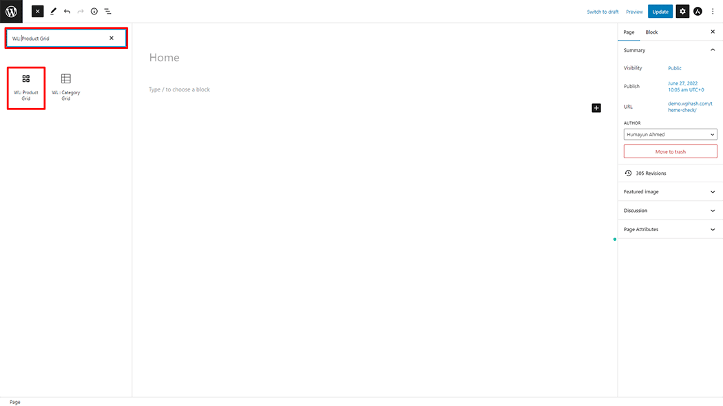
Drag and drop the WooLentor WL: Product Grid Block onto the Page.
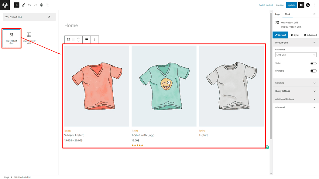
Step 3: How to customize the Product Grid Block?
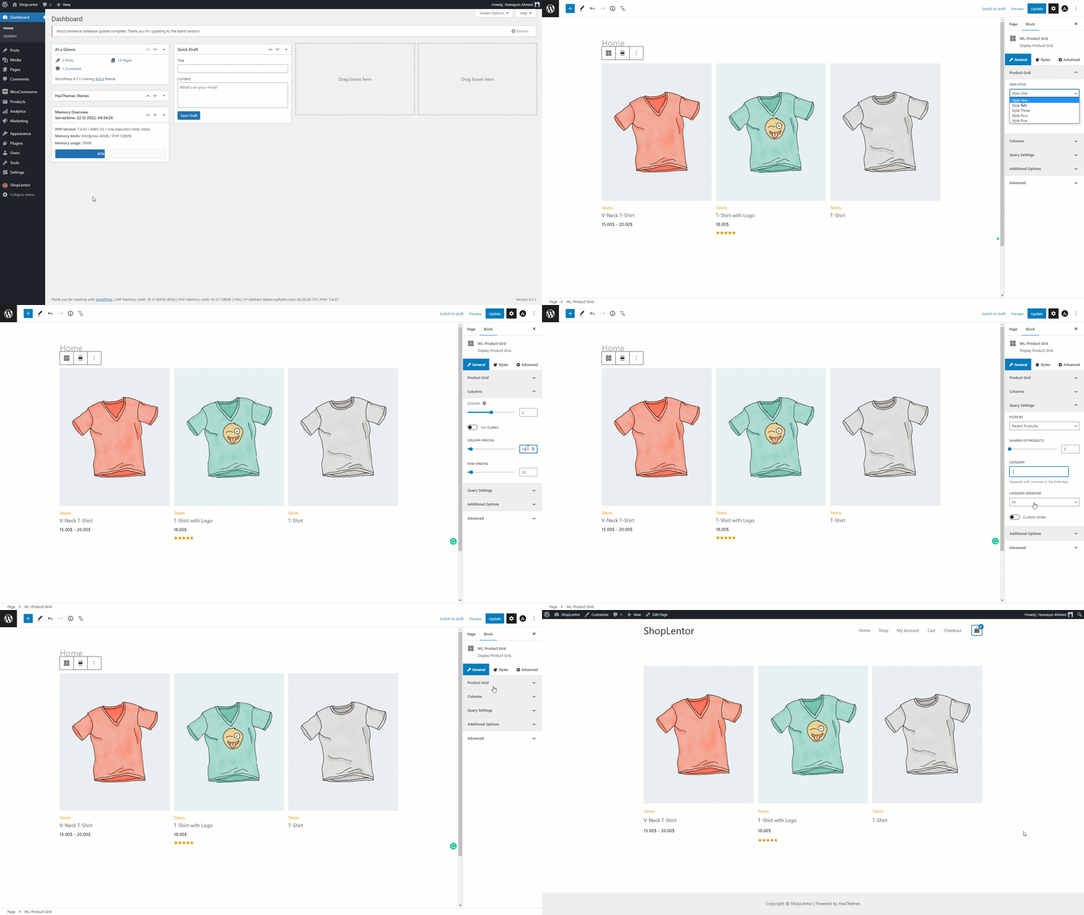
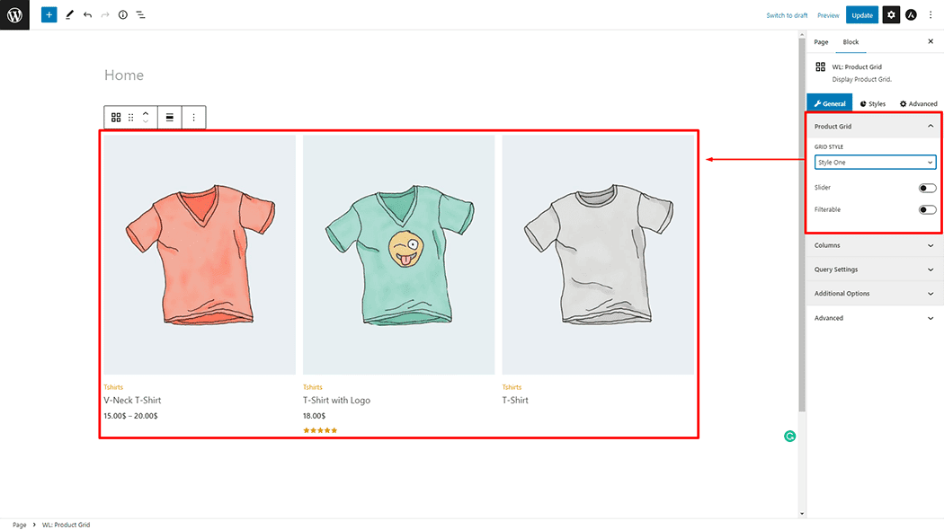
Review: You can set different layout Grid Styles, Slider, and Filterable of the Product Grid Item.
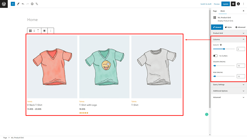
Column: You can change the Column, No Gutters, Column Spacing, and Row Spacing of the Product Grid Item.
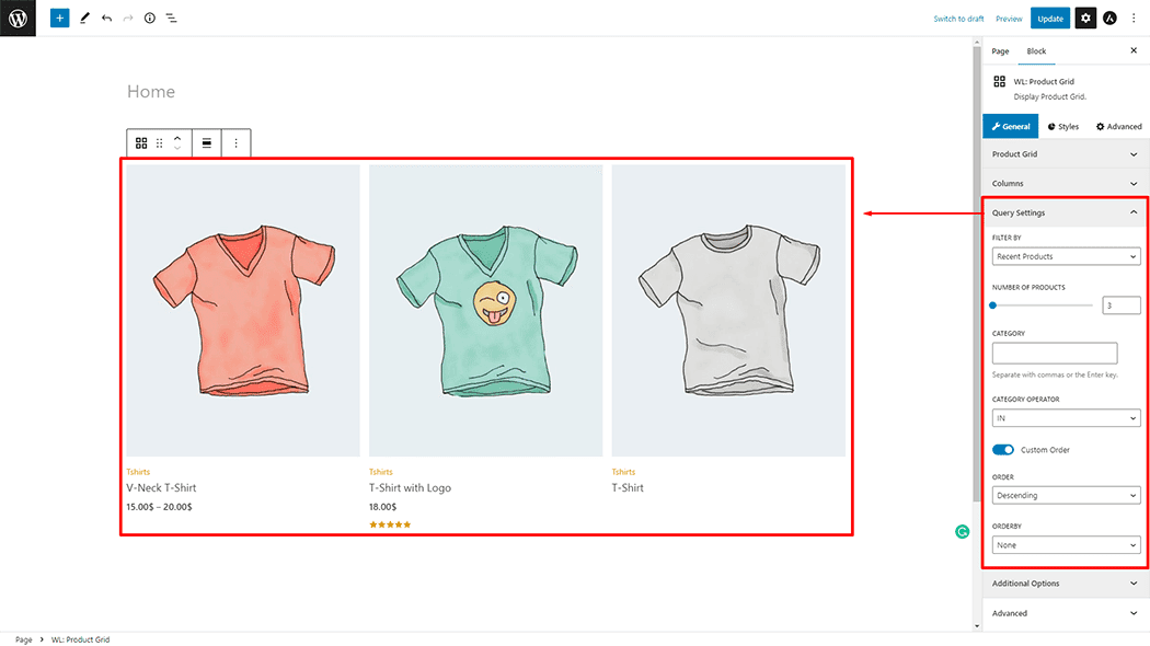
Query Settings: You can set Filter By, Number of Product, Category, Category Operator, Custom Order ( yes or no ), Order, and Orderby of the Product Grid Item.
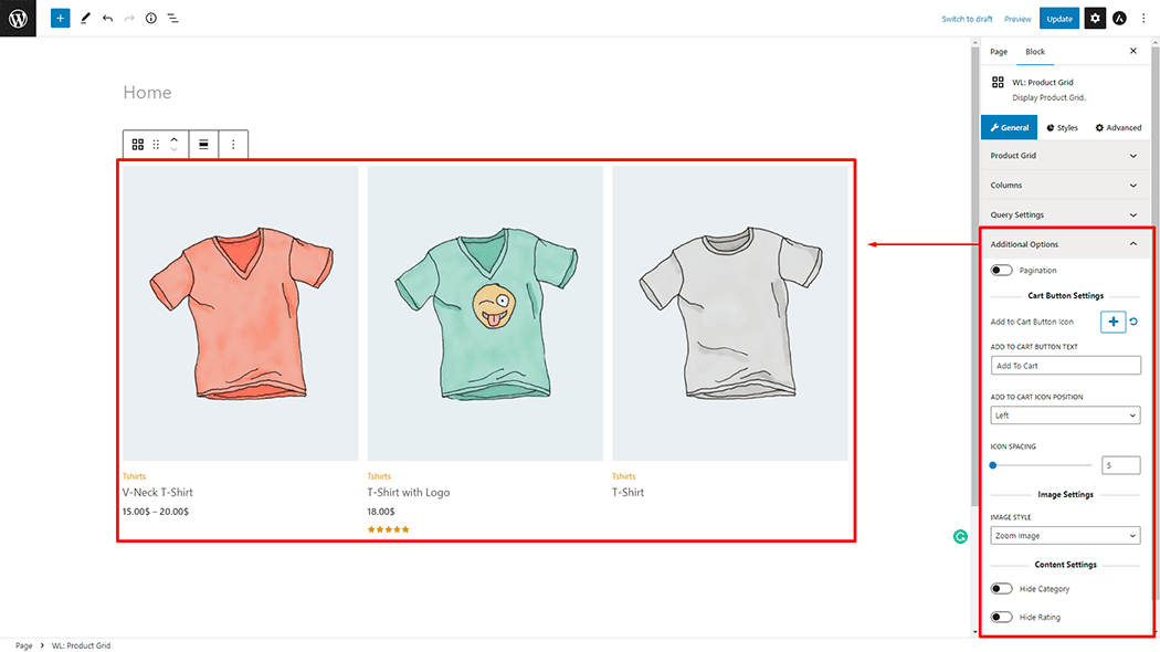
Query Settings: You can set Pagination, Add to Cart Button Icon, Add to Cart Button Text, Add to Cart Icon Position( Left or Right ), Icon Spacing, Image Style, Hide Category, and Hide Rating of the Product Grid Item.
How to customize the Product Grid style
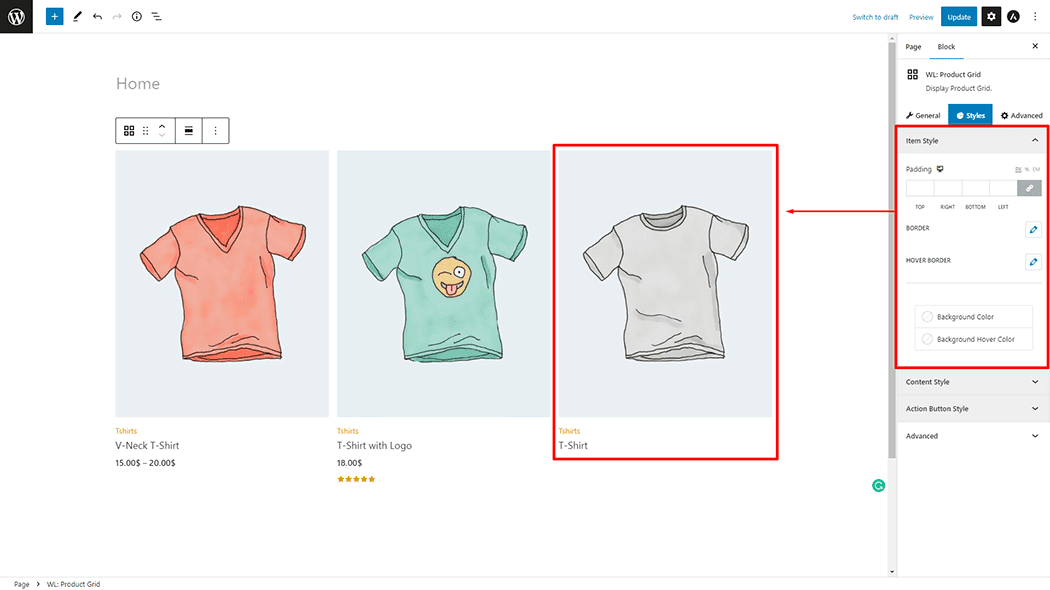
Item Style: You can change the Padding, Border, Hover Border, Background Color, and Background Hover Color, style of the Product Grid as needed.
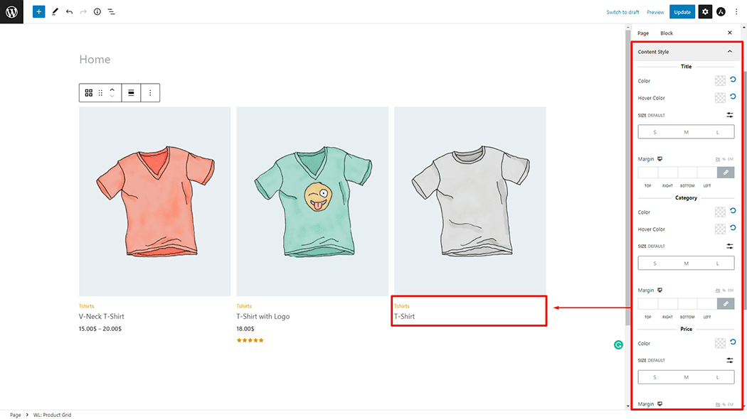
Content Style: You can change the Title (Color, hover Color, Size, and Margin), Category (Color, hover Color, Size, and Margin), Price (Color, Size, and Margin), and Rating(Color and Margin) style of the Product Grid as needed.
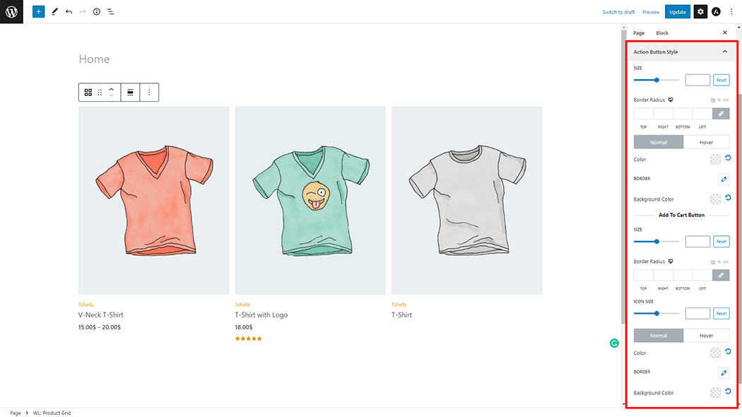
Action Button Style: You can change the Size, Border Radius, Color, Border, and Background Color style of the Product Grid as needed.
Step 4: Now see the preview
Visit the Page to Preview.
