The Filterable Product Grid Widget for Elementor allows you to display WooCommerce products in a visually organized grid with category-based filtering. This widget enables customers to browse products by category directly within the same section without navigating to different pages.
It is ideal for homepage product sections, product landing pages, promotional areas, and category showcases. With flexible query controls and powerful styling options, you can create a modern and interactive product grid that improves the shopping experience.
How to Enable the Filterable Product Grid Widget
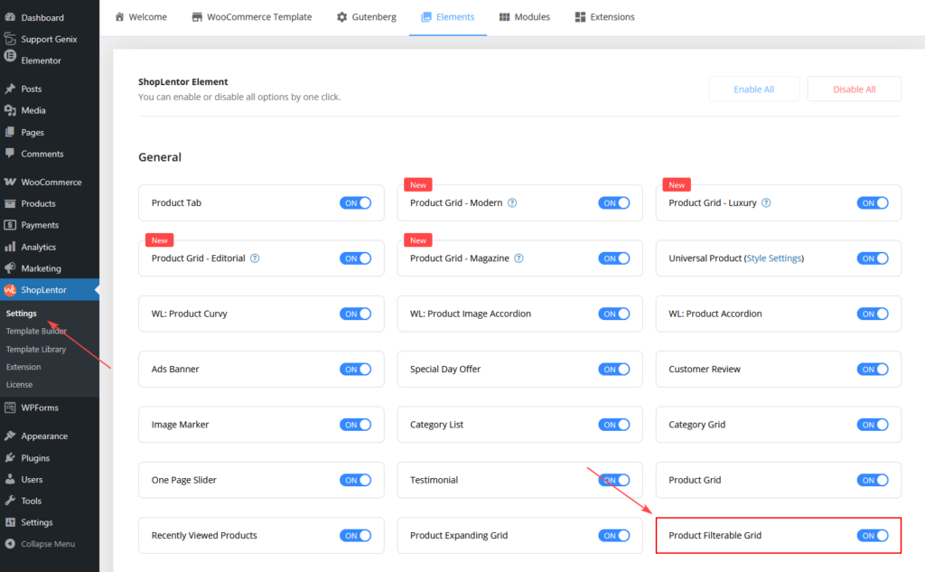
Before using the widget in Elementor, you need to enable it in the ShopLentor settings.
Step 1: Enable the Widget
- Go to WordPress Dashboard
- Navigate to ShopLentor → Elements
- Locate Filterable Product Grid
- Toggle the widget ON
- Click Save Settings
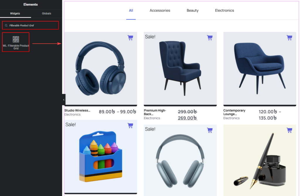
How to Add the Filterable Product Grid Widget
Once enabled, you can add the widget inside Elementor.
Step 2: Add the Widget in Elementor
- Open the page using Elementor
- Search for Filterable Product Grid
- Drag and drop the widget into your page section
- Configure the settings from the Content and Style tabs
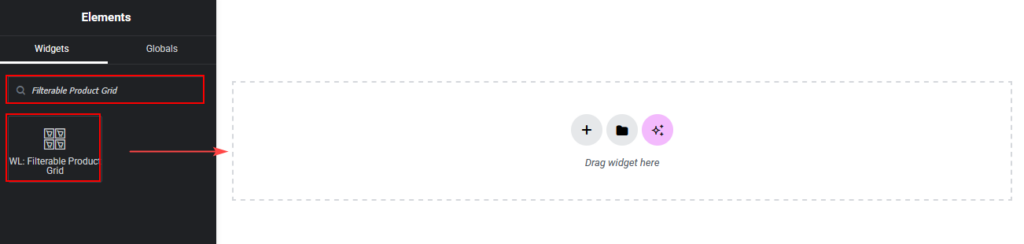
Drag and drop the ShopLentor WL: Filterable Product Grid Widget onto the Page.
Widget Settings Overview
The widget settings are divided into two main sections:
- Content Tab – Controls product queries and filtering behavior
- Style Tab – Controls the visual appearance of the grid and menu
Content Tab Settings
The Content Tab allows you to control which products appear in the grid and how users interact with the filter menu.
Query Settings
This section determines which WooCommerce products are displayed.
Available options include:
- Filter By (Recent Products, Featured Products, Best Selling Products, Sale Products, Top Rated Products, Random Products, Show By ID, Add ID Manually
- Product Limit.
- Product Categories.
- Allows you to display products from specific WooCommerce categories.
- To select categories:
- Click the + icon
- Choose the desired product categories
- Products will be filtered based on the selected categories
- Custom Order
- Enable this option to control how products are sorted.
- When enabled, additional sorting settings appear.
- Order By
- Choose the method used to sort products.
- Examples include:
- Date
- Title
- Product ID
- Menu Order
- Random
- Order:
- Select the order direction:
- Ascending
- Descending
- Select the order direction:

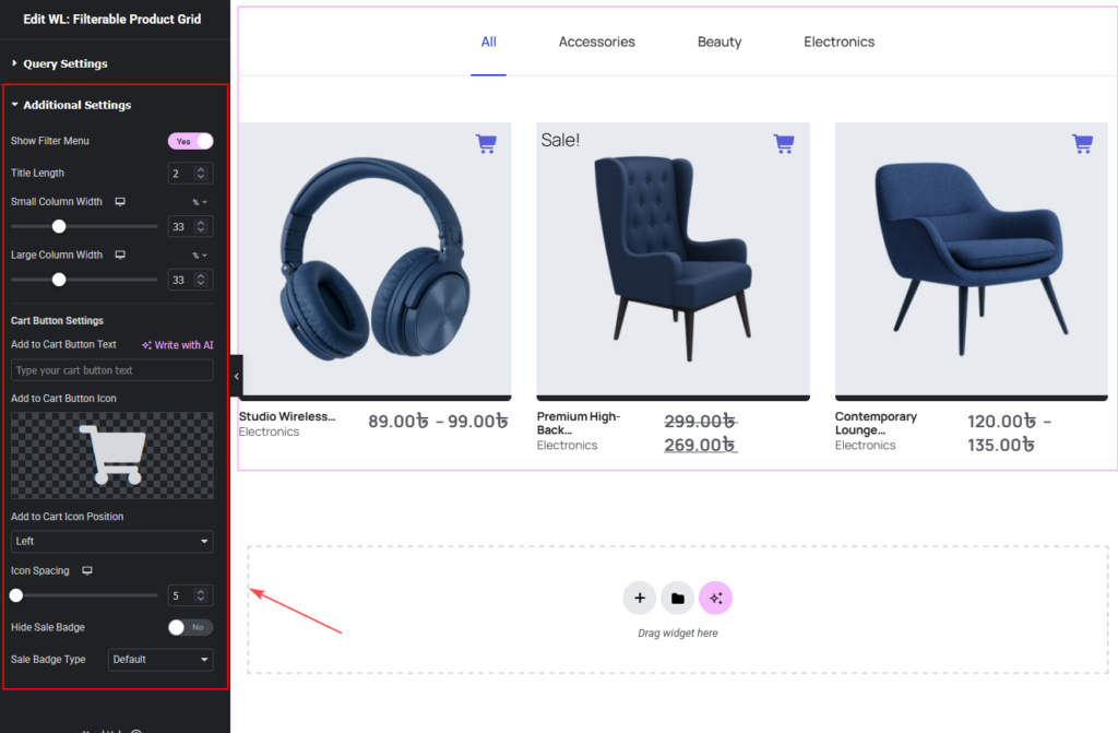
Additional Settings
These settings control the layout and filtering behavior of the grid.
- Show Filter Menu
- Enable this option to display a category filter menu above the product grid.
- Customers can click categories to instantly filter products without reloading the page.
- Title Length
- Controls how many words from the product title will be displayed.
- Example: If set to 2, only the first two words of the product title will appear.
- Small Column Width
- Adjust the width of smaller product items in the grid.
- Use the slider to set the width as a percentage.
- Large Column Width
- Adjust the width of larger product items within the grid layout.
- This option helps create a dynamic product grid layout.
- Cart Button Settings
- Customize the Add to Cart button displayed on each product.
- Add to Cart Button Text
- Enter custom text for the cart button.
- Examples:
- Add to Cart
- Buy Now
- Shop Now
- Add to Cart Button Icon
- Select an icon to display alongside the button text.
- Add to Cart Icon Position
- Choose the icon position relative to the text.
- Options include:
- Left
- Right
- Icon Spacing
- Adjust the spacing between the icon and button text.
- Hide Sale Badge
- Enable this option to hide the sale badge displayed on discounted products.
- Sale Badge Type
- Choose the visual style of the sale badge.
Style Tab Settings
The Style Tab allows you to customize the appearance of the filter menu, product cards, product details, and buttons.
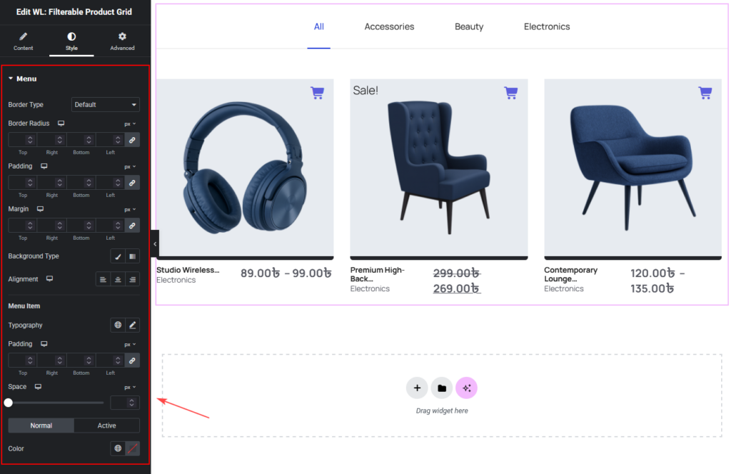
Menu Style
This section controls the appearance and layout of the product filter menu displayed above the product grid. The filter menu helps users quickly switch between product categories.
- Border Type
- Select the border style applied to the filter menu container.
- Available options include:
- Solid – Displays a solid border around the menu.
- Dashed – Displays a dashed border style.
- None – Removes the border completely.
- Border Width
- Adjust the thickness of the border around the filter menu.
Higher values create a more visible border.
- Adjust the thickness of the border around the filter menu.
- Border Color
- Choose the color of the border surrounding the filter menu.
- This helps match the menu style with your website design.
- Border Radius
- Adjust the roundness of the filter menu corners.
- Higher values create more rounded corners, giving the menu a softer appearance.
- Padding
- Controls the internal spacing inside the filter menu container.
- Increasing the padding creates more space between the menu content and its border.
- Margin
- Controls the external spacing around the filter menu.
- This helps separate the menu from other page elements.
- Background Type
- Choose the background style applied to the filter menu container.
- Available options include:
- Solid Color – Apply a single background color.
- Gradient – Apply a gradient background effect.
- Alignment
- Control how the filter menu is aligned within the widget.
- Available options include:
- Left – Align the menu to the left side
- Center – Center the filter menu
- Right – Align the menu to the right side
- Menu Item
- Customize the appearance of individual filter menu items.
- Available styling options include:
- Typography
- Padding
- Spacing
- Color (Normal and Active states)
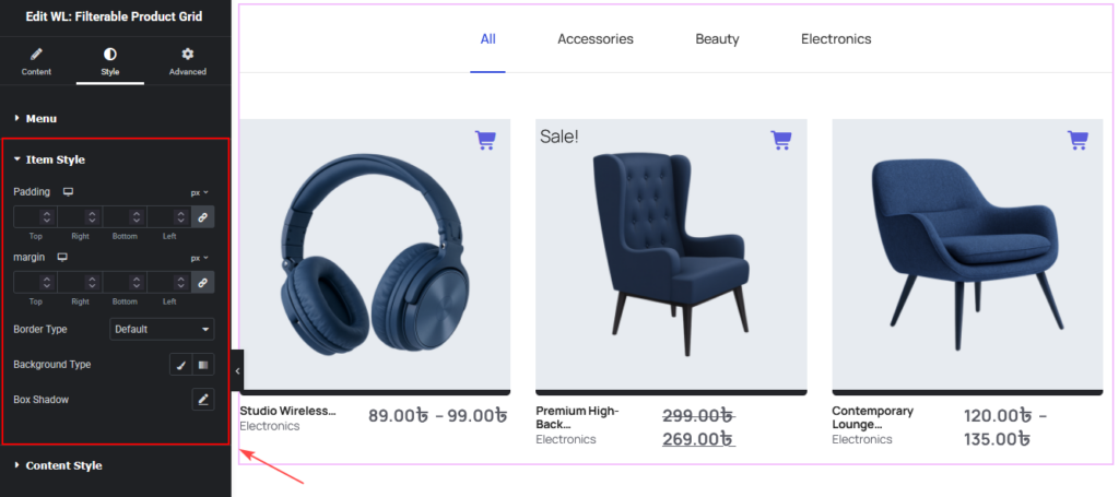
Item Style
This section controls the layout and design of each product card.
Options include:
- Padding
- Margin
- Border Type
- Background
- Box Shadow
Content Style
Customize the styling of product elements within the grid.
Product Image Style
Control the appearance of product images.
Options include:
- Padding
- Margin
- Border Type
- Border Radius
- Background
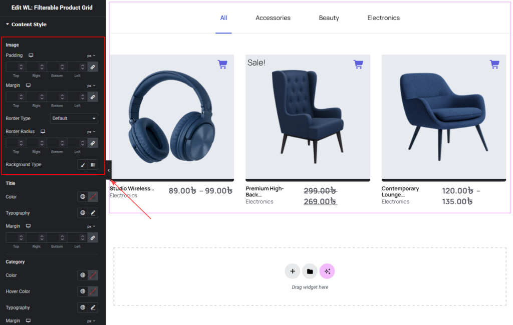
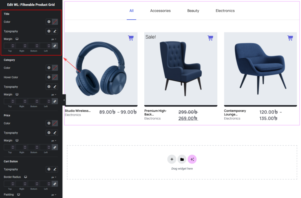
Product Title Style
Customize the product title.
Options include:
- Color
- Typography
- Margin
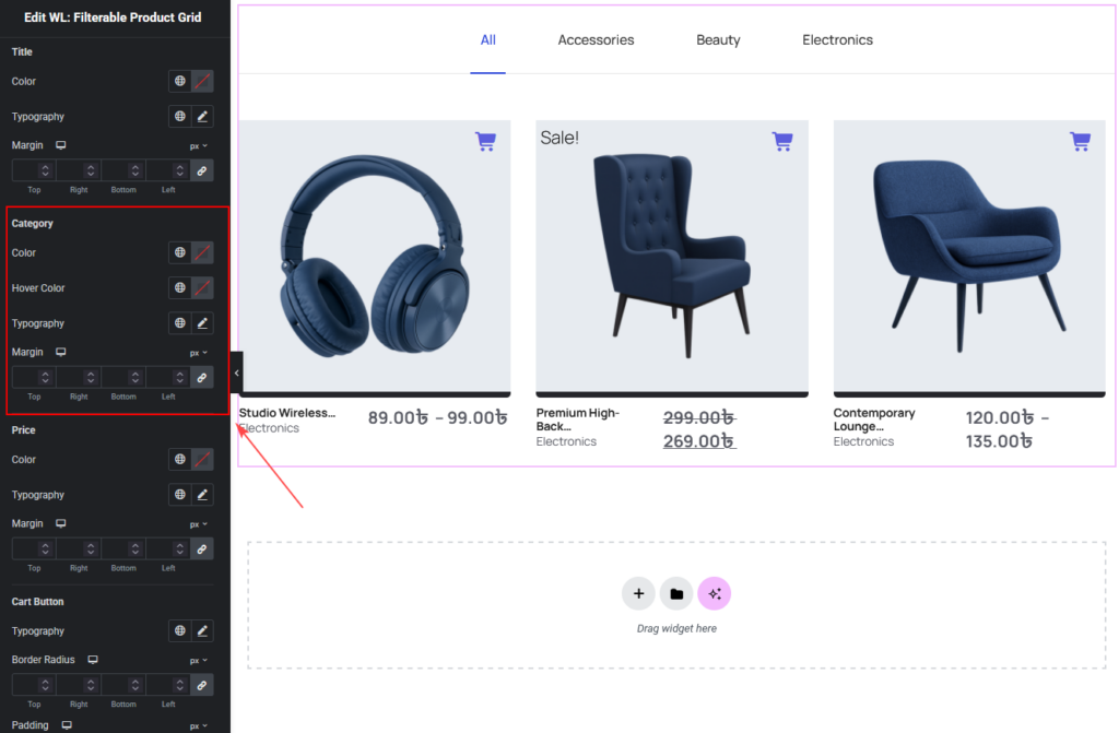
Product Category Style
Control the appearance of the product category label.
Options include:
- Color
- Hover Color
- Typography
- Margin
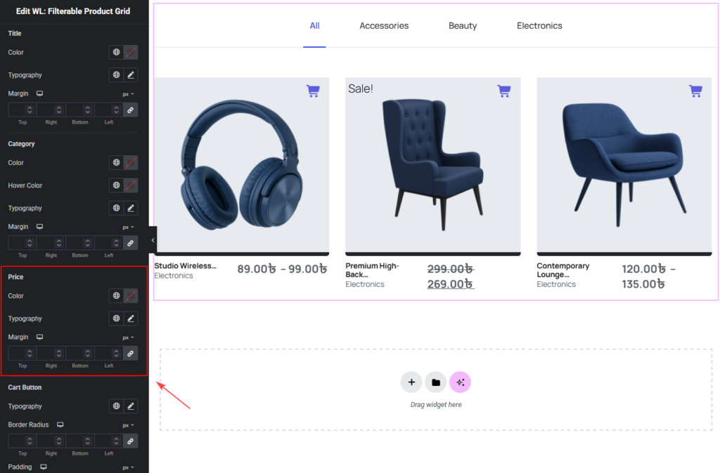
Product Price Style
Customize the product price display.
Options include:
- Color
- Typography
- Margin
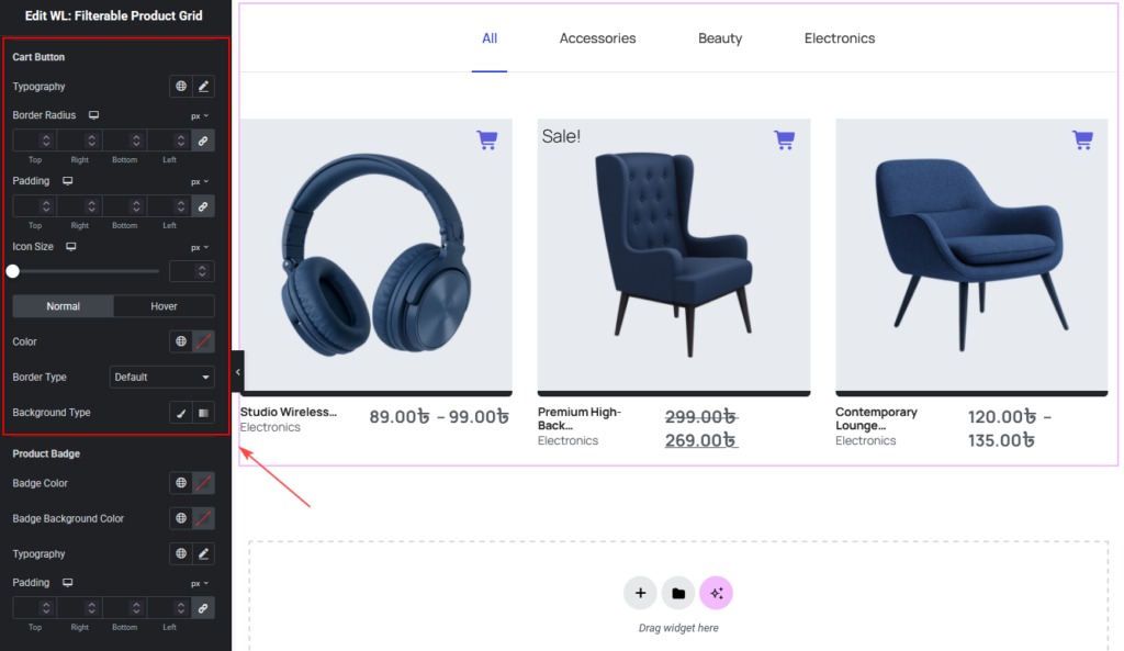
Cart Button Style
Customize the Add to Cart button design.
Options include:
- Typography
- Border Radius
- Padding
- Icon Size
- Color (Normal and Hover)
- Border Type
- Background
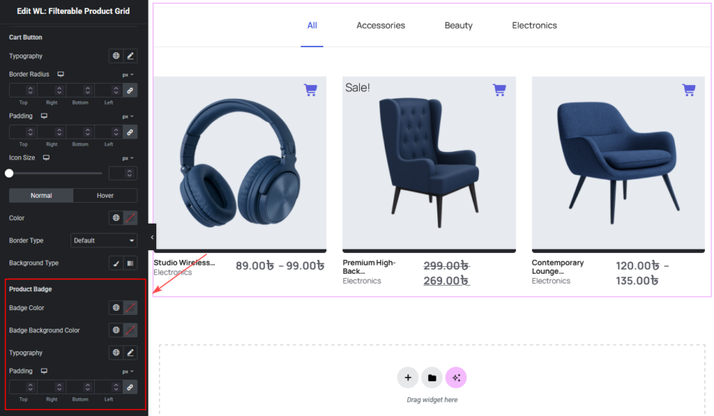
Product Badge Style
Customize badges such as the Sale badge.
Options include:
- Badge Color
- Badge Background Color
- Typography
- Padding
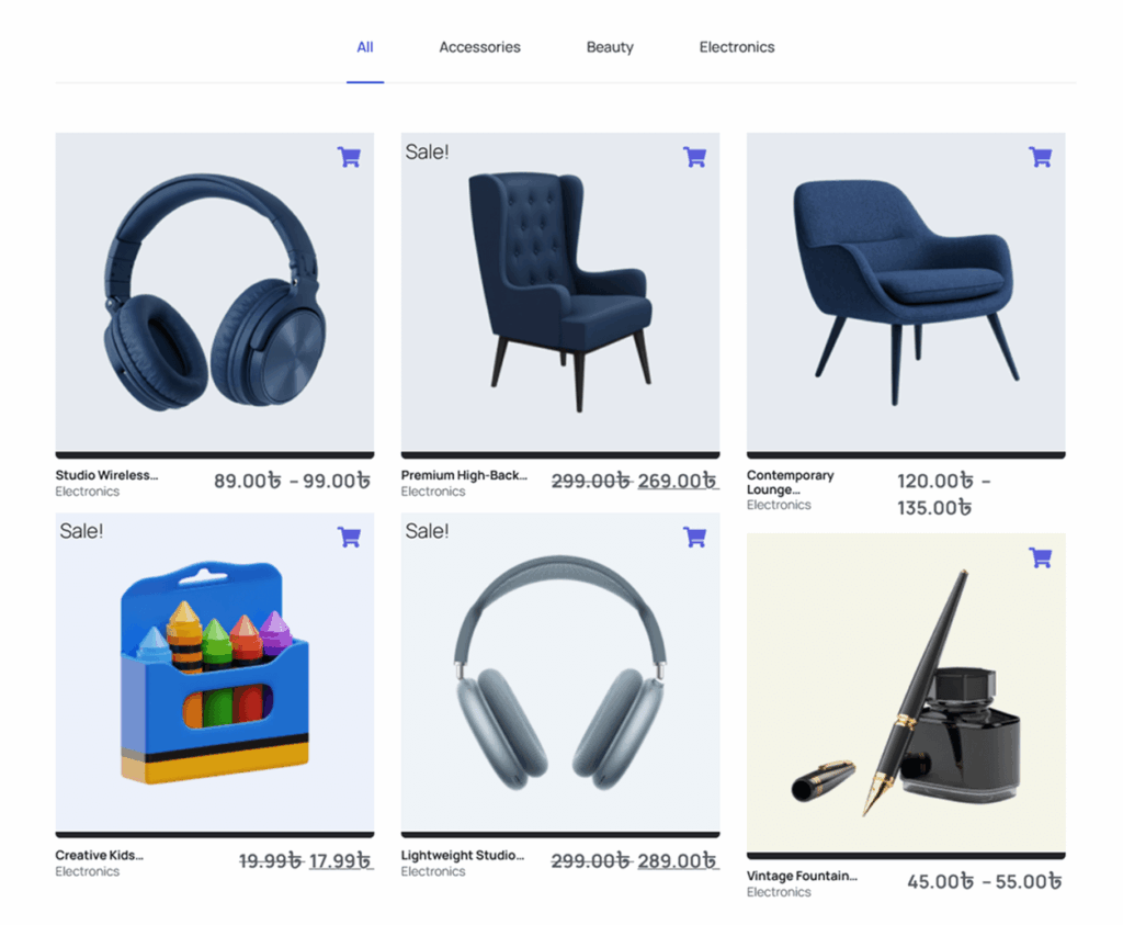
Final Result
After configuring the Filterable Product Grid Widget, your WooCommerce products will appear in a clean, filterable product grid that allows customers to browse products by category without navigating away from the page.
This improves:
- Product discovery
- User navigation
- Shopping experience
- Store conversions