

The Product Showcase – 2026 widget for Elementor lets you create a curated WooCommerce product section without custom code. Display the latest products, featured items, sale products, best sellers, and more in a grid or carousel. You can add a section introduction, optional product tabs, product-card details, pagination, and device-specific layouts.
Use this widget on a homepage, shop landing page, campaign page, or product-category page when you want customers to discover a focused group of products before browsing the full catalogue.
Why use the Product Showcase widget?
- Feature a purposeful product selection instead of an unfiltered shop grid.
- Show WooCommerce product sources such as latest, featured, sale, best-selling, top-rated, and hand-picked products.
- Match the section to a modern, editorial, luxury, or magazine-inspired store design.
- Add tabs when shoppers need an easy way to switch between product collections.
- Choose pagination for a browsable grid or a slider for a compact, interactive carousel.
- Control useful product-card details, including badges, ratings, price, add-to-cart, quick view, stock status, and colour swatches.
- Set layouts that remain practical on desktop, tablet, and mobile.
Before you begin
Make sure WooCommerce, Elementor, and ShopLentor are installed and active. Add the products, images, categories, tags, prices, stock settings, and any product attributes you plan to use before building the section.
For the best result, choose products with clear featured images, accurate prices, useful product titles, and active product pages. If you plan to show colour swatches, configure the relevant variable-product attribute first.
1. Enable Product Showcase – 2026
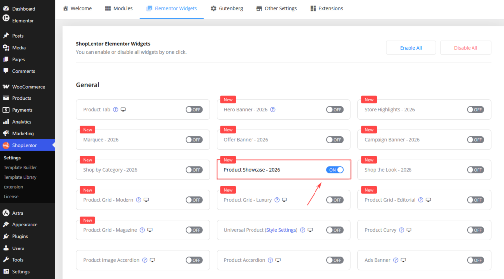
- In the WordPress dashboard, go to ShopLentor → Settings → Elementor Widgets.
- Find Product Showcase – 2026.
- Enable the widget and save your settings.
2. Add the widget in Elementor
- Open the page or template where you want the product section.
- Select Edit with Elementor.
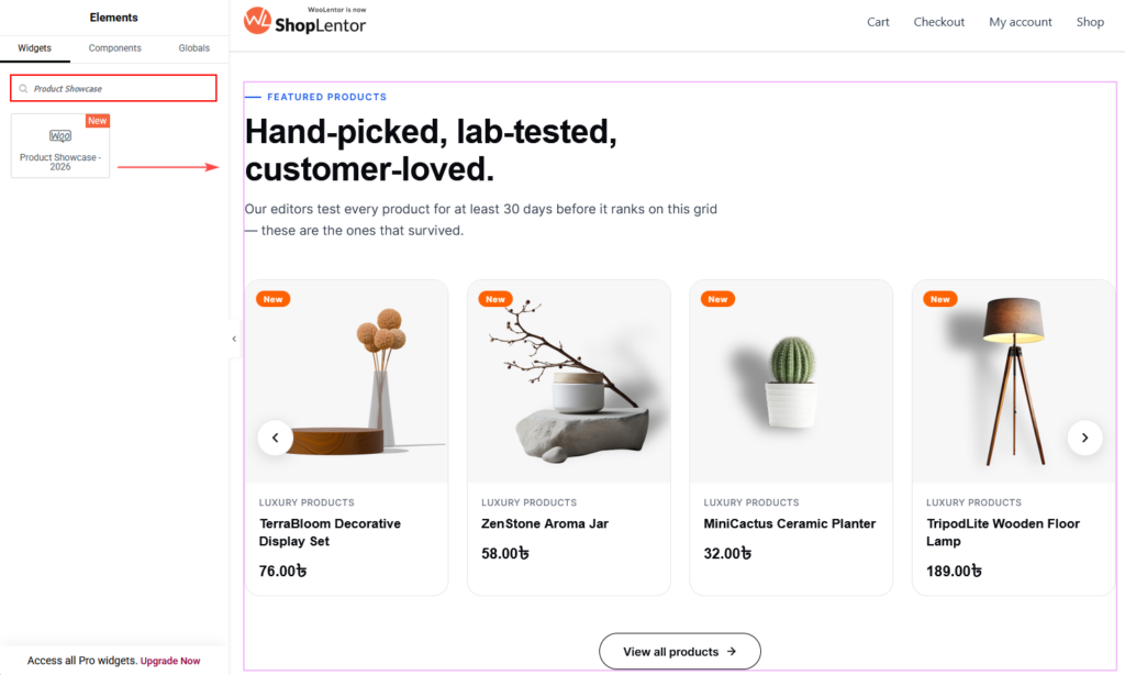
- Search for Product Showcase – 2026 in the Elements panel.
- Drag the widget into a section or container.
- Open the Content tab to configure it.
Place it after a homepage hero, below a campaign banner, or between complementary content sections. Give the selection a clear purpose, such as new arrivals, staff picks, best sellers, or seasonal gifts. Avoid placing several nearly identical product grids next to each other.
3. Choose a style pack and variant
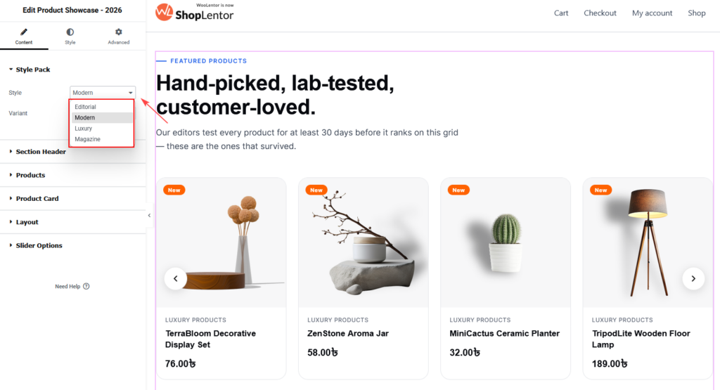
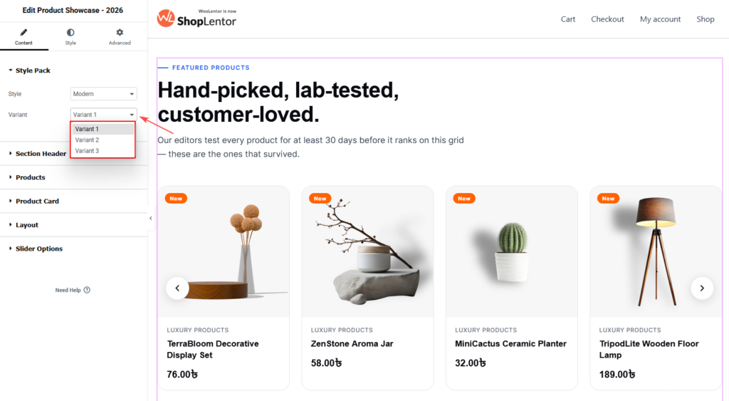
Open Content → Style Pack, then select a Style and Variant.
| Style pack | Best for |
|---|---|
| Modern | Clean, contemporary shops, electronics, and general retail. |
| Editorial | Fashion, lifestyle, and story-led product collections. |
| Luxury | Premium fashion, beauty, jewellery, and refined catalogues. |
| Magazine | Dense, high-contrast product presentations and editorial commerce. |
Each style pack includes Variant 1, Variant 2, and Variant 3. Changing a variant changes the product-section composition while retaining its content settings. Some settings may be available only when the selected design uses them, so choose the intended style and variant before detailed styling.
Note: Variant availability can depend on your ShopLentor plan. If Elementor shows an upgrade notice, choose an available variant or upgrade before using that design on a live page.
4. Add a useful section header
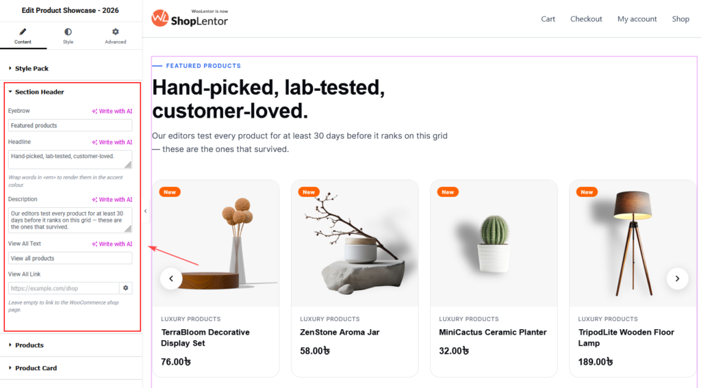
Open Content → Section Header to introduce the product selection.
| Setting | What it does | Recommended use |
|---|---|---|
| Eyebrow | Shows a short label above the heading. | Use concise context, such as “Featured products” or “Just in”. |
| Headline | Shows the main section heading. | Describe the selection’s value, not merely the widget name. |
| Description | Adds supporting copy below the heading. | Use one or two short, helpful sentences. |
| View All Text | Sets the text for the section-level action. | Use a clear label such as “View all products”. |
| View All Link | Sets the View All destination. | Link to the shop page, a relevant category archive, or a curated collection. |
You can wrap a short phrase in <em> in the headline to render it in the configured accent colour. For example: Discover our <em>new essentials</em>. Use emphasis sparingly so the heading remains easy to scan.
Write product-section copy for people and search engines
Use a natural heading that reflects what visitors will find. The description should provide context, not repeat the same keyword.
| Less effective | Better |
|---|---|
| Featured products | New arrivals worth knowing about |
| Shop products | Everyday essentials, freshly restocked |
| Best sellers | Customer favourites for every routine |
Use the page’s established heading hierarchy. In most cases, this widget headline should be a section heading beneath the page’s single H1, rather than another main page title.
5. Choose the products to display
Open Content → Products to configure the product query.
| Setting | What it does | Recommended use |
|---|---|---|
| Source | Selects the product collection. Available sources include Latest Products, Featured, Best Selling, Top Rated, On Sale, Recently Viewed, All Products, Hand-picked, and Current Page Query. | Match the source to the visitor’s intent and the page’s purpose. |
| Categories | Limits the query to one or more WooCommerce product categories. | Leave empty to include every category; use a focused selection for a campaign or category-led section. |
| Tags | Limits the query to one or more product tags. | Use only when tags are maintained consistently. |
| Products To Show | Sets how many matched products to display. | Start with 4–8 in a standard grid and review the section on mobile. |
| Order By | Defines the product sorting field, such as date. | Use a predictable, relevant order. |
| Order | Sets ascending or descending sorting. | New products commonly use date in descending order. |
| Exclude Products | Removes selected products from this widget instance. | Exclude unavailable, duplicate, or unsuitable items without changing their WooCommerce status. |
| Hide Out Of Stock | Removes out-of-stock products from the results. | Enable it for product-discovery sections when unavailable products would frustrate shoppers. |
| Hide Products Without An Image | Removes products without a featured image. | Usually enable it for image-led product cards. |
| Respond To Product Filters | Allows the Product Filter module to narrow this same product grid. | Enable only when the page includes a compatible product filter experience. |
Understand product sources
Choose the source that reflects the promise made in the section header.
| Source | When to use it |
|---|---|
| Latest Products | New-arrival and recently restocked sections. |
| Featured | Products marked as featured in WooCommerce. |
| Best Selling | Social-proof sections built around popular products. |
| Top Rated | Collections where product reviews help customers decide. |
| On Sale | Sale pages, promotional modules, and clearance campaigns. |
| Recently Viewed | Personalised browsing areas where supported by the customer session. |
| All Products | A flexible catalogue selection, usually narrowed by category, tag, or exclusions. |
| Hand-picked | A manually curated set of specific products. |
| Current Page Query | Product archive or search layouts that should follow the products requested by the current page. |
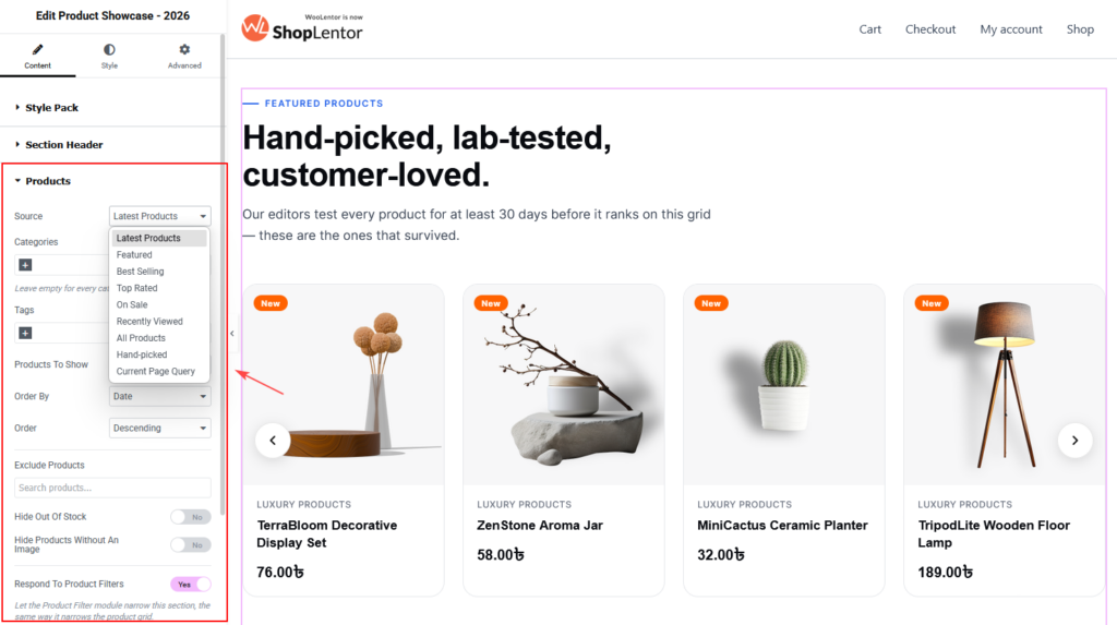
For Hand-picked, select products deliberately and revisit the selection after a product is discontinued. For Current Page Query, use the widget in the relevant WooCommerce archive or search context so it has a query to follow.
Tip: Categories and tags refine the matching products. If a selection seems unexpectedly small, check whether both filters are active and whether the products are assigned to them correctly.
6. Add pagination when visitors need more products
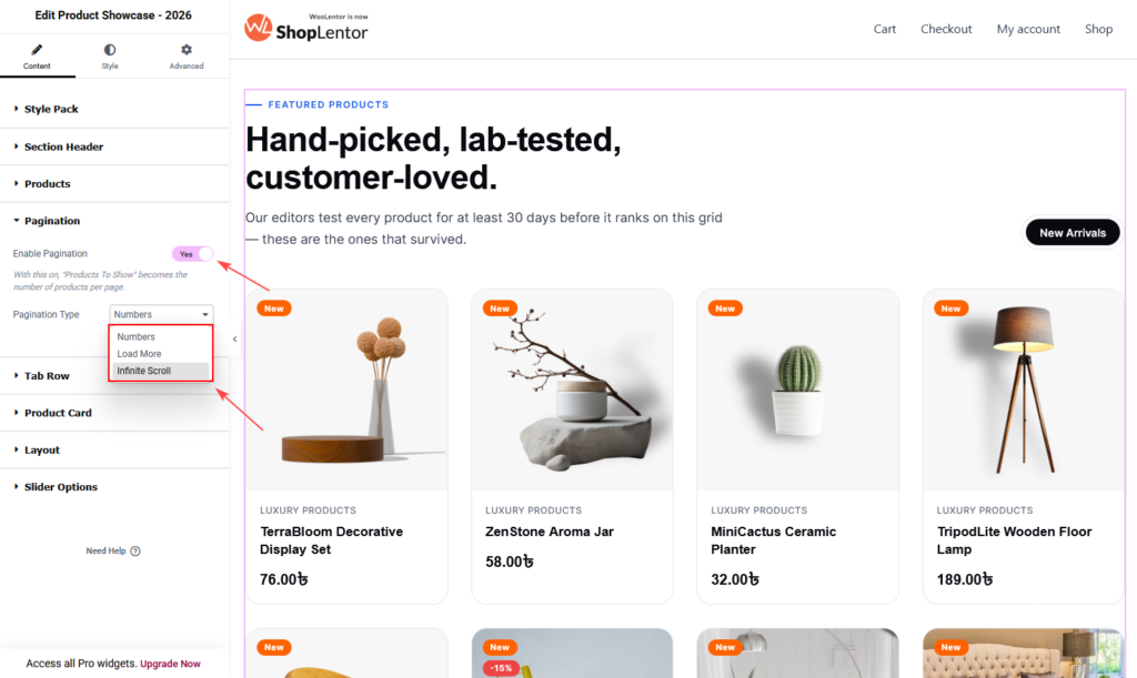
Open Content → Pagination and enable Enable Pagination to split the results into pages.
When pagination is enabled, Products To Show becomes the number of products displayed per page. Select a Pagination Type to choose the available page-navigation presentation, such as numbered pagination.
Use pagination for a product grid that needs to expose more products without making the first page excessively long. Do not enable pagination when the section is intended to be a short, curated teaser leading to the View All link.
7. Create optional product tabs
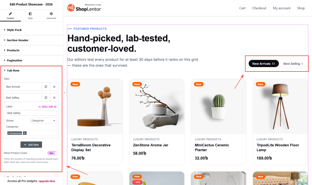
Open Content → Tab Row to add tabs above the product cards. Each tab can show a different product set without requiring visitors to leave the page.
- Select Add Item.
- Enter the tab Label, such as “New Arrivals”.
- Choose what the tab Shows: Everything (the section’s own settings), A product source, Categories, or Tags.
- When you choose A product source, select the relevant Source—for example Latest Products, Featured, Best Selling, Top Rated, On Sale, Recently Viewed, All Products, Hand-picked, or Current Page Query.
- Add other tabs as needed, then arrange them in the order shoppers are most likely to use.
| Tab setting | What it does |
|---|---|
| Label | The visible, clickable tab name. |
| Shows | Defines whether the tab inherits the section query, uses a new product source, or filters by category or tag. |
| Source | Selects the product source when Shows is set to A product source. |
| Show Product Count | Displays the number of matching products beside each tab label. |
Show Product Count performs an additional count query for every tab. Keep it off unless the counts meaningfully help shoppers compare collections. Use short, descriptive tab labels and limit the number of tabs so they do not wrap awkwardly on mobile.
8. Configure product-card content
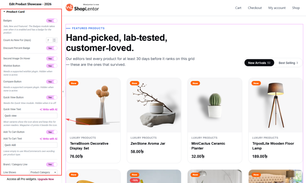
Open Content → Product Card to control the information and actions shown for each product.
| Setting | What it does | Best practice |
|---|---|---|
| Badges | Shows sale, new, and featured badges where product data supports them. This can override an enabled Badges module badge for that product. | Use badges to clarify status, not as decoration on every card. |
| Count As New For (days) | Sets how many days a newly published product is treated as new. | Choose a period that matches how frequently your catalogue changes. |
| Discount Percent Badge | Shows the discount percentage when a product is on sale. | Useful for price-led promotions; verify sale prices are accurate. |
| Second Image On Hover | Reveals a second product image on hover where available. | Use consistent gallery images; remember touch devices do not have hover. |
| Wishlist Button | Shows a wishlist action. | Requires a supported wishlist plugin; it is hidden when none is active. |
| Compare Button | Shows a compare action. | Requires a supported compare plugin; it is hidden when none is active. |
| Quick View Button | Shows an action to preview product details. | Requires the Quick View module; confirm the dialog is usable on mobile. |
| Quick View Text | Sets the Quick View label. | Use a clear, concise label such as “Quick view”. Some variants use the icon alone and retain this text for screen readers. |
| Add To Cart Button | Shows the add-to-cart action. | Keep enabled when a fast purchase path suits the product type. |
| Add To Cart Text | Sets the add-to-cart label. | Leave blank to use WooCommerce’s wording for each product type. |
| Brand / Category Line | Shows a short metadata line. | Use it to help shoppers distinguish product families. |
| Line Shows | Chooses the metadata type, such as Product Category. | Pick the label that is most useful for comparison. |
| Attribute Line | Shows a small product-attribute line below the title. | Products without the attribute are skipped, preventing empty metadata. |
| Attributes To Show | Limits how many attributes are displayed. | Keep the value low—usually one or two—to protect card readability. |
| Tagline | Shows a short italic line from the product’s short description. | Write compact, meaningful short descriptions; the slot collapses if a product has none. |
| Tagline Length (words) | Limits the tagline word count. | Use a short limit so cards stay aligned. |
| Star Rating | Shows WooCommerce product rating. | Enable when products have enough genuine reviews to be helpful. |
| Price | Shows the WooCommerce price. | Keep enabled for standard shopping sections. |
| Stock Line | Shows in-stock information. | Useful when availability is important; it reads WooCommerce’s own stock status. |
| Colour Swatches | Shows colour options from a variable product’s colour attribute. | Use only when product variations and colour attributes are complete. |
| Swatch Attribute | Sets the colour attribute slug, without the pa_ prefix. | Enter color when the WooCommerce attribute is pa_color. |
| Swatches To Show | Limits the visible colour swatches. | Use a small number, such as four, to avoid crowding the card. |
Only enable elements that help a customer choose a product. Too many badges, buttons, metadata lines, and swatches make a product card harder—not easier—to scan.
9. Set the grid layout
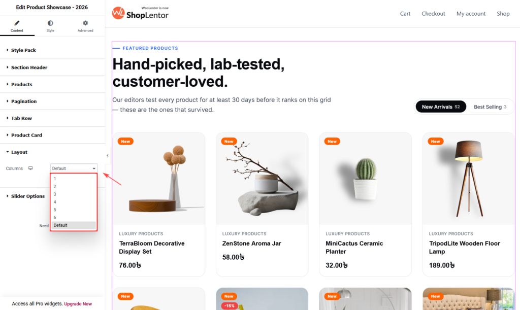
Open Content → Layout → Columns to set the number of cards per row. Choose Default to use the selected style’s layout, or select 1 through 6 columns. Use Elementor’s responsive controls to specify a suitable value for desktop, tablet, and mobile.
| Device | Recommended starting point |
|---|---|
| Desktop | 3–4 columns for detailed cards; 4–6 for compact cards. |
| Tablet | 2–3 columns. |
| Mobile | 1–2 columns, depending on card content and image ratio. |
Always inspect real card titles, prices, buttons, and swatches at each breakpoint. A high column count is not useful if it makes product names wrap heavily or targets difficult to tap.
10. Turn the section into a product slider
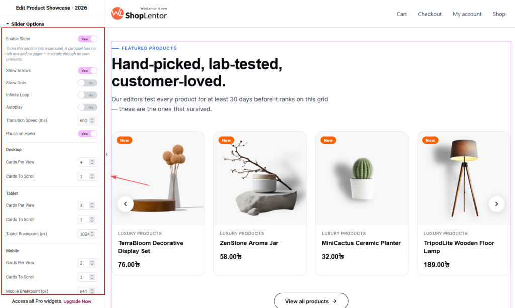
Open Content → Slider Options and enable Enable Slider to use a carousel rather than a static grid. A slider has no tab row and no pagination; it scrolls through its own products.
| Setting | What it does |
|---|---|
| Show Arrows | Displays previous and next carousel controls. |
| Show Dots | Displays slide-position indicators. |
| Infinite Loop | Returns to the beginning after the final slide. |
| Autoplay | Moves slides automatically. |
| Transition Speed (ms) | Sets the slide-change duration in milliseconds. |
| Pause on Hover | Pauses autoplay when a pointer is over the carousel. |
Slider cards per view and responsive settings
Configure these values independently for each device group:
| Device group | Controls |
|---|---|
| Desktop | Cards Per View and Cards To Scroll. |
| Tablet | Cards Per View, Cards To Scroll, and Tablet Breakpoint (px). |
| Mobile | Cards Per View, Cards To Scroll, and Mobile Breakpoint (px). |
A practical starting point is four cards per view on desktop, three on tablet, and two on mobile, moving one card at a time. Adjust this after checking the actual card content.
Keep autoplay off unless it serves a clear purpose. If you use it, use a comfortable transition speed, keep Pause on Hover enabled, and ensure arrows or dots provide a clear manual alternative. Avoid enabling both pagination and a slider: the slider mode is designed to manage its own navigation.
11. Customize the Style tab
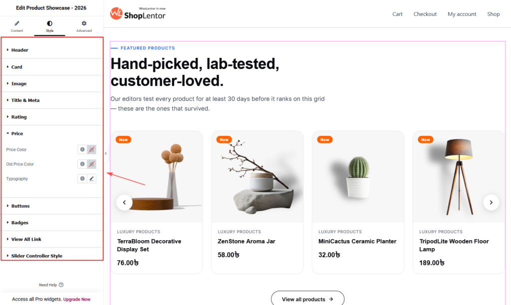
Choose the final style pack and variant first, then open the Style tab. The visible style sections follow the section’s visual parts.
| Style section | Controls shown in the widget |
|---|---|
| Header | Eyebrow colour; eyebrow typography; headline colour; headline accent colour; headline typography; description colour; description typography; space below header. |
| Card | Card appearance controls available for the chosen design. |
| Image | Product-image presentation controls available for the chosen design. |
| Title & Meta | Product title and metadata styling controls. |
| Rating | Rating display styling controls. |
| Price | Price styling controls. |
| Buttons | Product-action button styling controls. |
| Badges | Badge styling controls. |
| View All Link | Section-level View All link styling controls. |
| Slider Controller Style | Arrow and/or dot styling when slider controls are enabled. |
Use global colours and typography where possible so this section looks consistent with the rest of the site. Keep the heading dominant, metadata secondary, and interactive controls visibly distinct in both their normal and hover states.
12. Accessibility, responsive design, and SEO checklist
Before publishing, review the completed section in Elementor’s desktop, tablet, and mobile previews, then test the live page.
- Use a descriptive section heading and supporting paragraph that genuinely explain the product selection.
- Keep heading levels in order; do not use the widget headline as an extra page
H1. - Do not repeat a keyword unnaturally in the eyebrow, headline, description, tabs, and View All link.
- Use clear WooCommerce product names, prices, stock information, and featured images.
- Make sure image alternative text is meaningful wherever your media and product-image settings support it.
- Maintain sufficient contrast for headings, prices, badges, buttons, links, slider arrows, and dots.
- Do not communicate a sale, stock state, or active tab through colour alone; retain text, labels, or icons that communicate the same meaning.
- Use action-focused labels such as “Quick view”, “Add to cart”, and “View all products” rather than vague labels such as “Click here”.
- Test keyboard access to links, product actions, tabs, pagination, and slider controls.
- Check that hover-only information, such as a second image, is not essential to understanding a product on touch devices.
- Keep product counts, autoplay, and additional card elements only when they provide a clear visitor benefit.
- Verify that every product, tab, and View All link goes to a live and relevant destination.
13. Recommended uses
Use Product Showcase – 2026 in one of these common locations:
- Homepage: feature new arrivals, best sellers, or a seasonal edit below the hero.
- Shop landing page: lead into the full catalogue with a concise, curated collection.
- Campaign page: show sale products or hand-picked products that match the campaign.
- Category page: highlight complementary products or a focused sub-collection.
- Content-led page: pair a buying guide or editorial article with the products it discusses.
For example, a homeware shop could use tabs for New Arrivals, Best Sellers, and On Sale. A skincare store might use a single hand-picked grid headed “A routine for calmer skin.” Choose the grouping based on customer intent rather than only on your internal catalogue structure.
14. Troubleshooting
The widget is not visible in Elementor
Confirm that Product Showcase – 2026 is enabled in ShopLentor → Settings → Elementor Widgets. Reload Elementor and search for the widget again.
No products appear
Check Content → Products → Source, then confirm that the selected source has matching WooCommerce products. Review categories, tags, product exclusions, and the Hide Out Of Stock and Hide Products Without An Image settings. For hand-picked products, confirm that you selected active products.
The section shows fewer products than expected
Increase Products To Show. If pagination is enabled, remember that this setting is the number of products per page. Also check filters, exclusions, stock status, image availability, categories, and tags.
A tab displays the wrong products
Open Content → Tab Row, select the affected item, and review its Shows value. When it uses A product source, verify the selected Source. When it uses categories or tags, check the WooCommerce assignments.
Wishlist, compare, or Quick View is missing
Wishlist and compare buttons require supported active plugins. Quick View requires the Quick View module. The widget hides unavailable integrations rather than showing a non-working action.
Colour swatches are not showing
Confirm the product is a variable product and has usable colour variations. Check Content → Product Card → Colour Swatches, then enter the correct attribute slug in Swatch Attribute without pa_; for example, use color for pa_color.
The slider looks crowded on tablet or mobile
Reduce Cards Per View in the relevant tablet or mobile section. Keep Cards To Scroll low—often one—and review the breakpoints, card titles, prices, and buttons in Elementor’s responsive preview.
My changes are not visible on the live page
- Update the page in Elementor.
- Clear browser, WordPress, server, and CDN caches.
- Go to Elementor → Tools and regenerate CSS and data.
- Test the page in a private browser window.
Frequently asked questions
Can I show only products from selected categories?
Yes. Open Content → Products, use Categories to select the relevant WooCommerce categories, and choose a suitable source. Leave the category field empty when the source should search every category.
Can I create tabs for new arrivals and best sellers?
Yes. Add an item in Content → Tab Row, set Shows to A product source, then select a source such as Latest Products or Best Selling. Repeat for the other tab.
Does Product Showcase support pagination and a slider together?
No. When Enable Slider is on, the section becomes a carousel that manages its own products and does not use a tab row or pager. Use pagination for a grid, or use slider navigation for a carousel.
Can I hide unavailable products?
Yes. Enable Content → Products → Hide Out Of Stock. You can also enable Hide Products Without An Image to preserve an image-led card layout.
Can I change the Quick View or Add to Cart text?
Yes. Use Quick View Text and Add To Cart Text in Content → Product Card. Leave Add To Cart Text empty if you want WooCommerce to use its own wording for each product type.
How many products should I show?
Start with 4–8 in a curated grid, then assess the page purpose and mobile layout. Use pagination or a View All link when visitors need access to a wider catalogue.