
The Hero Banner – 2026 widget for Elementor helps you create modern, engaging hero sections for WooCommerce websites without writing custom code. You can use it to promote a new collection, highlight featured products, announce seasonal offers, or create a magazine-style homepage banner.
The widget includes four design styles—Editorial, Modern, Luxury, and Magazine—along with multiple layout variants. Depending on the selected style and variant, you can add hero slides, highlighted heading text, call-to-action buttons, feature images, promotional cards, and product spot cards.
Why Use the Hero Banner – 2026 Widget?
A hero section is usually the first major area visitors see on a homepage or landing page. A clear message, strong image, and relevant call-to-action can help visitors understand your offer and move toward the next step.
You can use the Hero Banner – 2026 widget to:
- Promote seasonal sales and special campaigns
- Highlight new arrivals or featured collections
- Create editorial or magazine-style layouts
- Display multiple hero slides
- Add primary and secondary call-to-action buttons
- Promote additional products through side panels
- Customize the design directly in Elementor
- Build responsive hero sections for desktop, tablet, and mobile
Where You Can Use the Widget
The widget works well in different areas of a WooCommerce website, including:
- Homepage hero sections
- Product launch landing pages
- Seasonal sale pages
- Collection pages
- Fashion and lifestyle websites
- Furniture and home decor stores
- Jewelry and premium product websites
- Magazine-style ecommerce homepages
1. Enable the Hero Banner – 2026 Widget
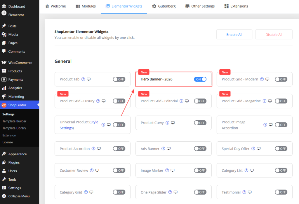
Before adding the widget to a page, make sure it is enabled in ShopLentor.
- Go to WordPress Dashboard → ShopLentor → Settings → Elementor Widgets.
- Find Hero Banner – 2026.
- Turn the widget on.
- Save the settings.
Note: Make sure WordPress, Elementor, and ShopLentor are installed and activated.
2. Add the Hero Banner – 2026 Widget in Elementor
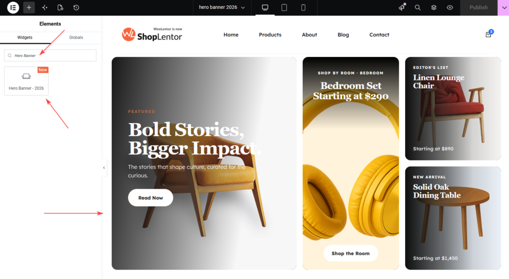
After enabling the widget, you can add it to any Elementor page.
- Open the page you want to edit.
- Click Edit with Elementor.
- Search for Hero Banner – 2026 in the widget panel.
- Drag the widget into your preferred section or container.
- Use the Content and Style tabs to configure the banner.
3. Configure the Content Tab
The Content tab controls the banner structure, slide content, buttons, images, and side panels.
3.1 Style Pack
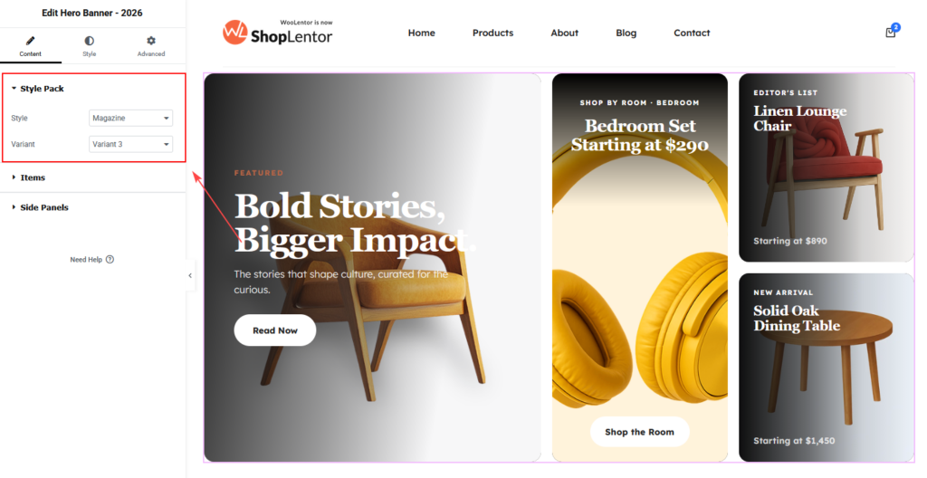
Open Content → Style Pack.
This section includes two controls:
- Style
- Variant
Style
Choose the overall design style of the hero banner.
The available options are:
- Editorial: Suitable for fashion, lifestyle, storytelling, and content-focused layouts.
- Modern: Suitable for contemporary stores, furniture websites, electronics shops, and general ecommerce brands.
- Luxury: Suitable for jewelry, watches, premium fashion, and high-end lifestyle products.
- Magazine: Suitable for editorial commerce, multi-category stores, curated collections, and visually rich homepages.
Variant
Each style includes multiple layout variations:
- Variant 1
- Variant 2
- Variant 3
The available content and styling controls may change depending on the selected style and variant.
For example, Magazine Variant 3 includes:
- A large feature panel
- A promo card in the middle
- A spot card at the top right
- A spot card at the bottom right
Note: Some variants may require ShopLentor Pro.
3.2 Configure Hero Slides
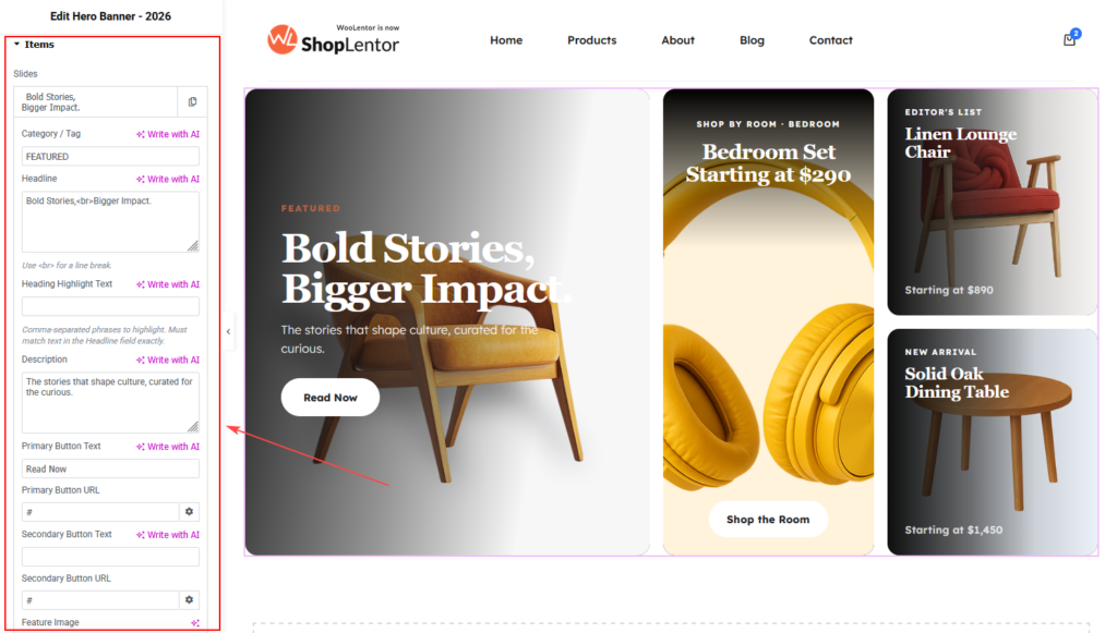
Open Content → Items.
The Items section allows you to add one or more hero slides. Each slide can have its own content, buttons, image, and variant-specific elements.
You can use the repeater controls to:
- Add a new item
- Duplicate an existing item
- Delete an item
- Edit each item separately
Click Add Item to create another hero slide.
Basic Content Settings
| Setting | Description |
|---|---|
| Category / Tag | Adds a small label above the heading. Use it for text such as Featured, New Arrival, or Summer Collection. |
| Headline | Adds the main hero heading. You can use <br> to create a manual line break. |
| Heading Highlight Text | Highlights exact words or phrases used in the Headline field. Separate multiple phrases with commas. |
| Description | Adds supporting text below the heading. Keep it short and easy to read. |
Example
Category / Tag: FEATURED
Headline: Bold Stories,<br>Bigger Impact.
Heading Highlight Text: Bigger Impact.
Description: The stories that shape culture, curated for the curious.
The phrase entered in Heading Highlight Text must match the text in the Headline field exactly.
Important: You do not need to add a custom
<span>tag. Use the dedicated Heading Highlight Text field.
Button Settings
The widget supports a primary button and an optional secondary button.
| Setting | Description |
|---|---|
| Primary Button Text | Sets the main call-to-action label. |
| Primary Button URL | Adds the destination link for the primary button. |
| Secondary Button Text | Adds an optional second call-to-action. |
| Secondary Button URL | Adds the destination link for the secondary button. |
Useful button labels include:
- Shop Now
- Explore Collection
- Read Now
- View Products
- Learn More
- View Lookbook
Use the primary button for the main action. Use the secondary button for a supporting action.
You can also use Elementor Dynamic Tags in the URL fields.
Feature Image Settings
| Setting | Description |
|---|---|
| Feature Image | Uploads the main image for the hero slide. |
| Feature Image Alt Text | Adds descriptive text for accessibility and image SEO. |
Use high-quality images that match the selected layout. Keep important subjects away from the image edges so they remain visible on smaller screens.
A practical starting size for the feature image is:
| Image | Recommended Size |
|---|---|
| Feature Image | 1600 × 1000 px |
Use WebP when possible and compress the image before uploading.
A good alt text example is:
Modern living room furniture collection
Avoid generic text such as image1 or photo.
Variant-Specific Settings
Some fields only apply to specific variants.
Variant 1 settings
| Setting | Description |
|---|---|
| Discount Badge | Adds a promotional label such as -32% TODAY. |
| Rating Text | Displays rating or review text such as 4.9 · 2,847 reviews. |
| Eyebrow Date / Issue | Adds editorial information such as Issue 247 · May 17. |
Variant 2 settings
| Setting | Description |
|---|---|
| Pill Tag | Adds a small decorative label such as Cover Story · N°02. |
| Spin Badge Text | Adds rotating circular text. Leave it empty to hide the rotating badge. |
Fields marked v1 only or v2 only should be used only with the matching variant. Leave them empty when they do not apply to the selected design.
3.3 Configure the Side Panels
Open Content → Side Panels.
In Magazine Variant 3, the Side Panels section controls three fixed content areas:
- Promo Card — Middle
- Spot 1 — Top Right
- Spot 2 — Bottom Right
These panels help you promote additional products, collections, or categories beside the main feature panel.
Promo Card — Middle
The Promo Card appears in the middle position.
Available settings:
| Setting | Description |
|---|---|
| Promo Image | Uploads the main visual for the promo card. |
| Label | Adds small supporting text above the title. |
| Title | Adds the main promo message. <br> can be used for a line break. |
| Button Text | Sets the promo button label. |
| Button URL | Adds the destination link. |
Example
Label: Shop by Room · Bedroom
Title: Bedroom Set<br>Starting at $290
Button Text: Shop the Room
Spot 1 — Top Right
Spot 1 appears in the top-right position.
Available settings:
| Setting | Description |
|---|---|
| Link URL | Adds the destination link for the card. |
| Image | Uploads the spot card image. |
| Label | Adds a small label above the title. |
| Title | Adds the product or campaign title. |
| Price Text | Adds a price or supporting line. |
Example
Label: Editor's List
Title: Linen Lounge<br>Chair
Price Text: Starting at $890
Spot 2 — Bottom Right
Spot 2 appears in the bottom-right position.
It includes the same settings as Spot 1:
- Link URL
- Image
- Label
- Title
- Price Text
Example
Label: New Arrival
Title: Solid Oak<br>Dining Table
Price Text: Starting at $1,450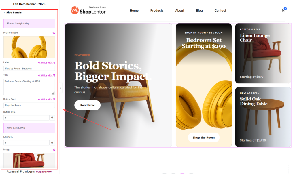
4. Style the Hero Banner – 2026 Widget
The Style tab changes according to the selected style and variant. For Magazine Variant 3, the controls are divided into two main sections.
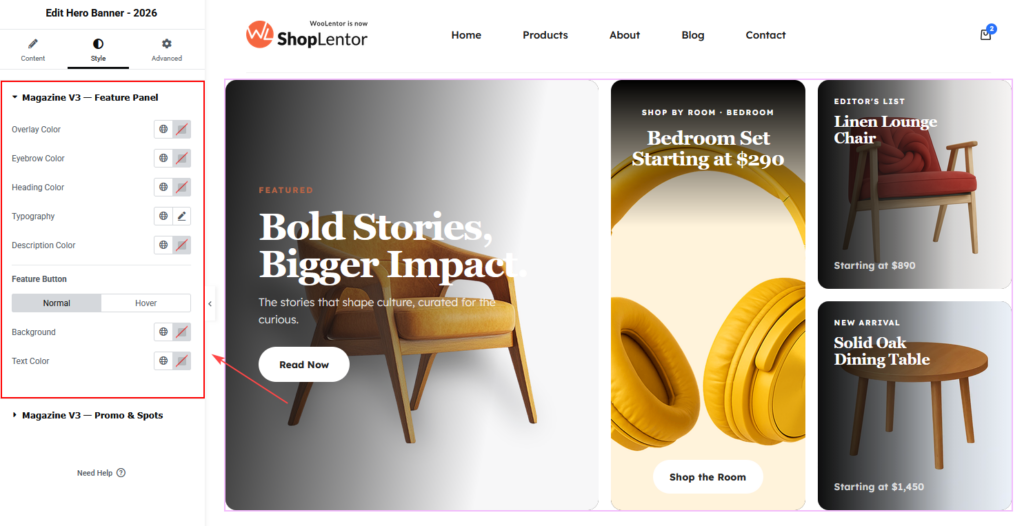
4.1 Magazine V3 — Feature Panel
Open Style → Magazine V3 — Feature Panel.
This section controls the main feature area.
| Setting | Description |
|---|---|
| Overlay Color | Adds a color layer over the feature image. Use a darker overlay when the image makes the text difficult to read. |
| Eyebrow Color | Changes the Category / Tag text color. |
| Heading Color | Changes the main headline color. |
| Typography | Controls the heading typography, including font family, size, weight, line height, and letter spacing. |
| Description Color | Changes the description text color. |
| Feature Button | Controls the main button appearance in Normal and Hover states. |
The visible button controls include:
- Background
- Text Color
- Normal state
- Hover state
Choose colors with enough contrast to keep the text readable.
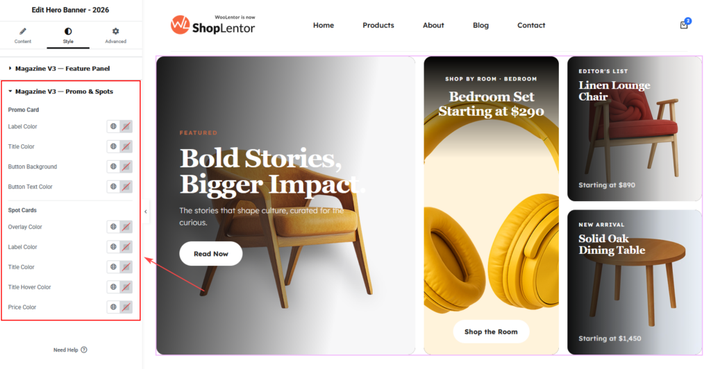
4.2 Magazine V3 — Promo & Spots
Open Style → Magazine V3 — Promo & Spots.
This section controls the promo card and both spot cards.
Promo Card Controls
| Setting | Description |
|---|---|
| Label Color | Changes the promo label color. |
| Title Color | Changes the promo title color. |
| Button Background | Changes the promo button background. |
| Button Text Color | Changes the promo button text color. |
Spot Card Controls
| Setting | Description |
|---|---|
| Overlay Color | Adds an overlay to the Spot Card images. |
| Label Color | Changes the Spot Card label color. |
| Title Color | Changes the normal title color. |
| Title Hover Color | Changes the title color on hover. |
| Price Color | Changes the price text color. |
How to Cover the Style Section with Only Two Images
To capture every styling control without using separate screenshots:
- Select Magazine and Variant 3.
- Open the Style tab.
- Expand Magazine V3 — Feature Panel.
- Collapse other sections and capture the complete panel.
- Expand Magazine V3 — Promo & Spots.
- Capture the complete panel in a second image.
- Place the first screenshot under the Feature Panel section.
- Place the second screenshot under the Promo & Spots section.
This approach covers all visible styling controls while keeping the documentation short and easy to follow.
5. Image Recommendations
Use consistent, optimized images to keep the banner attractive and fast.
| Image Area | Recommended Size |
|---|---|
| Feature Image | 1600 × 1000 px |
| Promo Image | 800 × 800 px |
| Spot Card Images | 600 × 600 px |
These sizes are practical starting points. The final crop depends on the selected style, variant, container width, and responsive layout.
For better performance:
- Use WebP or AVIF where supported
- Compress images before uploading
- Avoid unnecessarily large PNG files
- Keep the image subject away from important crop areas
- Add meaningful alt text
- Use a consistent photography style
6. Tips for Better Results
- Keep the headline between four and eight words.
- Use one clear message per slide.
- Highlight only the most important words.
- Use one strong primary call-to-action.
- Keep button text short and action-focused.
- Use consistent image dimensions across slides.
- Avoid adding too many slides.
- Place the most important message in the first slide.
- Keep Promo Card and Spot Card titles short.
- Preview the design on desktop, tablet, and mobile.
7. Responsive and Accessibility Tips
A hero banner should remain clear and usable on every screen size.
Before publishing:
- Check that the heading does not cover the image subject.
- Keep buttons large enough to tap on mobile.
- Avoid placing important text inside the image itself.
- Use readable font sizes.
- Maintain good contrast between text and the background.
- Add descriptive alt text to the Feature Image.
- Use clear button labels instead of vague text such as “Click Here.”
- Test the Spot Cards and Promo Card on smaller screens.
8. Troubleshooting
Highlight Text Is Not Working
Make sure the phrase in Heading Highlight Text matches the Headline field exactly.
Check spelling, punctuation, capitalization, and spaces. Separate multiple phrases with commas.
The Side Panels Are Not Visible
Confirm that the selected style and variant support Side Panels. Magazine Variant 3 includes the Promo Card, Spot 1, and Spot 2.
Also make sure the image and content fields are not empty.
A Button Is Not Showing
Check that the button text has been added.
Also review the button colors. The text or background may be blending into the image.
The Button Link Is Not Working
Make sure a valid URL has been added. If you are using Dynamic Tags, confirm that the selected dynamic source returns a valid link.
The Feature Image Looks Cropped
Upload an image with more space around the subject. Keep important elements away from the edges and test the image on desktop, tablet, and mobile.
The Style Controls Look Different
The Style tab changes depending on the selected style and variant. The controls described in this guide are based on Magazine Variant 3.
Changes Are Not Visible on the Frontend
- Update the page in Elementor.
- Clear your browser cache.
- Clear your WordPress or server cache.
- Clear any CDN cache.
- Go to Elementor → Tools and regenerate CSS and data.
- Check the page in a private browser window.
Frequently Asked Questions
Can I add multiple hero slides?
Yes. Open the Items section and click Add Item.
Can I duplicate an existing slide?
Yes. Use the duplicate icon inside the Items repeater.
Can I use only one slide?
Yes. Add a single item and configure it as a static hero section.
Can each slide use a different image?
Yes. Every item has its own Feature Image control.
Can I use HTML in the headline?
The Headline field supports <br> for manual line breaks. Avoid adding unnecessary block-level HTML.
How do I highlight part of the heading?
Enter the exact word or phrase in the Heading Highlight Text field. Separate multiple phrases with commas.
Can I hide the secondary button?
Yes. Leave the Secondary Button Text field empty.
Can I use dynamic links?
Yes. Click the Dynamic Tags icon beside the URL field and select an available dynamic source.
Why do I see fields marked “v1 only” or “v2 only”?
Those controls are designed for specific variants. Leave them empty when they do not apply to the selected variant.
Can I leave a Spot Card empty?
A Spot Card may not appear correctly if its image and content fields are empty. Complete all required fields for the intended layout.
Is the widget responsive?
Yes. However, you should always preview and adjust the page for desktop, tablet, and mobile.
Do I need ShopLentor Pro?
The widget may include free and Pro variants. Availability depends on the selected style, variant, and your active ShopLentor license.
Final Checklist
Before publishing the page, confirm that:
- Hero Banner – 2026 is enabled
- The correct style is selected
- The correct variant is selected
- At least one hero item is configured
- Highlight phrases match the headline exactly
- Primary and secondary button links are correct
- Feature images are optimized
- Feature image alt text is added
- Promo Card content is complete
- Spot 1 content is complete
- Spot 2 content is complete
- Text and background colors have enough contrast
- Button hover states are visible
- The banner has been tested on desktop
- The banner has been tested on tablet
- The banner has been tested on mobile
- The page has been updated and caches are cleared
Conclusion
The Hero Banner Elementor Widget gives you a flexible way to create professional WooCommerce hero sections without custom coding. You can choose from multiple design styles, add independent hero slides, use highlighted heading text, include one or two call-to-action buttons, and promote additional products through the Promo and Spot Cards.
Start by choosing the style and variant that fit your website. Then add the main content, configure the side panels, and use the Style tab to match the banner with your brand. Before publishing, test the complete layout on desktop, tablet, and mobile to ensure a clear and consistent shopping experience.