

Overview
The Checkout Login Form Widget for Elementor allows you to display a WooCommerce login form directly on the checkout page using Elementor. This widget helps returning customers quickly log in during checkout without leaving the page.
Using this widget improves the checkout experience by allowing users to access their accounts easily, apply saved addresses, and complete purchases faster. The widget also includes multiple styling options so you can match the login form design with your store layout.
How to Enable the Checkout Login Form Widget
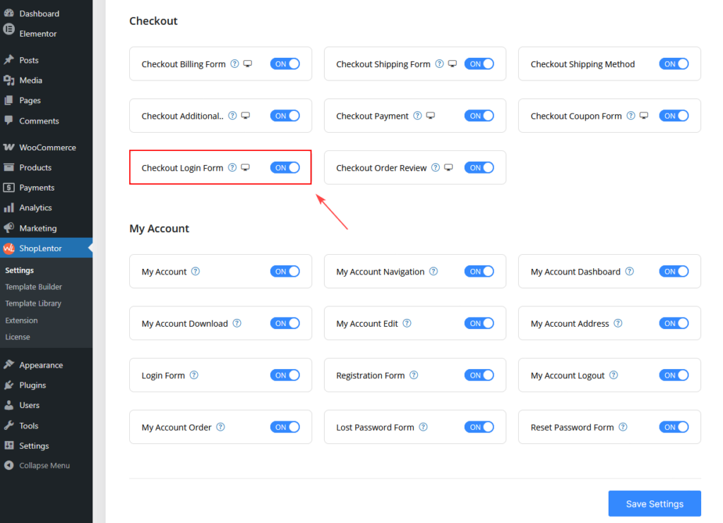
Before using the widget, you must enable it from the ShopLentor settings.
Steps:
- Go to Dashboard → ShopLentor → Elementor Widgets.
- Find Checkout Login Form in the widget list.
- Turn ON the widget.
- Click Save Settings.
How to Use the Checkout Login Form Widget
You can use this widget in two ways:
Option A: Edit Default Checkout Page
Steps:
- Go to Pages → Checkout Page.
- Click Edit with Elementor.
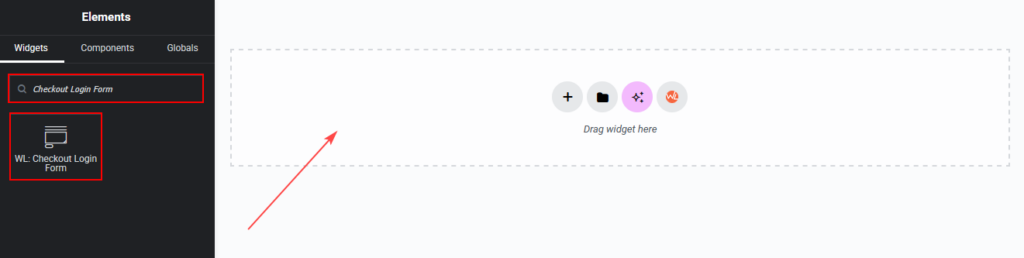
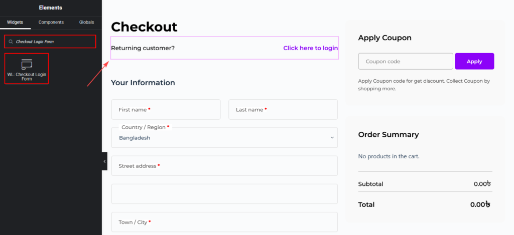
- Search for Checkout Login Form in the Elementor widget panel.
- Drag and drop the widget into the desired section of your checkout page.
- Customize the settings from the Content and Style tabs.
Option B: Use ShopLentor Template Builder
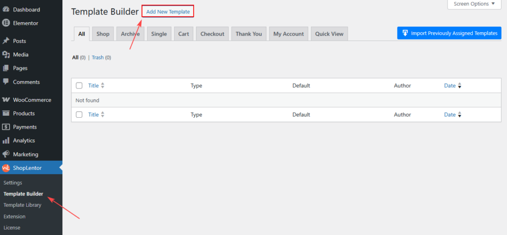
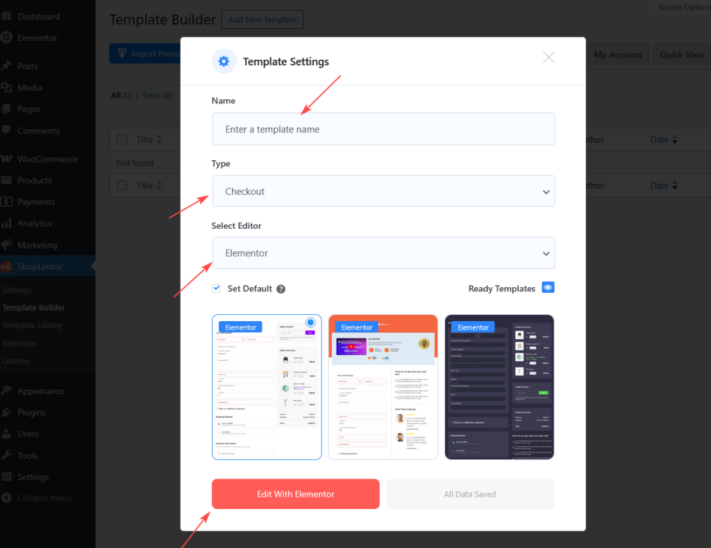
- Go to ShopLentor → Template Builder
- Click Add New Template
- Give it a Name
- Select:
- Type: Checkout
- Editor: Elementor
- Choose a ready template (optional)
- Click Edit with Elementor
Content Settings
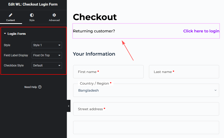
Login Form
This section allows you to choose the layout style of the login form.
Style
Select the design layout for the login form.
Available options:
- Default
- Style 1
Checkbox Style
Choose how the checkbox (Remember Me) appears.
Available options:
- Default
- Style 1
- Style 2
Style Settings
The Style tab allows you to customize the visual appearance of the checkout login form, including the notice message, form layout, input fields, and login button.
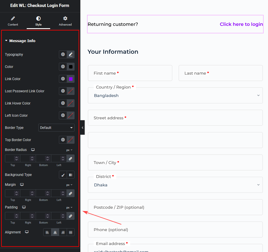
Message Info
This section controls the notice message displayed above the login form.
Available options include:
- Hide Icon – Show or hide the message icon.
- Typography – Customize the message text font style and size.
- Color – Set the message text color.
- Link Color – Change the color of links inside the message.
- Lost Password Link Color – Customize the Lost Password link color.
- Link Hover Color – Set the link color when hovered.
- Left Icon Color – Change the icon color displayed beside the message.
- Border Type – Select the border style for the message box.
- Top Border Color – Choose the color for the top border.
- Border Radius – Adjust the roundness of the message box corners.
- Background Type – Choose a solid or gradient background.
- Margin – Control the outer spacing of the message box.
- Padding – Adjust spacing inside the message container.
- Alignment – Set the text alignment (Left, Center, Right, Justified).
Form
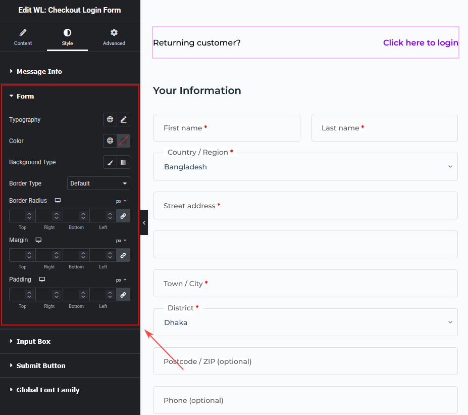
This section controls the overall design of the login form container.
You can customize:
- Typography – Change the font style used in the form.
- Color – Set the form text color.
- Background Type – Choose a solid or gradient background.
- Border Type – Select the border style of the form.
- Border Radius – Adjust the roundness of the form corners.
- Margin – Control spacing outside the form.
- Padding – Control spacing inside the form.
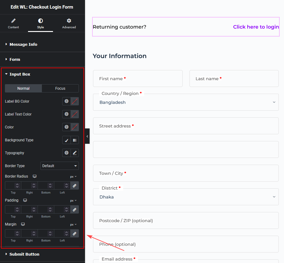
Input Box
This section allows you to customize the username and password input fields.
You can style the fields in two states:
- Normal
- Focus
Available customization options:
- Label BG Color – Set the background color of the input label.
- Label Text Color – Change the label text color.
- Color – Set the input text color.
- Background Type – Choose the input field background style.
- Typography – Customize the font style for input text.
- Border Type – Select the border style for input fields.
- Border Radius – Adjust the corner roundness of the input box.
- Padding – Control spacing inside the input field.
- Margin – Control spacing outside the input field.
Submit Button
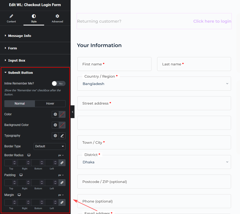
This section controls the appearance of the login button.
Inline Remember Me
Enable this option to display the Remember Me checkbox beside the login button.
Button States
You can style the button in two states:
- Normal
- Hover
Available options:
- Color – Set the button text color.
- Background Color – Choose the button background color.
- Typography – Adjust the font style of the button text.
- Border Type – Select the button border style.
- Border Radius – Adjust the roundness of the button corners.
- Padding – Control spacing inside the button.
- Margin – Control spacing outside the button.
Global Font Family
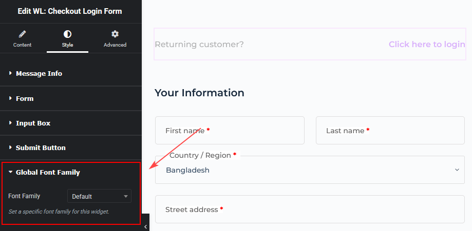
This option allows you to apply a custom font family to the entire widget.
Font Family
Select the font that will be used for the login form content.
Best Practice
To create a better checkout experience:
- Place the Checkout Login Form above the checkout form.
- Keep the design simple and consistent with your theme.
- Use clear button colors so customers can easily identify the login action.