

The Store Highlights – 2026 widget for Elementor helps you add a clear and attractive trust section to a WooCommerce page without custom code. Use it to show benefits such as free shipping, easy returns, secure payment, product warranties, or customer support.
A Store Highlights section usually works best directly below a homepage hero or near a purchase-focused area. It gives visitors quick reasons to trust your store before they browse products or complete an order.
The widget includes four style packs—Editorial, Modern, Luxury, and Magazine—and three layout variants for each pack. Select a style and variant, then use the same highlight content to create a different visual treatment.
Why Use the Store Highlights Widget?
A concise trust strip makes important store policies easy to scan. You can use the widget to:
- Explain shipping, returns, payment, warranty, or support benefits.
- Add linked service information to a homepage, product page, or landing page.
- Keep key store messages visible without adding a large block of text.
- Match the trust section to a clean, editorial, premium, or high-contrast storefront.
- Create a responsive layout for desktop, tablet, and mobile.
Before You Begin
Make sure WordPress, WooCommerce, Elementor, and ShopLentor are installed and activated. The Store Highlights – 2026 widget is available in ShopLentor 3.4.8 and later.
Some style variants may require ShopLentor Pro. The first variant in each style pack is available in the free version; Variants 2 and 3 are available in ShopLentor Pro.
1. Enable Store Highlights – 2026
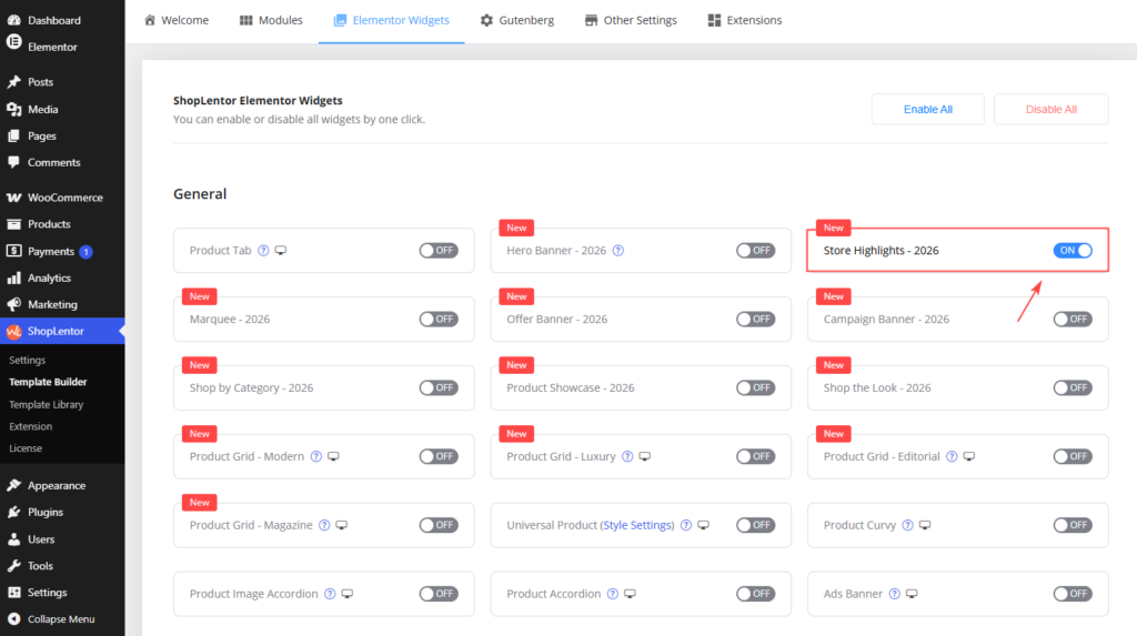
Before adding the widget in Elementor, enable it from the ShopLentor settings.
- Go to WordPress Dashboard → ShopLentor → Settings → Elementor Widgets.
- Find Store Highlights – 2026.
- Turn the widget on.
- Save your changes.
2. Add the Widget to an Elementor Page
Once the widget is enabled, you can use it on any Elementor page or template.
- Open the page you want to edit.
- Select Edit with Elementor.
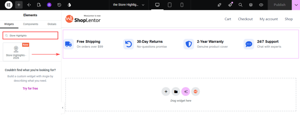
- Search for Store Highlights – 2026 in the Elements panel.
- Drag the widget into a section or container.
- Open the Content tab to configure it.
Place the widget in a full-width container when you want the highlight row to span the page. A standard-width container works well below a hero banner or above a product grid.
3. Choose a Style Pack and Variant
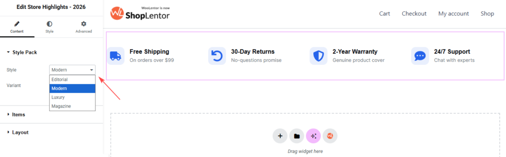
Open Content → Style Pack. This section contains the Style and Variant controls.
Choose a Style
| Style | Best for |
|---|---|
| Editorial | Fashion, lifestyle, storytelling, and content-led storefronts. It uses typographic emphasis and rule-separated items. |
| Modern | Clean, contemporary stores, technology shops, furniture stores, and general ecommerce brands. |
| Luxury | Jewellery, watches, premium fashion, and high-end lifestyle products. |
| Magazine | Editorial commerce, curated collections, and visually dense or high-contrast storefronts. |
Choose a Variant
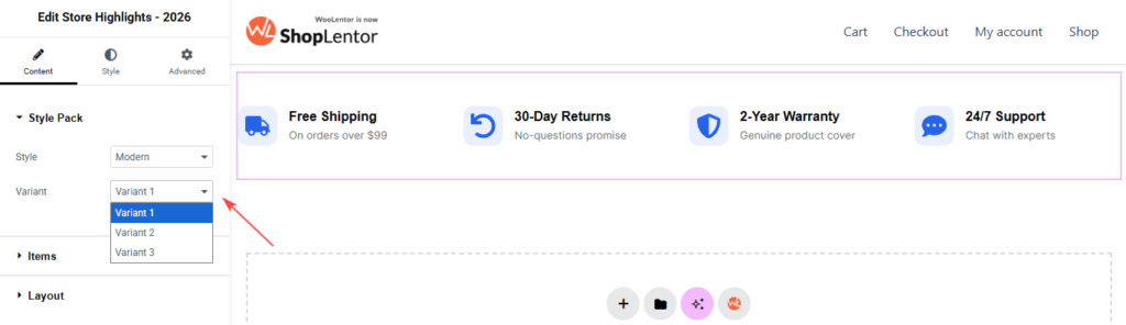
Each style pack has three variants: Variant 1, Variant 2, and Variant 3. Changing the variant changes the visual layout while keeping your existing highlight content.
Some content, layout, and style controls appear only when the selected style and variant use them. This is expected. Use the controls shown for the design currently selected.
Note: Some variants require ShopLentor Pro. If a locked variant is selected, upgrade to use it on a live page.
4. Add and Edit Store Highlights
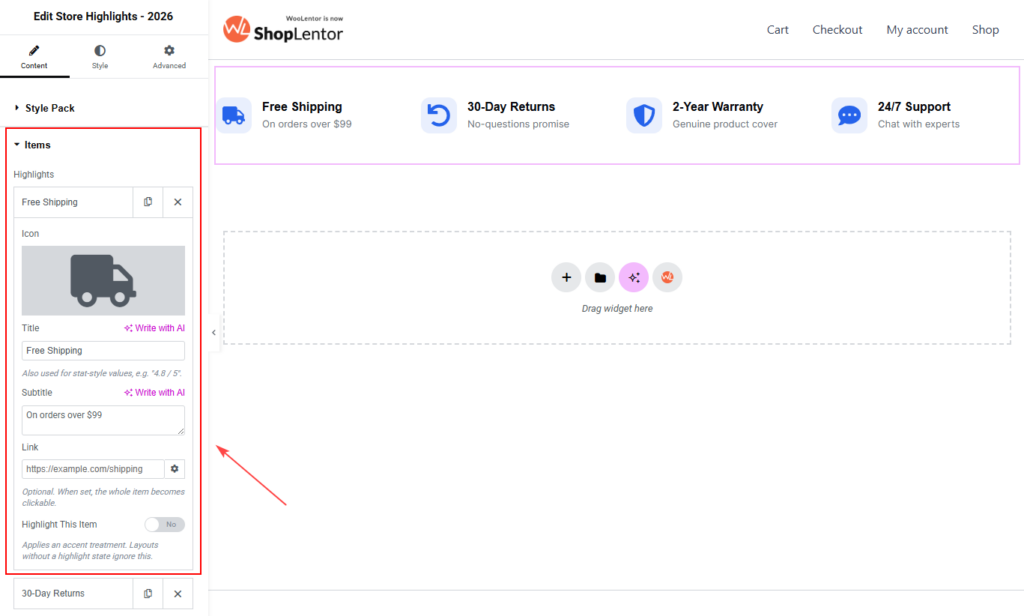
Open Content → Items. Each repeater item creates one store highlight.
You can add, duplicate, delete, and edit items independently. A useful starting set is:
- Free Shipping — On orders over $99
- 30-Day Returns — No-questions promise
- 2-Year Warranty — Genuine product cover
- 24/7 Support — Chat with experts
Highlight Item Settings
| Setting | Description |
|---|---|
| Icon | Choose an icon from an Elementor icon library or upload an SVG. Use a simple, familiar icon that supports the message. |
| Title | Add the main benefit, such as Free Shipping or Secure Payment. Keep titles short. |
| Subtitle | Add a brief supporting line, such as On orders over $99. |
| Link | Optionally add a destination URL. When a link is set, the entire highlight item becomes clickable. Use it for policy, shipping, returns, warranty, or support pages. |
| Highlight This Item | Applies the selected design’s accent treatment to one item. Use it sparingly so one message remains the visual priority. |
To add another item, click Add Item. To reuse an existing item, select the duplicate icon in that item. Use the delete icon only for highlights you no longer need.
Write Effective Highlight Copy
Keep the title direct and the subtitle specific. Visitors should understand each promise in a few seconds.
| Less Clear | Better |
|---|---|
| Shipping available | Free Shipping — On orders over $99 |
| Returns | 30-Day Returns — No-questions promise |
| Warranty information | 2-Year Warranty — Genuine product cover |
| Contact us | 24/7 Support — Chat with experts |
Avoid long subtitles, multiple promises in one item, or vague labels such as “Learn More” without context.
5. Set the Layout and Columns
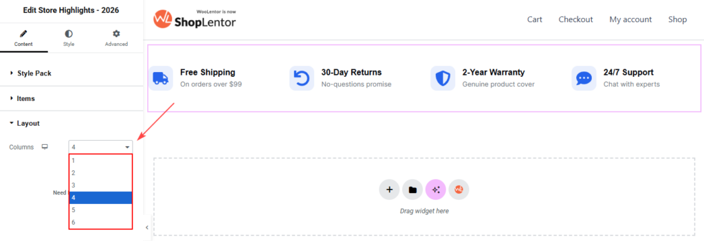
Open Content → Layout and use Columns to control how many highlight items appear in each row. The control supports responsive settings, so you can choose separate values for desktop, tablet, and mobile.
A practical starting point is:
| Device | Recommended Columns |
|---|---|
| Desktop | 4 columns for four highlights |
| Tablet | 2 columns |
| Mobile | 1 column |
If you use fewer items, reduce the desktop column count to avoid empty-looking space. Some variants use a fixed, centred row. For those designs, the Columns control may be unavailable.
6. Customize the Style Tab
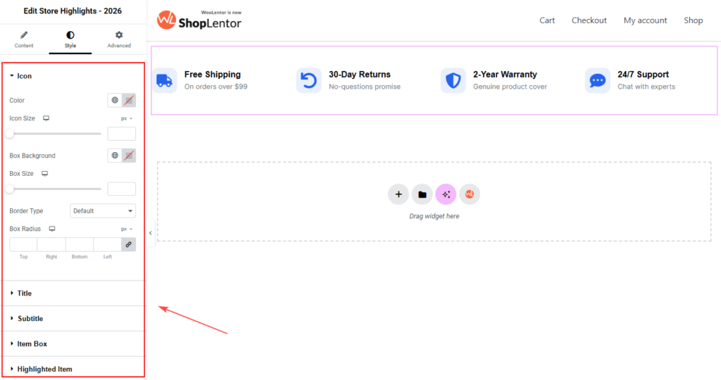
Open the Style tab after choosing your Style Pack and Variant. The sections displayed depend on the selected design.
| Style Section | What You Can Customize |
|---|---|
| Section Label | Set the label color and typography when the selected variant includes a section label. |
| Icon | Adjust the icon color and size. Depending on the selected design, you can also control the icon box background, size, and border radius. |
| Title and Subtitle | Set typography, colors, and spacing for the highlight title and supporting text. Keep the title easy to scan and the subtitle readable against the background. |
| Item Box | Control the gap between items, area background, padding, normal and hover background, border radius, and border color for boxed layouts. |
| Highlighted Item | Set the background, border color, and icon color for an item where Highlight This Item is enabled. |
| Divider | Adjust divider colors in layouts that use dividers instead of cards, including selected Editorial, Luxury, and Magazine designs. |
Tip: Style controls that do not apply to the selected design are hidden. Switch to the relevant Style Pack and Variant before looking for a design-specific option.
7. Responsive and Accessibility Tips
Review the widget in Elementor’s desktop, tablet, and mobile preview modes before publishing.
- Use simple, recognisable icons and do not rely on an icon alone to communicate meaning.
- Keep titles brief and subtitles readable on small screens.
- Use sufficient contrast between text, icons, dividers, and the background.
- Ensure linked items lead to the expected page and use meaningful destination pages.
- Keep touch targets comfortably spaced on mobile.
- Test the item order and column count at each breakpoint.
- If you upload custom SVG icons, make sure they are safe, optimized, and visually consistent with the rest of the site.
8. Best Practices for Placement
The Store Highlights widget works especially well in these locations:
- Directly below the homepage hero banner.
- Above a featured product grid or product category section.
- Near an add-to-cart or checkout-focused area.
- On a seasonal campaign landing page where shipping, returns, or support can reduce purchase hesitation.
Use three to five highlights in most cases. Too many items make the section harder to scan and reduce the importance of each promise.
9. Troubleshooting
The Store Highlights Widget Is Not Visible in Elementor
Confirm that the widget is enabled in ShopLentor → Settings → Elementor Widgets. Then reload the Elementor editor and search for Store Highlights – 2026 again.
A Style or Variant Does Not Show the Controls I Expected
Content and style controls change with the selected Style Pack and Variant. Select the intended combination first, then open the relevant Content or Style section.
My Highlight Item Is Not Clickable
Open Content → Items, expand the item, and make sure its Link field contains a valid URL. Update the page, then test the link on the frontend.
The Layout Looks Crowded on Tablet or Mobile
Open Content → Layout → Columns, select the responsive device setting, and reduce the number of columns. Also shorten long titles and subtitles.
Changes Are Not Visible on the Frontend
- Update the page in Elementor.
- Clear your browser cache.
- Clear any WordPress, server, or CDN cache.
- Go to Elementor → Tools and regenerate CSS and data.
- Check the page in a private browser window.
Frequently Asked Questions
Can I Add More Than Four Store Highlights?
Yes. Add items from Content → Items and choose an appropriate column count. For clarity, keep the most important benefits first.
Can I Use My Own Icons?
Yes. Choose an icon from Elementor’s icon library or upload a custom SVG icon.
Can I Make Only One Highlight Stand Out?
Yes. Enable Highlight This Item for the item you want to emphasize, then customize its appearance in the Highlighted Item style section when available.
Can I Link Each Highlight to a Different Page?
Yes. Add a separate URL to the Link field of each item. For example, link shipping, returns, warranty, and support highlights to their respective policy pages.
Why Does the Layout Look Different After I Select Another Variant?
Each variant is a separate layout. Some variants use cards, while others use dividers or a fixed centred row. The available controls change to match the selected design.
Which Variants Are Available in the Free Version?
Variant 1 of Editorial, Modern, Luxury, and Magazine is available in the free version. Variants 2 and 3 require ShopLentor Pro.