

The Offer Banner – 2026 widget for Elementor lets you create a responsive grid of promotional cards for a WooCommerce store. Use it to highlight seasonal sales, product categories, trade-in offers, gaming collections, coupon campaigns, or limited-time deals—without custom code.
Each banner can include an image, label, headline, supporting text, and call-to-action button. Choose a style pack and variant to change its visual presentation while keeping your banner content in place. If you need it, follow the ShopLentor download and setup guide before configuring the widget.
Why use the Offer Banner widget?
Offer banners help shoppers notice important collections and promotions before they reach a product grid. Use this widget to:
- Promote sales, categories, collections, or campaign landing pages.
- Display two or more image-led offers in a clean card grid.
- Give every promotion its own image, text, and destination link.
- Match a modern, editorial, luxury, or magazine storefront style.
- Create a layout that remains easy to browse on desktop, tablet, and mobile.
Before you begin
Make sure WordPress, Elementor, and ShopLentor are installed and active. The Offer Banner – 2026 widget requires ShopLentor 3.4.8 or later.
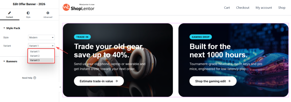
Variant 1 in every style pack is available in the free version. Variants 2 and 3 require ShopLentor Pro.
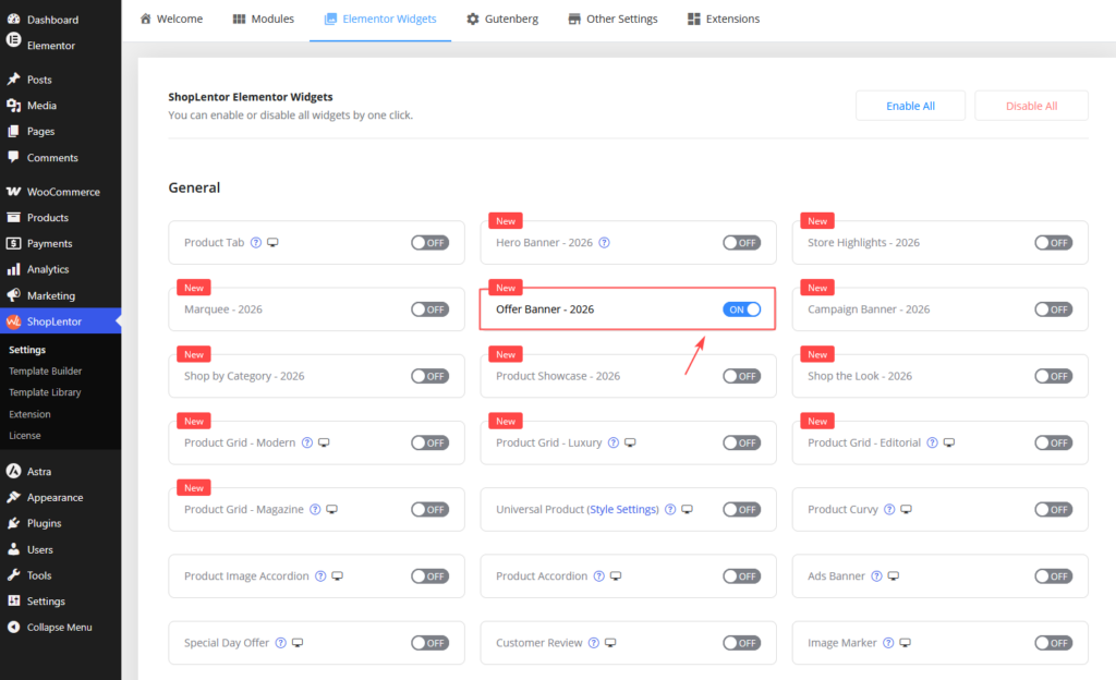
1. Enable Offer Banner – 2026
- Go to ShopLentor → Settings → Elementor Widgets in the WordPress dashboard.
- Find Offer Banner – 2026.
- Turn the widget on.
- Save the changes.
2. Add the widget to an Elementor page
- Open the page or template you want to edit.
- Select Edit with Elementor.
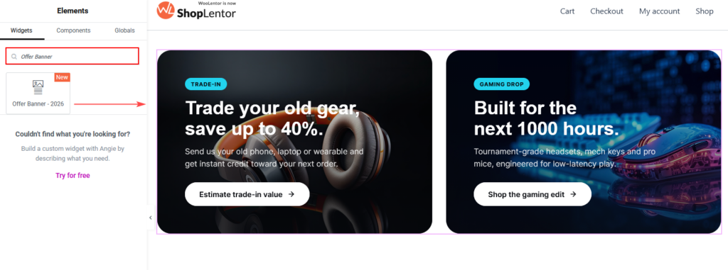
- Search for Offer Banner – 2026 in the Elements panel.
- Drag the widget into a section or container.
- Open the Content tab to configure the banners.
Place the widget below a homepage hero, above a product-category grid, or inside a campaign landing page. A two-column layout works well for featured campaigns, while three or four columns suit compact category promotions.
3. Choose a style pack and variant
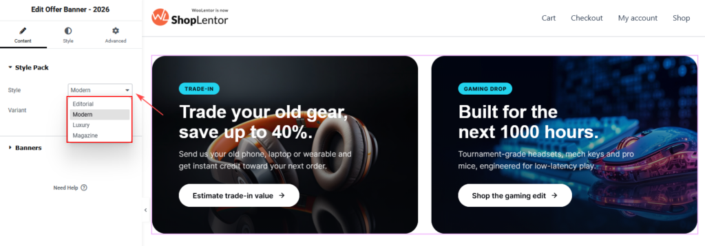
Open Content → Style Pack, then choose a Style and Variant. Changing the variant changes the visual layout while preserving existing banner content.
| Style pack | Best for |
|---|---|
| Modern | Contemporary stores, electronics, general retail, and bold product promotions. |
| Editorial | Fashion, lifestyle, story-led collection launches, and refined typography. |
| Luxury | Jewellery, premium fashion, watches, and understated campaigns. |
| Magazine | High-contrast offers, editorial commerce, coupon-led promotions, and content-rich cards. |
Each style pack includes three variants. Some controls appear only when the selected design uses them. For example, asymmetric layouts can use card size, while particular Magazine layouts can use card tone, feature lists, coupon text, and fine print.
Note: Selecting a Pro-only variant displays an upgrade notice in the editor. Activate ShopLentor Pro to use that design on a live page.
4. Add and edit offer banners
Open Content → Banners. Each repeater item creates one promotional card. You can add, duplicate, remove, and edit banners independently.
Select Add Item to create another banner. Use the duplicate icon to reuse an existing card as a starting point.
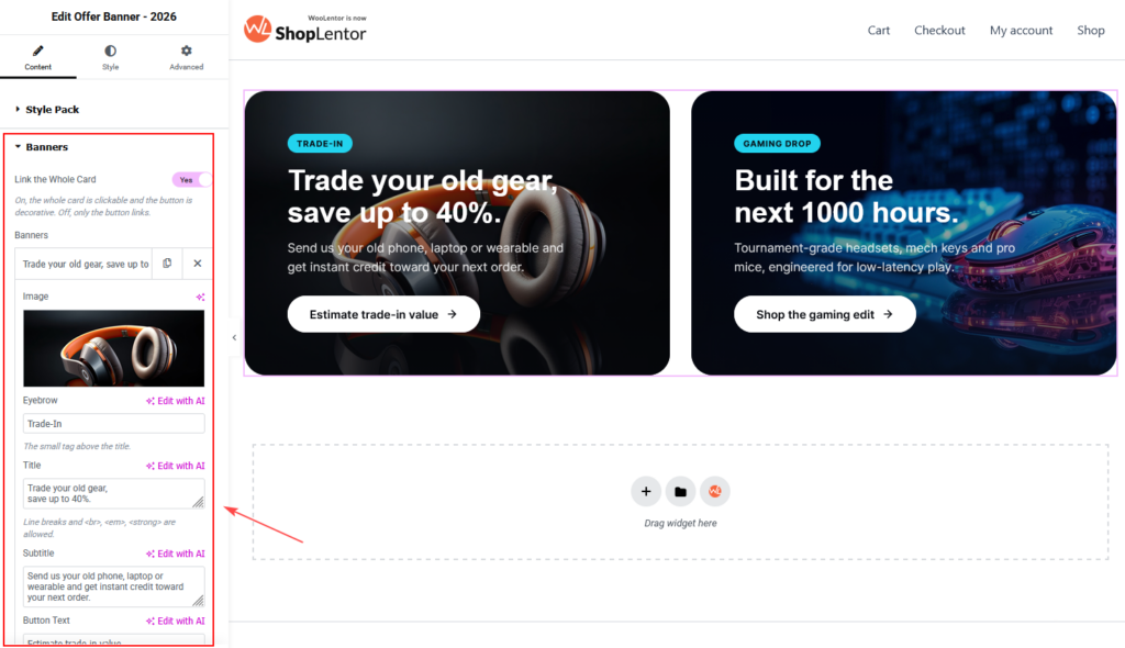
Banner item settings
| Setting | What it does |
|---|---|
| Image | Adds the visual for the card. Use a clear, high-quality image with room for text overlay. |
| Eyebrow | Adds a short label above the title, for example, TRADE-IN or GAMING DROP. |
| Title | Adds the main offer headline. Line breaks and basic text emphasis are supported. |
| Subtitle | Adds supporting copy below the title. Keep it concise and benefit-focused. |
| Button Text | Adds the call-to-action label, such as Shop the collection. Leave it empty to hide the button. |
| Link | Sets the destination URL for the button or the card. Link to the relevant collection, product category, campaign, or landing page. |
| Card Size | Chooses the card’s visual size in layouts that support asymmetric grids, such as Modern Variant 3. |
| Card Tone | Chooses the card tone in colour-coded layouts, such as Magazine Variant 2. |
| Badge Value | Adds a corner-badge value, such as 40%. Editorial layouts show this value alone; some Magazine layouts pair it with a label. |
| Badge Label | Adds a badge label below the value, such as OFF, where supported. |
| Feature List | Adds one feature per line for Magazine Variant 2. |
| Coupon Text | Adds a coupon chip beside the button for Magazine Variant 2. |
| Fine Print | Adds a brief note beneath card content for Magazine Variant 2. |
Make the entire card clickable
Turn on Content → Banners → Link the Whole Card when visitors should be able to click anywhere on a card. When it is off, only the button is linked.
Use this option only when the whole card should lead to the same destination. Always add a valid, relevant URL to the banner item.
Write better offer copy
Use an eyebrow for context, a short title for the main value, and a subtitle for the detail.
| Less effective | Better |
|---|---|
| Shop our products | New arrivals—Shop the autumn collection |
| Great gaming deals | Gaming drop—Built for the next 1,000 hours |
| Trade in | Trade-in—Trade your old gear, save up to 40% |
Avoid long titles, competing calls to action, or text that merely repeats the image. review every result for accuracy, brand tone, and link relevance before publishing.
5. Set columns and spacing
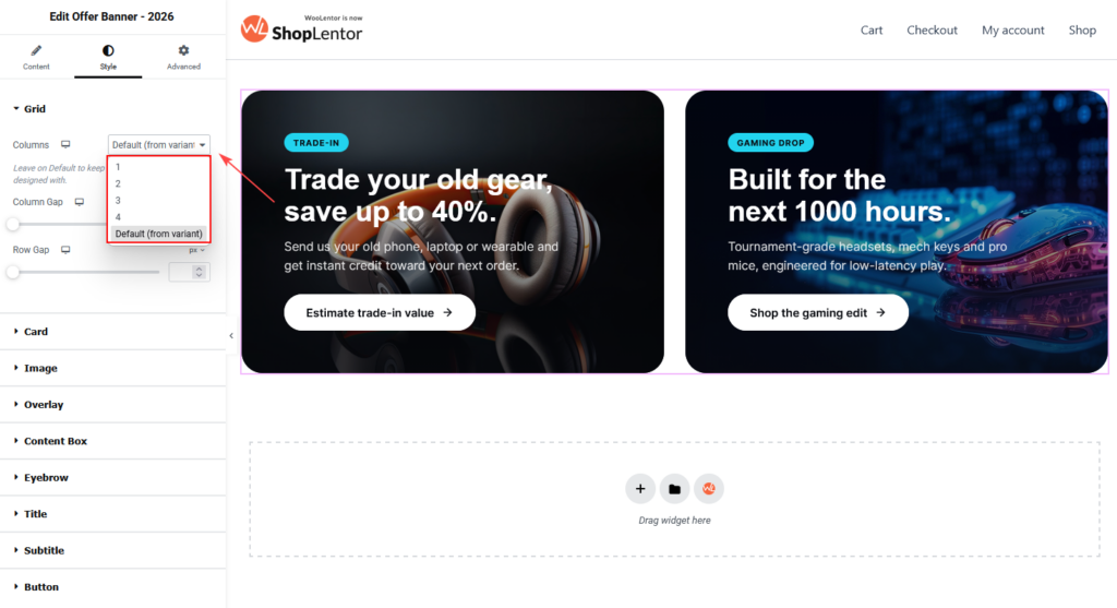
Open Style → Grid to configure the card grid.
| Control | Description |
|---|---|
| Columns | Sets 1–4 cards per row, or uses the selected variant default. |
| Column Gap | Sets horizontal space between cards. |
| Row Gap | Sets vertical space between rows. |
Use Elementor’s responsive controls to set a separate column count for each device.
| Device | Recommended starting layout |
|---|---|
| Desktop | 2 cards for wide feature offers; 3–4 cards for compact promotions. |
| Tablet | 2 cards. |
| Mobile | 1 card. |
Keep the variant default when the design uses an intentional asymmetric composition.
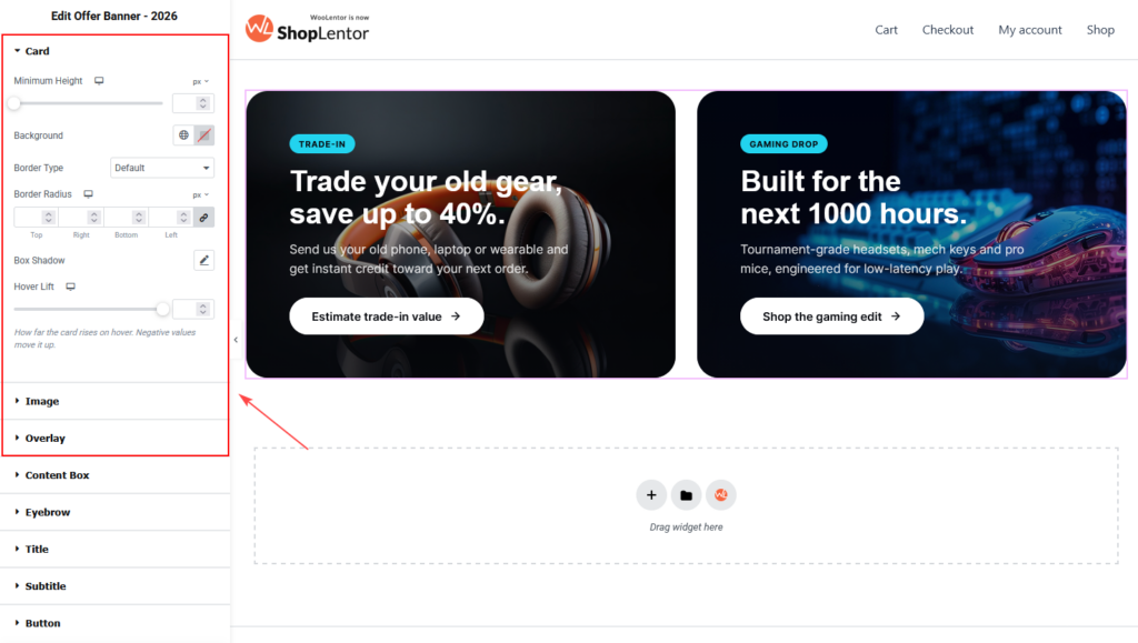
6. Customize card, image, and overlay styling
Use the following Style tab controls to refine the appearance and interaction of your offer banners.
| Style section | Available controls | How to use it |
|---|---|---|
| Card | Minimum height, background, border type, border radius, box shadow, and hover lift | Set a minimum height to keep cards visually consistent when banner titles have different lengths. Use background, borders, and shadow to match the site design. Keep hover lift subtle so the interaction feels smooth and does not distract visitors. |
| Image | Focal point, hover zoom, and card ratio | Set the focal point to keep the key product or subject visible when the image is cropped. Use hover zoom only when the image has enough empty space around the subject. Adjust the card ratio when you need a taller card for more content or a wider card for image-focused promotions. |
| Overlay | Normal overlay, hover overlay, solid background, and gradient background | Use an overlay when text appears over an image. A darker overlay improves the readability of white text. Set a distinct hover overlay to give visitors a clear visual indication that the card is interactive. |
7. Style content and calls to action
Use the following Style tab controls to customize the banner content and call-to-action button.
| Style section | Available controls | How to use it |
|---|---|---|
| Content Box | Padding, horizontal alignment, and vertical position | Use padding to keep content away from image edges. Choose the alignment and vertical position that place the text in the clearest area of the image. |
| Eyebrow | Color, background, typography, padding, border radius, and spacing below | Style the small label above the title. Use a contrasting background and short text to make campaign labels, such as “New Arrival” or “Limited Offer,” easy to notice. |
| Title | Color, typography, and spacing below | Make the main offer headline prominent and easy to scan. Use enough spacing below the title to separate it from the subtitle or button. |
| Subtitle | Color, typography, maximum width, and spacing below | Add short supporting text for the offer. Limit the maximum width when the image is busy, as this improves readability and prevents long lines. |
| Button | Normal and hover color, background, border type, typography, padding, border radius, and icon spacing | Switch between Normal and Hover states to style the button interaction. Use a descriptive label, such as Shop the gaming edit, instead of a generic label like Learn more. Ensure the button has sufficient contrast in both states. |
8. Responsive and accessibility tips
Review the widget in Elementor’s desktop, tablet, and mobile preview modes before publishing.
- Use text and overlays with sufficient contrast against images.
- Do not rely on color or imagery alone to communicate the offer.
- Keep titles and buttons short enough to avoid awkward wrapping on small screens.
- Test image crop and focal point at every breakpoint.
- Verify every card and button link goes to the expected page.
- Avoid excessive hover lift and zoom when several cards display together.
- Put the most important offers first in the grid.
9. Recommended placement
The Offer Banner – 2026 widget works especially well:
- Directly below a homepage hero.
- Above featured products or category sections.
- On a seasonal campaign landing page.
- Between product sections to break up a long homepage.
- On category pages to link visitors to complementary collections or services.
Use two prominent banners for major competing offers. Use three or four smaller cards for category shortcuts. Avoid placing too many banners at the top of a page, as this makes the main action less clear.
10. Troubleshooting
The widget does not appear in Elementor
Confirm that Offer Banner – 2026 is enabled in ShopLentor → Settings → Elementor Widgets. Reload Elementor and search again.
A control from this guide is missing
Controls depend on the selected Style Pack and Variant. Choose the intended design first, then check the relevant section in the Content or Style tab.
My image crops in the wrong place
Open Style → Image, adjust the Focal Point, and review the result on desktop, tablet, and mobile. Adjust the card ratio if needed.
The whole card is not clickable
Enable Link the Whole Card in Content → Banners and make sure the relevant banner has a valid Link. Update the page, then test it on the frontend.
The layout is crowded on mobile
Set Style → Grid → Columns to one for mobile. Shorten the title or subtitle, reduce minimum height where appropriate, and check the image focal point.
Changes do not appear on the live page
- Update the page in Elementor.
- Clear the browser cache.
- Clear WordPress, server, and CDN cache if used.
- Go to Elementor → Tools and regenerate CSS and data.
- Test in a private browser window.
Frequently asked questions
Can I add more than two offer banners?
Yes. Add items in Content → Banners, then set a suitable column count in Style → Grid.
Can every banner link to a different page?
Yes. Every item has its own Link field. Link banners to distinct product categories, collections, campaign pages, or custom URLs.
Can I hide the call-to-action button?
Yes. Leave Button Text empty to hide it. To keep the card linked, turn on Link the Whole Card and add a URL.
Why are some fields available only for certain variants?
Every variant has its own layout. Settings such as card size, card tone, badge label, feature list, coupon text, and fine print appear only when the selected design uses them.
Which Offer Banner variants are free?
Variant 1 of Modern, Editorial, Luxury, and Magazine is included in the free version. Variants 2 and 3 require ShopLentor Pro.