

The Shop the Look – 2026 widget for Elementor lets you turn an inspirational image into a shoppable WooCommerce experience. Add one or more look images, place interactive product pins on each image, and show the associated products in a panel beside the image. Customers can explore an outfit, room, collection, or styled scene and add its available products to the cart.
Use this widget for fashion outfits, room designs, beauty routines, gift guides, bundles, or any visual story where several products work together.
Why use the Shop the Look widget?
- Make editorial images directly shoppable without sending visitors through a long product search.
- Group complementary WooCommerce products into a single look or collection.
- Let visitors switch between multiple looks in one section.
- Place product pins at the exact point where each item appears in the image.
- Give customers a quick route to individual products or the complete look.
- Match the section to an Editorial, Modern, Luxury, or Magazine storefront design.
Before you begin
Make sure WooCommerce, Elementor, and ShopLentor are installed and active. Create the WooCommerce products that you plan to feature first, including their featured images, prices, categories, and product attributes.
Prepare one high-quality image for each look. Use images that clearly show the products, leave enough visual space for pins, and retain their subject when cropped on smaller screens. A look with three to ten products is usually easiest for shoppers to understand.
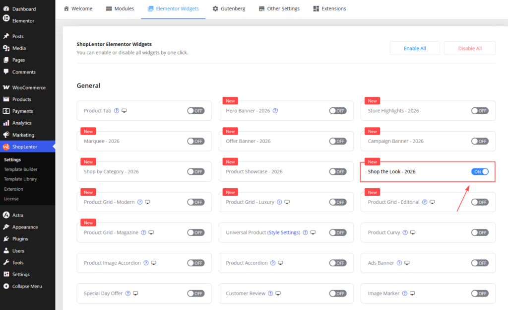
1. Enable Shop the Look – 2026
- From the WordPress dashboard, go to ShopLentor → Settings → Elementor Widgets.
- Find Shop the Look – 2026.
- Enable the widget and save the settings.
2. Add the widget in Elementor
- Open the page or template where you want to display the shoppable scene.
- Select Edit with Elementor.
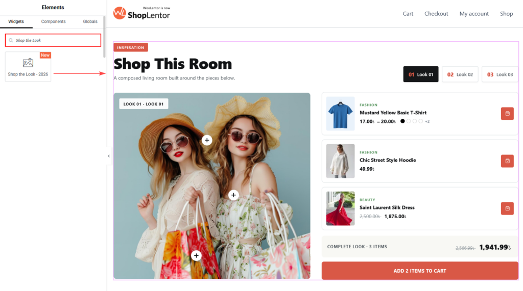
- Search for Shop the Look – 2026 in the Elements panel.
- Drag the widget into a section or container.
- Open the Content tab to configure the widget.
The widget works especially well below a campaign hero, inside an editorial landing page, or beside copy that explains the collection. Avoid placing several image-heavy widgets back to back; each look needs enough space for visitors to scan the image and product panel.
3. Choose a style pack and variant
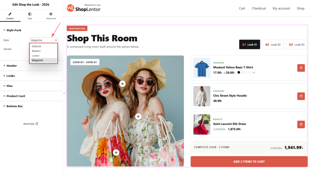
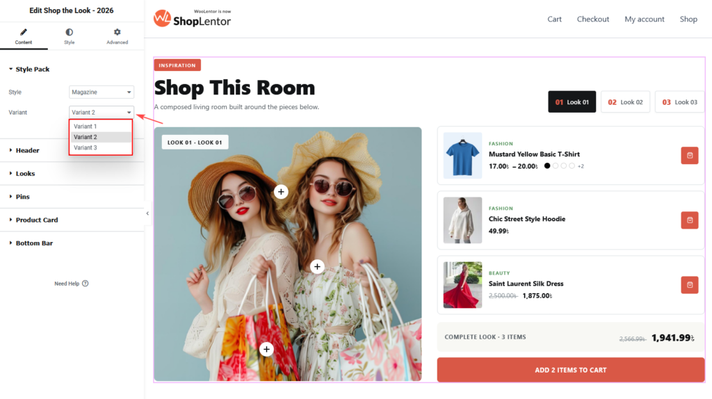
Open Content → Style Pack, then select a Style and Variant.
| Style pack | Best for |
|---|---|
| Editorial | Story-led fashion, beauty, and lifestyle collections. |
| Modern | Clean, contemporary stores and general retail. |
| Luxury | Premium fashion, jewellery, interiors, and beauty. |
| Magazine | Curated, image-led commerce with a bold editorial feel. |
Each style pack provides Variant 1, Variant 2, and Variant 3. A variant changes the visual composition while keeping the same look and product data available. Select the intended style and variant before fine-tuning content and styling, because the controls available for a design can vary.
Note: If Elementor marks a design as unavailable or asks you to upgrade, choose an available variant or use the required ShopLentor plan before publishing it.
4. Add a clear section header
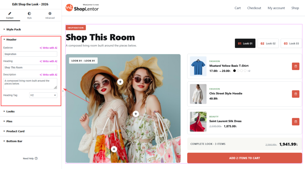
Open Content → Header to introduce the collection.
| Setting | What it does | Recommended use |
|---|---|---|
| Eyebrow | Adds a short label above the main heading. | Use context such as Inspiration, The autumn edit, or Styled for you. |
| Heading | Adds the section’s main visible title. | Describe the scene or collection, such as Shop this living room. |
| Description | Adds supporting text below the heading. | Explain what the visitor can shop in one concise sentence. |
| Heading Tag | Sets the HTML heading level for the heading. | Usually use H2 beneath the page’s single H1; use the level that preserves the page hierarchy. |
Write the heading for people first. For example, Shop this sunlit living room is more helpful than repeatedly using a generic phrase such as Shop the look products. Keep the eyebrow, heading, and description distinct so they add context rather than repeat the same keyword.
5. Create the looks
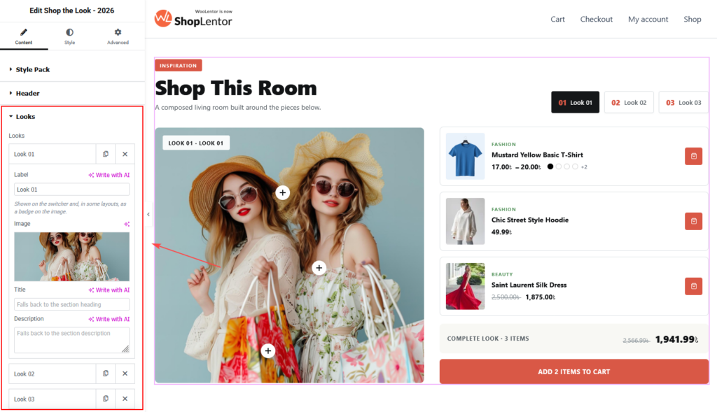
Open Content → Looks. Each item is one shoppable scene. The look switcher on the frontend lets visitors move between these scenes.
- Expand the first look item.
- Enter a short Label. This appears in the look switcher and, in some layouts, as a badge on the image.
- Upload or select the Image for the look.
- Optionally enter a Title and Description for that look.
- Add more looks as needed with Add Item.
- Use the duplicate icon to reuse an existing look setup, or the delete icon to remove an unwanted look.
| Look setting | What it does |
|---|---|
| Label | Names the look in the switcher and selected-layout image badge. Use brief labels such as Look 01, Living room, or Weekend edit. |
| Image | Supplies the visual scene where product pins are positioned. |
| Title | Overrides the section heading for this look when the selected layout displays a look title. Leave it empty to use the section heading. |
| Description | Overrides the section description for this look when the selected layout displays a look description. Leave it empty to use the section description. |
Use meaningful labels when the looks have different purposes. Numbered labels are fine for a fashion lookbook, but labels such as Desk essentials and Reading corner are more useful when visitors need to distinguish room scenes quickly.
6. Add products and position pins
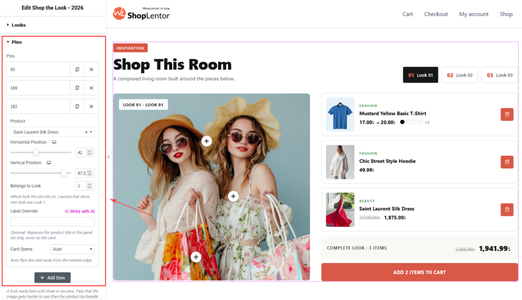
Open Content → Pins. Every pin connects one WooCommerce product to a position in a look image.
- Select Add Item.
- Choose the WooCommerce Product to feature.
- Set the Horizontal Position and Vertical Position controls to place the pin over the product in the image.
- Set Belongs to Look to the number of the look image that contains the product.
- Optionally enter a Label Override and choose how the product card opens.
- Repeat for the other products in the scene.
| Pin setting | What it does | Best practice |
|---|---|---|
| Product | Selects the WooCommerce product linked to the pin. | Choose the exact purchasable product, not a loosely related item. |
| Horizontal Position | Moves the pin left or right as a percentage of the image. | Position it close to the item without covering an important part of the image. |
| Vertical Position | Moves the pin up or down as a percentage of the image. | Check the position at desktop, tablet, and mobile widths. |
| Belongs to Look | Assigns the pin to a numbered look. | Set this to the matching item in Looks. For example, a pin for the first image belongs to Look 1. |
| Label Override | Replaces the product title in the panel list only. It does not change the product card title. | Use it only when a shorter or more contextual panel label is genuinely helpful. |
| Card Opens | Chooses the direction in which the product card opens. Auto places it away from the nearest image edge. | Keep Auto unless a pin’s card overlaps another important pin or image area. |
The editor gives each pin an internal item label and also lets you duplicate or delete it. These item labels are for editing and do not replace the product title shown to customers.
Pin placement tips
- Place each pin on or immediately beside its product, not in empty image space.
- Do not stack pins so closely that visitors cannot select the intended item.
- Keep pins away from faces, product labels, and essential visual details.
- For a cleaner experience, begin with three to ten pins per look. A very large number of pins makes the image harder to interpret and the product list harder to scan.
- Review every look after changing the image. New image proportions can shift the apparent pin position.
7. Configure the product card
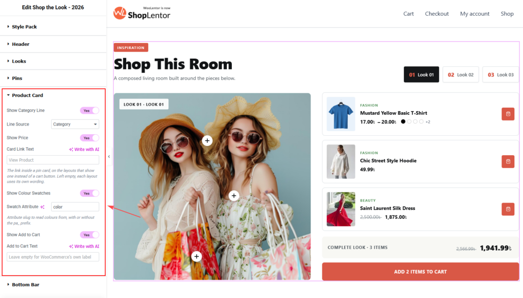
Open Content → Product Card to control the information and actions available for pinned products.
| Setting | What it does | Recommended use |
|---|---|---|
| Show Category Line | Displays a small metadata line in the product panel or card. | Enable it when a category helps identify the item. |
| Line Source | Chooses the source for the metadata line, such as Category. | Use the source that gives shoppers the most useful context. |
| Show Price | Displays the WooCommerce price. | Keep it enabled for normal shopping pages. |
| Card Link Text | Sets the link label for layouts that show a product link instead of a cart button. | Use a direct label such as View product; leave it empty when the layout should use its own wording. |
| Show Colour Swatches | Shows colour options for products where the product data supports them. | Enable only when variable-product colour data is complete. |
| Swatch Attribute | Sets the attribute slug used for colour swatches. | Enter color for a WooCommerce attribute named pa_color; do not include the pa_ prefix. |
| Show Add to Cart | Shows the add-to-cart action. | Enable it when customers can buy the selected product directly. |
| Add to Cart Text | Replaces the add-to-cart label. | Leave it empty to use WooCommerce’s appropriate label for each product type. |
Only turn on details that help the customer make a decision. Category lines, prices, swatches, and buttons should remain easy to scan rather than compete for attention.
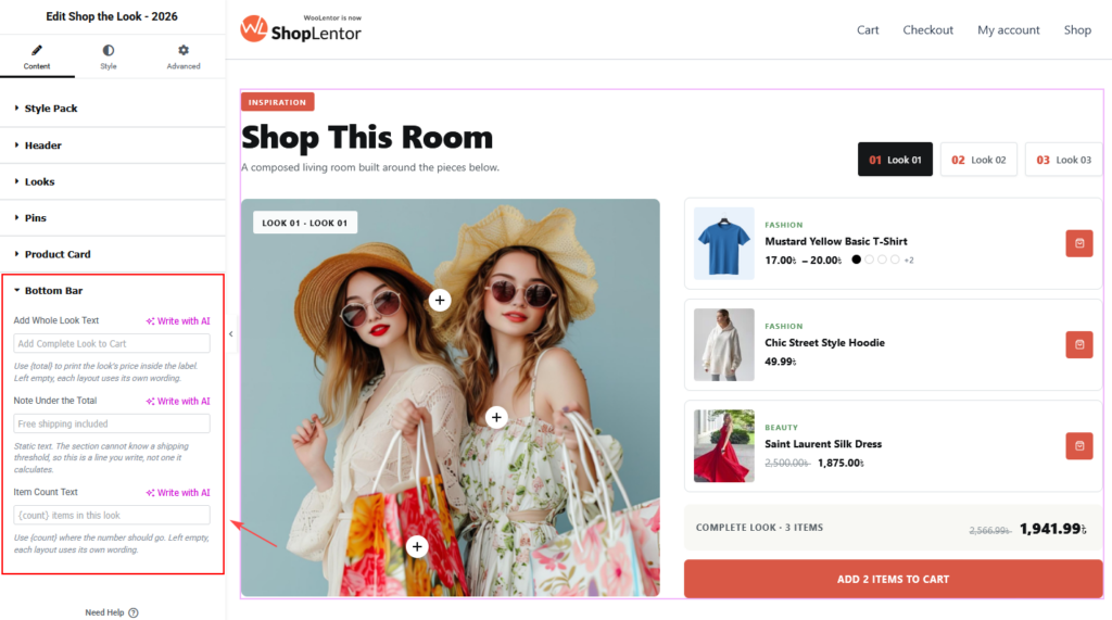
8. Set the complete-look bar
Open Content → Bottom Bar to customize the summary and complete-look action shown beneath the product list in layouts that support it.
| Setting | What it does | Recommended use |
|---|---|---|
| Add Whole Look Text | Sets the action label that adds the look’s available products to the cart. | Use a clear, action-led label such as Add complete look to cart. Use {total} when you want the look price included in the label. |
| Note Under the Total | Shows a static line beneath the total. | Add only accurate information, such as Free shipping included when it applies. This field does not calculate shipping. |
| Item Count Text | Sets the wording for the number of items in the look. | Use {count} where the item number should appear, for example {count} items in this look. Leave it empty to let the layout use its own wording. |
The complete-look action can only add products that are available and purchasable. Check the live page whenever the look contains variable, out-of-stock, external, or otherwise restricted product types.
9. Customize the Style tab
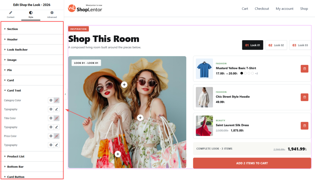
Choose the final style pack and variant before opening Style. The available accordions match the visible parts of the selected design.
| Style section | What you can customize |
|---|---|
| Section | Base background, text colour, padding, and border radius for the widget section. |
| Panel | The product-panel background and spacing where the selected design uses a panel. |
| Header | Header presentation, including the eyebrow, heading, and description where available. |
| Look Switcher | The controls visitors use to select a look. |
| Image | The visual presentation of the look image. |
| Pin | Pin appearance and interaction styling. |
| Card | Product-card appearance. |
| Card Text | Product title, category line, price, and related card typography where available. |
| Product List | The list of products associated with the active look. |
| Bottom Bar | The complete-look summary and total area. |
| Card Button | Product-card action button styling. |
Use global colours and typography where possible to keep the widget consistent with your store. Maintain a strong contrast between the image, pins, text, and buttons. Check normal, hover, focus, and active states for every interactive control.
Tip: The visible Style sections depend on the selected design. If a section is not shown, switch to the relevant style and variant, or use the controls that apply to the current layout.
10. SEO, accessibility, and responsive checklist
Before publishing, review the completed widget in Elementor’s desktop, tablet, and mobile previews, then test the live page.
- Use a descriptive heading and a short supporting paragraph that explain the collection naturally.
- Keep the page heading hierarchy logical. In most cases, use an
H2or lower widget heading beneath the page’s onlyH1. - Use real WooCommerce product names, current prices, accurate availability, and high-quality product images.
- Give the look images meaningful media alternative text where your WordPress media settings support it. Describe the scene rather than repeating a keyword.
- Do not use the same phrase in the eyebrow, heading, description, labels, and buttons merely for SEO.
- Ensure text, buttons, price information, and pins have sufficient contrast against their backgrounds.
- Do not communicate which look is selected, which pin is active, or which product is on sale through colour alone. Keep visible labels, text, and icons.
- Use clear action labels such as
View product,Add to cart, andAdd complete look to cart, not vague labels such asClick here. - Test keyboard access to look switchers, pins, product links, and add-to-cart buttons.
- Check that card popovers do not hide important content near the edge of the image; use Card Opens when Auto does not give a good result.
- Test pin spacing and product-panel readability on smaller screens. Reduce the number of pins or simplify the product-card details if the layout feels crowded.
- Confirm every linked product is published, purchasable, and relevant to the visible scene.
11. Recommended uses
The Shop the Look widget is especially useful in these places:
- Fashion homepage: show complete outfits for a season, occasion, or campaign.
- Furniture and homeware page: let visitors shop a styled room, desk, or dining setting.
- Beauty landing page: group the products used in a makeup, skincare, or haircare routine.
- Gift guide: show a themed set and make every recommended item easy to find.
- Editorial article: pair a styling story or buying guide with the products mentioned in it.
For example, a homeware store can create looks named Warm living room, Dining table edit, and Bedroom retreat, with a concise heading such as Shop the details that make a room feel finished. A fashion shop could use Weekend linen, City tailoring, and Evening colour as look labels. Name and group looks according to a visitor’s shopping intent.
12. Troubleshooting
The widget does not appear in Elementor
Confirm that Shop the Look – 2026 is enabled in ShopLentor → Settings → Elementor Widgets. Reload the Elementor editor and search for the widget again.
A product does not show in the active look
Open Content → Pins and check that the pin has a selected product and the correct Belongs to Look number. Also confirm that the WooCommerce product is published and visible to the visitor.
A pin appears in the wrong place
Adjust Horizontal Position and Vertical Position for that pin. Check the result on the real image, then review the tablet and mobile preview. If you replaced the look image, reposition the pins for the new image.
The product card opens off the image or covers another pin
Open the relevant pin and change Card Opens from Auto to a direction that leaves clear space. Recheck the layout at every breakpoint.
Colour swatches are missing
Confirm that Show Colour Swatches is enabled and that Swatch Attribute matches the WooCommerce attribute slug. For example, an attribute registered as pa_color uses color in this setting. The product must have valid variations using that attribute.
The complete-look action does not add every item
Review the products assigned to the active look. Out-of-stock, non-purchasable, variable products requiring an option, and product types with purchase restrictions may not be added as a simple complete-look action. Test the flow with the actual catalogue configuration.
Changes are not visible on the live page
- Update the page in Elementor.
- Clear browser, WordPress, server, and CDN caches.
- Go to Elementor → Tools and regenerate CSS and data.
- Test the page in a private browser window.
Frequently asked questions
Can I add more than one shoppable image?
Yes. Add an item in Content → Looks for each image. Use Content → Pins to assign each product pin to its corresponding numbered look.
Can a product appear in more than one look?
Yes. Create a separate pin for the product in each look, then assign each pin to the correct Belongs to Look number and position it for that image.
Can I change the product name only in the side panel?
Yes. Use Label Override in the pin settings. It replaces the product title in the panel list only and does not change the product card or the WooCommerce product name.
How many pins should a look have?
Start with three to ten pins. Use fewer when the image is busy or the products are close together. Add more only when each pin remains easy to identify and select.
Can I show the full price in the complete-look button?
Yes. Add {total} to Add Whole Look Text. The widget prints the look’s price where the token appears.
Can I change the item-count wording?
Yes. Enter custom text in Item Count Text and include {count} where the number should appear, such as {count} items in this look.