
The Cart Table Aura Widget is a modern WooCommerce cart page widget for Elementor that helps you create a clean, user-friendly, and visually appealing shopping cart experience. Unlike traditional cart tables, the Cart Table Aura Widget displays cart items in a stylish card-based layout, making it easier for customers to review products, update quantities, view savings, and manage their cart before checkout.
This widget is ideal for store owners who want to improve the appearance of their WooCommerce cart page while maintaining a smooth shopping experience for customers.
What You Can Customize
With the Cart Table Aura Widget, you can:
- Display a custom cart heading
- Show the total number of items in the cart
- Display product images and vendor information
- Show product variation attributes
- Display stock availability
- Enable quantity steppers
- Allow customers to remove products from the cart
- Display regular prices and discounts
- Show savings badges
- Fully customize the design and styling of each cart element
Before You Start
Before using the Cart Table Aura Widget, make sure:
- WooCommerce is installed and activated.
- Elementor is installed and activated.
- ShopLentor is installed and activated.
- A Cart Page Template has already been created.
How to Add the Cart Table Aura Widget
Step 1: Enable the Widget
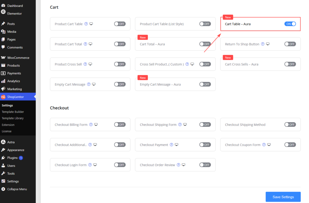
- Navigate to ShopLentor → Settings → Elementor Widgets in your WordPress dashboard.
- Find WL: Cart Table — Aura.
- Toggle the switch ON to activate it.
Step 2: Add the Widget
Edit your existing Cart Page template or create a new one.
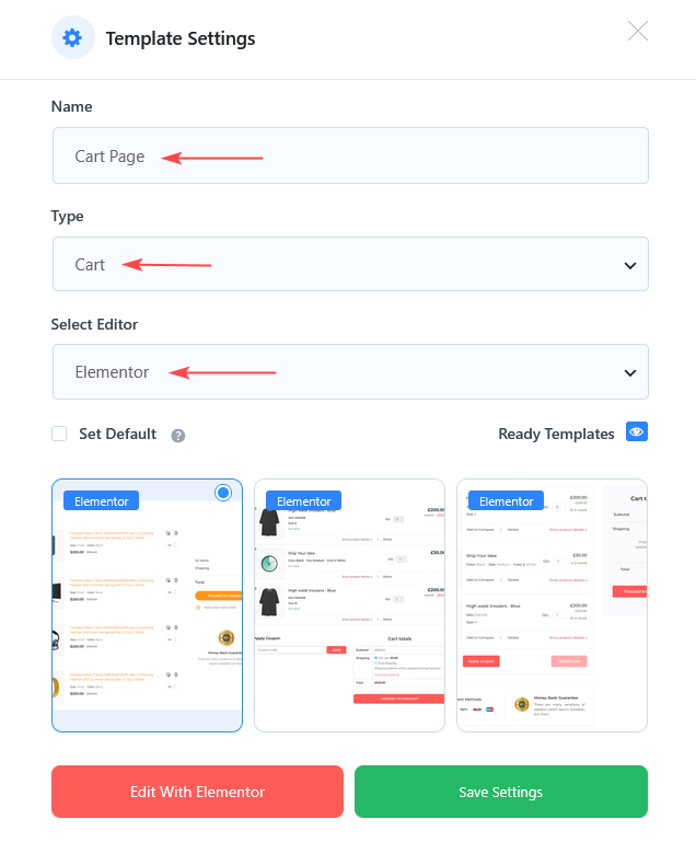
Go to ShopLentor → Template Builder. Click Add New Template. Fill in the popup form:
- Template Name: e.g., Cart Page
- Type: Select Cart
- Editor: Choose Elementor
- (Optional) Enable Set Default to make it your active template.
Select the sample layout: WL: Cart Table — Aura Click Save Settings, then Edit with Elementor.
Inside Elementor:
- Search for: Cart Table — Aura.
- Drag and drop the widget into your cart page layout.
- Configure the widget settings from the Elementor sidebar.
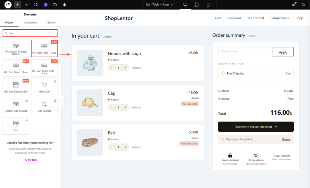
The cart page preview will update automatically as you make changes.
Content Settings
The Content tab allows you to control the information displayed within the cart.
Cart Heading
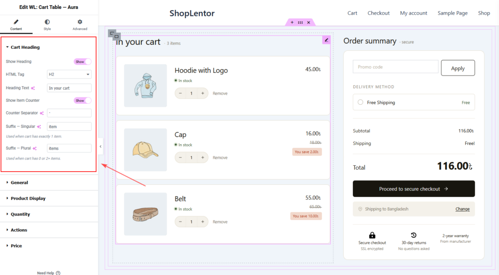
The Cart Heading section lets you customize the cart title and item counter.
Available Options
Show Heading
Enable or disable the cart heading.
HTML Tag
Choose the heading structure:
- H1
- H2
- H3
- H4
- H5
- H6
Heading Text
Enter a custom heading for the cart page.
Example:
In your cart
Show Item Counter
Display the total number of products currently in the cart.
Counter Separator
Choose a separator between the item count and label.
Example:
3 · items
Suffix – Singular
Text displayed when only one product exists in the cart.
Example:
item
Suffix – Plural
Text displayed when multiple products exist in the cart.
Example:
items
General Settings
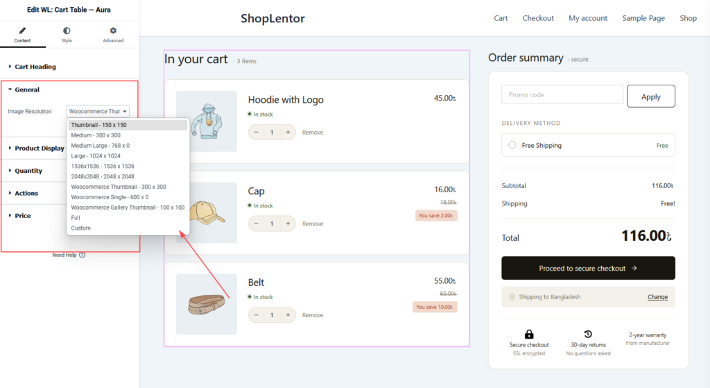
General settings control product image display.
Image Resolution
Choose which image size should be displayed inside the cart.
Available options may include:
- Thumbnail
- Medium
- Medium Large
- Large
- WooCommerce Thumbnail
- WooCommerce Single
- WooCommerce Gallery Thumbnail
- Full
- Custom Sizes
Selecting the appropriate image size helps improve performance and visual quality.
Product Display
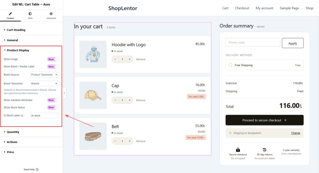
The Product Display section controls product-related information.
Show Image
Display or hide product images.
Show Brand / Vendor Label
Display product brand or vendor information.
Brand Source
Select where brand information should be retrieved from.
Example:
- Product Taxonomy
Brand Taxonomy
Choose the taxonomy used for brands.
Example:
Brands
Show Variation Attributes
Display selected product variations.
Examples:
- Size
- Color
- Material
Show Stock Status
Display stock availability information.
In Stock Label
Customize the stock status text.
Example:
In Stock
Quantity
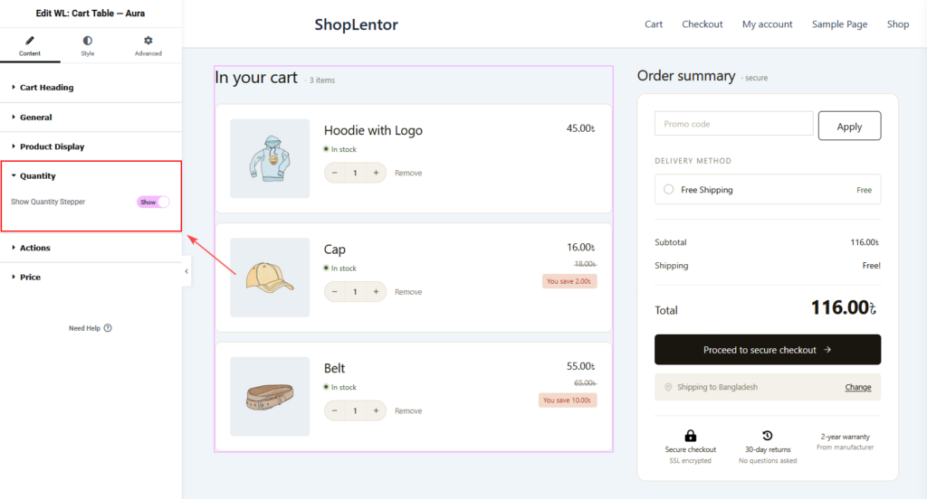
Show Quantity Stepper
Enable quantity controls so customers can increase or decrease product quantities directly from the cart page.
This helps customers update quantities without leaving the cart page.
Actions
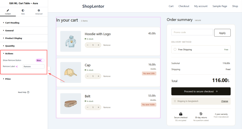
Show Remove Button
Allow customers to remove products from their cart.
Remove Label
Customize the remove button text.
Example:
Remove
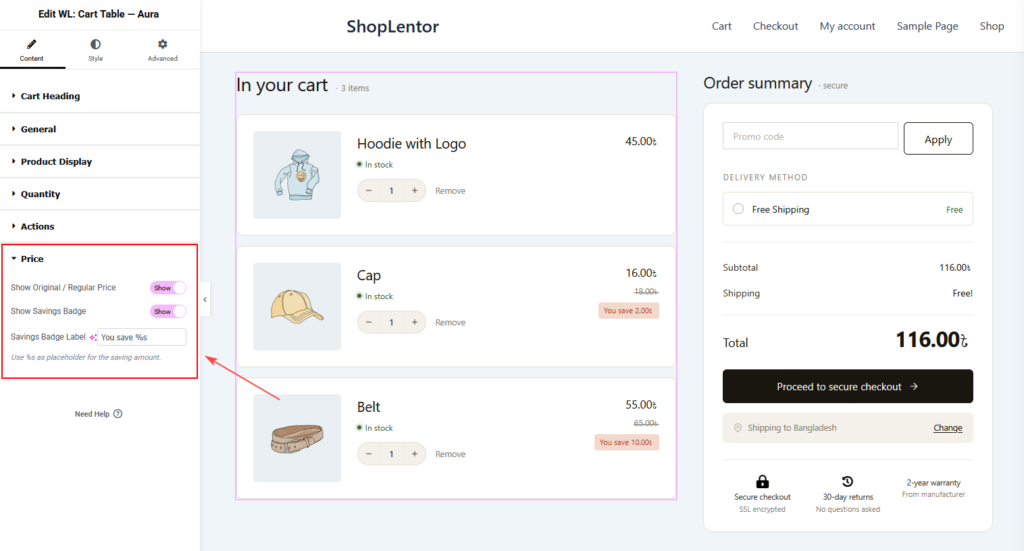
Price
Show Original / Regular Price
Display the original product price alongside the current price.
This is useful when products are on sale.
Show Savings Badge
Display the total savings amount for discounted products.
Savings Badge Label
Customize the savings badge text.
Example:
You save %s
The %s placeholder automatically displays the saved amount.
Style Settings
The Style tab allows you to fully customize the appearance of the Cart Table Aura Widget.
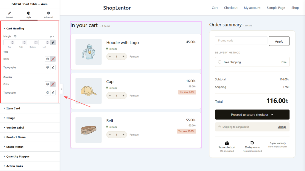
Cart Heading
Customize the heading area of the cart.
Available Controls
Margin
Adjust spacing around the heading section.
Title
- Color
- Typography
Counter
- Color
- Typography
Item Card
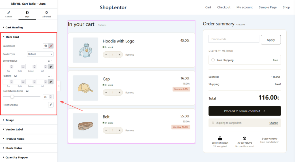
Customize the appearance of individual cart item cards.
Available Controls
Background
Set the card background color.
Border Type
Choose a border style for cart items.
Border Radius
Control corner roundness.
Padding
Adjust spacing inside the card.
Gap Between Items
Control spacing between cart item cards.
Hover Shadow
Add a shadow effect when users hover over cart items.
Image
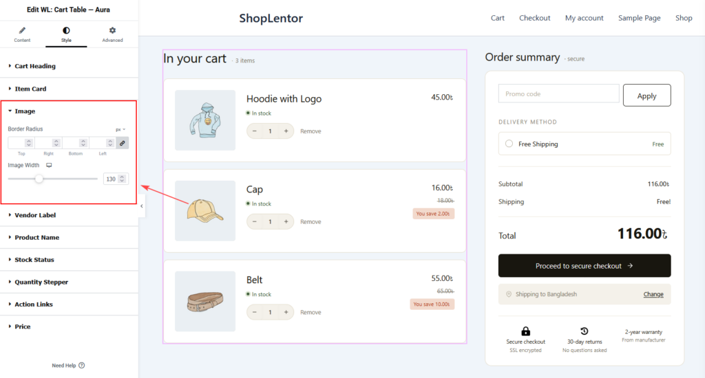
Customize product images displayed within the cart.
Available Controls
Border Radius
Round image corners.
Image Width
Adjust image width according to your design requirements.
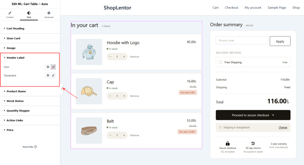
Vendor Label
Customize the appearance of vendor or brand labels.
Available Controls
- Color
- Typography
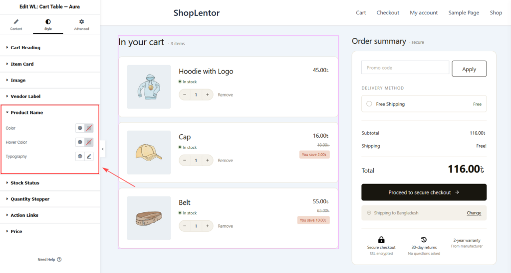
Product Name
Customize product title styling.
Available Controls
- Color
- Hover Color
- Typography
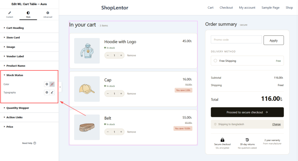
Stock Status
Customize stock availability labels.
Available Controls
- Color
- Typography
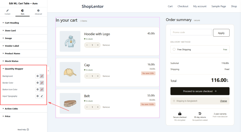
Quantity Stepper
Customize quantity control styling.
Available Controls
Background
Adjust stepper background color.
Border Color
Set the stepper border color.
Button Icon Color
Customize plus and minus button colors.
Input Typography
Customize quantity text typography.
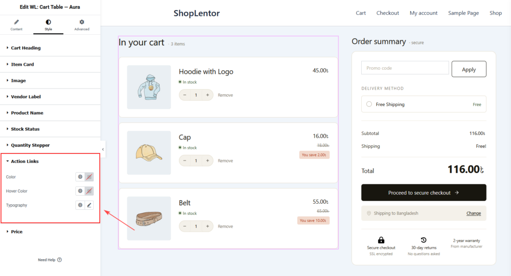
Action Links
Customize remove button styling.
Available Controls
- Color
- Hover Color
- Typography
Price
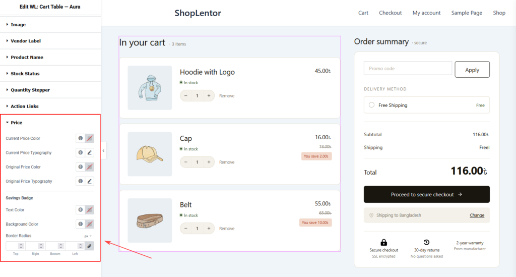
Customize price and savings badge appearance.
Current Price
- Current Price Color
- Current Price Typography
Original Price
- Original Price Color
- Original Price Typography
Savings Badge
- Text Color
- Background Color
- Border Radius
Best Practices
For the best user experience:
- Use optimized WooCommerce image sizes.
- Keep product images consistent.
- Display stock status to reduce customer confusion.
- Enable quantity steppers for faster cart updates.
- Highlight discounts using the Savings Badge.
- Use clear and readable typography.
- Maintain sufficient spacing between cart item cards.
Frequently Asked Questions
Can I customize the cart heading text?
Yes. Use the Heading Text option under Cart Heading settings.
Can I display brand information?
Yes. Enable the Show Brand / Vendor Label option and select a brand taxonomy.
Can customers update quantities directly from the cart?
Yes. Enable the Quantity Stepper option.
Can I display product savings?
Yes. Enable the Show Savings Badge option under the Price section.
Does the widget work with WooCommerce variable products?
Yes. The widget can display selected variation attributes when the Show Variation Attributes option is enabled.
Can I style every part of the cart layout?
Yes. The Style tab provides extensive customization options for headings, item cards, images, product names, prices, quantity controls, and action links.