Overview
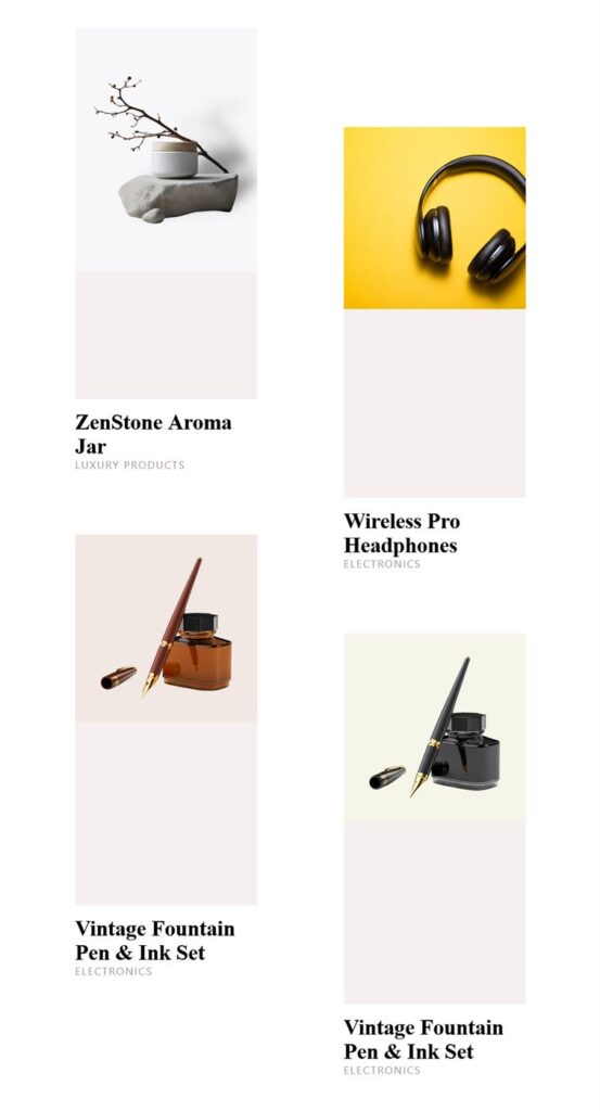
It’s easy to showcase WooCommerce products using the Product Expanding Grid Widget for Elementor. The Product Expanding Grid Widget allows you to display products in an interactive grid layout where product items expand to reveal more details when users interact with them.
This widget provides multiple layout, query, and styling options that allow you to create a clean and engaging product display. It is designed to be used inside Elementor pages or Elementor templates.
The Product Expanding Grid Widget for Elementor is a great way to organize your WooCommerce products. It works perfectly for eCommerce stores, homepage product sections, landing pages, product showcase sections, and product-focused templates where products need to be displayed in a visually appealing and interactive way.
Steps of Adding Product Expanding Grid Widget
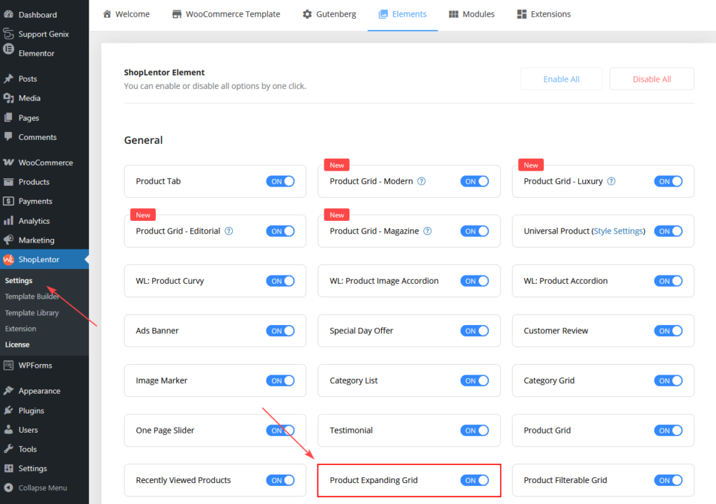
Go to WordPress Dashboard > ShopLentor > Elements.
From the list of Elements, turn ON the Product Expanding Grid Widget.
Step 1: How to Enable Product Expanding Grid Widget?
- Go to: Dashboard > ShopLentor > Elements
- From the list of available widgets, find Product Expanding Grid.
- Turn ON the Product Expanding Grid Widget.
- Click Save Settings.
Once enabled, the widget will become available inside the Elementor editor.
Step 2: How to Use the Product Expanding Grid Widget?
If you want to use the Product Expanding Grid feature on your WooCommerce store, you need to use the widget named: WL: Product Expanding Grid.
To add the widget:
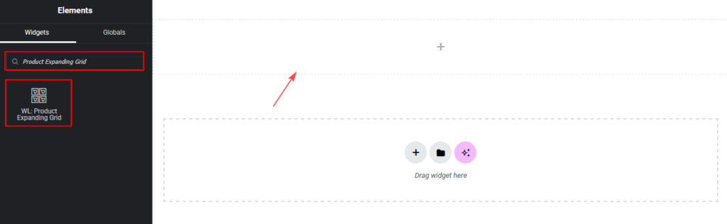
- Open the page where you want to display products and click Edit with Elementor.
- In the Elementor widget panel, search for Product Expanding Grid.
- Locate the widget that contains the WL Badge.
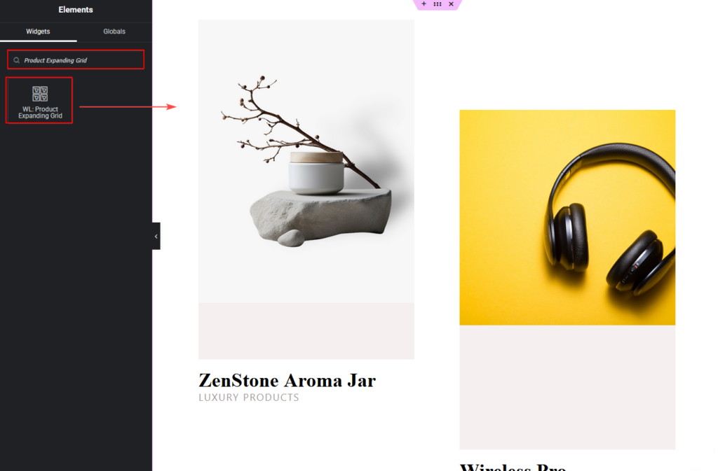
- Drag and drop the ShopLentor WL: Product Expanding Grid Widget onto the page.
Step 3: How to Customize the Product Expanding Grid?
You can customize the Product Expanding Grid using the Content and Style tabs available in the Elementor panel.
Content Tab Customization
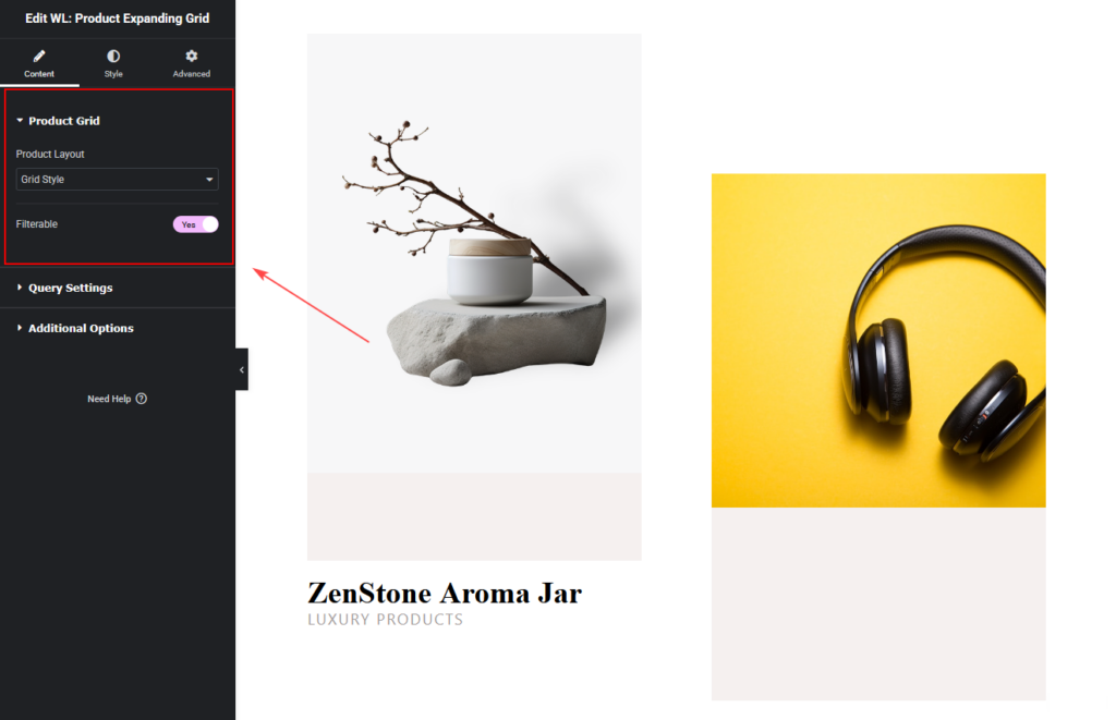
Product Grid Settings
From the Product Grid section, you can configure the product layout style.
You can set:
- Product Layout
- Current Theme Style
- Grid Style
This option allows you to control whether the widget follows the theme’s product style or uses the widget’s custom grid layout.
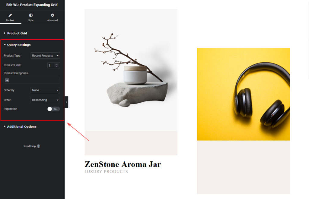
Query Settings
You can control which products to display.
You can set:
- Product Type (Recent, Featured, Best Selling, Sale, Top Rated, Random, Show by ID, Add ID Manually)
- Product Limit
- Product Categories
- Category Operator (AND / IN / NOT IN)
- Order By Order (Ascending / Descending)
Additional Options
The Additional Options section provides settings related to the Add to Cart button.
Cart Button Settings
You can customize the behavior and appearance of the Add to Cart button.
Available options include:
Add to Cart Button Text
- Change the button label.
- Example:
- Add to Cart
Buy Now
Shop Now
Add to Cart Button Icon
Select an icon to display alongside the button text.
Add to Cart Icon Position
Choose where the icon will appear:
- Left
- Right
Icon Spacing
Adjust the spacing between the icon and the button text.

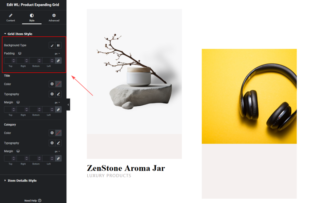
How to Customize the Product Expanding Grid Style
Go to the Style Tab to customize the visual appearance of the widget.
Grid Item Style
This section controls the design of each product item within the grid.
You can customize:
Background Type
Choose the background style for product items.
Padding
Adjust spacing inside each grid item.
You can control padding individually for:
- Top
- Right
- Bottom
- Left
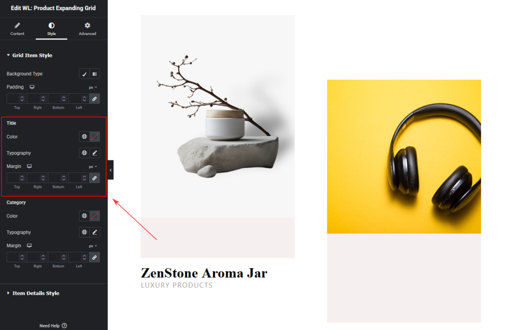
Title Style
You can customize the product title appearance.
Options include:
- Title color
- Typography
- Margin spacing
Category Style
Customize the appearance of product categories.
Options include:
- Category color
- Typography
- Margin

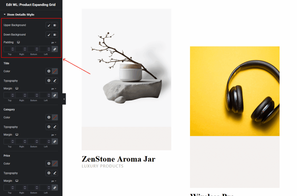
Item Details Style
This section controls the styling of the expanded product details.
Background Settings
You can customize two background areas.
Upper Background
Controls the background of the top section.
Down Background
Controls the background of the lower section.
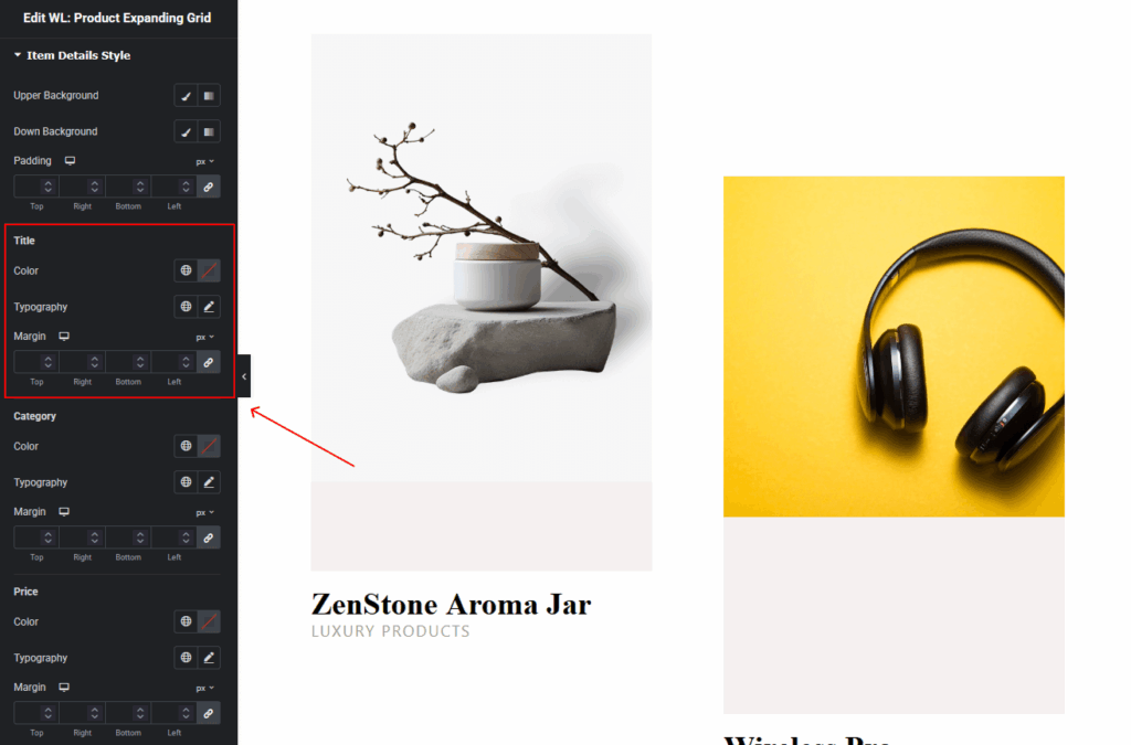
Title Style
Customize the expanded product title.
Options include:
- Color
- Typography
- Margin
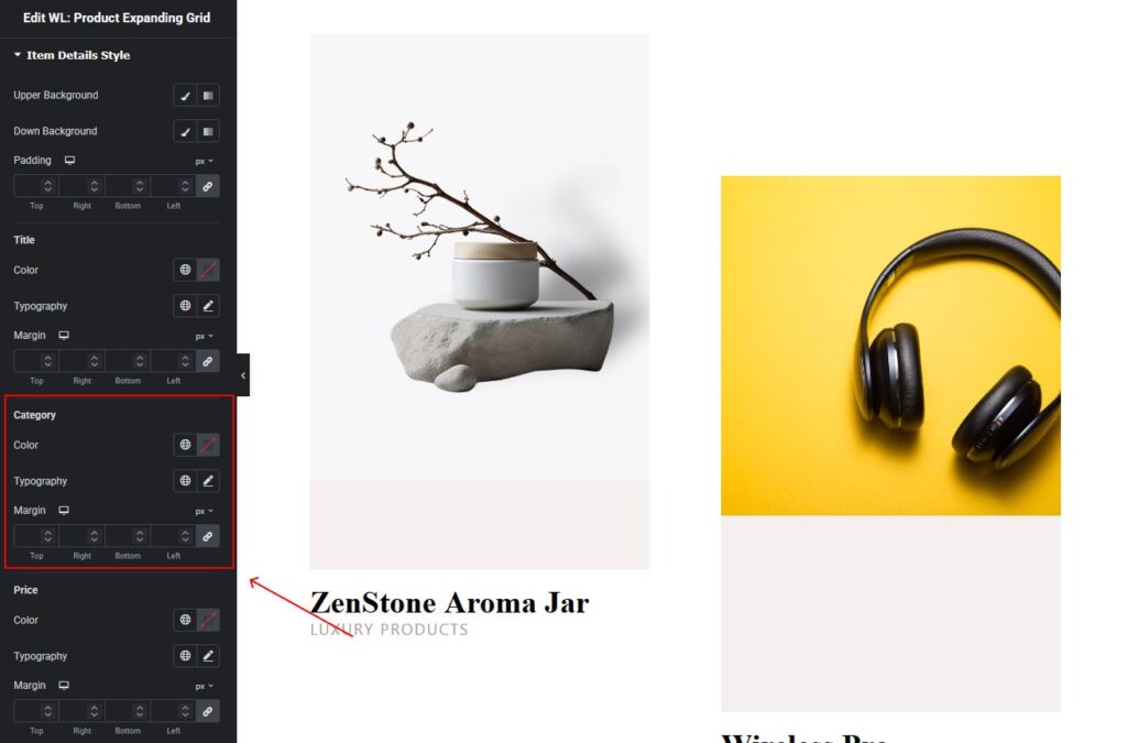
Category Style
Customize category styling in the expanded product view.
Options include:
- Color
- Typography
- Margin
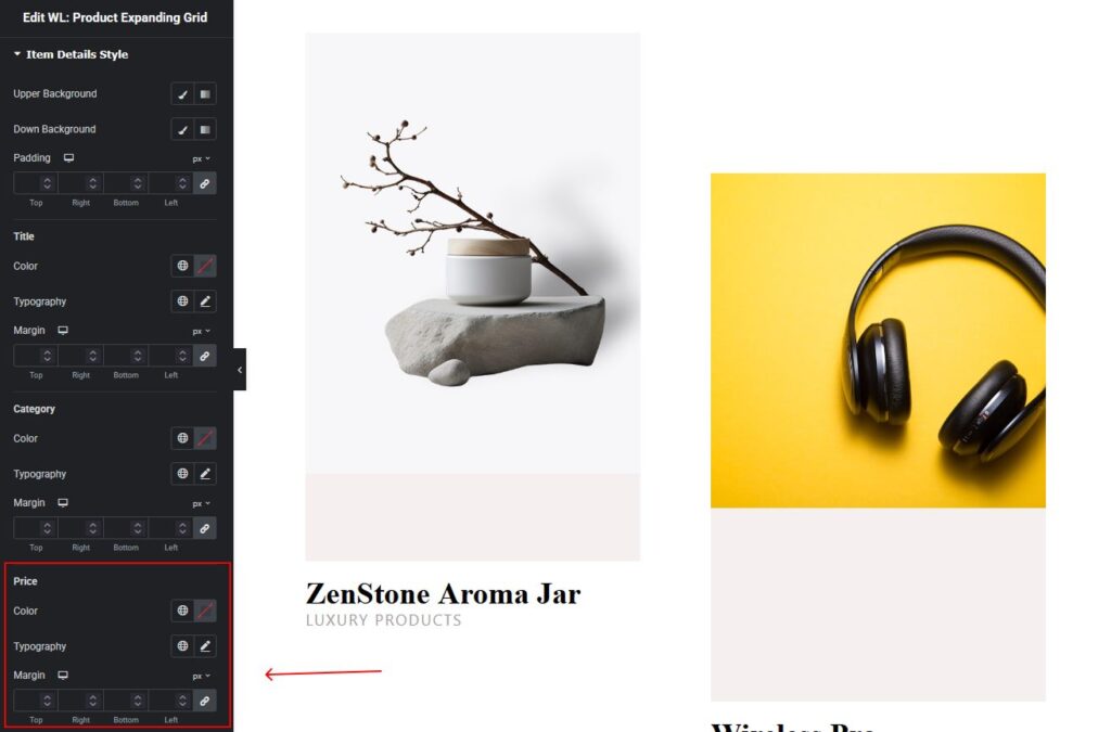
Price Style
Customize the appearance of the product price.
Options include:
- Color
- Typography
- Margin
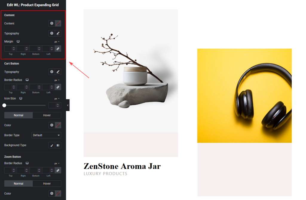
Content Style
Customize the styling of additional product content or description.
Options include:
- Color
- Typography
- Margin
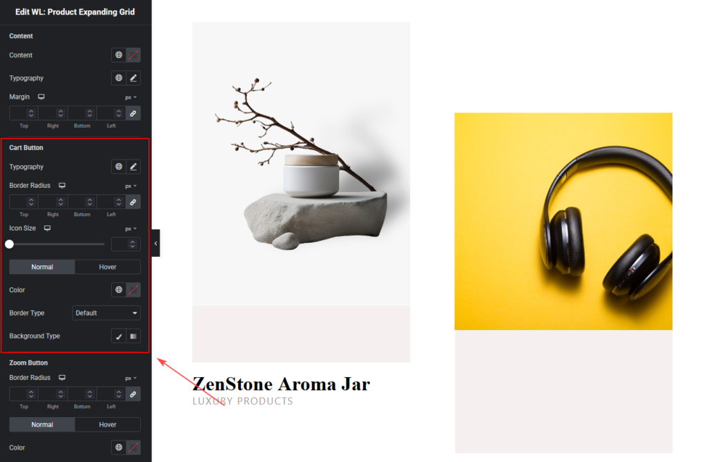
Cart Button Style
You can customize the Add to Cart button design.
Available options include:
- Typography
- Change the font settings for the button text.
- Border Radius
- Adjust the roundness of the button corners.
- Icon Size
- Control the size of the button icon.
Normal and Hover Styles
You can design separate styles for:
Normal State
- Text color
- Background color
- Border style
Hover State
- Hover text color
- Hover background color
- Hover border
Zoom Button Style
The Zoom Button allows users to preview products quickly.
You can customize:
- Border radius
- Button color
- Border type
- Background style
- Hover styles

Step 4: Now See the Preview
After completing all customization settings:
- Click Update or Publish.
- Visit the page to see the Product Expanding Grid displayed on your website.
Your WooCommerce products will now appear in an interactive expanding grid layout, allowing visitors to explore product details easily.