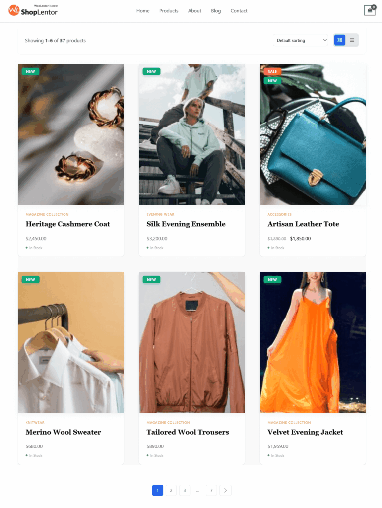
The Product Grid – Editorial Layout is a premium, magazine-inspired WooCommerce editorial product grid designed to give your store a refined, high-end visual identity. As an Elementor editorial product grid, it delivers a polished editorial look with balanced spacing, elegant typography, and visually driven layout options. The widget supports Grid View, List View, and a Grid–List Toggle, giving shoppers complete control over whether they want a fast gallery-style browsing experience or a detailed, content-rich product view.
Packed with modern eCommerce features—including professionally tuned aspect ratios, a signature View Details overlay button, animated stock indicators, editorial-style product descriptions, smart badges, quick action buttons, and versatile pagination options—this product grid editorial layout is ideal for fashion, beauty, lifestyle, luxury, and boutique WooCommerce stores.
Why Use Product Grid Editorial Layout?
The Product Grid – Editorial Layout offers a clean, stylish, and editorial browsing experience, inspired by magazine lookbooks and premium eCommerce design. With its elegant typography, refined spacing, and unique “View Details” overlay button, it helps shoppers explore products effortlessly and encourages higher engagement.
This layout is ideal for:
- Shop Page Templates
- Create a premium editorial-style shop page that highlights product photography and brand storytelling.
- Product Archive Templates
- Perfect for category pages such as fashion, beauty, home décor, and lifestyle products.
- Any Page Built with Elementor
- Use the Editorial layout anywhere in Elementor to maintain consistent, magazine-quality design throughout your site.
Steps of Adding Product Grid – Editorial Layout
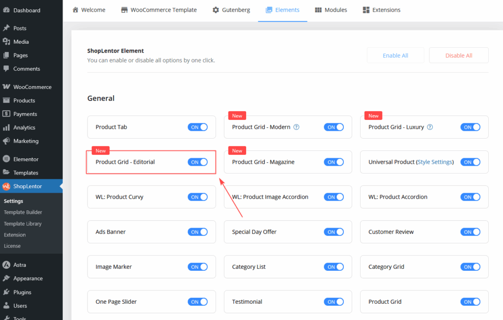
Step 1: How to Enable Product Grid – Editorial Widget
- Go to Dashboard → WooLentor → Settings → Elements
- Find Product Grid – Editorial Layout
- Switch it ON to activate the widget
Once enabled, the widget appears in your Elementor editor.
Step 2: How to Use the Product Grid – Editorial Layout Widget
You can add the Editorial layout in two ways:
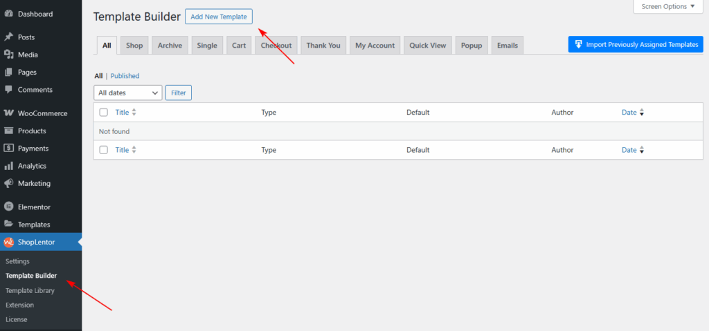
Method 1: Using the ShopLentor Template Builder.
- Go to Dashboard → WooLentor → Template Builder
- Click Add New
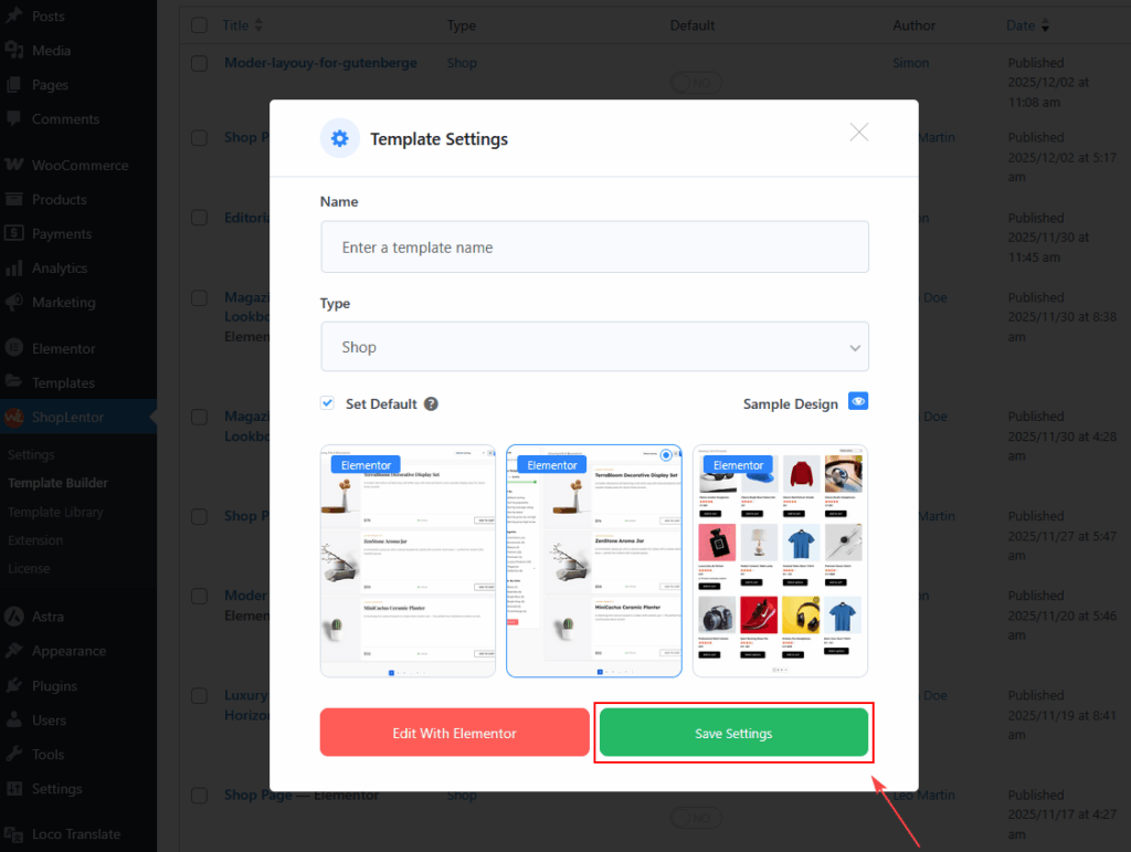
- In the popup:
- Enter a Template Name
- Select Type: Shop or Archive
- Enable Set Default
- Choose a starter design (optional)
- Click Save Settings
- Click Edit with Elementor
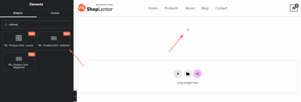
- Search for “Editorial ”
- Drag & drop the widget into your Shop page template
Method 2: Add Directly Inside Elementor
- Edit any page with Elementor
- Search for Product Grid – Editorial Layout
- Drag the widget into your desired section
- Adjust content, layout, and style options
Your Editorial product grid is now ready for customization.
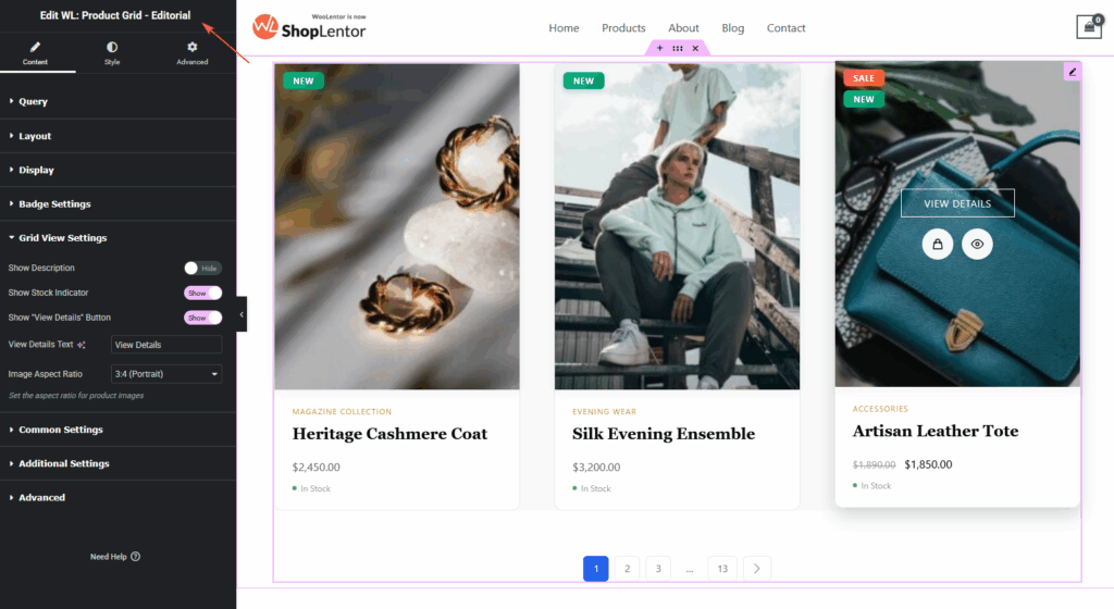
Step 3: How to Customize the Product Grid – Editorial Widget
All customization settings appear under the Content Tab inside Elementor.
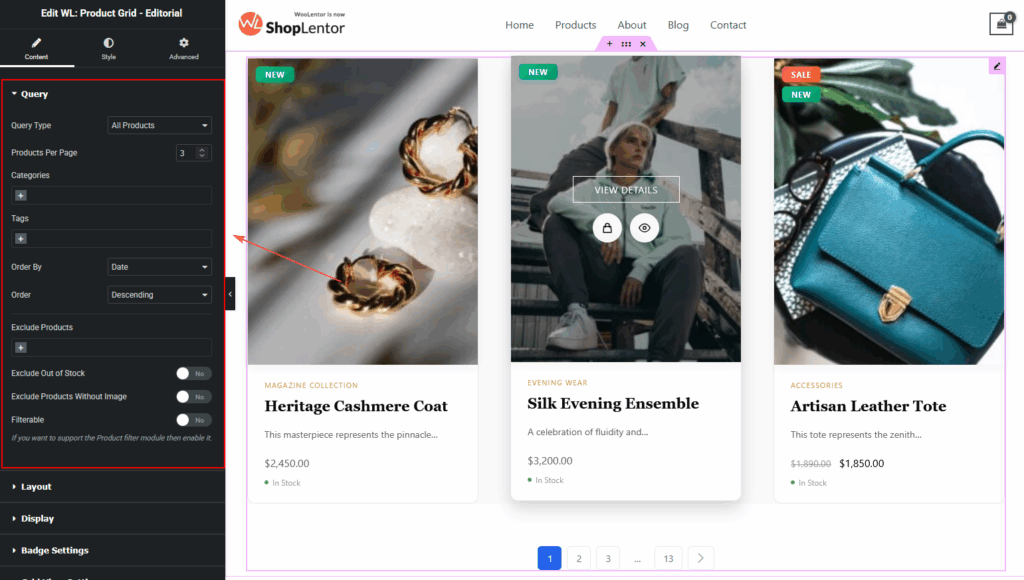
Query Settings
Control which products are displayed:
- Query Types: All Products,Recent Products,Featured,On Sale,Best Selling,Top Rated,Recently Viewed,Manual Selection.
- Products per page
- Categories & Tags
- Include / Exclude specific products
- Exclude Out-of-Stock products
- Exclude products without images
- Sorting (date, title, price, popularity, rating, random, etc.)
- Filterable mode compatibility
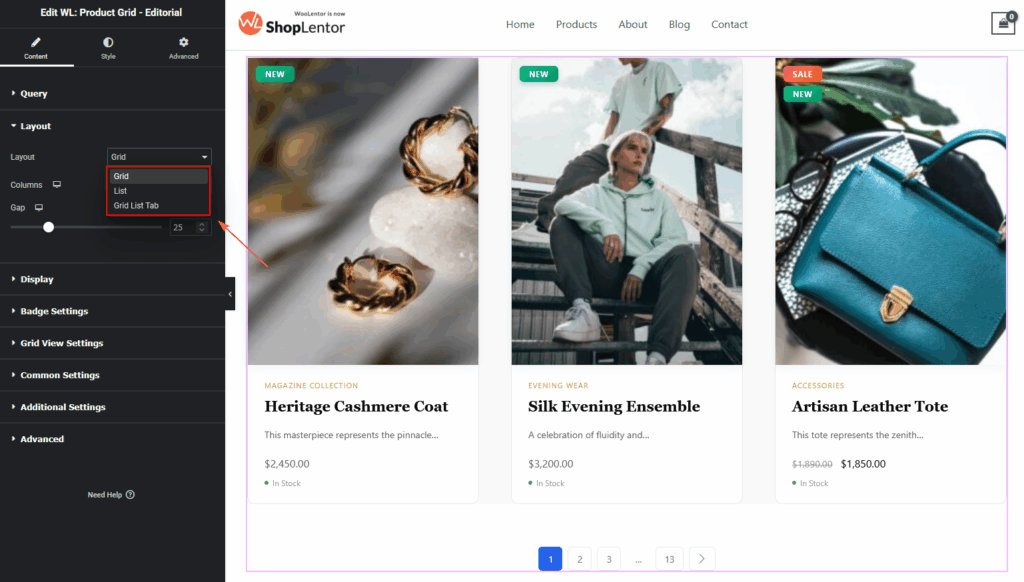
View Mode
Choose how products are displayed:
- Grid View (Editorial Default)
Magazine-style layout with image-focused cards, centered View Details button, and minimalist content arrangement.
- List View — Ideal for detailed storytelling. Includes:
- Larger image
- Longer description
- Add to Cart button
- Stock status
- Grid–List Tab View — Offers tabs to switch between views for a richer UX.
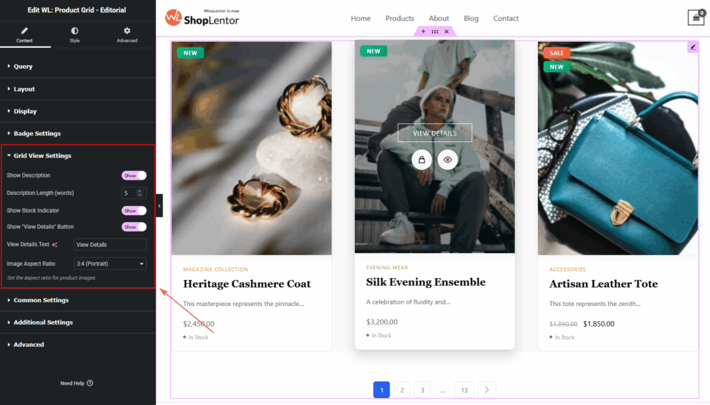
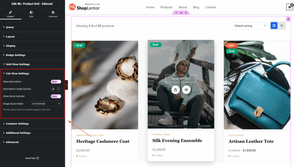
Grid
- Enable/Disable product description
- Control description length (word count)
- Enable/Disable Stock Indicator
- Enable/Disable View Details Button
- Choose professional Image Aspect Ratios:
- 1:1
- 3:4
- 4:5
- 9:16
List
Available only in List View or Grid–List Toggle mode:
- Show Product Description
- Extended description (longer text)
- List Description word count
- Show Stock Status (In Stock / Out of Stock)
- Show Discount Percentage
- Show Add to Cart button
- List Image Aspect Ratio:
- 1:1
- 4:3
- 16:9
- 3:4
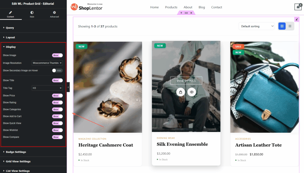
Display Settings
Choose which product details you want to show.
Available Options:
- Product Image
- Image Size
- Secondary Image on Hover
- Title
- Price
- Rating
- Categories
- Description (Grid / List)
- Add to Cart (List view)
- Stock Indicator
- View Details Button
- Quick Action Buttons (Wishlist, Quick View, Compare)
Badge Settings
Options Include:
- Show Badge
- Badge Style (Gradient, Solid, Outline)
- Badge Position (Top Left / Top Right)
- Show Sale Badge
- Sale Badge Text
- Show New Badge
- New Badge Text
- New Badge Days
- Show Trending Badge
- Badge Module Enable Notice
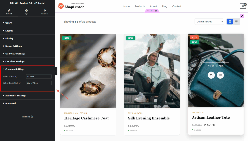
Common Settings
- In Stock Text
- Out of Stock Text
Additional Settings
Enhance the product cards visually:
1. Card Hover Effects:
- Lift Up
- Shadow
- None
2. Image Hover Effects:
- Zoom In
- Fade
- None
3. Quick Actions On Hover:
Shows floating action icons for:
- Wishlist
- Quick View
- Compare

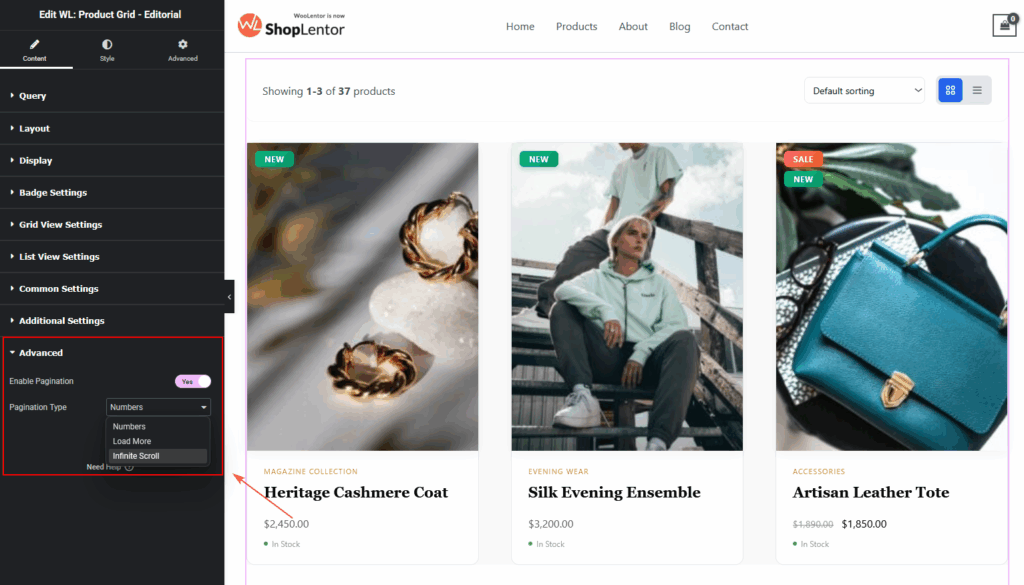
Advanced Settings
The Advanced Settings allow you to control how products load and how users navigate through your product list.
Enable Pagination
Show/hide pagination completely.
- Pagination Type:
- Numbers — classic pagination
- Load More — loads new products on button click
- Infinite Scroll — loads products automatically
- Load More Button Text(if Load More is selected)
- Customize the button label displayed on the Load More button.
- No More Products Text
- Set the message shown when there are no additional products to load.
Step 4: How to Customize the Product Grid – Editorial Style
All styling options are under the Style Tab in Elementor:
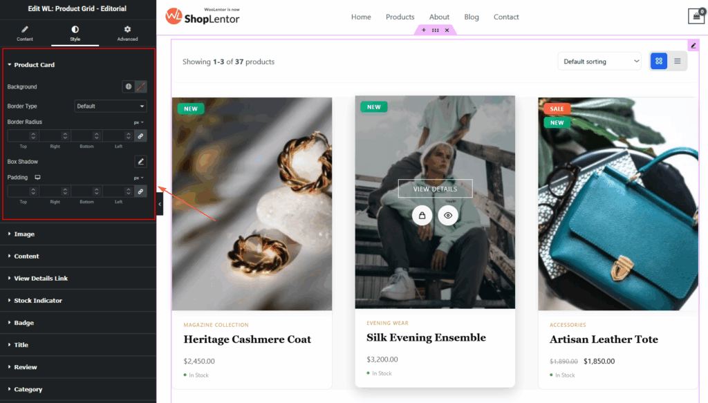
Product Card
- Background color
- Border type & color
- Border radius
- Padding
- Box shadow
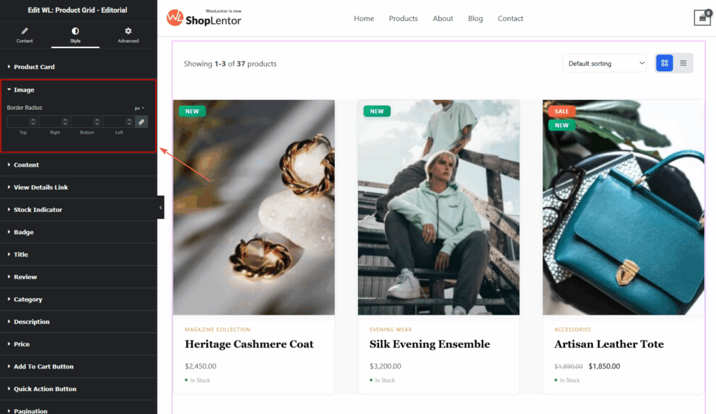
Image
- Image Border Radius:
- Adjust the corner roundness of the product image.
- Useful for creating soft, rounded, or sharp-edge layouts.
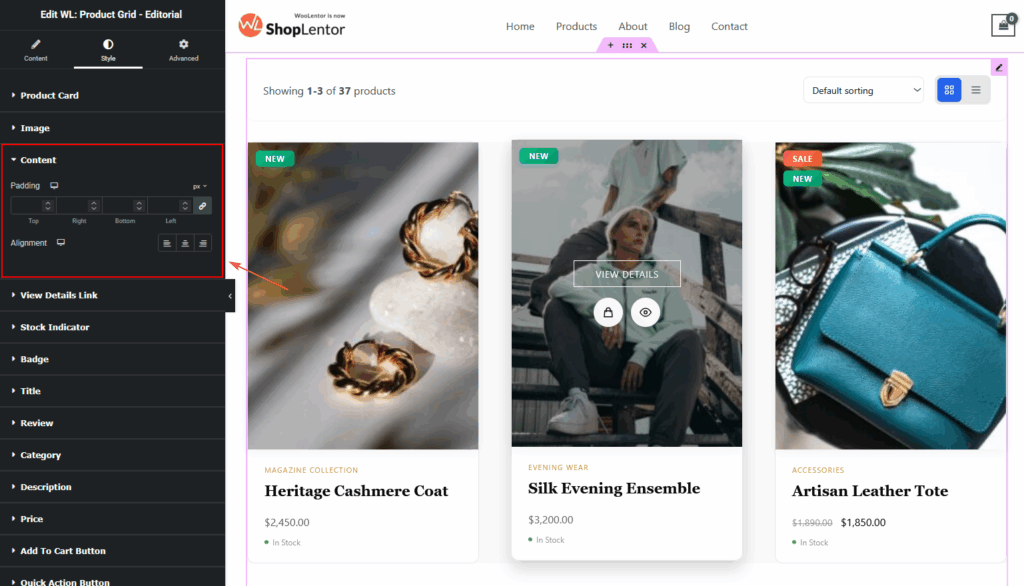
Content
- Content Padding
- Controls spacing around title, price, categories, and buttons.
- Content Alignment
- Left, Center, or Right.
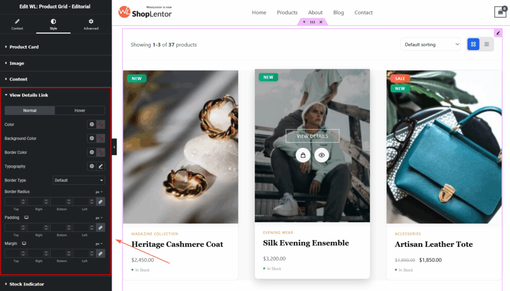
View Details Link
You’ll find two separate states:
- Normal – default state
- Hover – when the user hovers over the link
Available options in both states:
- Color
- Background Color
- Border Color
- Typography
- Border Type
- Border Radius
- Padding
- Margin
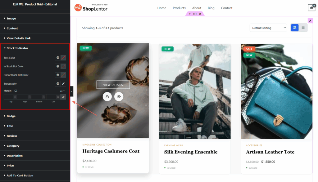
Stock Indicator
- Text Color
- In Stock Dot Color
- Out of Stock Dot Color
- Typography
- Margin
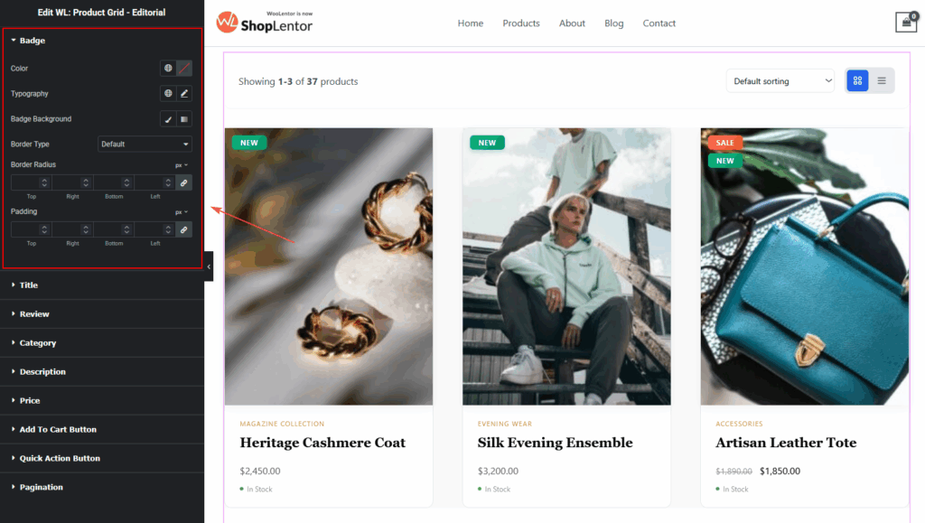
Badge
- Text color
- Background color
- Border type & radius
- Typography
- Padding & margin
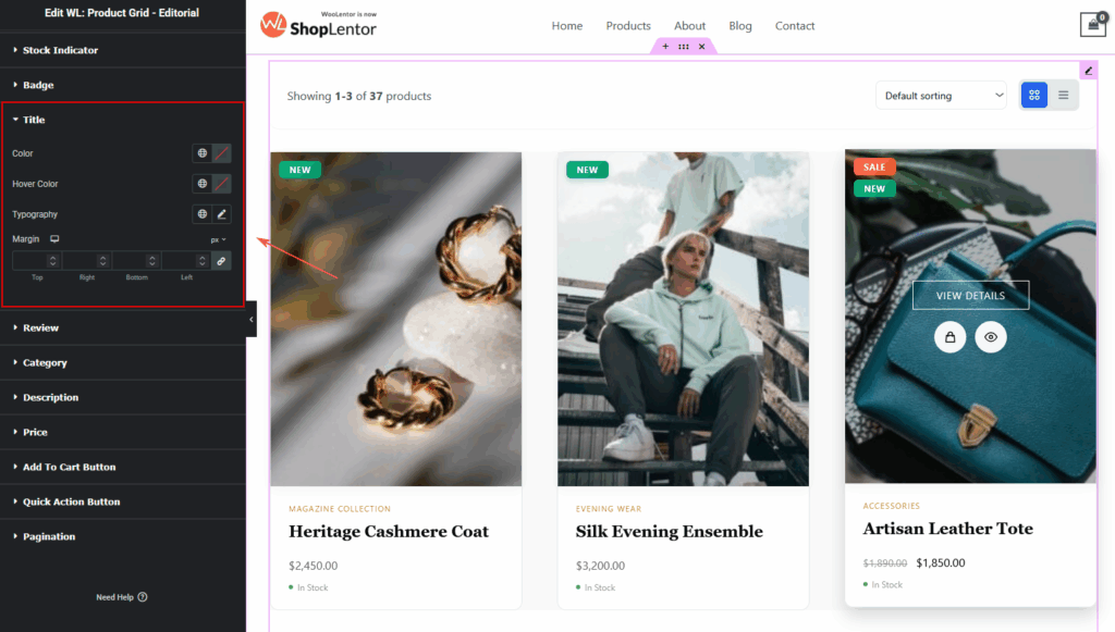
Title
- Normal & Hover color
- Typography
- Margin spacing
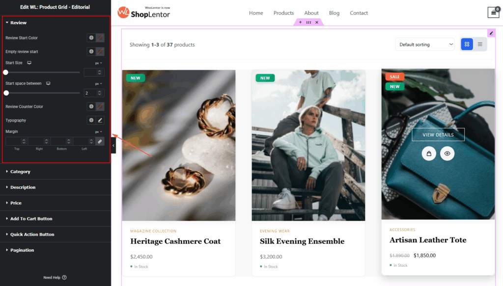
Rating
- Filled star color
- Empty star color
- Star size
- Spacing
- Review count typography
Category
- Text color
- Background color
- Hover color
- Typography
- Padding
- Margin
- Border radius

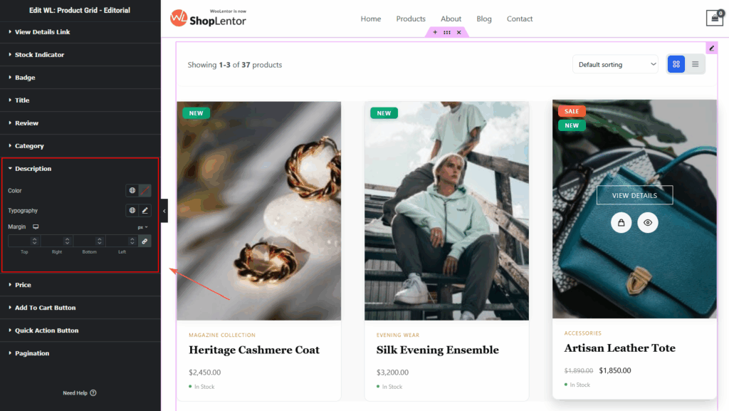
Description
- Text color
- Typography
- Margin spacing
Price
- Regular price color
- Sale price color
- Typography

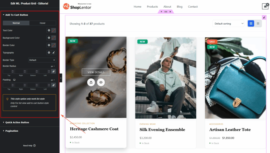
Add To Cart Button
- Normal & Hover color
- Background color
- Icon size
- Typography
- Border
- Border radius
- Padding
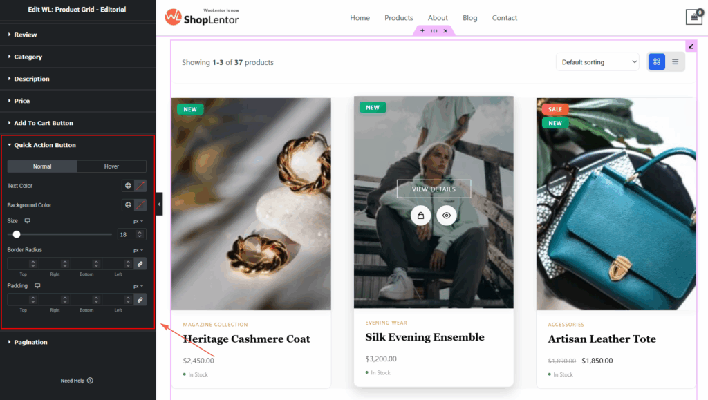
Quick Action Buttons
- Normal & Hover color
- Background
- Button size
- Border radius
- Padding
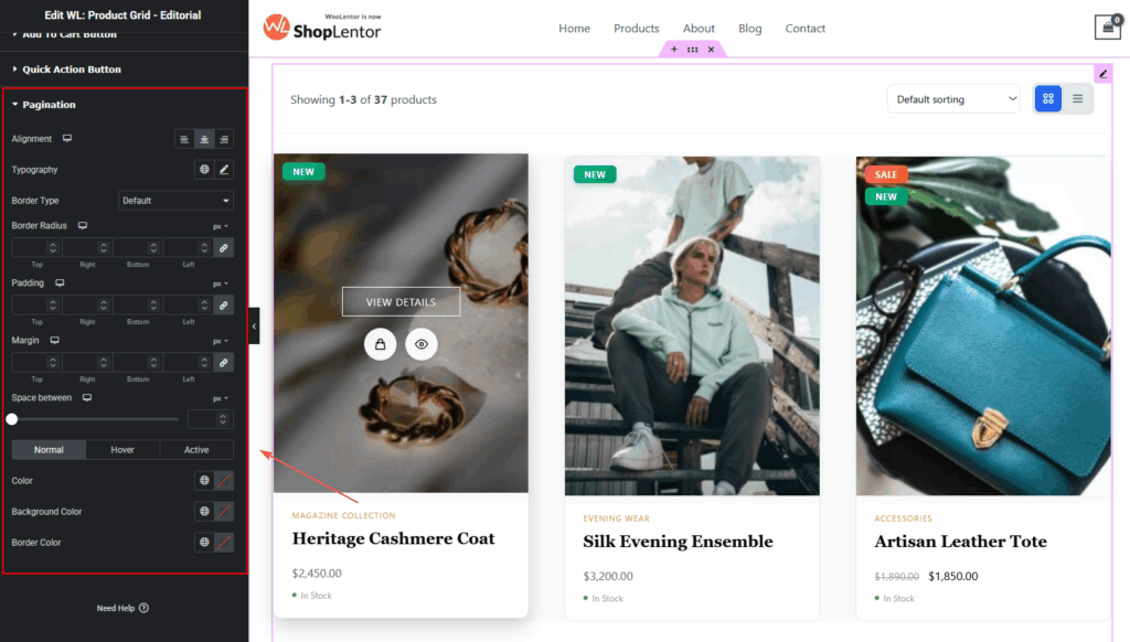
Pagination
- Alignment
- Typography
- Normal, Hover & Active colors
- Background
- Border type & radius
- Padding
- Margin
Step 5: Visit & Preview Your Page
After styling is complete:
- Click Publish or Update
- Open the Shop page
- Test both Grid and List views
- Check Mobile, Tablet, and Desktop
- Adjust spacing & typography for perfect balance
Your Product Grid – Editorial Layout is now ready!
Use different aspect ratios and hover styles to discover the best layout for your shop.
Tips for Best Visual Results
- Use 4:5 aspect ratio for editorial-quality product photography
- Turn on View Details for premium product navigation
- Use Zoom Image Hover for fashion or lifestyle stores
- Use Stock Indicators to enhance trust
- Keep descriptions short in Grid view for a clean look
- Use Extended Description in List view for storytelling
Conclusion
The Product Grid – Editorial Layout is a refined, feature-rich, and highly customizable product grid that elevates the visual experience of any WooCommerce store.
Whether you’re building a full Shop Page, Category Page, Lookbook, or editorial-style landing page, this widget gives you complete control over layout, elements, interactivity, and styling—making it perfect for modern, premium, and visually driven eCommerce brands.