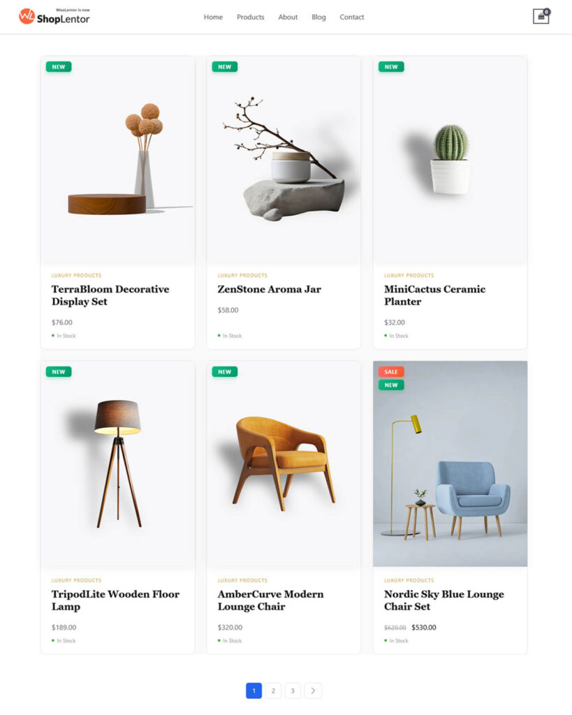
The Product Grid – Editorial Layout Gutenberg block lets you build a polished, magazine-style product display using a WooCommerce editorial product grid directly in the native WordPress Block Editor. Designed for fashion, beauty, lifestyle, and luxury stores, it offers refined typography, balanced spacing, elegant product cards, and professional image aspect ratios that elevate your WooCommerce shop pages.
This block supports Grid View, List View, and a Grid–List Toggle, enabling customers to effortlessly switch between gallery-style browsing and detailed product views. With key editorial features like the View Details overlay button, animated stock indicators, smart badges, quick action buttons, editorial-style descriptions, and flexible pagination options, you can fully customize your store’s look and feel without needing Elementor.
Why Use the Editorial Layout in Gutenberg?
The Gutenberg version of the Editorial Layout brings the same magazine-inspired presentation to users who prefer the native WordPress Block Editor. It’s ideal for:
- Shop Page Templates – Create a premium editorial shop layout.
- Product Category & Archive Templates – Ensure consistent styling on all WooCommerce archive pages.
- Custom Pages Built in Gutenberg – Add the block wherever WordPress blocks are supported.
What Makes This Block Stand Out?
- Clean, editorial WooCommerce product grid
- Grid, List & Grid–List Toggle views
- Professional aspect ratios (1:1, 3:4, 4:5, 9:16)
- View Details overlay button
- Animated stock indicators (with pulsing In Stock dot)
- Smart badges (Sale, New, Trending)
- Wishlist, Quick View & Compare support
- Load More & Infinite Scroll pagination
- Advanced product queries
- Full styling customization for colors, spacing, typography & hover effects
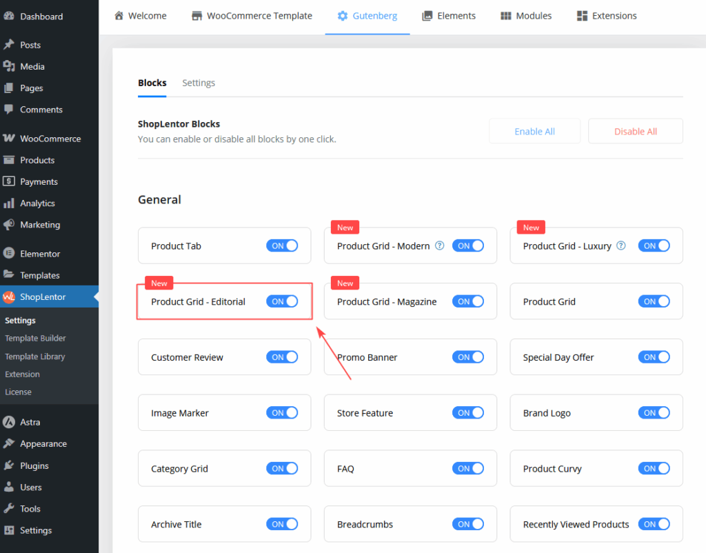
Step 1: How to Enable Product Grid – Editorial Block
Before using the block inside Gutenberg, make sure it is enabled.
- Go to Dashboard → ShopLentor → Settings → Gutenberg
- Scroll to the Gutenberg Blocks section
- Locate Product Grid – Editorial Block
- Switch the toggle ON to activate the block
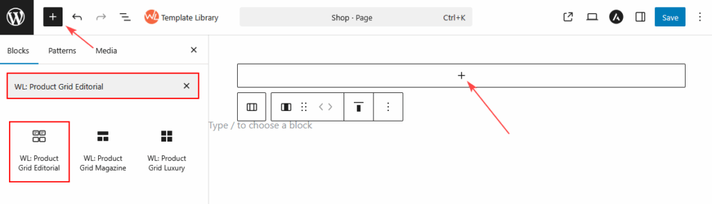
Step 2: How to Add the Product Grid – Editorial Block in Gutenberg
Once the block is enabled, you can insert it into any WordPress page.
Method 1: Add Inside a WordPress Page
- Open any page using the Block Editor (Gutenberg)
- Click the ( + ) Add Block button
- In the block search bar, type: “Product Grid – Editorial”
- Select the block
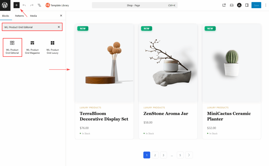
- The default Editorial product grid will be inserted into your page
- Customize settings from the Block Sidebar Panel
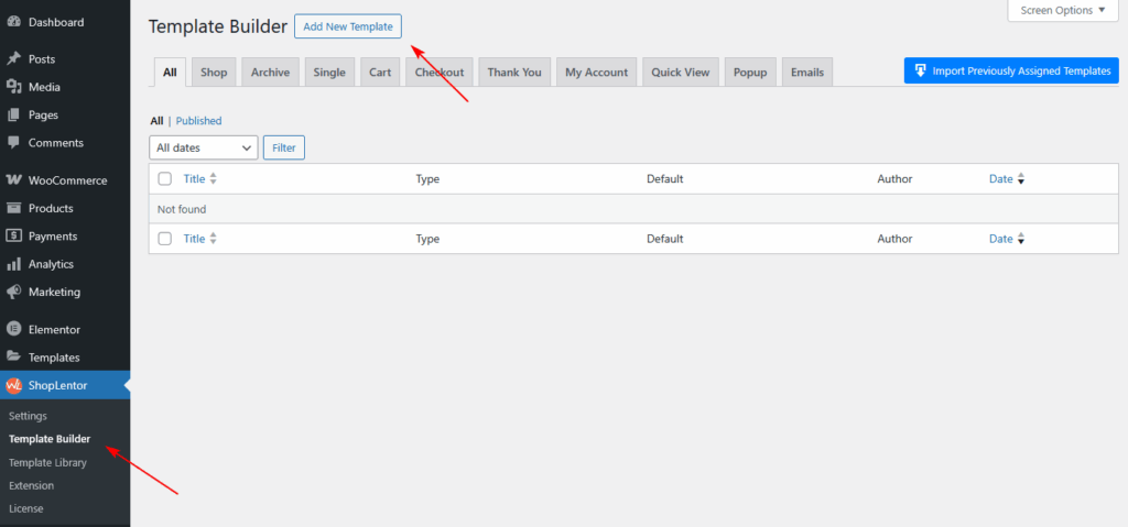
Method 2: Using the ShopLentor Template Builder.
- Go to Dashboard → ShopLentor → Template Builder
- Click Add New Template
- In the popup:
- Enter a Template Name
- Select Type → Shop or Archive
- Select Editor → Gutenberg
- Enable Set Default ( optional )
- Choose a Sample Design
- Click Save Settings
- If you selected a Sample Design, your template is ready to use.
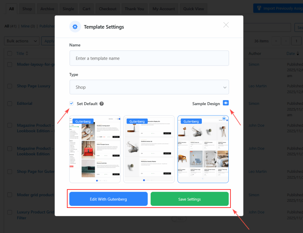
- To create a fully custom layout from scratch, follow the next steps:
- Select Edit with Gutenberg
- Click the + Block Inserter
- Search for Product Grid Editorial
- Insert the block into your Shop or Archive template
Product Grid – Editorial Block Options
All settings are available inside the General and Styles tabs.
GENERAL SETTINGS
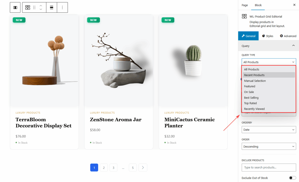
Query
- Query Type:
- All Products
- Recent Products
- Manual Selection
- Featured
- On Sale
- Best Selling
- Top Rated
- Recently Viewed.
- Number Of Products
- Categories / Tags
- Include / Exclude Products
- Order & Order By
- Exclude Out-of-Stock
- Exclude Products Without Image
- Filterable
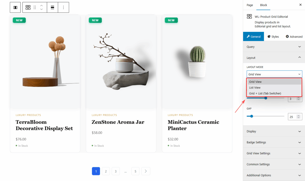
Layout
- Grid or List
- Grid List tab
- Columns
- Gap
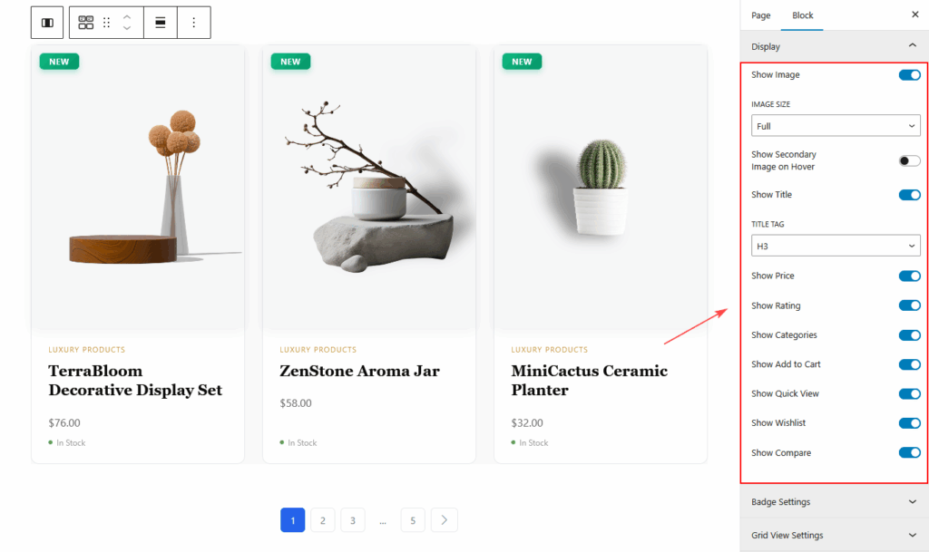
Display
- Image
- Image Resolution
- Secondary Image on Hover
- Title
- Price
- Rating
- Categories
- Add to Cart Button
- Quick View Button
- Wishlist Button
- Compare Button
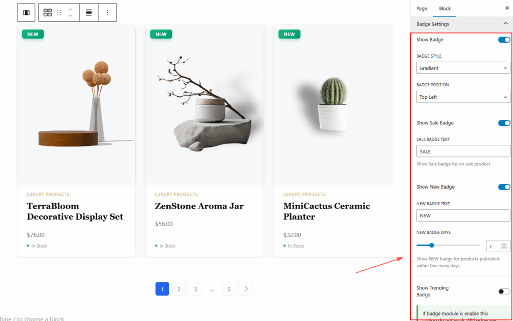
Badge Settings
- Show Badge
- Badge Style (Gradient, Solid, Outline)
- Badge Position (Top Left, Top Right)
- Sale Badge
- Sale Badge Text
- New Badge
- New Badge Text
- New Badge Days
- Trending Badge
- Note: If the Badge Module is enabled globally, these settings are overridden.
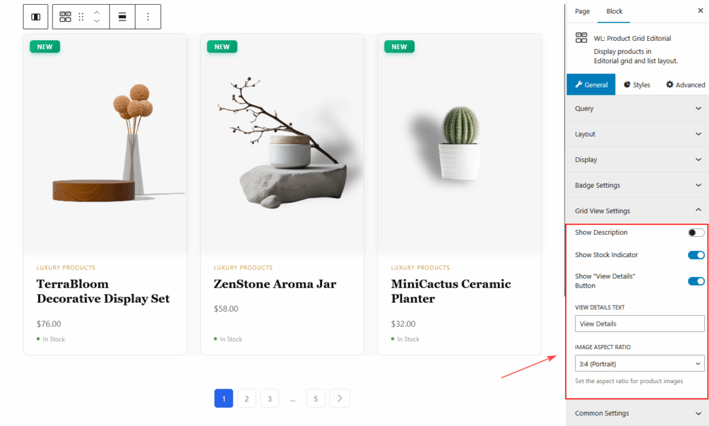
Grid View Settings
- Show Description
- Description Length
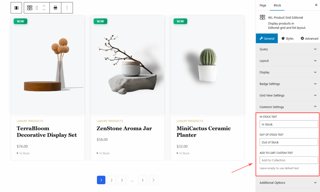
Common Settings
- In Stock Text
- Out of Stock Text
- Add to Cart Custom Text
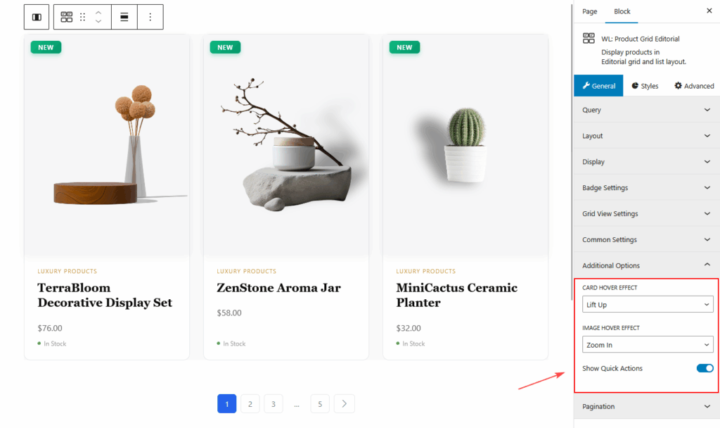
Additional Options
- Card Hover Effect
- Image Hover Effect
- Show Quick Action Buttons
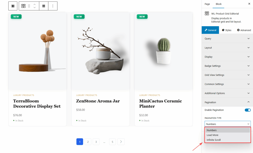
Pagination
- Enable Pagination
- Pagination Type:
- Numbers
- Load More
- Infinite Scroll
STYLES TAB
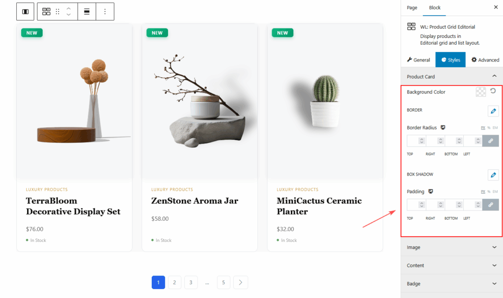
Product Card
- Background
- Border
- Border Radius
- Box Shadow
- Spacing
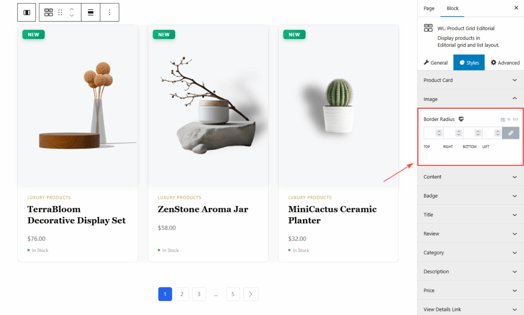
Image
- Image Border Radius
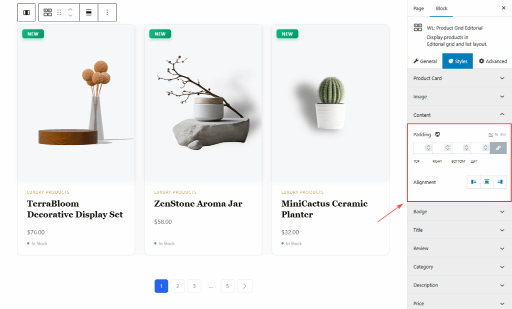
Content
- Content Padding
- Alignment
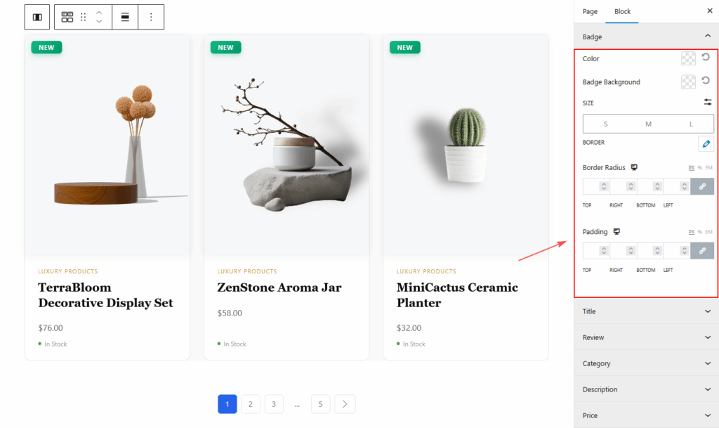
Badge
- Typography
- Color
- Background Color
- Border
- Border Radius
- Padding
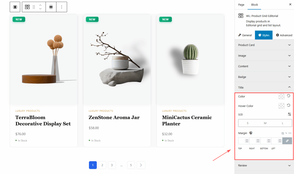
Title
- Typography
- Color
- Hover Color
- Spacing
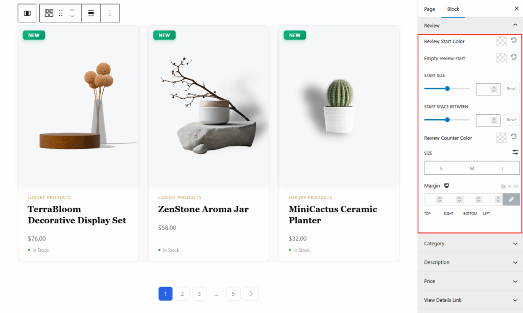
Review
- Star Color (Filled / Empty)
- Star Size
- Star Spacing
- Review Count Typography
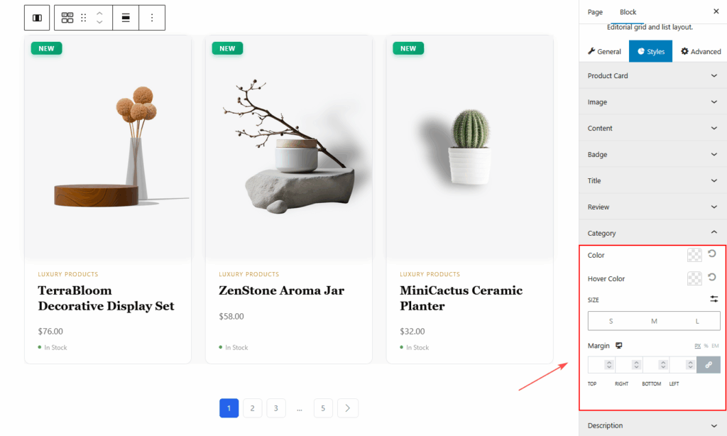
Category
- Typography
- Category Color
- Hover Color
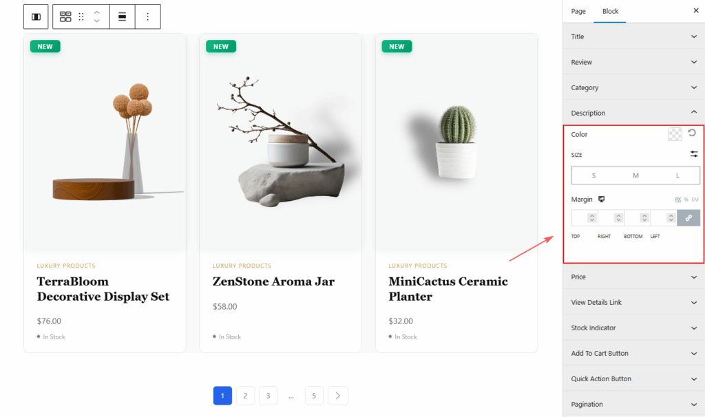
Description
- Typography
- Color
- Margin
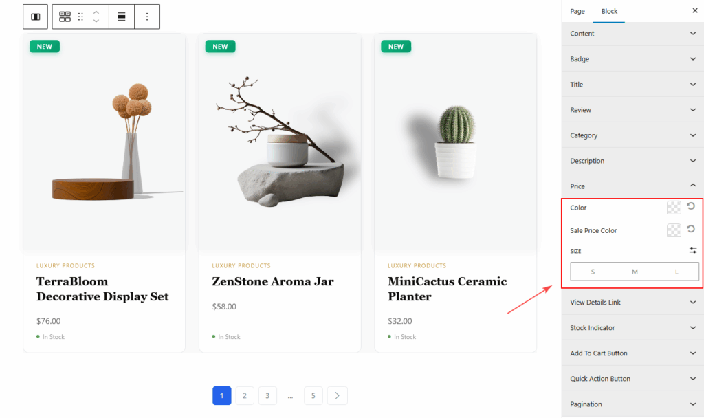
Price
- Regular Price Color
- Sale Price Color
- Typography
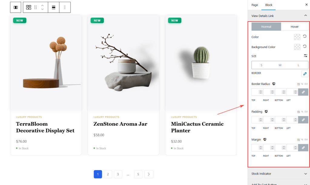
View Details Link
You’ll find two separate states:
- Normal – default state
- Hover – when the user hovers over the link
Available options in both states:
- Color
- Background Color
- Border Color
- Typography
- Border Type
- Border Radius
- Padding
- Margin
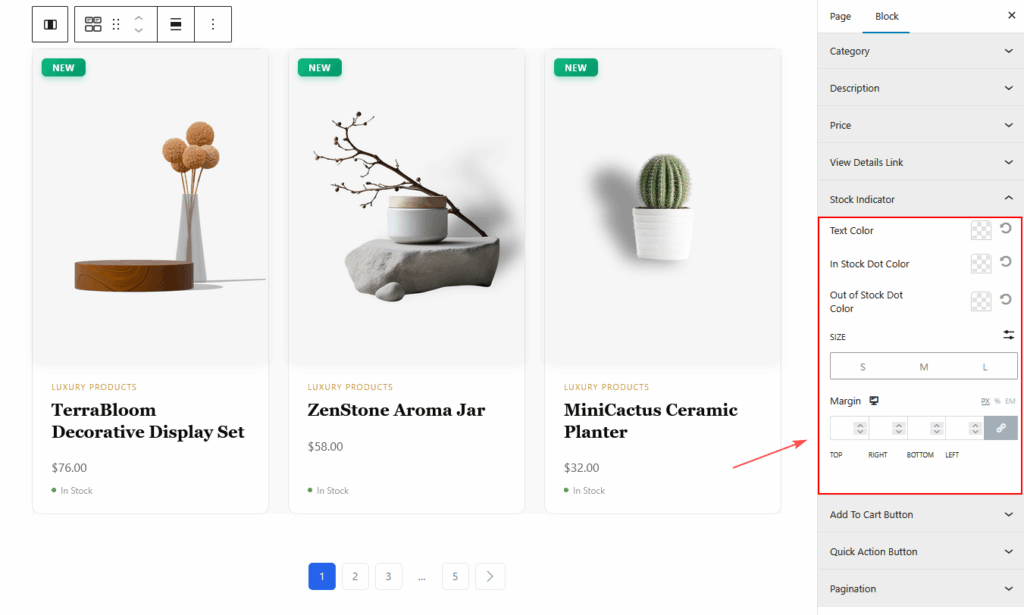
Stock Indicator
- Text Color
- In Stock Dot Color
- Out of Stock Dot Color
- Typography
- Margin
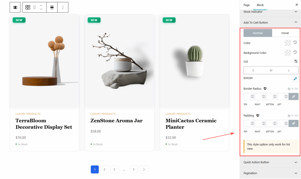
Add to Cart Button
- Normal and Hover Style
- Color
- Background Color
- Border
- Typography
- Border Radius
- Padding
- Icon Size (if used)
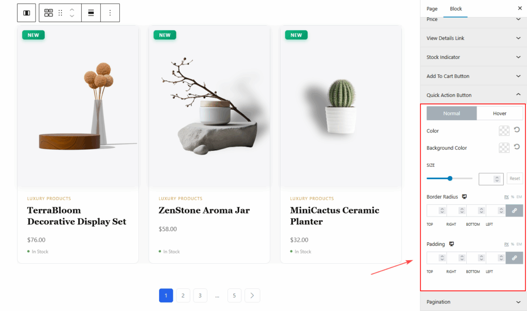
Quick Action Button
- Icon Size
- Color
- Background
- Border Radius
- Padding
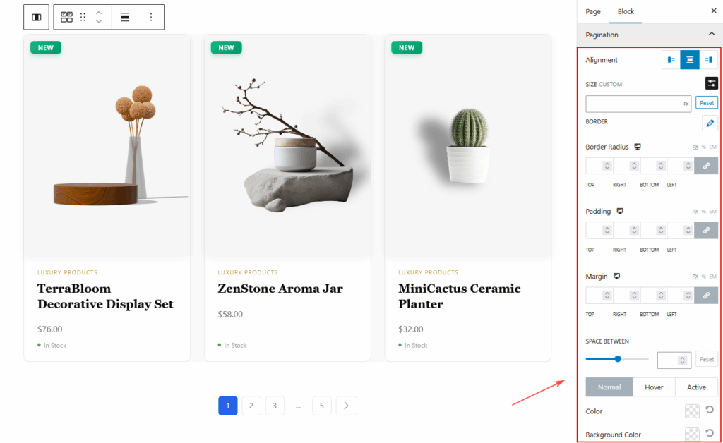
Pagination Style
- Pagination Alignment
- Typography
- Normal State Colors
- Hover State Colors
- Active State Colors
- Border Type
- Border Color
- Border Radius
- Padding
- Margin
Visit & Preview the Page
Once you finish customizing:
- Click Publish or Update
- Visit your Shop page
- Test both Grid and List views
- Check responsiveness on Mobile, Tablet, and Desktop
- Make any additional style adjustments
Your Product Grid – Modern Block is now live!
Tips for Best Visual Results
- Use Grid View for visual products like fashion, home decor, and beauty.
- Use List View for detailed or B2B product types.
- Enable secondary image hover for a modern, dynamic look.
- Keep product descriptions short for Grid View.
- Use badges (Sale, New, Trending) strategically to draw attention.
- Use Load More or Infinite Scroll for large catalogs.
- Align spacing and colors with your theme for a polished finish.
- Preview on mobile to refine small-screen spacing and readability.
Conclusion
The Product Grid – Modern Layout Gutenberg block is a powerful and flexible way to design beautiful WooCommerce product displays inside the Gutenberg editor. With modern design options, advanced filtering, customizable badges, hover effects, multiple pagination styles, and complete styling control, it helps you create a high-quality product grid that enhances user experience and drives conversions.
Whether used on a Shop Template, Archive Page, or any custom-designed Gutenberg page, this block provides the perfect blend of functionality and modern visual design for any WooCommerce store.