It’s easy to showcase products using the Product Grid Widget for Elementor. The Product Grid Widget for Elementor allows you to create your own customized layout to display WooCommerce products using multiple built-in layout and styling options available in this widget. This widget is designed to be used inside Elementor pages or templates.
The Product Grid Widget for Elementor is a flexible way to organize your product catalog. It is perfect for eCommerce stores, homepage product sections, landing pages, and product-focused landing templates where products need to be displayed in a visually appealing and professional manner.
Steps of Adding Product Grid Widget
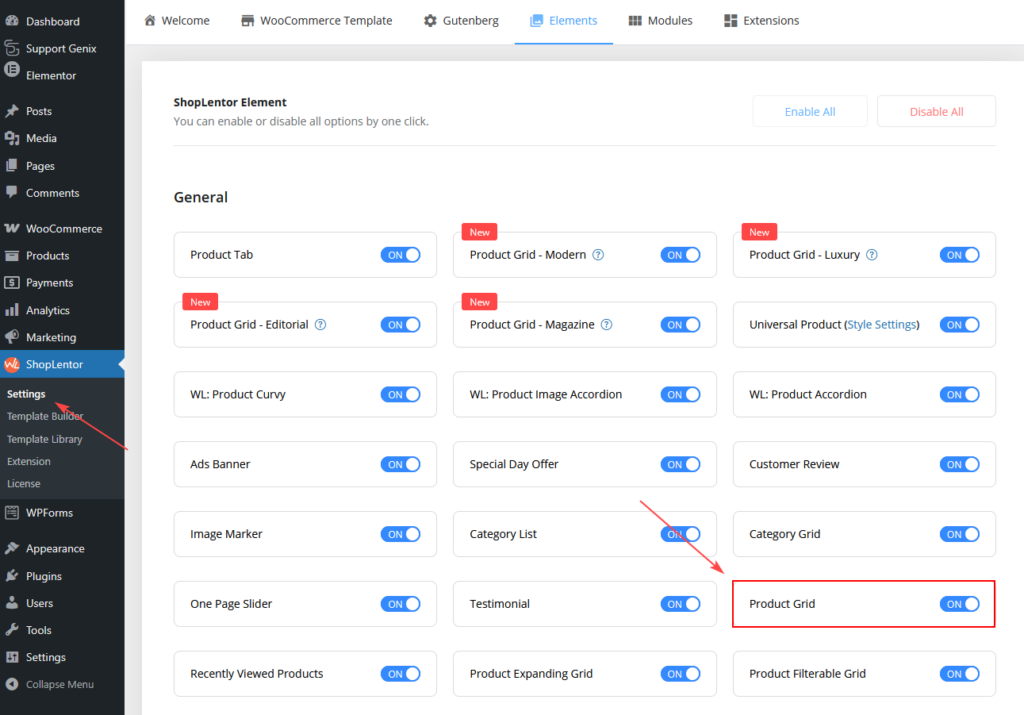
Go to WordPress Dashboard > ShopLentor > Settings > Elements. From the list of Elements, turn ON the “Product Grid” Widget.
Step 1: How to Enable Product Grid Widget?
- Go to: Dashboard > ShopLentor > Elements
- From the list of Elements, turn ON the Product Grid widget.
- Save settings.
Step 2: How to Use the Product Grid Widget?
If you want to use the Product Grid feature on your WooCommerce store, you need to use the widget named “WL: Product Grid”.
To add the Product Grid Widget, search by “Product Grid” and use the Widget that has the “WL Badge”.
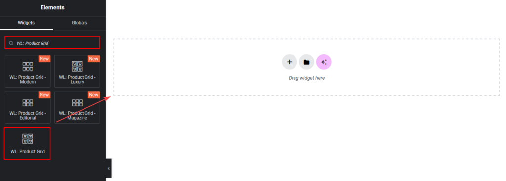
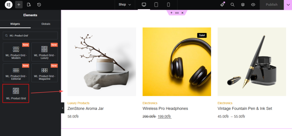
Drag and drop the ShopLentor WL: Product Grid Widget onto the Page.
Step 3: How to Customize the Product Grid?
You can customize the Product Grid from the Content and Style tabs.
Content Tab Customization
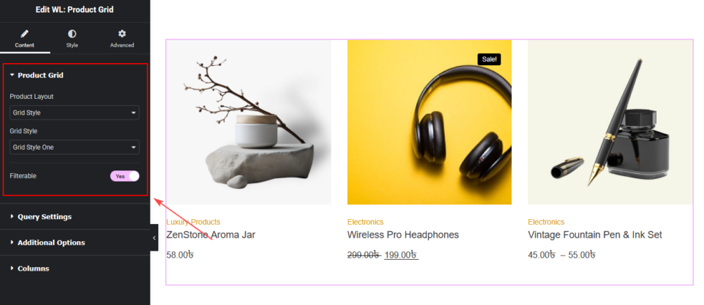
Product Grid Settings
You can set:
- Product Layout (Current Theme Style / Grid Style)
- Grid Style (Style One, Two, Three, Four, Five)
- Filterable option (Enable AJAX filtering)
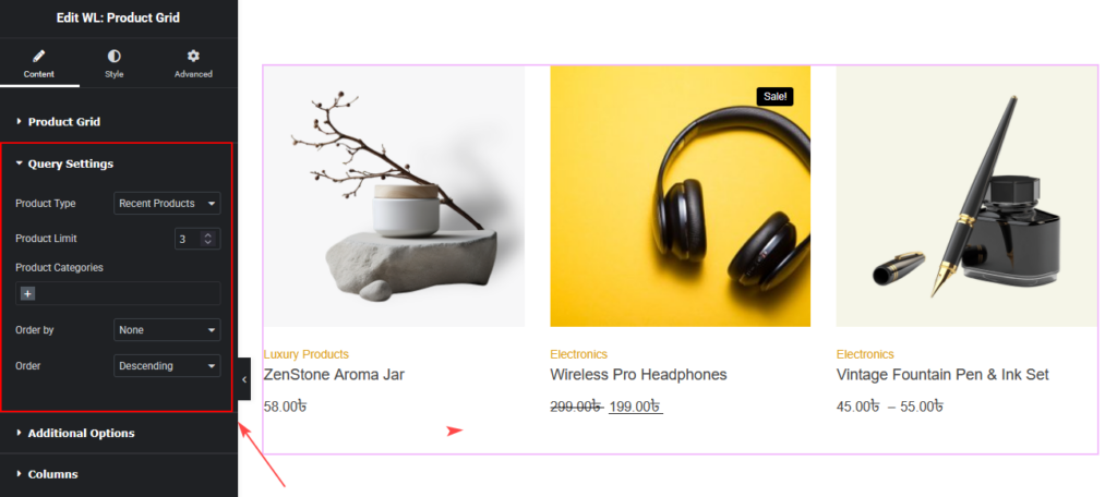
Query Settings
You can control which products to display.
You can set:
- Product Type
(Recent, Featured, Best Selling, Sale, Top Rated, Random, Show by ID, Add ID Manually) - Product Limit
- Product Categories
- Category Operator (AND / IN / NOT IN)
- Order By
- Order (Ascending / Descending)
Additional Options
You can set:
- Slider On (Enable product slider)
- Pagination
- Title HTML Tag
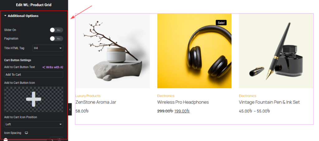
Cart Button Settings
You can customize:
- Add to Cart Button Text
- Add to Cart Button Icon
- Add to Cart Icon Position (Left / Right)
- Icon Spacing
- Variation Product Quick Cart
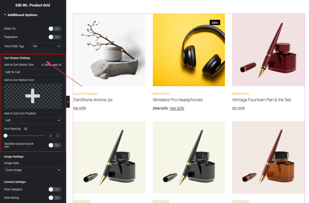
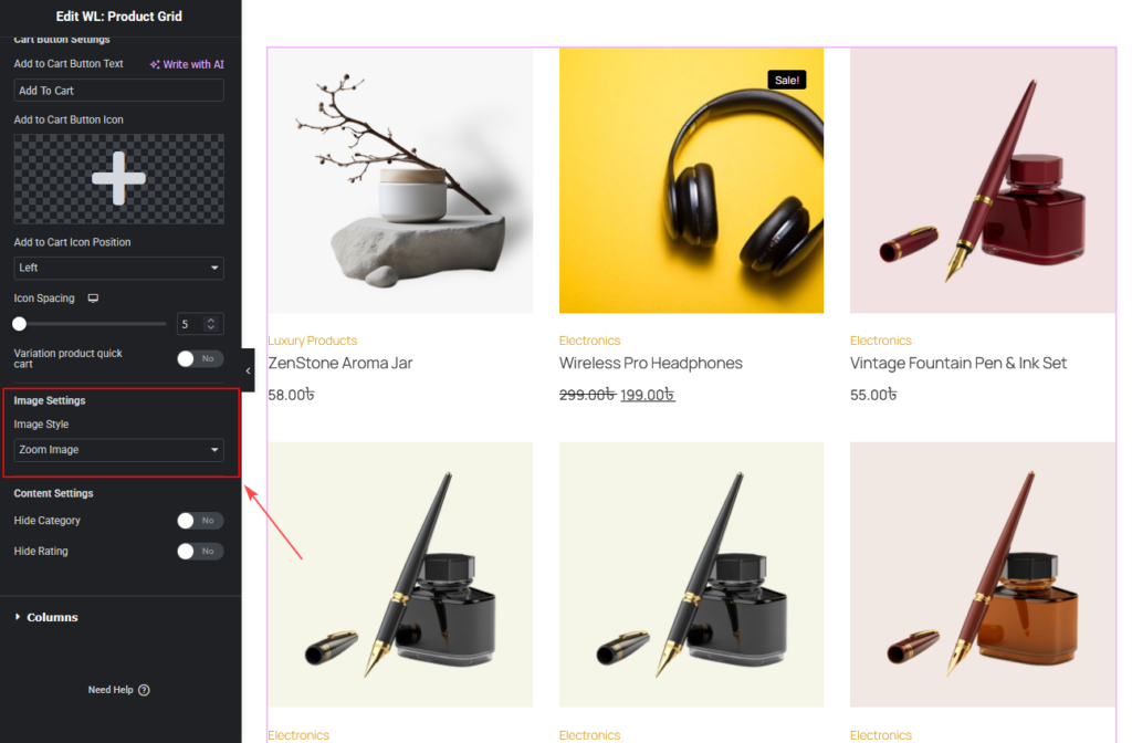
Image Settings
You can choose:
- Zoom Image
- Secondary Image
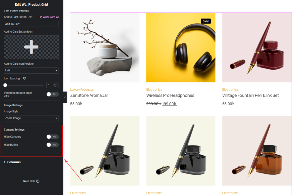
Content Settings
You can:
- Hide Category
- Hide Rating
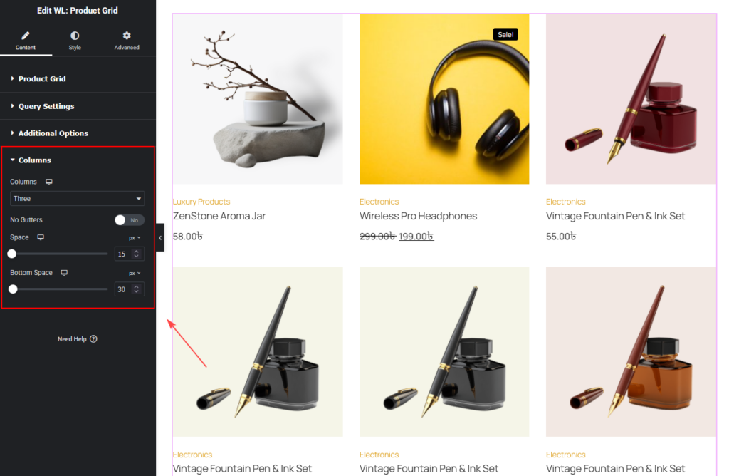
Columns
You can change:
- Columns
- No Gutters
- Space
- Bottom Space
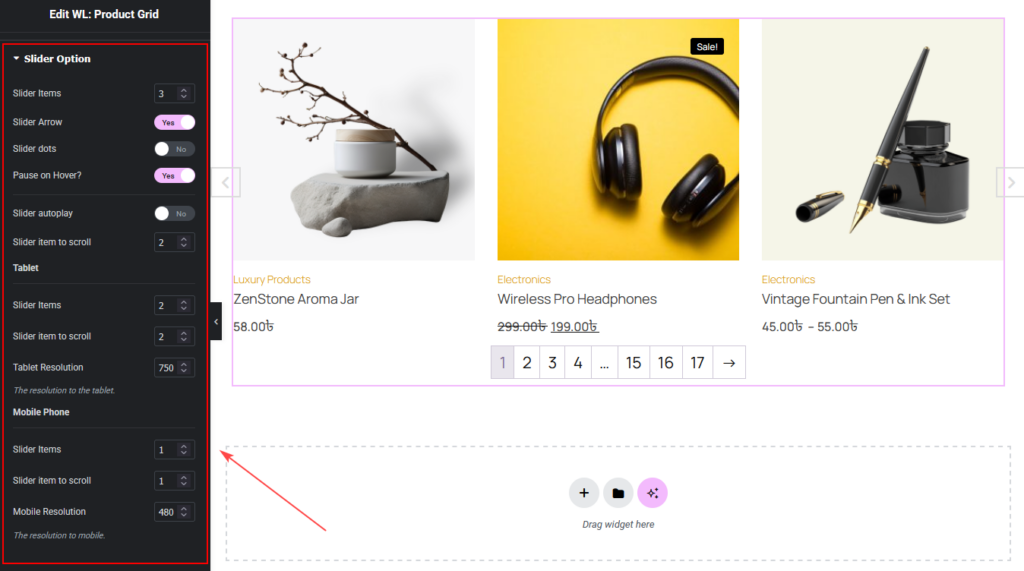
Slider Options (If Slider Enabled in Additional Options)
You can customize:
- Slider Items
- Slider Arrow
- Slider Dots
- Pause on Hover
- Autoplay
- Autoplay Speed
- Animation Speed
- Item to Scroll
- Tablet & Mobile settings
How to Customize the Product Grid Style
Go to the Style Tab to customize the design.
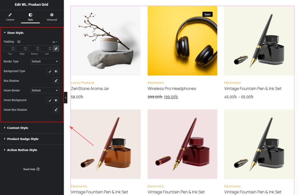
Item Style
You can change:
- Padding
- Border
- Hover Border
- Background
- Hover Background
- Box Shadow
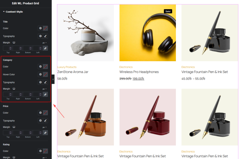
Content Style
You can customize:
Title
- Color
- Typography
- Margin

Category
- Color
- Hover Color
- Typography
- Margin
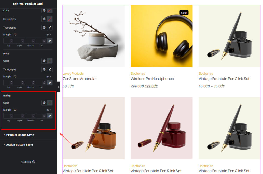
Price
- Color
- Typography
- Margin

Rating
- Color
- Margin
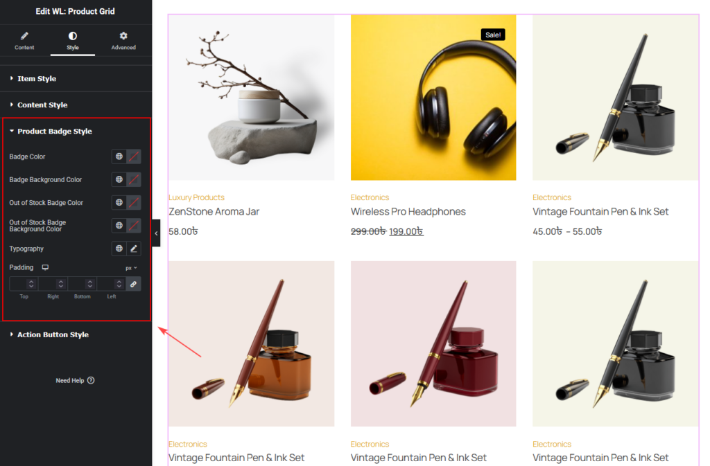
Product Badge Style
You can change:
- Badge Color
- Badge Background Color
- Out of Stock Badge Color
- Out of Stock Badge Background Color
- Typography
- Padding
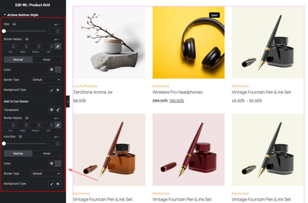
Action Button Style
You can customize:
- Size
- Border Radius
- Color
- Border
- Background
- Icon Size
- Normal and Hover styles
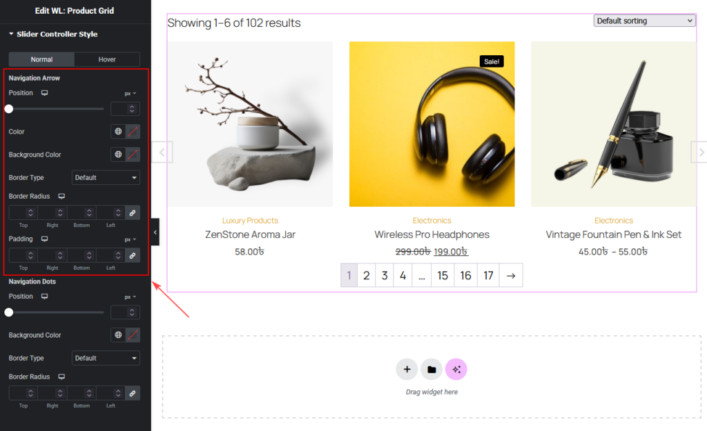
Slider Controller Style
(Visible when Slider On is enabled)
You can customize the slider navigation design from Style > Slider Controller Style.
Normal / Hover
You can style the slider controller separately for:
- Normal
- Hover
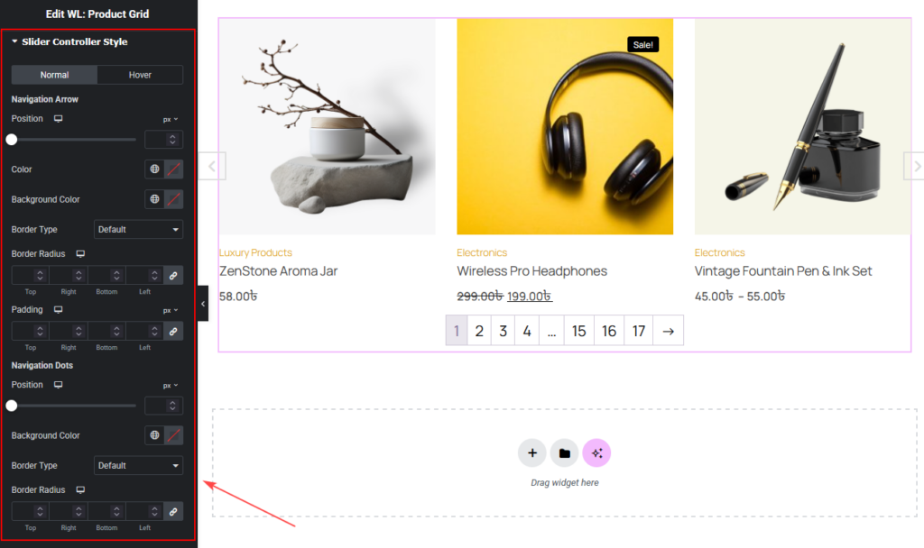
Navigation Arrow
You can change:
PositionColorBackground ColorBorder TypeBorder RadiusPadding
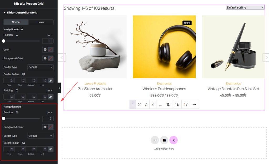
Navigation Dots
You can change:
PositionBackground ColorBorder TypeBorder Radius
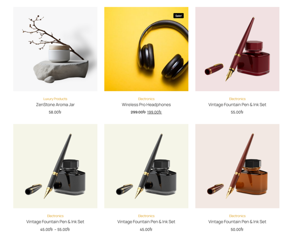
Step 4: Now See the Preview